马赛维约港
2021-05-11EdmundSumner
建设单位:MPM,马赛普罗旺斯
项目地点:法国马赛
建筑设计:福斯特建筑事务所
合作单位:Michel Desvigne Paris,Tangram 建筑师事务所,Ingerop Mediterannee,AIK YannKersale
结构设计/机电设计:Ingerop Mediterannee, Marseille
用地面积:约100 000 平方米(一期)
设计/建造:2010 / 2013 年
摄影:Edmund Sumner
Client: MPM, Marseille Provence Metropole
Location: Marseille, France
Architectural Design: Foster + Partners
Collaborating Architects: Michel Desvigne Paris (Lead Design);Tangram Architects, Marseille; Ingerop Mediterannee,Marseille; AIK YannKersale, Paris
Structural + Mechanical Engineers (Local): Ingerop Mediterannee, Marseille
Site Area: Approximately 100 000 m2in Phase 1
Design / Completion: 2010 / 2013
Photography: Edmund Sumner
维约港是世界遗产港口。但随着时间的推移,行人无法进入其滨水地带,该地区已与城市生活隔绝。重建的总体规划将码头作为一个城市空间,为表演和活动创造新的非正式场所,消除交通,创造一个安全、行人友好的公共领域。它的改造是一系列以纪念城市作为欧洲文化之都2013 年的项目的委托。
该方案拓宽了行人的空间,之前在码头边缘的船屋和技术设施已经用水上的全新平台和俱乐部取代,以建立一个安全、步行环境延伸到水边。与Michel Desvigne 一起开发的景观设计,包括一个新的暗白色花岗岩表面,与原来的石灰岩鹅卵石相呼应。简单、粗糙的材质保证了人们的可达性,同时消除了障碍并尽量增大灵活性。
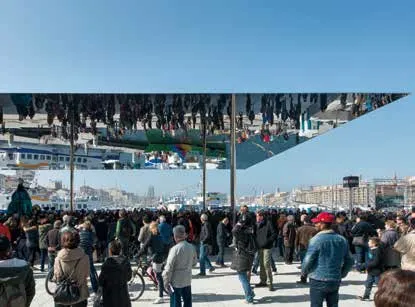
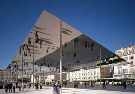
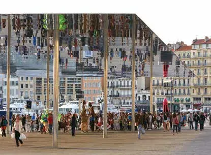
在建筑上,使用了非常谨慎的方法来增强空间。在Fraternité 码头(Quai de la Fraternité),港口宽广的东边,反光不锈钢刀片为活动和市场提供了一个灵活的新展馆。建筑四面开放,长46 米,宽22 米'ombrière '由细长的柱子支撑,高6 米。通过工作室的建筑师和工程师创造性的合作,该设计解决了在保持苗条轮廓的结构和美学挑战的同时,确保稳定性来使西北风偏斜。为了确保天篷足够坚硬,不会因自身重量而弯曲和下沉,它由一个坚硬的中心框架支撑,轮廓呈平缓曲线,向边缘逐渐变细,以减少视觉冲击。接缝和排水渠道隐藏在结构内,给人一种平整、无缝的外观。天篷的侧面由高度抛光的钢板组成——它是大海和港口生活的一面镜子,从水面上看,它只不过是地平线上一条简单的银色线。
Marseille’s Vieux Port is one of the grand Mediterranean ports, but over time its waterfront had become inaccessible to pedestrians and the area had been cut off from the life of the city. The masterplan for its regeneration reclaims the quay sides as a civic space, creating new informal venues for performances and events and removing traffic to create a safe, pedestrian friendly public realm. Its transformation was one of a series of projects commissioned to mark the city’s year as European Capital of Culture 2013.
Enlarging the space for pedestrians, the technical installations and boat houses on the quay sides have been replaced with new platforms and clubhouses over the water. The landscape design, which was developed with Michel Desvigne, includes a new pale granite surface, which echoes the shade of the original limestone cobbles. Planting is kept to aminimum in favour of hard-wearing, roughly textured materials appropriate to the tough port setting. The design eliminates kerbs and changes in level to improve accessibility, as well as using removable cast iron bollards to maximise flexibility.
Architecturally, the space has been enhanced using very discreet means. At Quai de la Fraternité, the broad eastern edge of the harbour, a blade of reflective stainless steel shelters a flexible new pavilion for events and markets. Open on all sides, the 46 by 22 metre‘ombrière’ is held a loft by slender pillars, six metres high. Resulting from a creative collaboration between the studio’s architects and engineers, the design resolved the structural and aesthetic challenges of maintaining a slim profile, while ensuring robustness to deflect the Mistral winds. To ensure that the canopy would be sufficiently rigid not to flex and dip under its own weight, it is supported by a stiff central frame and has a gentle curve in profile, which tapers towards the edges to minimise its visual impact. Joints and drainage channels are concealed within the structure to give a flush, seamless appearance. Thunder side of the canopy is made up of highly polished steel panels - it is a mirror for the sea and life of the port, which from the water resembles nothing more than a simple line of silver on the horizon.

© Foster + Partners

© Nigel Young / Foster + Partners


© Hufton + Crow

