深圳蛇口汇港中心中国深圳
2019-09-06CynthiaLiau,RatalKapusta,LintangWuriantari等
开发单位:招商地产
规划和建筑设计:SPARK 思邦
项目总负责:斯蒂芬·平博理+ 林雯慧
项目经理:Carlo Joson, Peter Morris
设计团队:Cynthia Liau, Rafal Kapusta, Lintang Wuriantari,
Darmaganda, Mark Mancenido, Olivia Wong, Fabian Ong,
Paula Zheng, Arnold Galang, Natasha Hill
设计时间:2013-2016年
竣工开业:2017年
总建筑面积:71,600平方米(其中办公:47,200平方米,商业:
20,400平方米, 公交场站:4000平方米)
建筑高度:110米
幕墙顾问: ARUP
设计院/机电/结构设计:广东省建筑设计研究院深圳分院
Client: China Merchants
Master Planand Architecture: SPARK
Project Director: Stephen Pimbley, Wenhui Lim
Project Associates: Carlo Joson, Peter Morris
Team: Cynthia Liau, Rafal Kapusta, Lintang Wuriantari, Darmaganda, Mark Man
cenido, Olivia Wong, Fabian Ong, Paula Zheng, Arnold Galang, Natasha Hill
Design Period: 2013-2016
Completion Date: 2017
Total GFA (sqm): 71,600 sqm (Office: 47,200 sqm, Retail: 20,400 sqm,
Bus Terminal: 4000 sqm)
Height: 110m
Façade Consultant: Arup
1929年《中国摄影学会画报》刊载的《值得登广告之侧眼旁观所得剧外的几幕》中详细记载了“无形的时装展览”实况:
Local Design Institute: Guangdong Province Design Institute Shenzhen Branch
Photography: SK Photo
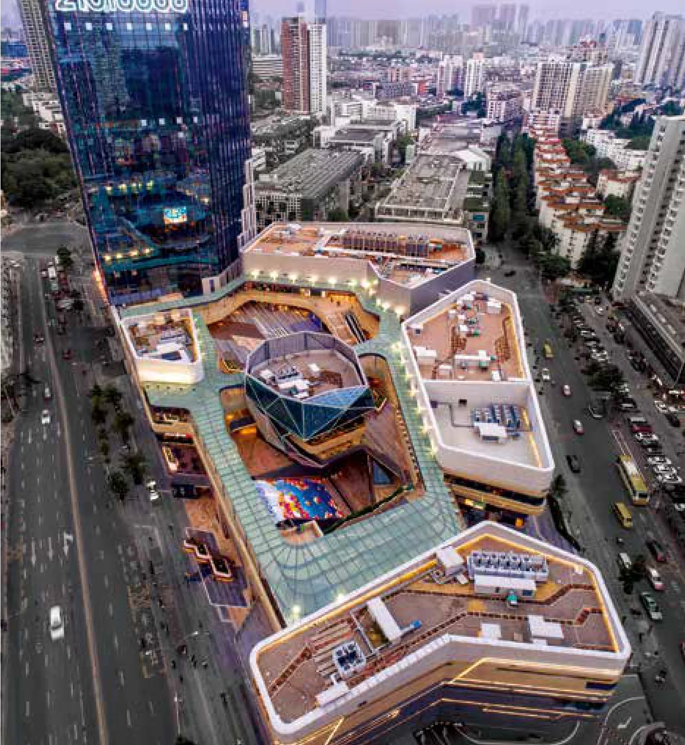
这是一组建筑面积约七万平方米的商业综合体和交通枢纽项目,由一个110米高、27层的办公塔楼和5个通过景观露台连接的独栋商业组成,创造了该地区第一个独特的开放式的商业和具有活力的目的性消费场所。然而这个项目的雄心并非商业本身——它同时建设在公交站点和“海上世界”地铁站口之上,成为蛇口区域新的交通枢纽——也是中等规模的TOD开发典范。
SPARK的设计策略在建筑、景观、室内三个方面呈现出高度的一致性:那就是层叠的山体景观。
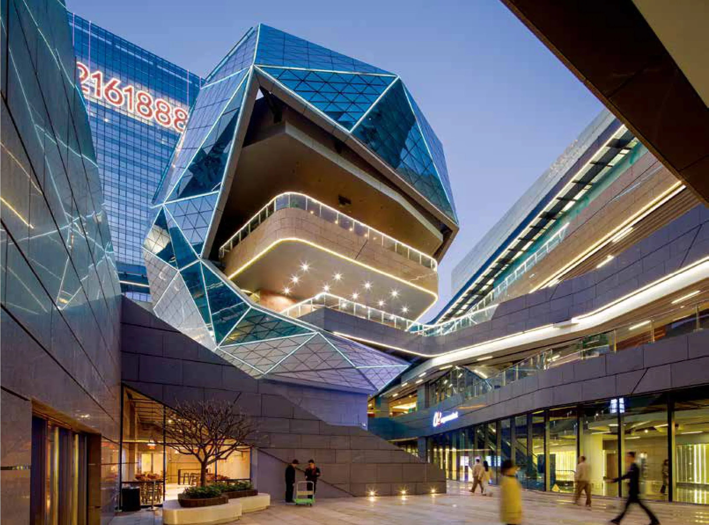
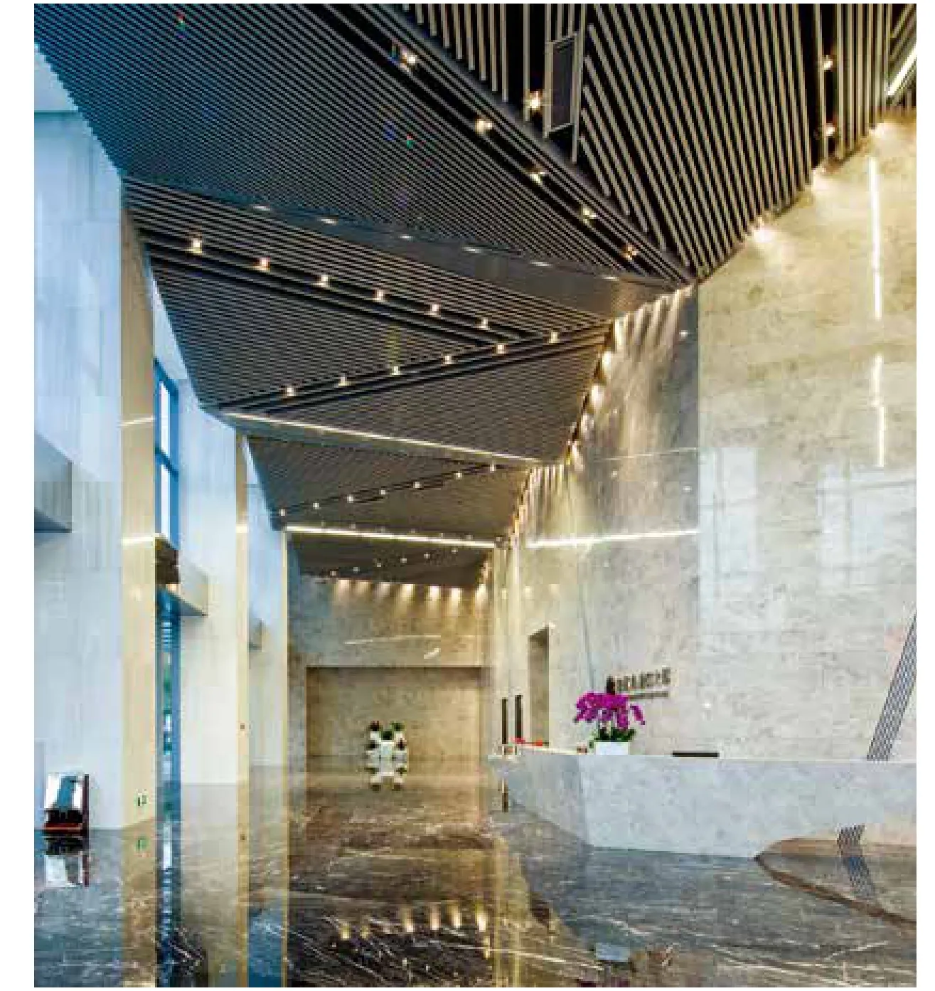
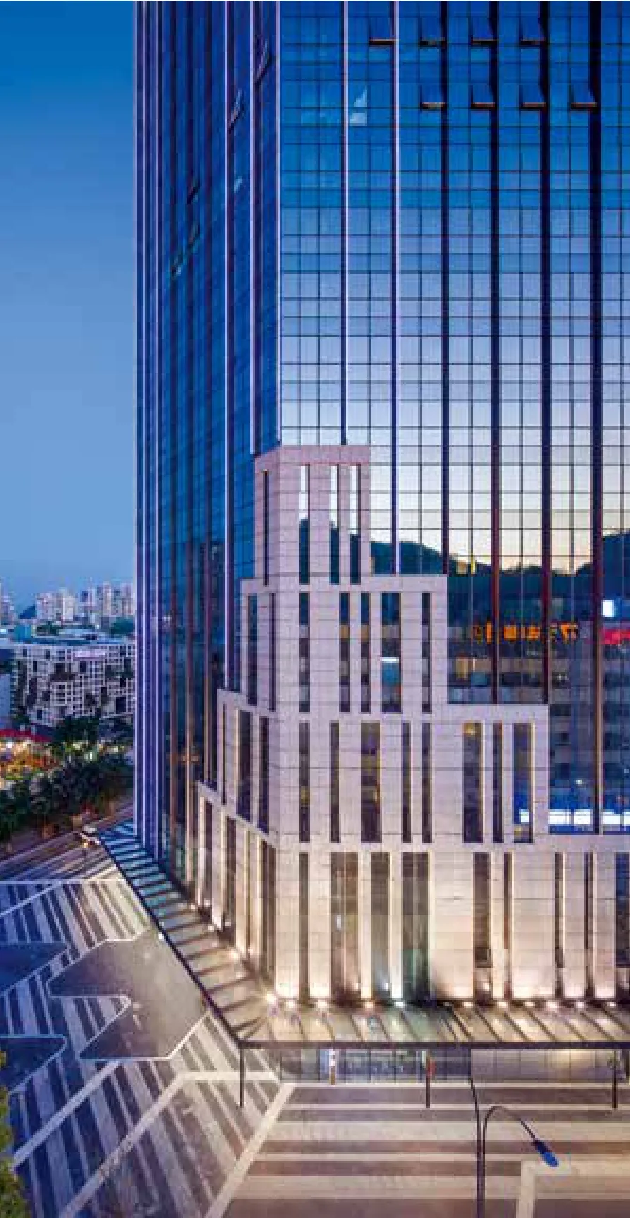
为了提升大厦优雅的形象,大厦高区的玻璃幕墙设置了纤细的竖向铝质百叶,在遮挡阳光的同时也能够为大厦的外立面增添层次感。塔楼底部与商业裙楼在三层通过流线和立面材料转换进行连接。这里,商业水平排布的石材与塔楼的表皮纹理相融合,石材也随着塔楼的上升有层次变化。设计突出了塔楼的主导地位,同时为整个项目带来了视觉上的延续性。将来在太子大厦办公的用户可在3层直接通往商业露台,而不用担心深圳多雨的天气影响。
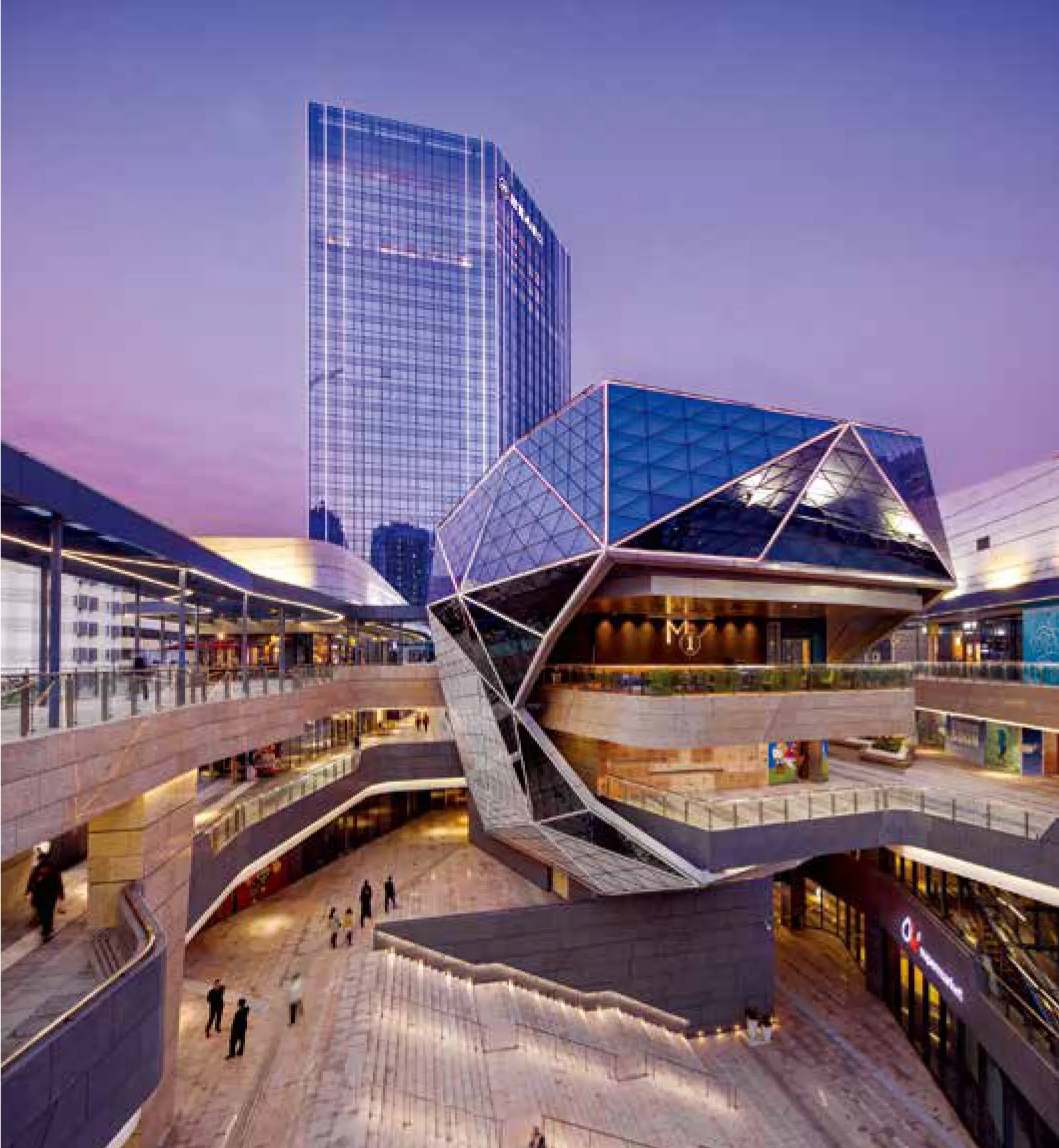
从较小规模的街区尺度来看,建筑的体验在于五个相互连接的商业内亭空间。其中有四个“亭子”是汇聚在一个中心庭院周围的,而还有一个“灯笼亭”则立于三角形场地的中心位置。用SPARK自己的话说:“我们的设计让边缘围合的商业空间直接汇入城市环境之中,提供进入到城市商业花园的通道,进一步将该项目与更广泛的城市肌理汇合”。
四层的商亭包外立面由水平条带状石材组成,这与周围山体岩层的意向存在一定的关联。这些元素为项目催生出一种更加亲人的尺度,同时又能更好地将商业及广告标示与建筑有机延续。商亭的角落弯曲,柔化了建筑并引导人流。所有的商亭都在首层陈列延续的玻璃透明店铺,而获取最大限度的商业机遇。
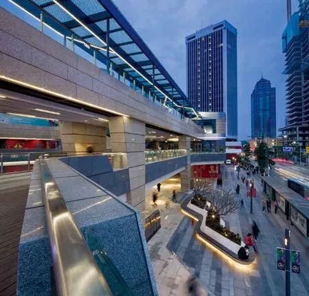
下沉花园和2层的景观露台为项目注入一种更加私密的购物体验。地铁和公交带来的大量人群在商业流线引导下自然的从外街走到商业景观中。上部的露台环绕中心灯笼亭,而灯笼亭又通向上层的露台就餐区。这些都勾勒出一种浪漫的就餐体验,非常适合深圳当地的气候环境。这样的设计也可保证建筑在非购物高峰时段可以充当另一种城市目的地:关于社交和娱乐的综合场所。
SPARK has completed the design of Gateway One a 71,600-square-metre mixed-use development and transportation hub for China Merchants. Located in Shenzhen South China the 110-metre-high, 27-storey office tower and five retail pavilions are connected by landscaped terraces that combine to create a unique naturally ventilated retail and business destination for the lively Skekou district of the city. The buildings sit over and adjacent to a new transportion hub that includes a bus terminal and the Seaworld subway station.
Gateway One is located at the southern tip of Shenzhen on the Nantou Peninsula, an area of outstanding natural beauty. Surrounded by water on three sides, Shekou wraps around the verdant Danan and Xiaonan mountains. The relationship between the dramatic subtropical coastline and its history of human intervention that generated the inspiration for SPARK'sdesign.
The architecture, landscape and interior design of the Gateway One Development were all designed by SPARK, the design language and motifs used are consistent providing Gateway One with a distinctive urban-garden identity.
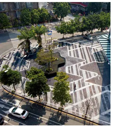
The ground level of Gateway One is intentionally permeable facilitating pedestrian connections from adjacent city streets to the heart of the development. Taking inspiration from the Renaissance Nolli map of Rome where the boundaries between public and private spaces are combined to expanded to create more places for people.
SPARK Director Wenhui Lim comments: ‘‘Landscaped routes extend from the city into the sunken garden, upper level terraces and event plazas within the Gateway One development,enriching the urban experience. ‘‘ Pedestrian connections from the metro station, bus terminal, office tower and the adjacent Shekou Seaworld development are routed through the the porous plan of Gateway One. Physical and visual connections within and from Gateway One have been carefully orchestrated to make an easily navigable and enjoyable experience for the visitor''
The office tower's base is connected to the adjacent retail pavilions physically and materially.The linear stone and aluminium façade of the retail pavilions merges with the tower façade anchoring the tower to the ground bringing visual continuity to the entire development. The upper retail terrace is connected directly to the office tower at level three giving office users year round weather protected access to the retail pavilions and supporting infrastructure.
Five conjoined retail pavilions are arranged to create convivial human scale courtyards that are well connected to the existing city streets. Four of the pavilions are clustered together protecting the heart of the development. The fifth pavilion an ‘‘urban lantern'' straddles the



剖面及立面展开设计图 section & elevation stretch-out view
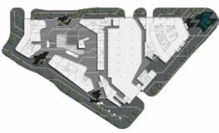
景观总平面图 landscape overall plan

一层平面图 level 1 plan

三层平面图 level 3 plan

centre of triangular site, articulating and providing a focal point for the two courtyards. ‘‘We have created spaces between the perimeter pavilions to connect the development directly to the city,'' explains SPARK Director Stephen Pimbley. ‘‘These will provide routes into and through the retail‘‘rooms'' to integrate the project with the wider existing urban fabric,'' he said.The four-storey pavilions are finished in horizontally layered panels of stone and aluminium, inspired by the rock strata of the adjacent mountains. The layering provides the project with a rich textural and colour palette and a building scale that deliberately does not dominate but compliments and completes the busy Shekou streets. The entry corners of the pavilions are
‘‘softened'' encouraging pedestrian flow into and through the development. The pavilions have continuous glazed shop fronts at ground-floor maximising retail frontage designed to animate the city streets and courtyards.
‘‘With the retail environment flowing seamlessly into the interior courtyards at street level, the internal scale of these ‘‘retail rooms'' will provide an intimate experience,'' says Stephen Pimbley. The upperlevel terraces wrap around the central lantern that opens onto terraced intimate dining destinations. The dining terraces help the building to remain vibrant outside the normal retail hours. ‘‘It's a layered, open urban retail concept,'' says Stephen Pimbley
‘‘that creates a unique environment in which to shop, work and play.''
The unique outdoor mall concept permits continuity of the layered external façade to continue into the interior spaces of the courtyards ‘‘retail rooms''The way finding and graphic design options draws from the same colour palette to complement and enhance the warm natural tones of the façade.
