马蒂纳斯·马齐达斯国家图书馆室内改建工程,维尔纽斯,立陶宛
2018-06-19项目改建UAB室内设计2XJ
项目改建:UAB,室内设计:2XJ
Project Reconstruction: UAB, Interior Design: 2XJ
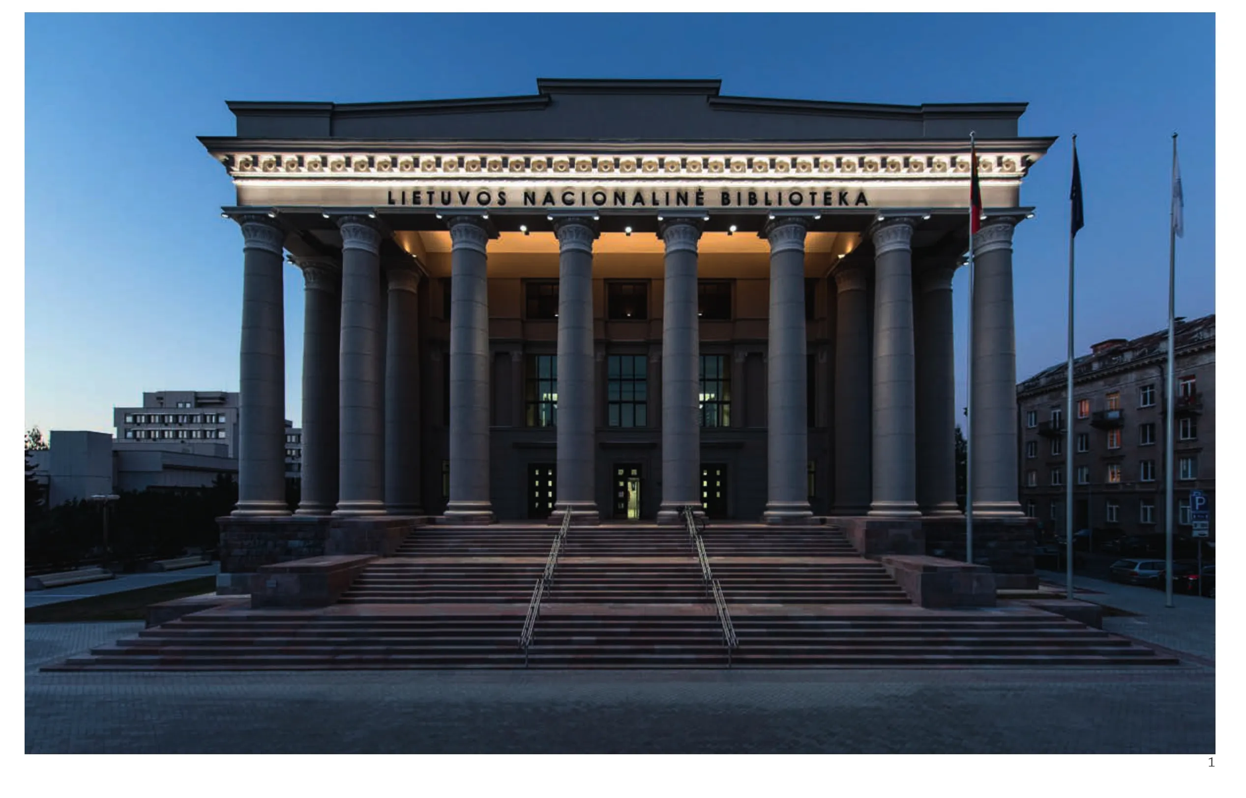
1 外景/Exterior view
马蒂纳斯·马齐达斯国家图书馆建造之时(1963年),采取彼时的图书馆范式。它仅仅是一座书籍档案馆——也是国家文化权威的标志之一,一座让档案管理员、员工和学者竭力维持其秩序和静谧的“乌木塔”。这座建筑自外到内都采用了有利于营造这种氛围的形象。纪念性的立面、壮观的入口大厅、宽阔的中厅,皆为了让参观者瞬间眩晕,从而在踏入建筑的一刻就臣服于它所裹挟的秩序。
然而时间不仅带来技术问题——例如建筑的破损——也要求我们重新审视图书馆范式、重整项目的功能定位。如今是时候让图书馆成为城市中一个富有吸引力的文化中心,提供各类活动所需的基础设施——从个人工作空间,到交流、创造甚至休闲的多功能空间。
年轻事务所2XJ参与到改建过程中,项目共持续了8年。室内设计和深化只经历了大约18个月。原因是建筑平面、空间乃至其中一些元素和装饰皆作为遗产而受到保护,建筑师改造的空间十分有限。设计的核心理念是在新与旧之间实现显著区分,寻求美学上的平衡。他们选择了最少的手法,以实现理想的效果:黑色家具,在视觉上呼应了原始的黑色窗框、扶手、柱子和白墙。
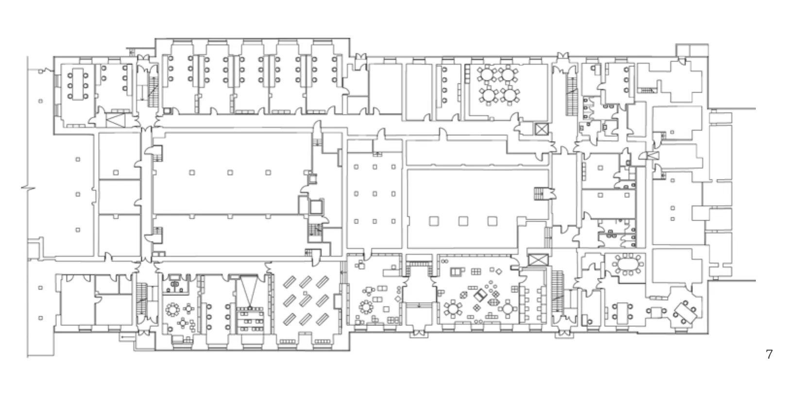
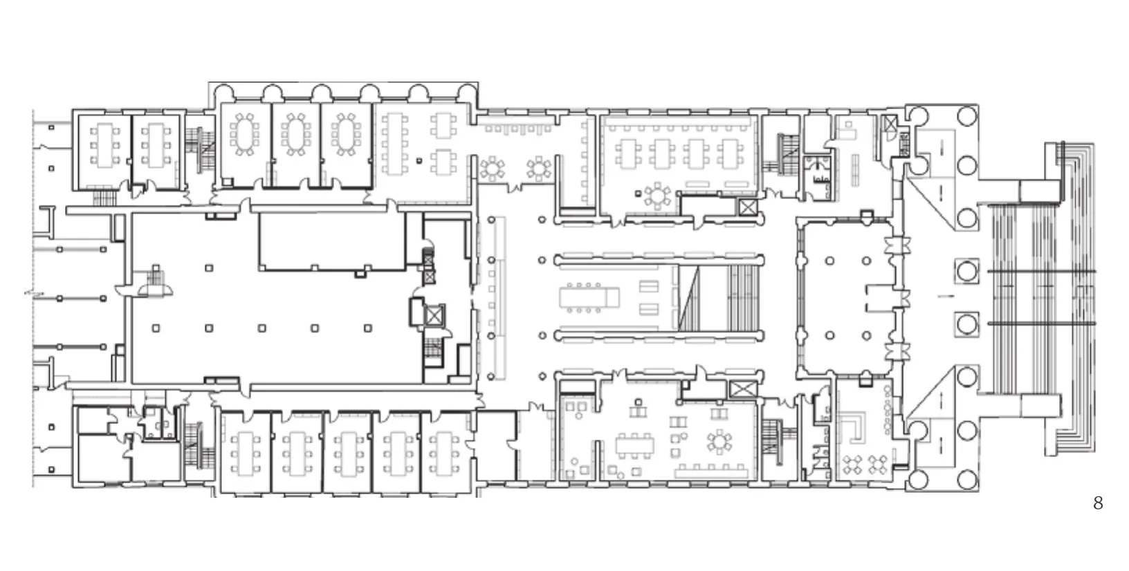
旧建筑改造后适应于全新的功能:除了公共阅览室、办公空间、集体和个人工作间之外,图书馆还提供一个儿童区、几间会议厅、录音和影像工作室、工作坊和一间书店。
原本气势慑人的建筑,降低身段邀请读者进入,被赋予了亲和的气质——读者可以坐在大台阶上读书,或坐在中庭阳台上观察空间和图书馆中的日常。
通过理性、简约而创新的设计策略,图书馆的形象和氛围得到彻底重塑。毫无疑问,它依然是全国最重要、最震撼的书写文字圣殿,一处学习、探索和创造的场所。庄严的建筑、空间和原始细节在重建过程中得到保护和展现,依然保持着这座建筑给人的宏大印象。然而,它不再是压倒性的,而是化身为一座人性化的、热情拥抱读者的高品质建筑。□ (黄华青 译)
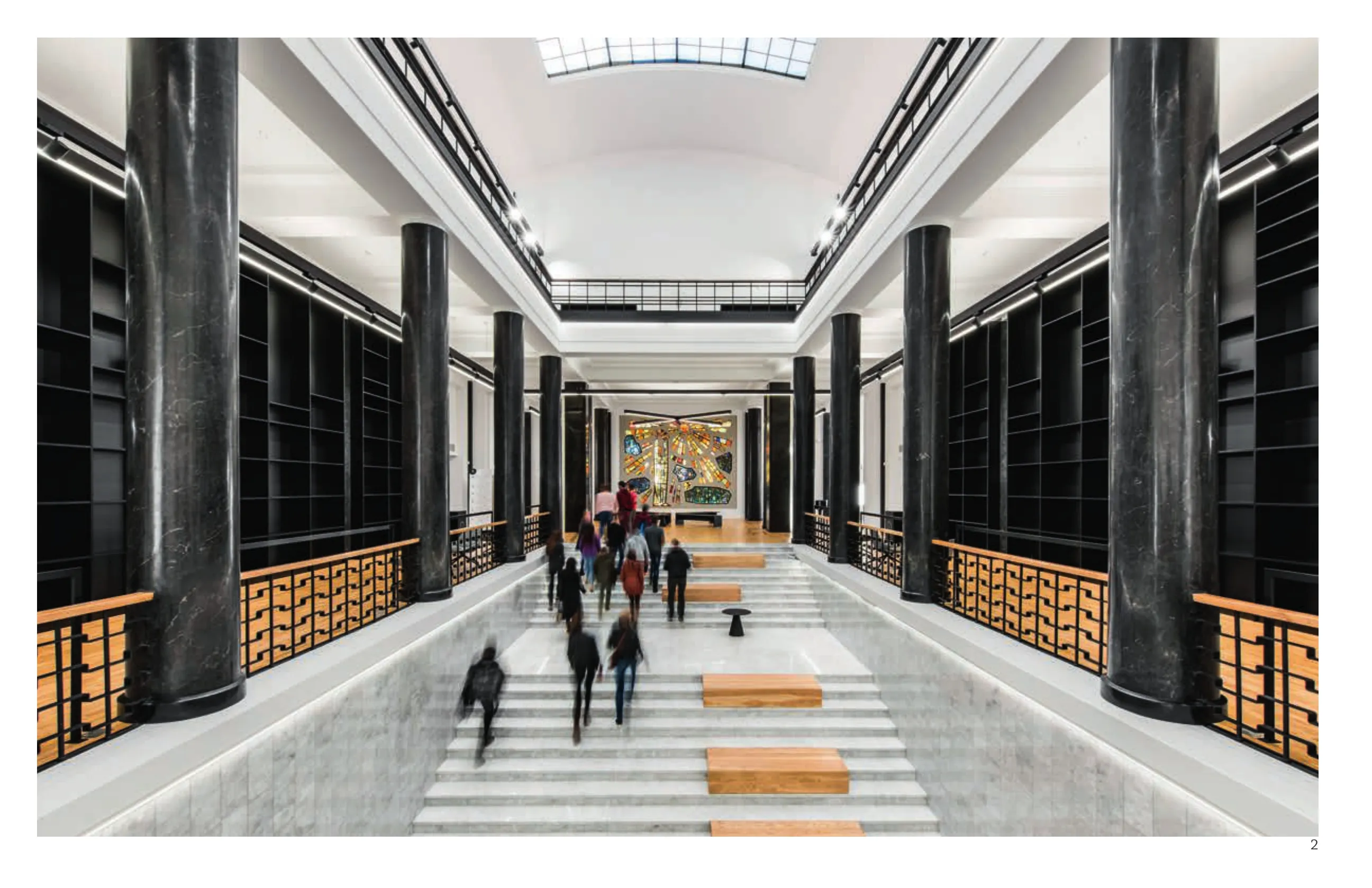
2 内景/Interior view
When the building of the National library of Martynas Mazvydas was built (in 1963) it was adjusted to a typical library of the time. It was an archive of books, one of the symbols of state's cultural power and an "ebony tower" where archivists,the staff and scholars were strictly preserving the order and quietness. The architecture – from outside to inside – served as a corresponding scene for such ambience. Monumental facades, impressive entrance hall, spacious atrium served to perplex the visitor and make him/her submit to the rules as entering.
However, time brought not only technical problems, related with the wear and tear of the building, but also a need to review the paradigm of a library and revamp the program. It was time for a library to become an attractive cultural hub in the city,providing infrastructure for new kinds of activities,from premises for individual work to flexible spaces for communication, creative endeavours and even leisure.
A young architectural office 2XJ joined the reconstruction process that lasted 8 years, at the very end. The interior design was created and implemented in more or less 18 months.
As the plan, spaces and even certain elements and furnishing are protected as valuable heritages,the architects had limited playground for changes.The core idea of the design was to create a clear difference between the old and the new, seeking for aesthetic balance. Minimal means were chosen as tools to create the desired effect: black furniture, that visually refers to originally black window frames, rails and columns, and white walls.
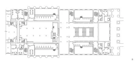
The old premises were adjusted to the new functions:besides common reading rooms, administration premises,rooms for group work and individual cubicles, the library offers a children area, several conference halls, sound record and cinema studios, workshops, a bookstore.
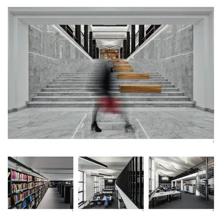
3-6 内景/Interior views
7 首层平面/Ground floor plan
Imposing architecture is given welcoming character by letting the visitors to be in it: to sit on the main stairs,to read books, or just observe the space and the life in the library sitting in the atrium's balconies.
Implementing rational, simple and innovative design solutions the image and the atmosphere of the library was totally recharged. Undoubtedly, it still is the most important national-wide, impressive palace of a written word, a place for learning, exploring and creating. The stately architecture, spaces and original details, preserved and exposed during the reconstruction, support that magnitude. However, it is not about overpowering anymore, but about a human being, a celebration of high quality architecture which embraces the visitor. □ (Text by Rūta Leitanaitė)
8 二层平面/Floor 1 plan
9 三层平面/Floor 2 plan
10 屋顶/Roof
项目信息/Credits and Data
项目团队/Project Team: 项目改建/Authors of the Project Reconstruction: UAB Jungtinės architektų dirbtuvės, arch.Leonilė Majerienė, Arūnas Andrašiūnas.
室内设计/Authors of the interior design: 2XJ, arch. Jokūbas Jurgelis, Laimis Valančiūnas, Jurga Marcinauskaitė.
建筑总面积/Total Area of the Building: 15,454m2
室内设计面积/Interior Design Area: 6100m2
施工周期/Construction Period: 2008-2016
重建造价/Value of the Reconstruction: €25,910,125
摄影/Photos: 2XJ
评论
张路峰:初看以为这是个由历史建筑改造而成的图书馆,再看才知道这本来就是图书馆,而且是1963年才建成的。这不由得引起对其时代背景的猜测:图书馆建筑采用古希腊神庙的样式,将知识神圣化,必定是出于某种政治需求。改造的思路大体上是在保护历史信息、增加新功能的前提下“去神圣化”,比如在大台阶上附加了座位,扰动了交通空间的对称感,削弱了仪式空间的纪念性。有一处细节值得特别关注:通常在高大空间中放置书架是个难题,建筑师都喜欢设计成整面墙的通高书架,但在人手不及的架位摆书、不摆书、摆假书都显尴尬。在本例中,夹层空间端部的墙面看上去也是整面墙通高书架,但仔细一看,书架上部渐变成了墙面分割装饰,与书架浑然一体。这种兼顾实用性与整体性的设计手法值得借鉴。
Comments
ZHANG Lufeng: At first glance, I thought this library was converted from a historical building, but after looking closer I realised that it was a library built in 1963. This hints towards the building's historical background: the library building employs the style of a classical Greek temple, which symbolises sanctifying knowledge from the perspective of political needs. The aim of this reconstruction is to protect the architecture as a valuable piece of heritage and create new functions while "secularising". Such secularisation can be seen, for instance, in the large steps: the seats on the steps diminish the sense of symmetry in the circulation space and also help to weaken the memorial sense of the ritual space. There is one detail of the building that deserves special attention. Placing bookshelves in a high and large space has become a difficult challenge for architects as they prefer to design full-length-wall, double-height bookshelves. This way of design is often dissatisfying due to problems with book allocation; for example, unreachable books on tall shelves, empty shelves, or table books on the real shelves. With this design too, it first appears to use these typical bookshelves on the wall at the end of the intermediate space; however, interestingly, at a closer look,these are simply for decoration of the wall segmentation of the upper part of the bookshelf, and are well integrated with the bookshelves. It is worth learning from this kind of design to give consideration to both functionality and integrality. (Translated by Dandan Wang)
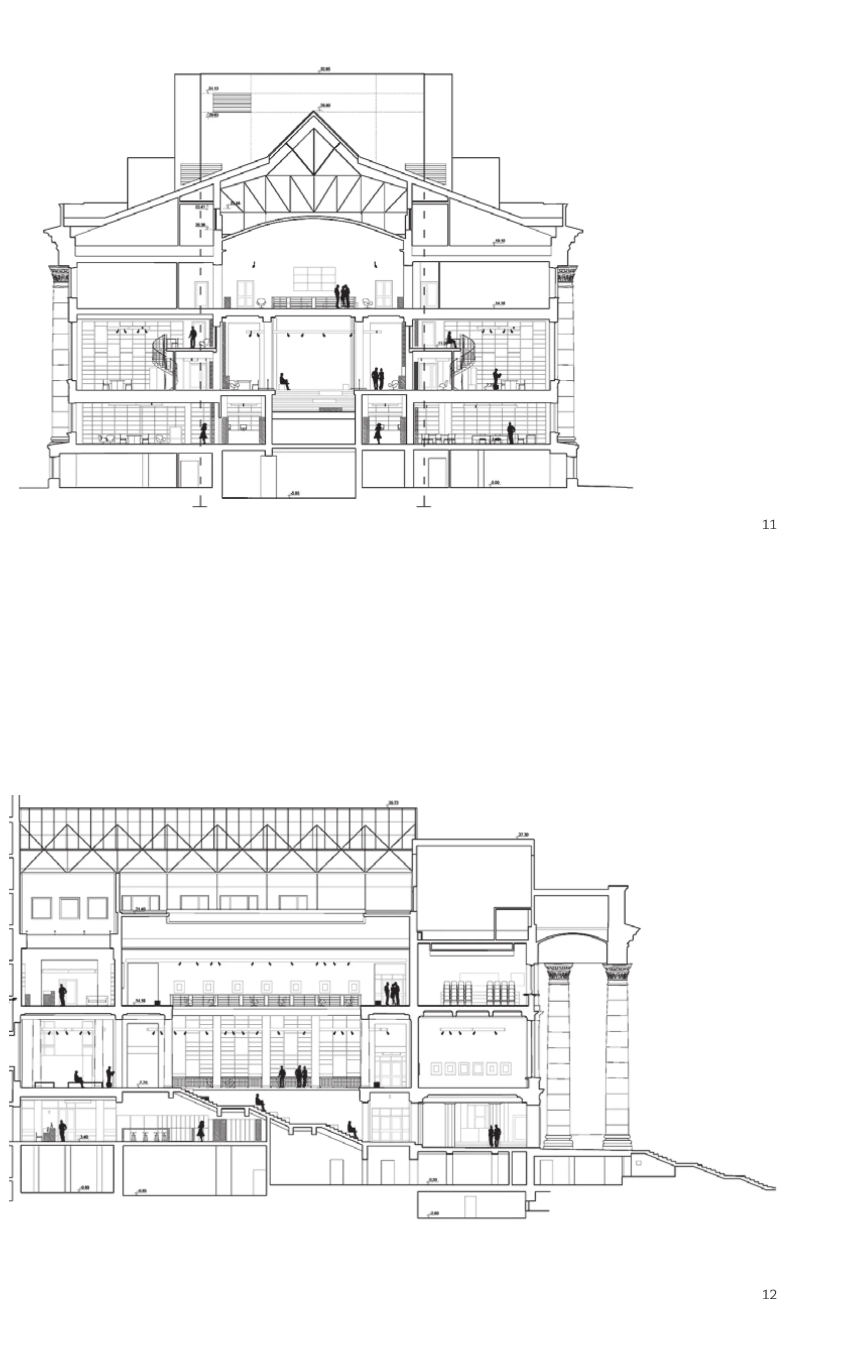
11.12 剖面/Sections
安娜玛丽亚·安德里佐尤:历史保护建筑的修复更新始终是具有挑战性的工作,它意味着以创造性想法,在具保护价值和纪念意义的、需要保留的旧建筑与现代而时尚的、需要持续与建筑功能密切关联的新建筑之间寻求一种微妙的平衡。
在这一案例中,展开挑战性工作的维度十分有限,新建筑部分的介入主要通过材料与色彩的谨慎使用和对现存空间的创造性再解读而实现,并未对文物遗产进行强烈干涉。简洁而现代的外观来自于黑、白、木色的搭配与同色系大理石表面的平衡,从而取得了与纪念建筑的协调性及建筑本身的历史相关性。(陈茜 译)
Anamaria Andritoiu: The renovation of a historical monument is always a challenging task, a creative struggle for delicate balance between the old, valuable, significant that needs to be preserved and the new, modern, up-to-date that is required for the continual relevance of the building and it's function.
In this case, where minimal latitude for changes was given, the infusion of new and relevant is achieved mainly through the thoughtful use of materials and colors and the creative reinterpretation of existing spaces, without aggressive intervention in the valuable heritage. The clean and modern look achieved to great effect by the black/white/wood color palette is balanced by rich marble finishing in the same color scheme, congruent with the monumental architecture and historical relevance of the building.
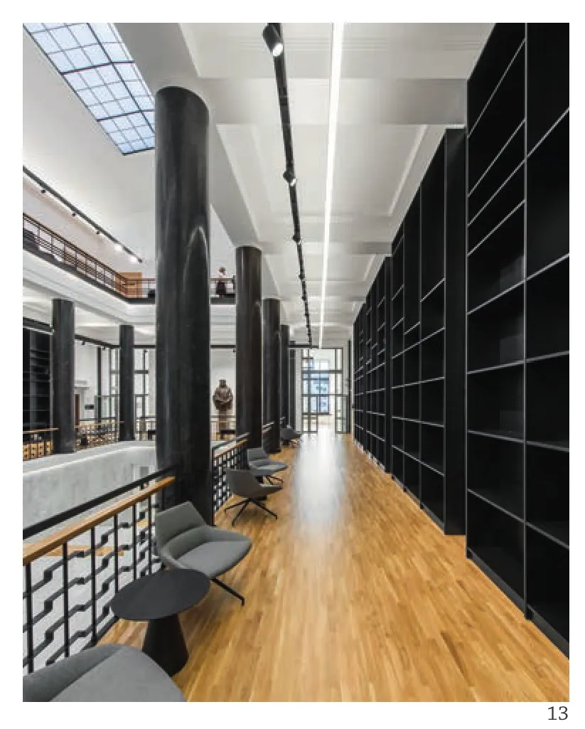
13 内景/Interior views
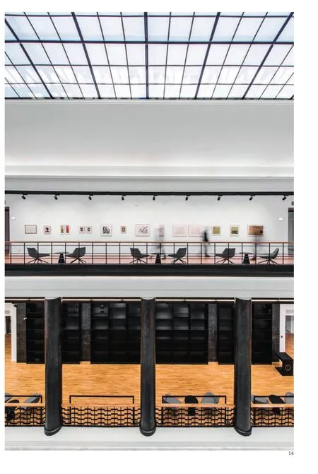
14 内景/Interior views
