奥斯陆古城区改造扩建
2014-07-24JIRIHAVRAN
奥斯陆古城区的修复、填充项目以及新办公空间。
地点:挪威奥斯陆
面积:16 500m² 办公
日期:1996年
奖项:建筑遗产奖(卓宁根蒙3号的修整),1996年混凝土面板奖,2002年城市奖,2006年奥斯陆议会银禧奖。
摄影:Jiri Havran
Restoration, infill project and new office space in the historical city of Oslo.
Location: Oslo, Norway
Size: 16 500m² office
Year: 1996
Awards: Architectural heritage award (Dronningensgate 3 restoration), The concrete panel prize 1996, The City Prize 2002, Oslo Council’s Jubilee Prize 2006.
Photo: Jiri Havran
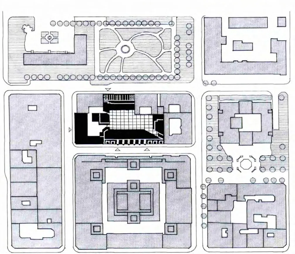
克里斯蒂·科瓦塔雷特是奥斯陆老城区常规网格模式布局的一部分,其历史可追溯到1624年克里斯蒂国王的四号计划。
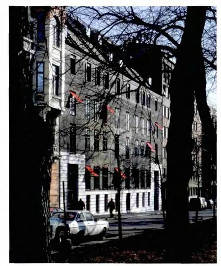
颜色、材料及细部都体现了城市这一部分的历史重要性。
在玻璃顶的后院中,建筑物因各种鲜艳颜色及屋顶露台而彼此相辅相成。
最理想的情况应该是将城市居住结构中的一个街区作为一栋单独建筑,其中每个元素都有助于建立一个和谐延续及变化的主旋律。建筑的墙壁都有不同方面的体现,因其周围的街道及露天空地不同,身份和重要性也各不相同。
遗憾的是,现实很少与我们的期望保持一致。一些街区的建筑位置很有问题,它们彼此相对形成了鲜明的反差,因此阿斯佩林·拉姆决定要在最大程度上修复这个问题。该委托包括了卓宁根蒙3号的全面恢复(约建于1840年),以及设计一幢新建筑用以替代朝向格鲁·温德尔丝·赛普拉斯的近乎废弃的房子。
我们的目标是,与街道的其它部分相联,保留与挪威银行那样相同的精细、整齐的规模,又同时建基于两边老旧侧翼外墙严谨含蓄的垂直结构。沿河岸的挪威银行外立面“正中”带有铜线的韵律,经由围绕着支柱结构而巧妙实现的玻璃材质的细节得以在我们这边街道上展现,且我们给予其较侧翼更低的飞檐线条。我们试图以带彩的混凝土表明一种清晰的“立场”,这与街道更深处的挪威老银行十分相像。
The Christiania Qvartalet city block is part of the regular gridded pattern in the old city of Oslo,dating back to King Christian IV plan of 1624.
Colours, materials and details refect the historical importance of this part of the city.
In the glass covered backyard the buildings enrich each other by various bright colours and terraced roofs.
It should ideally be possible to regard a street block within the living fabric of a city as a single building, in which each individual element contributes to a harmonious continuation of and variation on a main theme. The walls of the block all have different aspects, as the surrounding streets and open spaces all have different identities and importance.
Sadly, reality is seldom as we would wish. Some of the buildings on the block in question stood in glaring contrast to each other when Aspelin Ramm decided to revitalise the largest of them. The commission included the complete restoration of Dronningens gate 3 (ca 1840), and a design for a new building facing Grew Wedels plass to replace a near-derelict house.
Our aim was to retain the same fne, neat scale seen in the Bank of Norway in relation to the rest of the street and at the same time build on the cautiously intimated verticals of the facade structure of the two older wings on each side. The rhythm of the Bank of Norway’s facade along Revierstredet,with its copper “middle”, was interpreted on our side of the street by lightly executed glass detailing around the pillar structure which we also gave a lower cornice line than the side wings. W e chose to signal a clear “standpoint” in favour of concrete with a colour that is very like that of the old Bank of Norway further up the street.


城市街区平面图 City block plan with infill offices and glazed courtyard

