“感知空间”展,皇家艺术学院,伦敦,英国
2014-02-21建筑设计李晓东工作室
建筑设计:李晓东工作室
Architects: Li Xiaodong Atelier
“感知空间”展,皇家艺术学院,伦敦,英国
Exhibition of "Sensing Space" at the Royal Academy of Arts,London,UK,2014
建筑设计:李晓东工作室
Architects: Li Xiaodong Atelier
项目信息/Credits and Data
邀请单位/: 英国伦敦皇家艺术学院/Royal Academy of Arts,London,UK
主持建筑师/Principal Architect: 李晓东/LI Xiaodong
项目团队/Project Team: 刘诗晴,陈炜曦,李坤,黄新语/ LIU Shiqing,CHEN Weixi,LI Shen,HUANG Xinyu
摄影/Photos: 李晓东(Fig 2-4),Benedict Johnson(Fig 7)

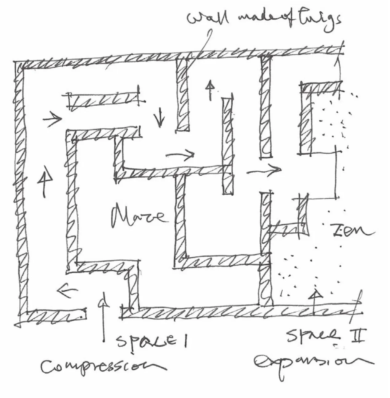
1 草图,平面/Sketch,plan
1 有关展览
“感知空间”是由伦敦皇家艺术学院主办的一个展览,由主办方从世界各地挑选适合这次主题的不同国籍的建筑师参加。参展建筑师有7位:李晓东,格拉夫顿建筑师事务所,叠贝多·弗朗西斯·凯雷,隈研吾, 佩佐·冯·艾利赫夏森,阿尔瓦罗·西扎,艾德瓦尔多·苏托·德·莫拉。
这次的展览“感知空间:建筑之重新想象”所设定的任务与意图如同画廊馆长凯特·古德温所说——展览的核心是希望能在之中产生交互影响的3个要素: 物理空间的本质,我们对于它的感知能力,以及它能被唤起的力量。
我们希望能在传统的画廊环境里,特别是在皇家艺术学院这样一个雄伟的艺术展览空间中,唤起建筑的经验及潜藏的力量。因此,不同于一般由图纸、照片及模型组成的建筑展览,这个展览要求展品本身不仅能突出建筑师对于建筑在功能或纯粹视觉上的观点,同时也能够提出一种方法,提高我们对于所居住的环境空间的感知能力。因此,此次展览的主要课题为: 展览的设计是否能够鼓励参观者提出他们对于建筑想法上的问题,以及这些经验是否能够唤醒他们对于周遭——不只是在画廊里面,同时也对于之外的空间——的感知能力?
2 有关空间想法
东方与西方在空间观念上有明显的不同,西方倾向将世界看成是由主观感知的一系列的客体,而在东方或是中国,则倾向于不区分主体与客体。所以,西方建筑一般是从人观察建筑的透视视角开始发展,而中国建筑则以建筑是某种可以从内部被感受的事物的观念开始发展。
在中国的空间里,所注重的焦点多集中于无形而不是有形的物体上;如同中国的绘画,画面上留白与描绘的部分是一样重要的。例如,在一幅游动的鱼的水墨画之中,画中游动的鱼是意象上重要的部分,因为我们可以从其背后留白的部分推断出水的型态;因此,如果空间是为了可以满足物理经验,那么,留下想像的空间就变成是重要的;例如,北京紫禁城的空间序列,是关于为了体验空间之后的空间、再之后的空间,而不是一个个体的建筑物。
对于这个观念,中国古代哲学家老子曾明确地提出与阐明过:“重要的并不是承载的对象,而是被承载的内容”;而中国传统住宅的合院空间类型也可以作为其例。
3 有关“感知的空间”
3.1 概念——找不到、找得到
空间是通过想象与真实之间的对话来感知的;就如同作家运用他们的想象力去发展及重新解释自己经验中的真实来创作。而我们的身体里面有数以百万计能取得有关我们周遭环境的讯息并传送回至我们大脑的传感器,就如同扫描我们周围事物并将讯息传回的阅读机。因此,如何能藉由空间的感受去刺激这些身体的传感器,是这次设计最主要的任务。
这个空间的装置主要由两部分组成:前半部是一个由白色发光的地板及用纤细树枝组成的墙体所构成的迷宫空间;而后半部则是一个打开的地上铺着卵石的禅院空间。两个部分不管是空间的构成或是氛围都呈现出极大的差异。主要是希望藉由创造对比反差强烈的空间状态,来刺激参观者对空间产生一种“刺痛的知觉感”;而其中大部分效果来自于通过空间时所改变的氛围对身体感知所造成的影响。
简单来讲,这个空间装置设计主要的核心概念就是“通过陌生化来刺激感知”。
3.2 关于过程
整个经验起始于从外部忙碌的皮卡迪利大道,进入安纳伯格中庭,然后是18世纪的宫殿,再向上推至雄伟的楼梯间,最后进入19世纪的画廊。在街上,你会有一种来自于不同的喧哗与背景相异的行人及城市肌理所混合而成的感受;而进到画廊里面的感觉则是很纯净。这个由外到内的过程已经有一个丰富的序列了。
当参观者进入展场的空间装置后,对他们来说感觉会像是一场发现之旅。在过程中偕同一种感知:有一个另类的世界正并排于他们的路线运行,且与它相互交叉。顺着这个方向在这个路线上,如同在中国卷轴画中所描绘的意境,不是每件事在同一个时间都是可以被看见及清楚的,它是需要通过时间在过程中来领会的故事。


2.3 迷宫/Maze
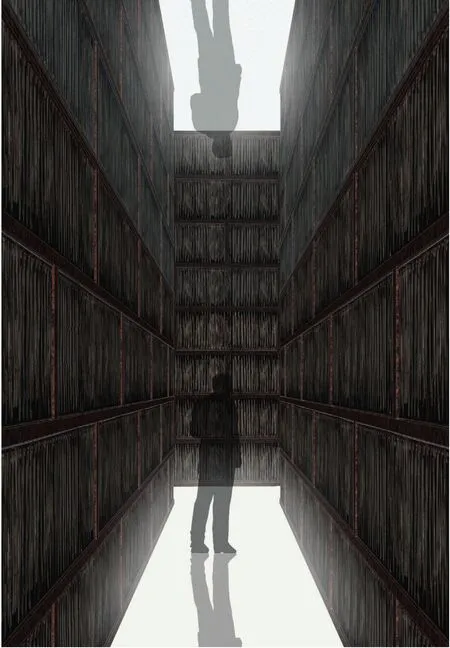
带有隐喻性地,在通过这个空间的过程中,你会如同走在一个由发着光的白色地板及由纤细的树枝墙体构成的迷宫所诠释的“下着雪的森林夜晚”里面;产生一种方向感迷失的知觉。而在这探索之中,偶然会发现代表着提供希望及意外惊喜的壁龛。

4 3D效果图,迷宫/3D image,maze
在这个前半部的空间里面,建筑师创造了进入禅院前错综复杂有如迷宫般的过程途径。而在迷宫的终点,会抵达一个视野清楚开阔、能激发灵感的禅院。这一系列的经验,会让参观者最后能创造出他们自己内心的景色印象。
对比禅院与迷宫空间的差异;一开始进入的迷宫空间,不管是尺度、距离、组织,都是一般所熟悉的,也被清楚地定义了出来,但其空间的构成会造成参观者丧失方向感。而在之后的禅院里面则会带给参观者一种新的开阔性感受及在感知上的启示。通过这样的对比反差及在空间中流动的能量,会吸引参观者在这样的经验里面去思索并提高自身的察觉力。从一个“认识论”的观点来看,它会引导参观者去思考与理解,而从“盲目”变成具有“知觉”。
另外,使用树枝是因为这是一般不被预期在建筑中会看到的自然材料;而在不预期的环境里,用非惯例的手法来运用这些熟悉的材料,能够产生出相当的作用及效果。而在禅院里也使用了镜子的元素,因为它具有能改变空间感觉的力量,能使物质的墙体变成类似幻觉的东西。因此,就算空间被局限与围住,它也能感觉是被延展及扩大的。在中国,镜子常被使用于在本质上是有关环境与流动能量的风水之上。
建筑师的观点是,所谓的创造力,并非只来自于一种原创,它也会来自于对一般对象或材料的再理解及重新运用。在这个展览里面,建筑师尝试在一个人造环境里去创造一个看似自然的环境;而这些自然的东西,当你在乡村的时候却可能会不自觉地尝试去忽视。
4 结语
这次展览的设计,不同于大部分的建筑设计任务那样有被具体指定的功能及内容,更多是有关美学的经验。一方面,它是简单的,因为不需要思考现实需要面对的问题;但另一方面,却是困难的,因为要创造一个能让人感动的有魅力的空间;参观者他们期待着一些东西,但他们不知道那是什么!
所以对建筑师来讲,要如何激发出他们的好奇心及如何在他们身上产生出他所想要制造的那种冲击是他最关心的;基本上所有的设计都是围绕在这个核心的想法上来发展及成形的。

5 草图,迷宫/Sketch,maze
1 About the Exhibition
"Sensing Space" is an exhibition hosted by the Royal Academy of Arts.Architects were selected to participate in the exhibition from an international list of candidates thought suitable to work on the theme The final list of participating architects include: LI Xiaodong (China),Grafton Architects (Ireland),Diebedo Francis Kere (Burkina Faso and Germany),Kengo Kuma (Japan),Pezo von Ellrichshausen (Chile),and Alvaro Siza and Eduardo Souto de Moura (Portugal).
The task and purpose of "Sensing Space: Architecture Reimagined" is best captured by Curator Kate Goodwin: "The heart of this exhibition is the interaction between three factors: the nature of physical spaces,our perception of them,and their evocative power."
With our installation,we hope to evoke the experience and power of architecture within a traditional gallery environment-specifically,the grand Beaux-Arts spaces of the Royal Academy of Arts Typical exhibitions of architecture consist of drawings,photographs and models We asked whether an exhibition could become a mechanism for highlighting not just the functional and visual aspects of architecture but also the sensation of inhabiting built space The exhibition poses the question: can a designed experience awaken visitors' sensibilities to spaces around them,not only within but beyond the gallery walls?
2 Thinking of Space
There is a clear distinction between Chinese and Western concepts of space: the Western tendency is to look at the world as a series of objects,while in China and the East we tend not to differentiate between subject and object Western architecture develops from perspective,with the building as an object to be looked at from "without," while Chinese architecture develops from the idea that the building is something to be experienced from "within."
The Chinese tend to focus on the intangible rather than the tangible-you see this in Chinese painting,in which the blank surface is often just as important as what is inscribed For instance,in a hand scroll that shows a pair of swimming fish,the presence of water,which can be inferred from the blank background,is a vital part of the image Allowing room for imagination is essential if a space is to become a satisfying physical experience The Forbidden City in Beijing,for instance,is about experiencing space after space after space rather than appreciating individual buildings.

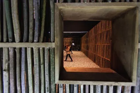
8 禅院/Zen garden
This concept was articulated by the ancient Chinese philosopher Lao Zi,who said that what is important is what is contained,not the containeran idea exemplified by the courtyard typology of traditional Chinese housing.
3 "Sensing Space"
3.1 Concept: Could or could not find the route
Space is perceived via a dialogue between imagination and reality As when a writer creates a story,using his imagination to develop and reinterpret the reality of his own experiences There are millions of sensors all over our bodies,taking in information about our environment and transmitting it to our brains They are like radar,scanning our surroundings and sending back signals The principal task of this design is to stimulate bodily sensors and,through them,the perception of space.
The installation is made up of two parts.The first part is a maze of slender branches or twigs with a white floor lit from below The second part is an open Zen garden paved with cobblestones The two parts differ from each other in terms of their spatial qualities,compositions and atmospheres.We aim to create a "pinch of consciousness" for the viewer with these contrasting spatial conditions Much of the effect will come from the changes in atmosphere as you move through the space.
Simply put,the core concept of the installation is to "pinch consciousness through defamiliarisation."
3.2 About the Process
The experience of the exhibition starts outside: travelling from busy Piccadilly into the Annenberg Courtyard,then to the eighteenth-century palace,up the grand staircase,and finally into the nineteenth-century Main Galleries On the street there is a mix of different textures and noises,different people from different backgrounds Then,in the galleries,it is very pure Outside to inside,is a rich sequence.
Once visitors enter the installation itself,it would become a journey of discovery.They will have the sense that alternative worlds run alongside their path and intersect with it Along the way,not everything will be visible and clear.Instead,the story will unfold like the painted image on a Chinese handscroll,something to be appreciated over time.
Metaphorically,you are walking through a snowy forest at night,an experience represented by a maze of slender branches or twigs and a white floor lit from below where you feel lost But as you explore,you discover niches that provide hope and happy surprises.
In the first half of the space we created a labyrinthian route to the second half the spacethe Zen garden At the end of the maze you arrive at the garden which represents clear-sightedness and inspiration Through this experience,visitors will have collected a series of impressions that create a new mental landscape.
Let us briefly compare the differences between the Zen garden and the maze When you enter a maze,its texture,scale and dimensions are clearly defined and familiar and yet there is also a loss of orientation Then in the Zen garden you experience a new openness and sense of revelation This contrast,and the flow of energy through the spaces,invites you to speculate on your experience and heightens your awareness From an epistemological point of view,this invites you to look and understand,to turn "blindness" into "vision."
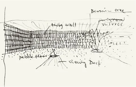
I am using branches because they are a natural material people do not expect to see in architecture,and the unconventional application of a familiar material in an unexpected environment generates an effect I have used a mirror in the Zen garden because mirrors have the power to change the feeling of a space It becomes not about the physical presence of a wall,but the illusion of something else The mirror makes the space seem expansive even though it is enclosed Mirrors are used a lot in feng shui,which is fundamentally about the environment and the flow of energy.
In my view,when you want to be creative,it is not only about originality per se,but about reinterpreting and re-using ordinary materials and objects In the countryside you might try to blend the branches with nature but at the Expo it is about creating a seemingly natural setting within an artificial environment.
4 Conclusion
The exhibition,different from most architectural commissions where there is a specified function and programme,is more about aesthetic experience On the one hand it is easier,because you do not have to think about the practical issues,but on the other hand it is more difficult because you need to create a space that people will find appealing-they expect something but they do not know what.
Therefore for me,the main question is how do you arouse their curiosity and generate the kind of impact you want to make? Basically,this is the point from which the design was developed and formulated (Translated by ZHANG Qingfei)

6 3D效果图,禅院/3D image,Zen garden

7 草图,禅院/Sketch,Zen garden
评论
李翔宁:李晓东在英国伦敦皇家艺术学院画廊的装置作品创造了一种和西方建筑师截然不同的空间感受。诚然,他的空间语言是西方的,理性的几何空间,就连迷宫也是来自西方传统的空间意象。然而空间的氛围又是东方的,正如佛朗索瓦·于连在《迂回与进入》中认为:和西方人直截了当的方式不同,中国的文学和文学评论都采用了曲折迂回的进入方式。同样,和西方迷宫导向出口的结果不同,李晓东的东方式迷宫迂回曲折的结果是进入一个冥想的禅院。在一个西方式的美术馆空间中植入的空间,又通过树枝阵列产生出一种去熟悉化或者说是陌生化的效果,把西方迷宫中坚实的墙体置换成了东方屏风式半遮半透的空间隔断,也传达了手工和自然材料的温暖质感。最后,地面白色灯箱的效果使得整个装置有一种漂浮感,它消解了具象建造和材质的属性而凸现装置的概念性:这里呈现给观者的是一个东方迷宫/园林的抽象图式而非园林本身。
Comments
LI Xiangning: LI Xiaodong's installation at the Royal Academy of Arts created a feeling of space distinctively different from anything Western architects would have done Although he incorporated Western spatial language and rational geometric space,and even the maze was derived from spatial images of Western tradition,the installation overall was given an Oriental atmosphere As Francois Jullien wrote in Le Détour et l'Accès,Chinese literature and literary criticism have adopted a means of access full of twists and turns,which differs from the straightforward expression of Westerners Similarly,LI Xiaodong's Oriental maze,moves through twists and turns but leads to a contemplative Zen Garden rather than an exit as Western mazes would do By de-familiarizing and exoticizing the implemented space in a Western art gallery using a branch matrix,LI Xiaodong replaced the solid wall of the Western maze with a semi-transparent spatial partition (an Oriental screen) and thereby conveyed the warm texture of handmade and natural materials Finally,the white light-box of a floor floats the whole installation.This disrupts ones perception of the concrete buildings and other constituent materials of the Academy and highlights the overall concept of the installation: what it presents to spectators is an abstract schema of Oriental maze/garden instead of a concrete garden.
