独唱者:贝尔法斯特兰尼昂广场
2014-01-26PaulMegahey
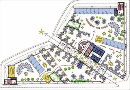
带步行通道首层平面 Ground floor plan with walkthrough passage
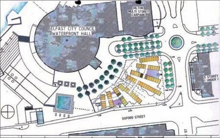
带滨水大厅总平面 Site plan with Belfast waterfront hall
地点:爱尔兰贝尔法斯特
建筑类型:办公
面积:10 500m²
年份:2010年
奖项:邀请竞赛一等奖
摄影:PaulMegahey Photography
Location: Belfast, Ireland
Building type: Office
Size: 10 500m²
Year: 2010
Awards: 1stPrize invited competition
PaulMegahey Photography
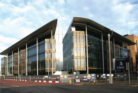
各方面都非常明显,该设计方案的目标是建立一个与码头艺术大厅互补的标志性建筑,并建立一个通向整个兰尼昂广场的入口。如果您把音乐厅当作是指挥,而所有周围的建筑是乐团,则我们设计的建筑就是“独唱者”。
设计的目的是通过地点改善人行道,并遮挡从西南方向吹来的风。
建筑共有五层,共计10 500平方米,屋顶有植物栽培室,风帆顶板穿过码头艺术大厅的栏杆。作为一个投机性的项目,一楼将包括商业或综合用途的设施,而二楼以上是A类商业办公室。
建筑的构想是,通过一楼的通透性吸引公众,这个概念的功能体现在西南/东北轴线所划分的商场,即与位于音乐大厅入口、圣乔治大楼入口及位于牛津街对面角落的维多利亚市场连成一排。在该拱形商场内几座小桥被与连接两层楼面的平面玻璃圈围。根据设想,该商场将成为建筑的“心脏”,人们可以悠闲从容地通过,同时可以容纳办公室入口,也可以排列开设咖啡馆、小酒馆和画廊等。
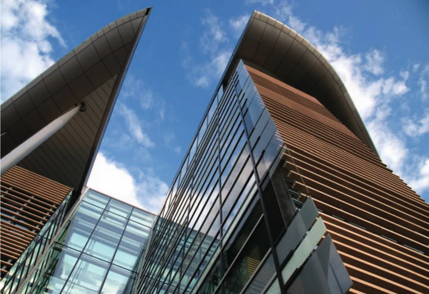
一楼及顶楼的外立面设计朝后,以突出第二、三、四楼的外观。金属水平条纹突显西面和南面外墙的水平状态。从而这种水平状态被外表面的许多“眼睛”——楼板框架的空隙所打破,其目的则是要在员工与社交之间创造开放的空间。
码头艺术大厅用放射状向外延伸的“手臂”来阐明这个意图,这些手臂的“拳头”向外冲出通过外墙向东西方延伸,与码头艺术大厅相连接。
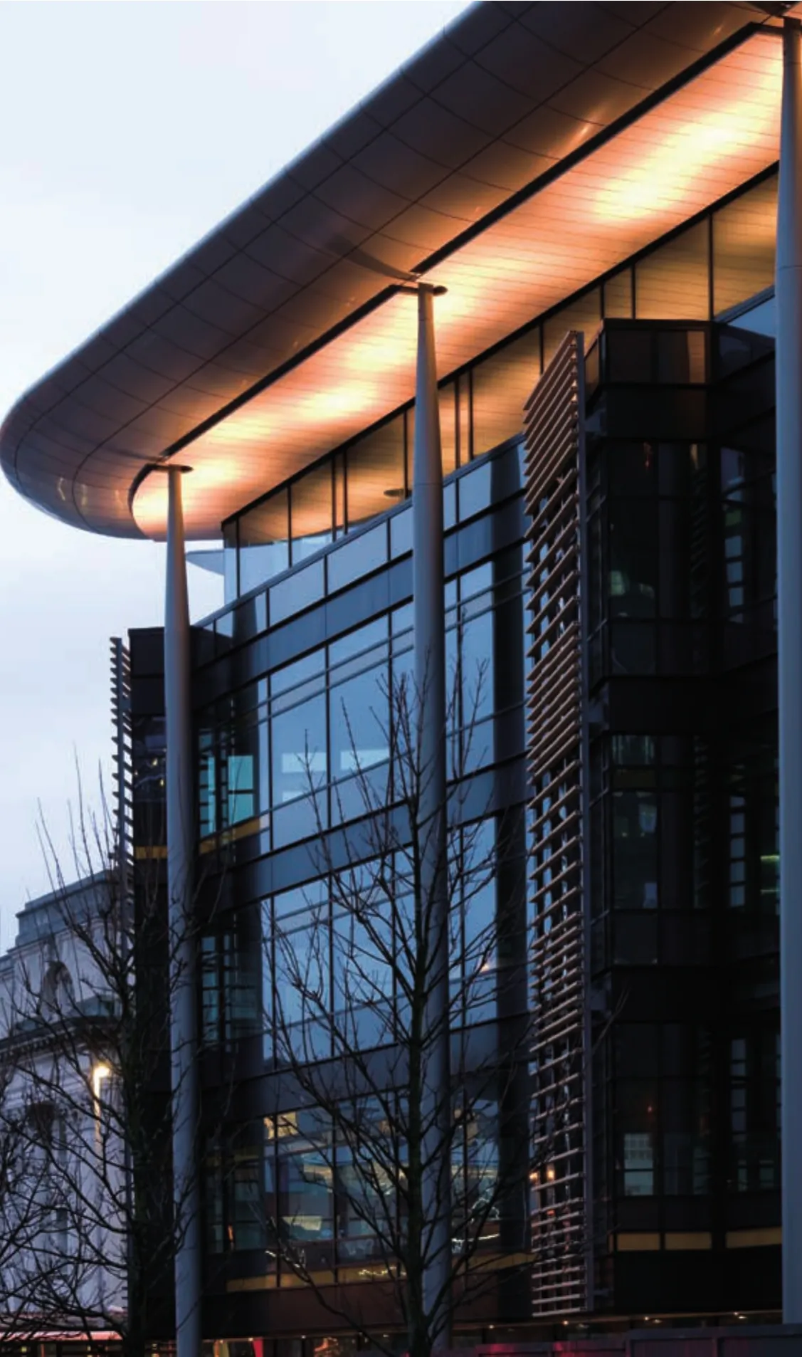
独立栏杆的风帆屋顶与外立面的水平状态形成了鲜明的对比。
Highly visible from all sides, the objective of the scheme is to create a landmark building that complements Waterfront hall, and establishes an entrance to the overall Lanyon Place site. If you consider the concert hall to be the conductor, and all the buildings around to be the orchestra, then think of building we have designed as the 'Soloist'.
The design has been developed to enhance pedestrian routes through the site, and shield the site from South Westerly winds.
The building consists of five storeys of accommodation, 10 500 m² with a plant room on the roof, with the over sailing roof lining through with the parapet of Waterfront Hall. As a speculative development it is proposed that the ground fl oor will consist of commercial or mixed use accommodation, whilst the upper fl oors will consist of category A commercial of fi ce use.
The building was conceived to allow public permeability through the ground fl oor, and this concept is now re fl ected in the feature arcade that splits through the building on a south-west / north-east axis lining up with entrance to the concert hall with the entrance to St Georges, a victorian market on the opposite corner of Oxford Street. Within the arcade several bridges enclosed within a bowl of planar glazing unite the two fl oor plates. It is envisaged that the arcade will become the 'heart' of the building allowing people to pass through at their leisure, whilst also accommodating of fi ce entrances and possibility to be lined with cafes,bistros and galleries etc.
The facades of the ground and fourth (top) fl oors are set back to accentuate the main facade of the second,third and fourth fl oors. The horizontality of the west and south facades are accentuated by horizontal bands of metal. This horizontality is then broken up by a series of 'eyes' in the facade that frame the voids in the fl oor plates behind which are designed to create break-out spaces where employees and socialise.
The plan is articulated by a series of 'arms' that radiate out from Waterfront Hall, with the 'fi sts' of these arms punching through the facades to the east and west facades, engaging with Waterfront Hall.
An over sailing roof, sitting on its own free standing columns, contrasts against the horizontality of the facades.

