长宁国际发展广场中国上海
2022-04-25林静衡,祈礼庭
设计及项目建筑师:Aedas
业主:上海褐石投资发展有限公司
总建筑面积:259 000平方米
竣工年份:2021年
主要设计人:林静衡,全球设计董事;
祈礼庭,全球设计董事
摄影:Aedas
Design & Project Architect: Aedas Ltd
Client: K2 Real Estate (Shanghai Heshi Investment Development Co. Ltd)
GFA: 259 000 sqm
Completion Year: 2021
Design Directors: Christine Lam, Global Design Principal;
David Clayton, Global Design Principal
Photography: Aedas
项目地处长宁区凯旋路与淮海西路交汇处,10号线虹桥路地铁站出口处,毗邻上海城市雕塑艺术中心、红坊创意园等文创地标,但距上海各CBD核心区较远。项目之初摆在设计师面前的首要难题就是如何激活地块商业价值、吸引不同类型租户群和市民的同时,让建筑融入周边肌理。
山水嶙峋的水墨画卷
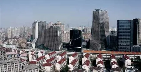
设计从山景中汲取灵感打造出集悬崖峭壁、蜿蜒裂谷于一体的活力街景,以雕塑般的建筑轮廓弥补了上海缺乏山景的遗憾。
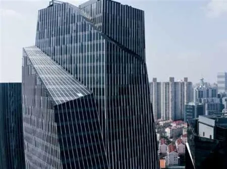
一座文化楼、三座办公塔楼、两座展厅和五座商业楼被打造为山峰、山石。其中办公楼以对角线切割形成了多个锥形切口,如同岩石堆叠风化后棱角分明的山峰,把目光导向群山之颠,颠覆传统办公环境设计,在刀削山峰下塑造了多处形状独异的科技感办公空间,以山峰坚韧不断攀登的意境与初创氛围相合。设计汲取水墨画精髓,富有层次变化的立面纵向线条,如同虚实疏密相间的水墨笔法,生动演绎了山地岩石嶙峋不一的轮廓。
展厅和商业楼则是简单的石块造型,而从屋顶自上而下的斜面玻璃幕墙,则像是石块上的裂缝和纹理,形状不一,隔街呼应。商业楼的顶部切割出几处露台,面向下沉广场,在享用美食之余还能欣赏建筑营造的山景。而下沉广场则如同一个个地下洞穴,让自然光线透入地下,曲折蜿蜒联通街道南北的地块,吸引行人流通。
山脉流水的空间布局
总体规划布局模仿鸟瞰山脉水流风貌, 以山峰、石林、岩穴、庭院、峡谷等山水形态打造各大小建筑外形及空间, 拼砌出城市中的水墨画。横穿地块的凯田路作为山脉中的裂缝,将山石一分为二,使商业多层沿凯田路两侧隔街相望,而车水马龙则是裂缝底部湍急而过的河流。展厅、办公楼、文化楼和商业楼错落分布,从西侧的凯旋路望去,形成了动态有机的外观。并以下沉广场模拟洞穴裂谷,连通地块南北,共同形成了标志性的“山地”剪影。
The development, located at the intersection of Kaixuan Road and Huaihai West Road of Changning District and conveniently accessible via MTR Line 10 at Hongqiao Road Station, is adjacent to the Shanghai City Sculpture Art Centre, and Redtown Art District. The site is not among any of the CBDs in Shanghai. Thus, a primary and key purpose of the development is to drive business value by attracting tenants and consumers as it integrates with the surrounding context.
An lnk Scroll Depicting a Rugged Landscape
Derived from concept of mountains, the development stands to present a stratified geology providing pinnacles,caves, rocks and waterfalls in the valleys, with geometric office towers expressing as mountain peaks and rockshaped pavilions lining alongside the busy traffic flow in between to form a dynamic streetscape.
A cultural tower, 3 office towers, 2 exhibition pavilions and 5 retail pavilions within the development are strategically scattered on the site to form a layered mountainous experience of the wild nature. Ascending office towers are sculpted with powerful tapering cuts, expressing as mountain peaks and leading the eyes to the apex. Inspired by traditional Chinese landscape painting, layering of a mountainous contour is depicted by using Void and Solid striation, which also assist in complying with the glazing to wall ratio requirement.
Along Kaitian Road features a dynamic serrated façade symbolizing fissure through the mountain, together with busy traffic flowing in-between, a vibrant streetscape is created. Rock-inspired pavilions are featured with surface details of symbolic “cracks”, and cut-out terraces on top forming unique form for each block and allowing consumers to enjoy an uninterrupted view of the “mountainous” scenery they are in. Cave-like sunken plazas are smartly set to allow natural daylight into the basement as it enhances pedestrian circulation and connection between northern and southern part of the development.
Spatial Layout of Mountain Range & Water Streams
The overall layout takes a bird's-eye view and captures a panoramic snapshot of the bucolic surrounding.An ink painting in a city emerges from the collaging of mountain peaks, stone forests, caves, courtyards,canyons that emulate varied architectural shapes. Run across the site is Kaitian Road, a fissure below which runs the traffic current and bifurcates the rocks to occasion a face-to-face outlook between the multi-storey commercial buildings. The cultural tower, office towers, retail and exhibition pavilions are couched in a jagged manner which contributes to its dynamic and grandiose appearance, viewed from the West. The sunken plaza
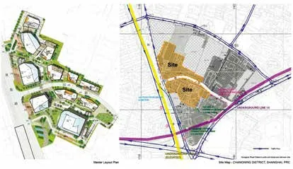
总图 site location
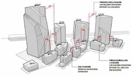
建筑比例 building scale
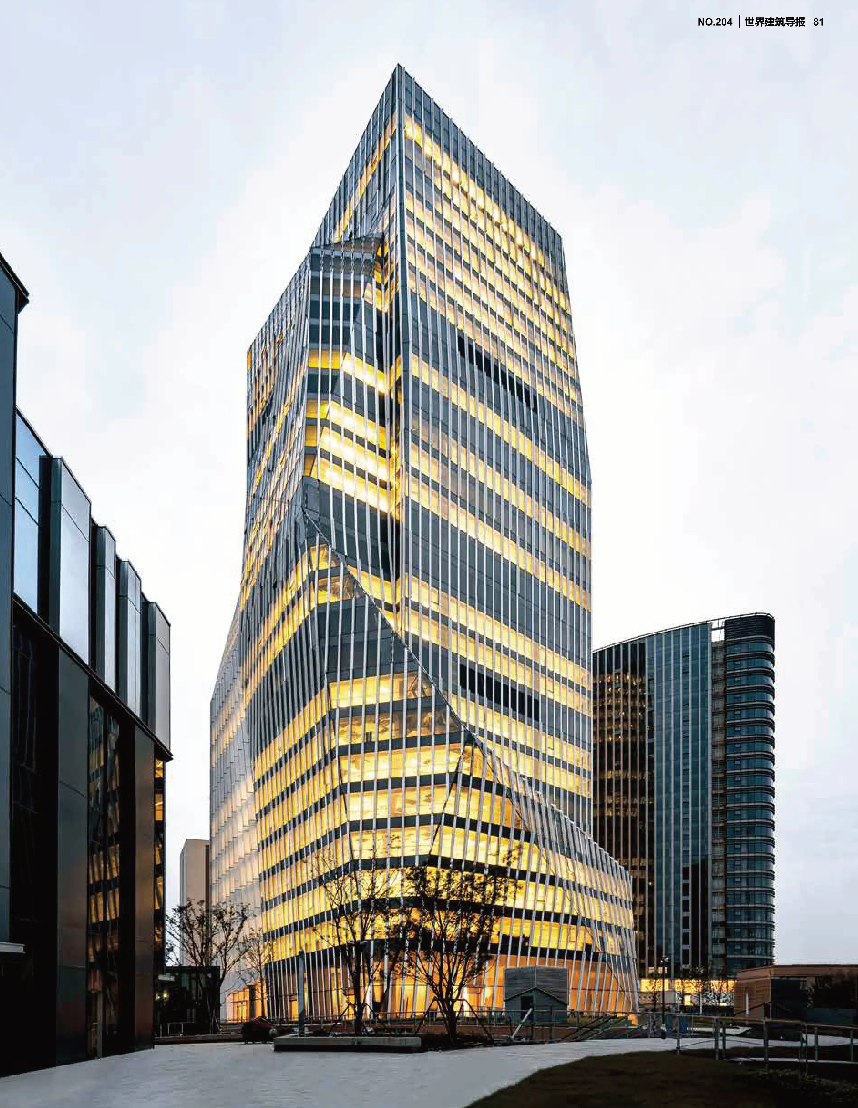
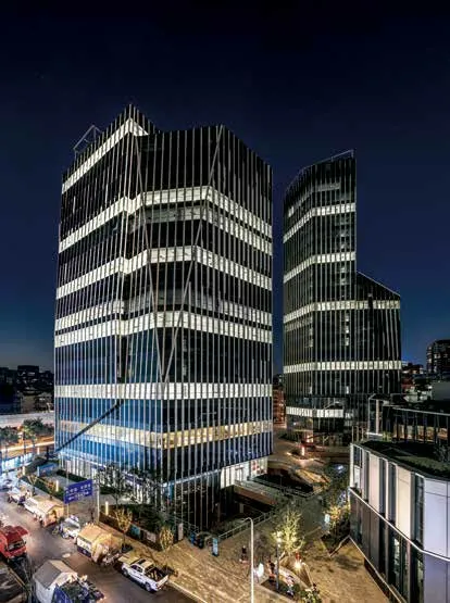
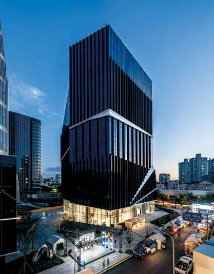
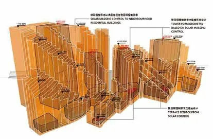

设计排布让不同高度间楼群间距尽可能最大化,保证楼群间尺度宜人。在此基础上,设计师全方位分析了日照情况,以路两侧由南向北以此递减的阶梯状建筑体量,巧妙解决周边住宅日照的问题。
未来多元办公
团队在co-work未在亚洲普及开时便设计了可拓展的公共办公空间,并以独特的定位使它从一众办公楼中脱颖而出。阳光下有机玻璃幕墙倒影着周边景色的影子,极具现代感的材质与山石这一传统东方意象相碰撞,营造出未来感与典雅韵味交融的。高挑的办公大堂入口,在透明玻璃幕墙和内部几何拼接图案的衬托下,高端商务办公氛围显露无疑,与集团总部毫无二致。
设计在打造独特建筑造型的同时,兼融了室内空间的实用性和灵活性。塔楼采用高效的中央核心筒,标准平面以多边方形为主,进深合理,客梯分高低区,通过高区退筒营造出更宽办公空间,并利用斜柱结构转换配合建筑外型变化,使外观造型同时保证空间实用性。此外,独立空间为初创企业提供小规模总部般的环境,与其他大空间混坐的co-work相比极具吸引力。
此外,设计师另配置了会展空间,企业不必为了展览空间而花费额外时间在寻找和交通运输之中,所有商务所需在综合体内都可以满足。而螺旋式中庭、空中花园为不同企业提供了互动交流空间,提升办公环境的舒适度。
地方创生
“作为一个城市化发展进程中的‘地方创生(local creation)’项目,如何提升片区品质、创造出社区共享价值及社区能力,是设计成功的关键。”团队基于“城市再生”方针,顺应互联数字城市的变化要求,在互联枢纽发展的框架下,以社区为基础,透过个性建筑造型及公共空间为其注入独有的身份形象,让居民能够感受到归属感,从而成为后续营运中的重要份子,实现亲社区的可持续发展。
同时,设计以长宁国际发展广场清晰响应并结合组织交通道路,在优化城市接口中,为地区提供新办公、配套商业、服务设施新功能, 在配合对城市进行系统的实施和管理中,带动片区协同发展。that connects the north and the south creates an illusion of a cave rift, completing the silhouette of an iconic mountainous terrain.
To mitigate negative shading impacts to the environment, and provide a solution for the problem of residence insolation, the stacking building blocks are sensibly arranged through rigorous analysis on site setback, mechanical loading and solar requirements.
Future Diversified Office
The team is ahead of the curve in that we have started developing expandable working spaces, before the outcrop of co-working spaces in Asia. From glazing panels of the grand entrance to details of geometric mosaic patters within, materials are delicately chosen to blend futuristic elements into to the oriental aesthetic of the development,resulting in the sparkling charm and elegance of a high-end business centre.
The tower adopts an efficient core tube structure and employs polygonal shapes in the standard floor plan. By dividing the passenger elevator into high and low zones, the high zone serves to create a more expansive office area through the setback of the core. Architectural forms are anticipated by the inclined transferred columns to retain usable space. In addition,the independent space provides a small-scale headquarters-like environment for start-ups,which renders it more attractive compared to other large-scale spaces. In addition, exhibition spaces within the development would serve as a value-added feature for the tenants, largely eliminating time and costs spent for sourcing and transportation for their exhibition needs.
Placemaking
"To create a successful design and fulfill the conditions of placemaking, one has to deliver on three aspects: improve district quality, generate robust, self-contained capabilities and establish community-shared values.” Guided by the tenets of urban regeneration and the requirements of increasingly connected digital cities, the design is rooted in the community. Through creating arresting visual motifs, a sense of belonging among members can be fostered, which in turn guarantees the sustainability of the community.
IM Shanghai echoes and integrates with the traffic structure. The optimization of the city’s interface brings in new offices, complementary commercial and service facilities. With a coordinated and systematic approach, it streamlines development and ensures the flourishing of the district.
