Baidu International Building Shenzhen
2019-05-07王照明,颜世宁,倪俍等
地点:中国深圳
建设单位:百度国际科技(深圳)有限公司
设计/落成:2012年/2016年
用地面积:5 995 平方米(东塔),8 148.2平方米(西塔)
总建筑面积: 92 000 平方米(东塔),127 500(西塔)
高度/层数:180米/39层(东塔),147.3米/33层(西塔)
设计单位:悉地国际,东西影工作室
设计人员:王照明、颜世宁、倪俍、凌子
摄影:方健
Location: Shenzhen, China
Client: Baidu International Technology (Shenzhen) Co., Ltd.
Date: 2012 / 2016
Area: 5 995m2(East Tower), 8 148.2m2(Weast Tower)
Building Area: 92 000m2(East Tower), 127 500 (Weast Tower)
Hight/Floor: 180m / 39F (East Tower), 147.3m/33F (Weast Tower)
Design: CCDI, Dongxiying Studio
Design Team: Wang Zhaoming, Yan Shining, Ni Liang, Ling Zi
Photograph: Fang Jian
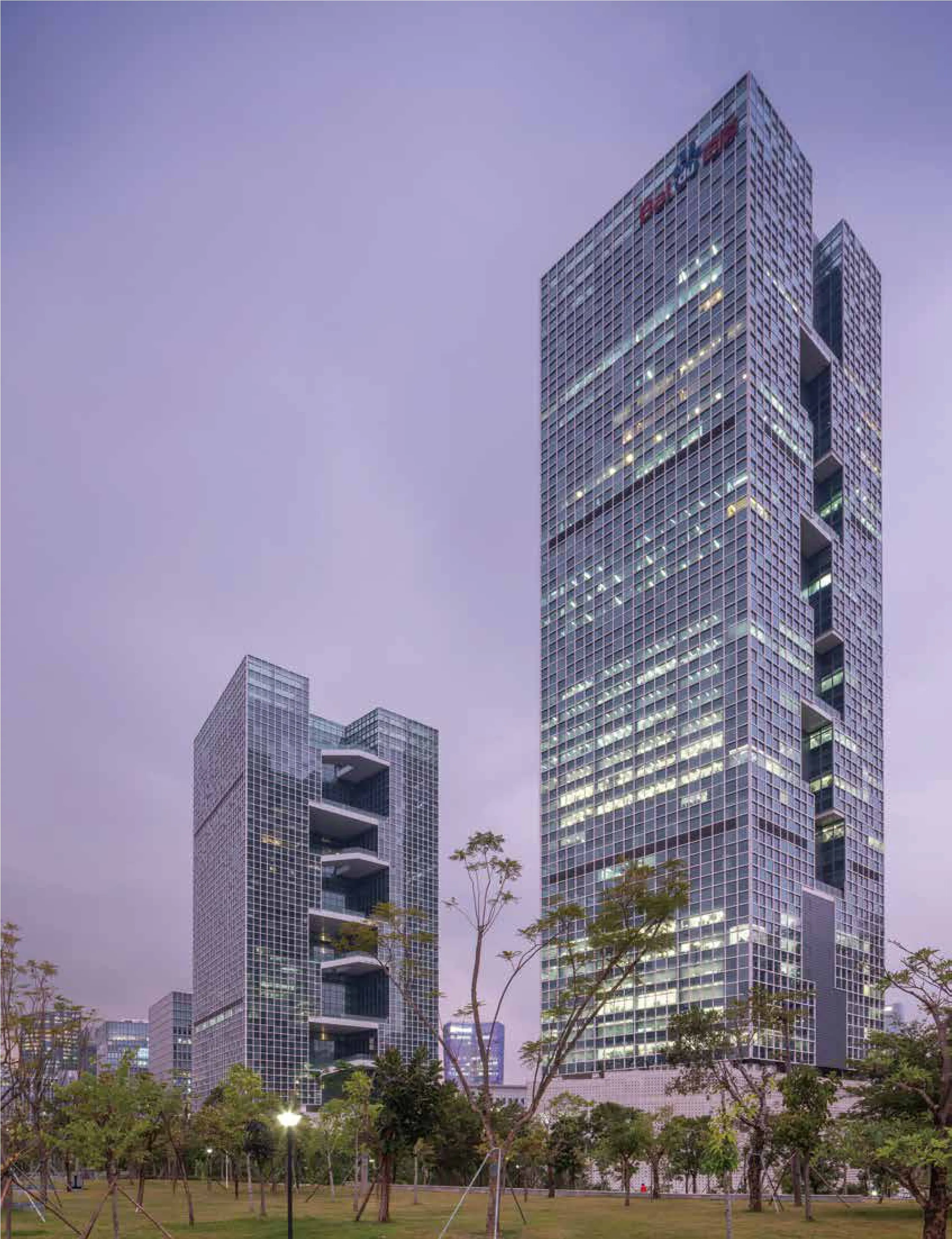
百度国际大厦是2016年底竣工投入使用。在投标过程中我们的野心非常大,东西塔楼和北边那栋楼是整体连接的,创造了一个三栋塔楼共享的环,并且从环上引出了活力核心带到塔楼的标准楼层上,设计了连续的楼梯让人们从屋顶花园一直步行到楼层的每一个区域。当时这个概念共享空间非常多,在实施过程中,一部分的内容被缩减了。百度国际大厦,是我们基于对it型、总部自用办公建筑的一次定制实践。从空间模式上讲是属于平面加剖面双重叠加的一个产品。外观上可以看得出它的空间是以剖面的形式进行叠加的。然后在平面上是围绕边庭空间形成了一个U字型的活动区域。为此区域整个核心筒向一侧偏置,由此所产生一系列的改变去适应这种空间形态,是更复合的形态。
设计思路上是希望每一层都能够有一定的空间,能让大家体会到室外自然环境和交流场所的植入,更强调内外融合。
先落成投入使用的是东塔,其形体空间的构成逻辑也很简单纯粹,裙房满铺基地,塔楼南北薄切形体,核心筒偏置退让出空间,以8层为一个单元植入空中花园,每4层单元错位叠加,设置观景阶梯将建筑的外部空间竖向串联。
户外空间是这个项目关注的重点,正因为高层建筑对场地使用的高度集约,外部空间显得异常的稀少和珍贵,设计希望为百度员工创造能够随时使用的空中庭院,以这个充满可能性的“核心”为载体展开日常工作和生活。通过环绕在空中庭院的步道系统,实现楼层间自由的连接,降低日常使用对电梯的依赖。
我们在建筑的底部大堂做了一个空腔体,裙房大多数的房间都是不需要采光的,如IDC机房,厨房、会议室等等,需要采光的区域我们通过穿孔板做了云状采光口,大堂部分设计希望抬头可以看到空中叠合的活力核心模快,视觉上形成贯穿的联系。
活力核心每八层一个标准单元,由一个大活动平台、两个小露台加两个单向观景阶梯组成,每个楼层都有专属可达的户外区域。景观阶梯是上下楼层的重要联系,左侧是一个快速通过的楼梯,右侧设计了一个大阶梯状的台地,将一些绿植和休闲桌椅放置在这里,成为日常工作和交流的好去处。
在不破坏建筑完整性的前提下,我们尽量在一些夹层空间设计了可供活动的场所。群房屋顶设计了一个屋顶花园,虽然尺度不是很大,但是由于它和这个餐饮楼层是上下楼层的关系,通过步道从餐厅直达这个架空花园,享受阳光和自然。
立面采用了2.1x2.1的标准模数,使用了三种不同配置的玻璃,通过白色彩釉点的疏密调整色差,形成像素效果。
裙房采用的是非标准的6mm铝板,不需折边,铝板的拼接变得异常平滑,看起来像一个面一样。切得非常锐利的转角能够把表皮的厚度消减到最薄。附加了一层轻且柔和的表皮。
整个项目提供非常好的空间体验。与传统封闭式的高层办公建筑有明显的价值区别,建筑将人的活动从内部转移至外部,近场地交流得以实现,是体验式办公建筑难得的设计实践。
在现在这个日益下滑的行业状况下,对设计师而言很重要的一点,是能够站在使用者的角度去思考问题,适度地传输设计理念,最终达到改善公共空间使用方式的目的。建筑师也会在这种协调角色中获得成长,这是我个人觉得非常好的一种状态。


Baidu international building was completed and put into use at the end of 2016.During the bidding process, our ambition was very big. The east and west tower was connected to the north building, creating a ring Shared by three towers, and bringing the energy core from the ring to the standard floor of the tower. Continuous stairs were designed to allow people to walk from the roof garden to every area of the floor.At that time, the concept was so much Shared space that part of the content was reduced in the implementation process.
Baidu international building is a customized practice based on it type and headquarters' self-use office building.In terms of spatial pattern, it belongs to the product of plane plus section double superposition.It can be seen that its space is superimposed in the form of sections.And then on the plane it forms a u-shaped moving region around the lateral quad space.Therefore, the whole core tube of this region is offset to one side, which produces a series of changes to adapt to this spatial form, which is more complex.
The design idea is that each layer can have a certain space, so that everyone can experience the implantation of the outdoor natural environment and the communication place, with more emphasis on internal and external integration.
First completed and put into use is the east tower, the formation logic of its physical space is also very simple and pure, the house full spread base, the tower north and south thin cut shape, the core tube offset retreat out of space, eight floors as a unit implanted into the sky garden, four floors of units dislocation superposition, set observation stairs to connect the building's external space vertically.
Outdoor space is the focus of this project. Due to the intensive use of the site by high-rise buildings, the external space is extremely rare and precious. The design hopes to create an aerial courtyard that can be used anytime and anywhere for baidu employees.The free connection between floors is achieved through the footpath system surrounding the courtyard in the air, reducing the dependence of daily use on elevator.
We are at the bottom of the building lobby, made a body cavity, and podium most room does not need lighting, such as IDC room, kitchen, room, etc., need lighting area we did cloudy daylight opening through the perforated plate, want to look up the lobby part design can see air composite dynamic core mould fast, visual form through the link.
Each of the eight floors is a standard unit consisting of a large event platform, two small terraces and two one-way viewing stairs. Each floor has its own outdoor space.The landscape ladder is an important link between the upper and lower floors. On the left is a staircase that passes quickly. On the right, a large staircase platform is designed.
On the premise of not destroying the integrity of the building, we try to design places for activities in some mezzanine Spaces.The roof of the group house is designed with a roof garden. Although the scale is not very large, it is connected with the catering floor from the upper and lower floors. Through the footpath, it reaches the overhead garden from the restaurant, enjoying the sunshine and nature.
The facade adopts the standard modulus of 2.1x2.1 and USES three kinds of glass in different configurations to adjust the color difference through the density of the white glaze points to form the pixel effect.
The skirt room USES the non-standard 6mm aluminum plate, does not need to fold the edge, the aluminum plate's joint becomes extremely smooth, looks like a face.A very sharp cut Angle reduces the thickness of the epidermis to its thinnest.A light and soft cuticle is added.
The whole project provides a very good spatial experience.There is a significant difference in value between the traditional enclosed high-rise office buildings. The building transfers people's activities from the inside to the outside, and the near site communication can be realized, which is a rare design practice of experiential office buildings.
In the current situation of the declining industry, it is very important for designers to think from the perspective of users, properly transmit the design concept, and finally achieve the purpose of improving the use of public space.Architects also grow in this role of coordination, which I personally think is a very good state.

