砖砌建筑学校,浦那,马哈拉施特拉邦,印度
2019-02-26建筑设计吉里什多西Navkar建筑事务所
建筑设计:吉里什·多西/Navkar建筑事务所

1 外景/Exterior view


2.3 墙体细部/Details of brick walls
为了完美地构建一个当代的学习与过去进行热忱对话交流的统一空间,我们尝试了许多创造性的想法,设计了以厂房为核心并意在彰显“建筑文化体验”的空间。
该项目的用地位于浦那市郊的安德里,和许多其他新区一样,这里即将成为未来城市社区的一部分。当地的建筑主要是成片的住宅,除了两条主干道,远处的山峦成为这片褐色土地唯一的视觉重心。
我们意识到,该地段的发展规划为打破现有居住密度、构建一个亟需的机构性的社交枢纽提供了契机。因此,这个新校区被定性为一个与城市文化和精神相融合,且具有象征价值和知识认同的存在。
该项目从两个同样关键的角度进行了广泛的设计:
首先,由内及外的(内在)设计过程——满足项目指定的功能需求和精神诉求;其次,由表及里的(外在)设计过程——将区域肌理、街头文化与校区相联系。
项目平面是极其对称的布局。顺应着内在逻辑,人们从接待广场出发,凭着自身直觉进入到一个纯粹的步行区以感知内部空间。非正式的内部空间里布满纵横交错的流线路网——流畅的路网将空间变得有序,串联起阶梯教室、连廊、走道、开敞的庭院、悬挑空间、游戏平台、坡道、楼梯和阳台。贯穿整个建筑的“灵活流线”有助于促发使用者的日常交流,这是教育类建筑设计工作的核心。
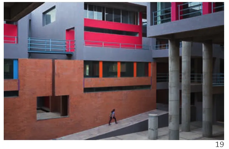
从外部性看,该建筑体块的整合依托于多层次、不透明的砖砌平行墙体等不朽的设计手法,从南侧工作室一直到北侧入口广场,尺度逐渐递减,逐步分割细化以形成宜人的尺度。这个大尺度的体块经过了深思熟虑,让人联想起该地区的历史遗产。内部的功能体系决定了教学楼外部及屋顶的几何形状。因此,这些平行的砖砌墙壁穿插在周边可进入的斜坡和露台当中,分别作为行政管理和学习空间。顺着流线下行,一系列经过精心设计的平台掩映在起伏的景观环境当中。景观门廊和室内广场环绕着作为中庭的教学楼,为学校提供了互动式的社交核心并减少了拥堵。
一连串的设计工作室都是模数化的封闭空间,使学生拥有私密学习空间的同时,以交互式学习体验的培养为宗旨。光线通透、通风适宜还有能俯瞰夹层的视野。建筑的采光和通风采用了创新的处理方式,这启发了我们可以将空间按照不同的光线条件进行规划。该平面不但反映了封闭、半封闭和开敞空间相互依存的功能关系,也是对自然光的不同需求的呈现。巨大的悬挑空间下方,是设计工作室在南立面的入口,悬挑结构使场地的山峦景色得以一览无余。设计精妙的天窗为设计工作室引入了额外的光线。每个空间对自然光的需求各不相同,例如管理及办公空间被有意安排在北立面,层层叠叠的场地有效平衡了这里的光照。散点式的庭院不仅光照充足,还实现了空间尺度转换和通风系统的一体化。光照条件根据建筑体量的进深而变化,并随着空间环境变换着亮度和色调。此外,这个方案还提高了整个建筑的保温性能,大大减少了调节温度的需求。这些沐浴着阳光的空间还拥有着不被过多打扰的静谧感。
周边环境的美化衬托了校区与城市肌理的融合,通过建筑工艺使生活品质得以提升。自然存在的活水,汇聚成一个个隐匿的蓄水库,通过管道季节性地供水。总而言之,这个阶梯状的纪念碑式作品以内省、平和的姿态,静静矗立在时间流逝之中表现自己。□(天妮 译)

4 总平面/Site plan
1-主入口大门(人行)/Main entrance gate (pedestrian)
2-入口广场/Entrance plaza
3-干蓄水池/Dry kund
4-门卫室/Watchman's cabin
5-常设展览空间/Permanent exhibition space

5 外景/Exterior view
6-变压器/Transformer
7-入口大门2(车行)/Entrance gate 2 (vehicular)
8-食堂/Canteen
9-顶楼蓄水箱/Overhead water tank
10-设计学校(二期)/Design school (phase II)
Much of the creative endeavour was to perfecly fantasise a unified space for contemporary learning exchange with keen dialogue with past - a factory centre with a clear intent of celebrating "building culture experience".
The project's contoured site, like many other new areas is part of upcoming urban neighbourhood -Undri, located on the out-skirts of Pune city; wherein local predominant built components comprise of housing parcels. Apart from two arterial roads, a hilly range in the far backdrop composes the only significant aspect of the brown field.
It was recognised that the development of this site offered the opportunity to create a muchneeded intervening institutional social hub between the housing densities. This new campus was consequently briefed to be an identity of knowledge having symbolic value integrated with the city culture and spirit.
First, designing process from the inside-out(Intrinsic) - engaging the specified functional needs and spiritual pursuit of the programme.Secondly, the outside-in process (Extrinsic) -making neighbourhood fabric and street culture's connections to the campus.
The "Plan" is powerfully symmetric. Conforming the intrinsic principle, from the reception plaza the observer is engaged in a quintessential pedestrian realm guided by their own intuition to understand interior spaces. The interior informal spaces are designed as interlinked circulation network - a fluid network designed as kind of spatial series,composed of amphitheatres, bridges, corridors,open-to-sky courtyards, overhangs, platforms,ramps, stairs and verandah. This "fluid circuit" of connection throughout the building encourages the creative informal engage across and between users that is central to the workings of such school.
Extrinsically, the aggregate volume assembly is conceived on a monumental vocabulary of layered and opaque brick-cladded parallel walls, descending in scale from southern studio's direction towards the northern entrance plaza rhythmically fragmenting to meet the human scale. This largely monolithic massing is deliberated, reminiscing heritage history of the region. The functional hierarchy within dictated the architectural roof geometry of the building's enclosure. Consequently, these parallel walls are roofed by accessible sloping and flat terraces, accommodating administrative and learning programme respectively. Climbing down,the project resembles a series of sculpted terraces quarried into the contoured landscape. The building encloses a landscaped loggia and indoor piazza in the form of a Central Court, serving the school a social core for interactive destination and a kind of decongestion chamber.
The studio string are developed as modular enclosed pavilions; interconnected by light, airy and overlooking mezzanine, hosting intimate working spaces fostering the motto of interactive learning experience.
Manipulation of the building section for light and ventilation in inventive ways has inspired our approach towards a volumetric planning in different light. The studio is the basic modular block of the building. Enclosed, Semi-enclosed and open spaces have been interlocked not only to reflect their interdependent relationships but also for their varying needs of natural light. Studio's openings on South façade are sheltered with large overhangs opening generous view of hills in the site backdrop.Additional studio light is strategically crafted via"clerestory" openings. Spaces that do not have a requirement for the same quality of natural light,such as the administration and offces are purposely planned on the north façade where access to users sunlight is balanced through application of shaded courts. Punctuated courts not only light up but also allow for the integration of programme, spatial modulation and ventilation. The light shafts deliver natural light through the depth of the building volume providing direct connectivity with the exterior through the changing intensity and colour of the ambience. In addition, they enhance thermal performance of the space throughout the building,reducing the need for active conditioning of air.Moreover these sun-lit volumes enhanced by the immaterial presence of silence render a meditative integrity to spaces.
Quantitative differences between the analyzed groups should be considered as the limitation of this study,as well as the lack of information on the long-term results.
The landscaping of the surroundings expresses the school's sensitivity in the urban fabric embodying a progressive life for the Building craft.The natural surface run-off water is routed and harvested into concealed tank and seasonal stepped kund through open ducts. Conclusively, the sense of introspection and peace of this terraced monument;ambitions itself to immerse in time.□

6 首层平面/Ground floor plan

7 二层平面/First floor plan

8 三层平面/Second floor plan

9 四层平面/Third floor plan

10 立面/Elevation


11-16 剖面/Sections

17 院子/Courtyard

18 剖面详图/Detail of section
项目信息/Credits and Data
客户/Client: Satish Misal Educational Foundation (Pooja Misal)
主持建筑师/Principal Architect: Girish Doshi
设计团队/Design Team: Girish Doshi, Ajeet Hippergekar,Ubez Shaikh
结构工程/Structural Engineer: Vilas Purandare
机电顾问/Electrical Consultant: Sachin Godbole
工程管理顾问/Project Management Consultant: Nikhil Gathani (R.K.Gathani Engineers)
承包商/Contractors: Ajay Sanas, Sanskruti Buildcon
标识设计/Signage: Sayali Sancheti (Forest Communications)占地面积/Site Area: 20,000m2
建筑面积/Floor Area: 3529m2
项目启动/Initiation of Project: 2012.04
摄影/Photos: Onil Shah (fig.1,17,19-21), Hemant Patil(fig.2,3,5,22-25)


19-22 流线/Route views

23.24 内景/Interior views
评论
王亦知:建筑师以非常娴熟的手法打造出这一建筑群。相对于外部形象的塑造,建筑师似乎更加着迷于内在空间的营造,多样的材质、构成和色彩,创造出一片错综的小环境,以及复杂的交错流线,从而极大地延展了空间的尺度和丰富性。建筑在北立面精心设计出极具几何感的错落形象供人观赏,然而相信漫步其中才是体验这一建筑的正确方式。
Comments
WANG Yizhi:The architectural techniques applied on the construction group by the architect are quite skillful. Compared with creation of external form, it seems that the architect is more obsessed with the interior space: diversified materials, structures, and colours to create a complex small environment and complicated interwoven flow lines, which expand the spatial dimension and enriches the space to a great extent. Though a delicate geometrical image is designed on northern façade of the construction for people's appreciation, I believe the right way to experience the building is to wander in it. (Translated by QIAN Fang)
丁建华:这并不是一个传统意义上“上镜”的建筑,建筑师并不避忌暴露建筑的“素颜照”,而呈现其最真实的材质与使用。粗犷与力量,或许是对它最直观的感受,然而仔细考量之下,却也不难发现建筑师的精巧构思所在:如丰富的空间形式为孕育多样校园活动提供基质;又如学习空间内对光、风能量要素的细腻处理,使建成环境的舒适与健康成为可能;再如多种材料与三原色的精心拼配与应用,更为原本严肃厚重的砖砌建筑带来别样的生机与诗意,这种“粗中有细”的强烈对比,更凸显匠心独运。
DING Jianhua:This is not a traditional "pictureperfect" building. Architects do not avoid exposing the building without "filters", but presenting its most authentic materials and functions. Roughness and strength may be the most intuitive feelings about it.However, for this study, it is not diffcult tofind out the ingenious ideas of the architect. The rich spatial form provides a matrix for the breeding of diverse campus activities. Another example is the delicate treatment of light and wind in the learning space, making the comfort and health of the built environment as far as possible. Also the careful combination and application of a variety of materials and three primary colours,which brings different vitality and poetry to the originally serious and heavy brick building. This strong contrast between "crude and refined" is rather unique.

25 内院/Inner courtyard
