BANQ 餐厅美国波士顿
2018-04-27NaderTehrani,DanGallagher,MonicaPoncedeLeon等
设计负责人:Nader Tehrani
项目建筑师:Dan Gallagher
项目协调:Catie Newell, Brandon Clifford
设计团队:Monica Ponce de Leon, Harry Lowd, Richard Lee,Lisa Huang, Remon Alberts, Janghwan Cheon,
Jumanah Jamal, Aishah Al Sager
Principal in Charge: Nader Tehrani
Project Architect: Dan Gallagher
Project Coordinators: Catie Newell, Brandon Clifford
Project Team: Monica Ponce de Leon, Harry Lowd, Richard Lee, Lisa Huang,Remon Alberts, Janghwan Cheon, Jumanah Jamal, Aishah Al Sager
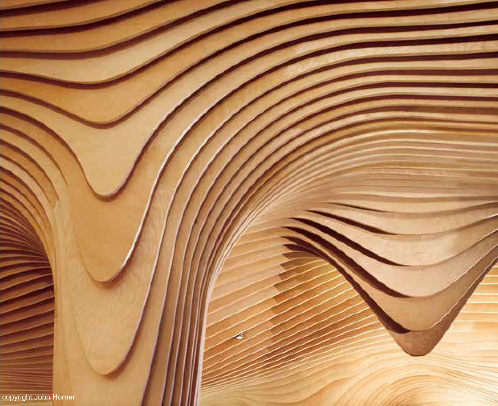
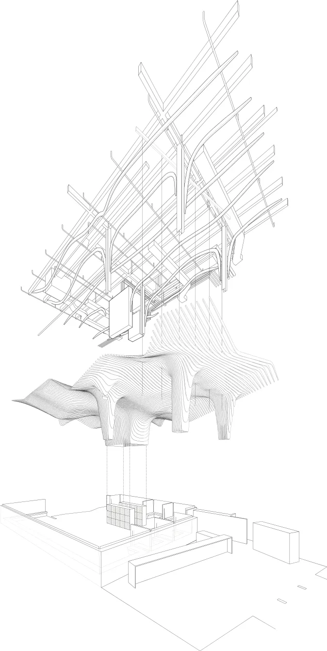
Banq餐厅位是一家新型餐厅,位于便士储蓄银行(Penny Savings Bank)旧大楼以前用来经营银行业务的大厅内。餐厅分成两个部分,前面区域面向华盛顿大街,设计成酒吧,后面的大厅则作为用餐区。然而,这个空间在z轴上以天花板和地面之间的另一个分区为中心进行设计。如果由于餐厅空间活动的多变性而需要保持灵活性——包括两个座位、四个座位和六个座位,以及与聚会和其他活动有关的座位配置——那么天花板就包含了一部分的固定的建筑物基础设施,即结构、排水系统、机械设备、喷水系统、照明系统和其他声学系统。为此,设计者开发了一种条纹木板条系统,它能在纵向轴上隐藏机器、管道和照明系统,为使用者提供一个可供就餐的顶篷。木板材的几何形状与上述设备协调一致,但也采用辐射式,以便与其他毗邻设备之间实现平滑过渡关系,营造了无缝景观。大厅中央的柱子和酒窖,起到了支撑楼层的作用,给人一种似乎是从天花板上悬挂下来的感觉。如果纵向轴强调无缝表面,那么横向的视野就可以向上看到服务空间的条纹,使人产生神秘莫测的感觉。为了强调这一策略,天花板的某些区域采用“滴落”和“骤降”的处理方式,以确认出口标志的位置、照明功能以及其他细节。
Located in the old Penny Savings Bank, Banq is a new restaurant located at the base of the former banking hall. Divided into two segments, the front area on Washington Street is programmed as a bar, while the larger hall behind serves as the dining area. The design of the space, however,is conceptualized around another division, on the z axis, between the ceiling and the ground. If the ground needs to remain flexible as a result of fluctuating activities of the restaurant space--two seaters, fours, and sixes, among a range of other organizations related to parties and other events-- then, the ceiling contains fixed programs that are part of the building’s infrastructure-- the structure, drainage, mechanical equipment, sprinkler system, lighting, and other the acoustic systems. To that end, a striated wood-slatted system that conceals the view of the mechanical,plumbing, and lighting systems on the longitudinal axis was developed that offers a canopy under which to dine. The geometry of the wood slats conform to the equipment above, but are also radiused in order to smoothen the relationship between other adjoining equipment, creating a seamless landscape. The columns and the wine storage, in the middle of the hall, serve to uphold the fiction, and appear to be suspended from the ceiling. If the longitudinal axis emphasizes the seamless surface, then lateral views offer striated glimpses into the service space above, and demystify the illusion. To underline this strategy, certain areas of the ceiling “drip” and “slump”,acknowledging the location of exit signs, lighting features, and other details.


