多义性边界
——合肥北城中央公园文化艺术中心
2017-12-27肖诚,印实博,何啟帆等
多义性边界
——合肥北城中央公园文化艺术中心
Ambiguous Boundary—Cultural Center of Beicheng Central Park in Hefei
地理位置:安徽合肥北城新区
建筑设计:深圳华汇设计有限公司 / hhd-sz
主持建筑师:肖诚
项目建筑师:印实博 何啟帆 毛伟伟
设计时间:2016年12月
竣工时间:2017年08月
业主:合肥万科置业有限公司&苏州高新地产集团有限公司
基地面积:9 000 m2
建筑面积:3 400 m2
结构形式:钢筋混凝土框架结构
主要材料:清水混凝土,超白U型玻璃
建筑摄影:姚力 隋思聪
Location: Beicheng New District, Hefei, Anhui
Architectural design: Shenzhen Huahui Design Co. Ltd / hhd-sz
Chief architect: Xiao Cheng
Project architect: Yin Shibo, He Qifan, Mao Weiwei
Design time: Dec. 2016
Completion time: August, 2017
Owner: Hefei Vanke Real Estate Co. Ltd & Suzhou New Real Estate Group Co. Ltd
Base area: 9 000 square meters
Building area: 3 400 square meters
Structure form: reinforced concrete frame structure
Main material: bare concrete, super white U glass
Architectural photography: Yao Li, Sui Sicong
好的建筑,生于场地,生成场所。而人的体验则构成了场所的灵魂。
我们试图在建筑与其外部空间之间建立一种新的关联,从而创造出一种新的场所体验。我们姑且将这种关联称为“多义性边界”。
该项目是建筑规模近100万平方米的北城中央公园居住区文化教育配套的一部分,在前期兼具项目展示中心的功能,后期则作为图书馆和儿童教育营地使用。基地是一个东西宽约260米、南北深约70米的矩形场地。用地南面则是占地面积近4万平方米的城市公园,中央公园项目藉由此得名。在空旷的土地上描绘繁华的愿景,几乎成为当下大型项目展示区的共同使命。在中央公园项目这样的场地上,设计面临的挑战一方面是如何形成一个鲜明而有力的城市界面从而与尺度巨大的城市公园相呼应,共同创造一种先声夺人的展示性。另一方面则是如何创造一个具有独特体验的场所以激发人们探索和参与的意愿。得益于项目未来的文化教育功能,我们首先可以赋予它一种即开放又具文化内涵的场所特质,进而在此基调之上演绎功能,组织叙事。
A good building, born on a site and create a place And the human experience constitutes the soul of the place
We try to create a new relationship between building and its outer space, thus creating a new place experience. Let's call this association "ambiguous boundary" for the moment
The project is part of cultural and educational facilities for the nearly 1 million square meters Central Park residential area,The base is a rectangular field about 260 meters wide in east and west and about 70 meters wide in north and south, with the city park on the south which covers an area of nearly 40 thousand square meters, after which the Central Park project is named.
Depicting the bustling vision in the open land is almost a common mission for the exhibition hall of a large projects. In places like this project, the challenge for design, on one hand, is how to form a distinctive and powerful city interface to correspond with the huge city park, and jointly create a visual display. On the other hand, it is how to create a field of unique experience,so as to stimulate people's willingness to explore and participate. Benefiting from the future cultural and educational function of the project, we can first endow it with open and cultural characteristics, and then deduce the function and organize the narrative on this tone.

回顾中国传统的建筑和园林空间,院落是构成场所特质最强的空间形态之一,它几乎构成了中国传统建筑空间的核心特征。而界定院落的建筑界面则是墙和廊。这两者也使得院落具有了不同的空间特色:一个围合,一个渗透;一个封闭,一个开放。前者多见于街墙和宅邸,后者多见于园林与阔院。而两者又往往结合使用,让院落空间具有了更好的多样性与故事性。
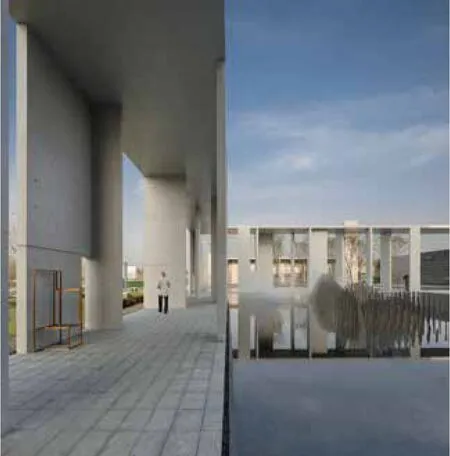
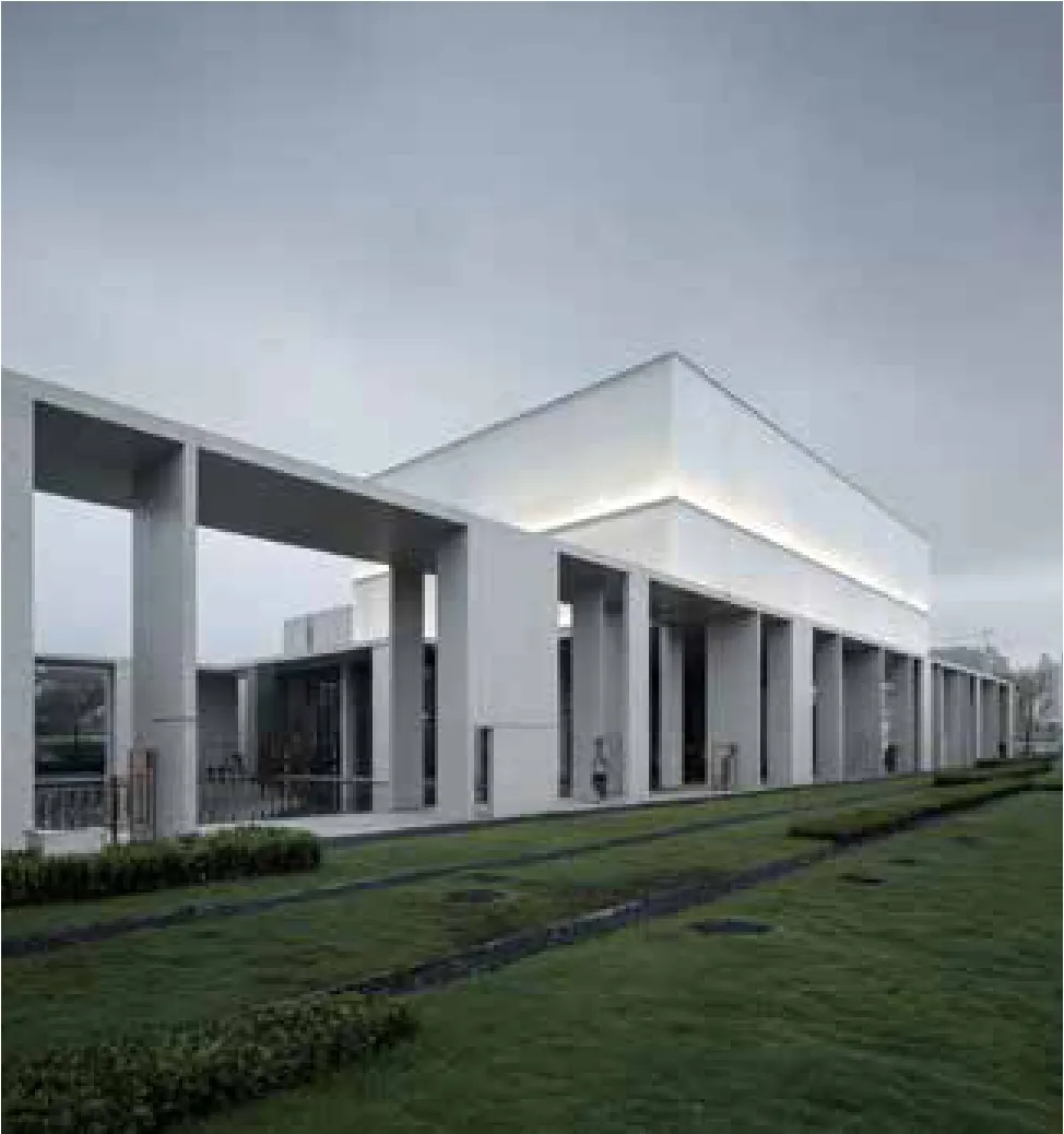
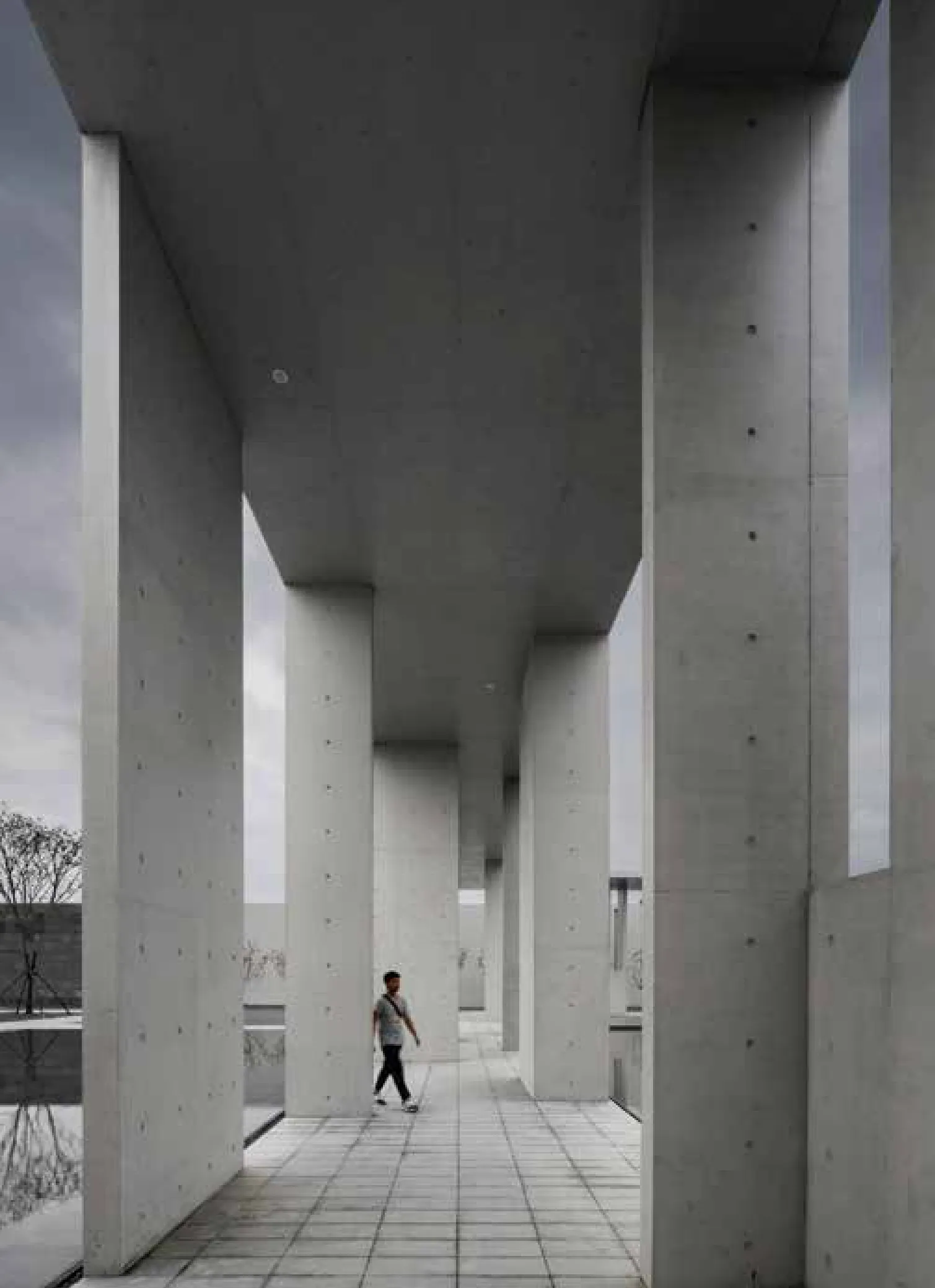
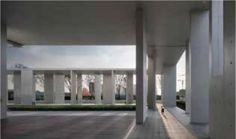
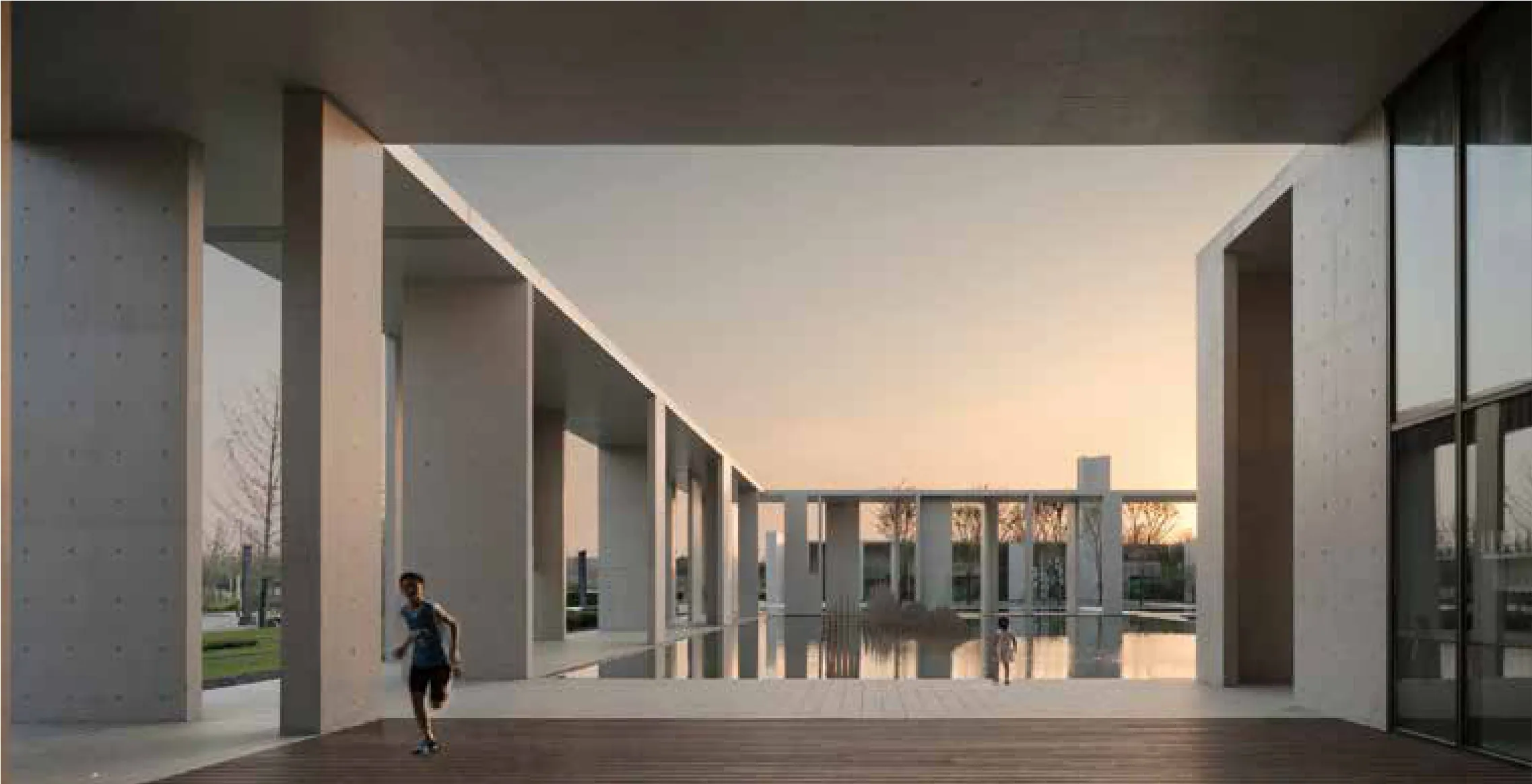
而在我们尝试为界定院落空间创造一种新的建筑原型时,我们最终在墙和廊之间找到了结合点--它刚好是由短墙构成的廊,伴随不同的形态和模数的组合,形成对于院落空间的多样化的界定方式,同时构成多义的场所体验。我们所说的“多义性边界”也由此形成。它的形态如同从建筑的墙体之中游离出来,意在融于室外场所之中。“墙廊”有一个统一的整体尺度--6米高,4米宽,它界定了整个场地的边界,同时创造了一个特殊的“回环景域”。当边界有了可以进入的厚度,日常生活、艺术活动也就有了空间的载体,可以是小朋友放学后捉迷藏的乐园,也可以是社区文化艺术展廊。
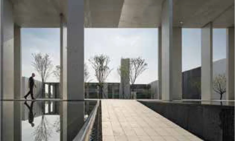
墙廊围合的,是中央的水庭,它的主体是一片浅水池。一如中国传统园林,水构成另一种界面,藉由镜像创造放大的建筑尺度感和空间领域感,同时也模糊了天地的界限,本与建筑隔水相望的人们,则可以通过一条“弦道”,由场地之外,穿越水面,进入建筑。而这个地坪标高不断变化的“弦道”,则让这个穿越的过程因视线高度的不断变化而产生不同的视觉经验。
Reviewing the traditional Chinese building and classic garden, courtyard is one of the most powerful spatial forms. It almost forms the core feature of Chinese traditional architectural space. And the building interface of the courtyard is the wall and corridor. The two also bring the courtyard different spatial characteristics: Enclosure or penetration,closed or open.The former is mostly found in street walls and mansions, and the latter is more common in gardens and courtyard. And the two are often used in combination, so that the courtyard space has a better diversity and story appeal.
While we try to create a new architectural prototype for the definition of the courtyard space, we finally find the combination between the wall and the corridor -- it is just the corridor composed of short wall,with the combination of different forms and modules, forming the diversity definition for courtyard space, also constituting a multiple place experience. This is what we call the "ambiguous boundary".Its form is free from the wall of the building, intended to melt in the outdoor place. "Wall corridor" has a unified whole scale, --6 meters high, 4 meters wide, which defines the boundaries of the entire site,while creating a special "circle scene domain". When the boundary has thickness , daily life and art activities then have a space vector, it can be a paradise for kids to play hide and seek after school and can also be a culture and art gallery of the community.
The wall corridor encloses the central water court, and its main body is a shallow pool. As Chinese traditional garden, water constitutes another interface to create an amplified architecture scale and space field sense, and also fuzzy the space boundaries, and the people on the other side of the building across the water can, through a "crescent path", go across the water to enter the building from the outside. And the "crescent path" with continuously changing elevation of the ground floor makes the process of crossing produce different visual experiences due to the change of the sight height.
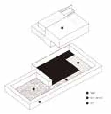
空间基本逻辑:廊-院子-房子Basic logic of space: Gallery -courtyard - house
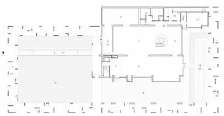
一层平面 图1st floor plan
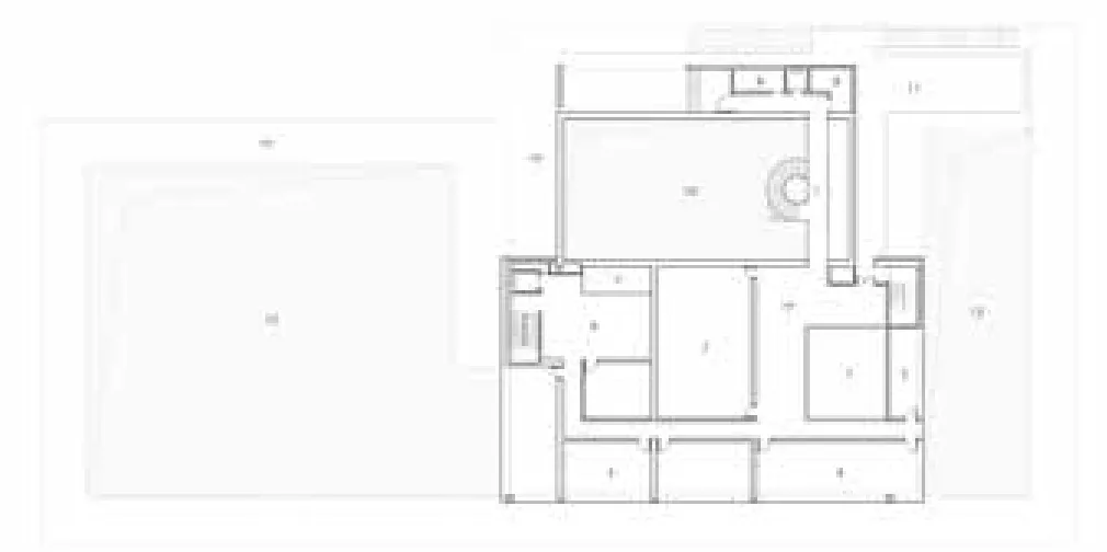
二层平面 图2nd floor plan


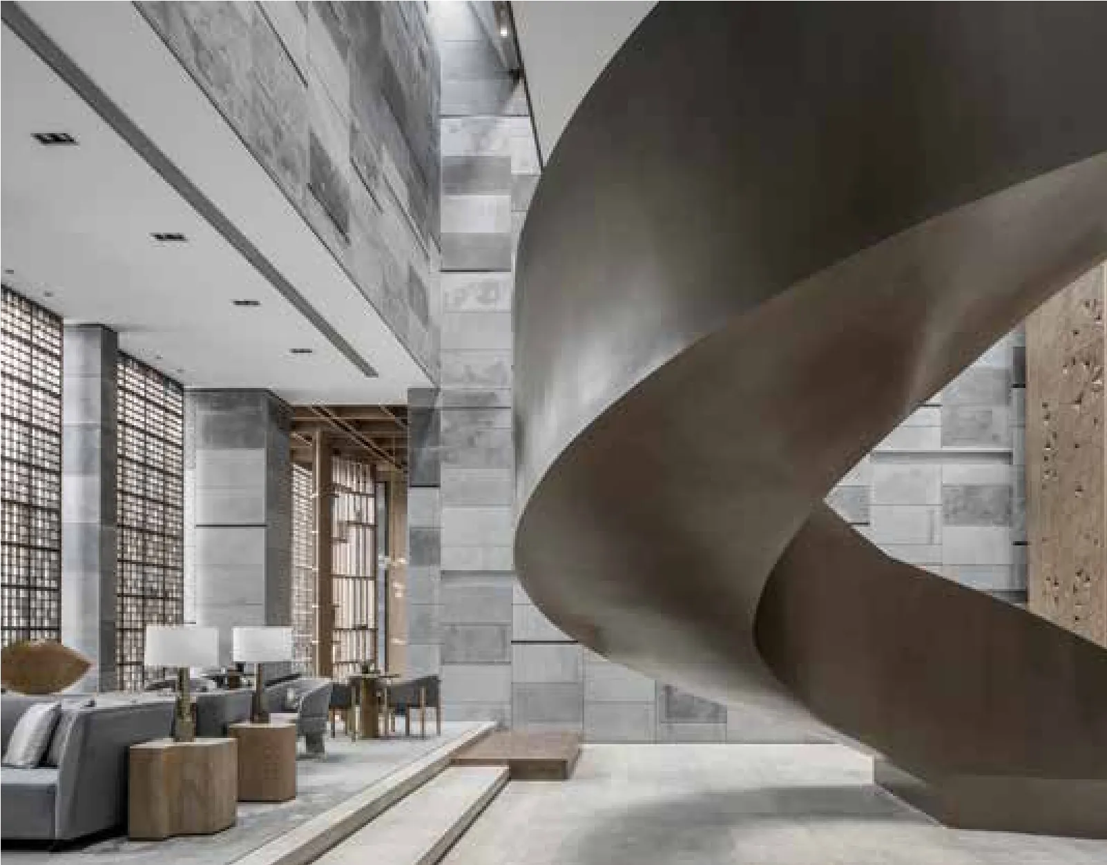
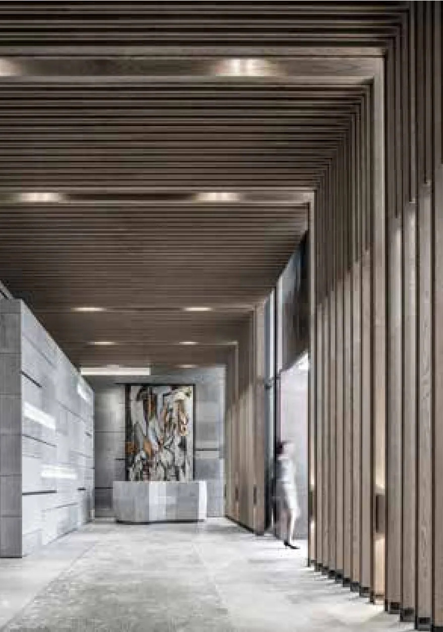
当人们穿越“弦道”,在屋檐之下推开大门,首先来到一个由一片对景实墙界定的门厅,门厅北侧是小展示厅,这是进入中厅的一道转折空间,中厅是更大尺度的展厅,两层高,通过天窗为空间带来自然光,经过屋顶折板的过滤,被塑造成数条光线,落在墙上,在一天之中,可以形成不同方向以及粗细的变化,如日晷般记录时间的流逝。底景是螺旋楼梯和二层的廊桥,廊桥穿越中厅,连接两个不同的能空间,上下两层的人,在这里也能形成交流和对话。
由天窗龙骨与混凝土密肋梁组合形成的天窗构件,两者离缝的设计,在中午时分,能形成粗细不同的两道光线,构件截面的方向和组合方式,能为早上提供更大的入射角,而下午则是较小的入射角,从而遮挡掉大部分西晒。
东面和南面作为侧厅,提供水吧、洽谈和阅览等功能,与外部庭院关联,是室内外空间的延续和渗透,尤其是南面的灰空间,作为儿童的趣味性活动场地,进一步加强了这种延续关系。两个侧厅的外墙上,我们适当地将墙柱的设计语言进行引申。整个空间中,我们并没有强调轴线与仪式感,而是利用转折与进深表现空间的流动性。二三层由大小不同的教室构成,教室围绕两层通高的庭院布置,庭院不仅是室外活动空间,也为教室带来更好的自然采光的通风。
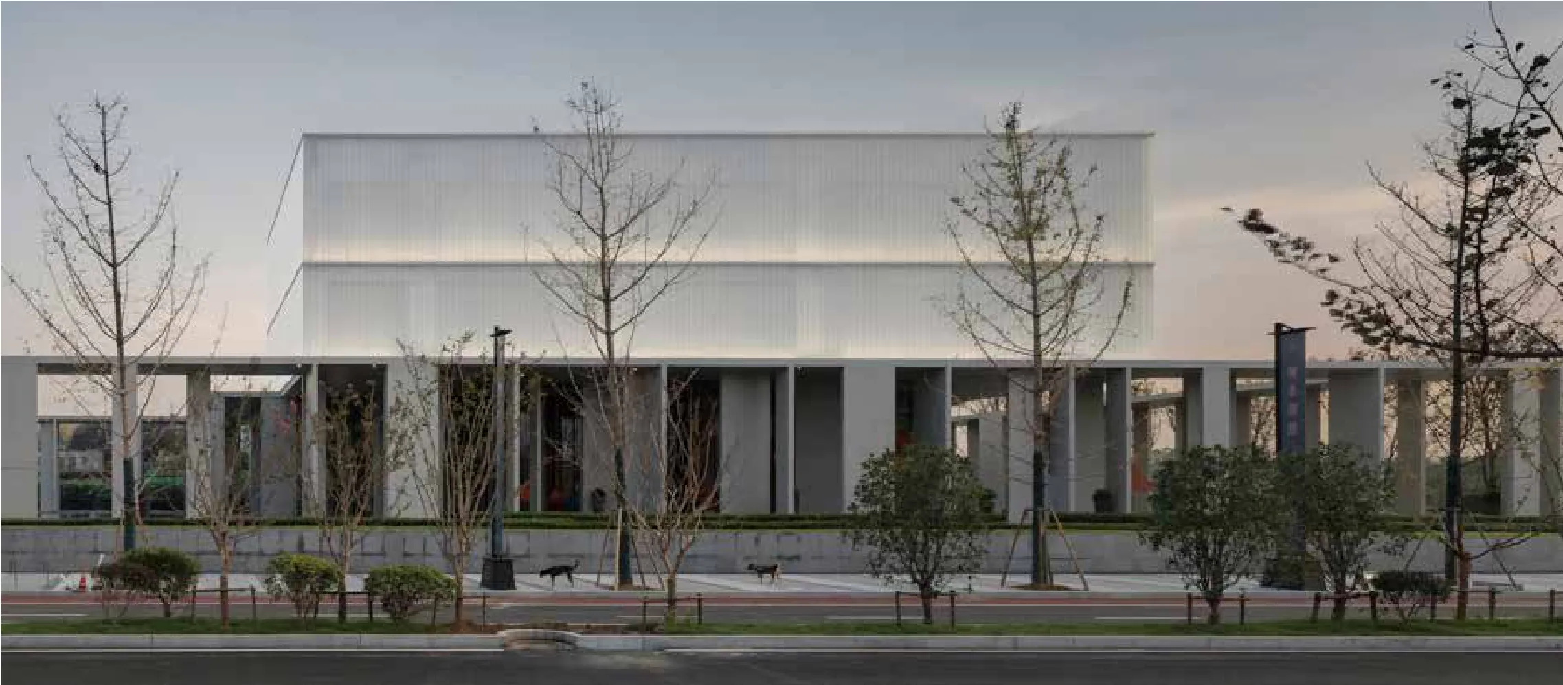
在材料的选择上,我们根据建筑体量与功能进行清晰的划分,一层的清水混凝土和二、三层的U型玻璃,一轻一重,一虚一实。清水混凝土表面光洁,质感朴素而坚实,而我们通过“墙廊”这种特殊的构成方式形成一个既稳健又开放的界面;漫反射的U型玻璃质感温润,而我们则将其作为建筑主体空间的包裹面,使之呈现出一种“半透的体积感”。二者不会形成强烈的反差,却能在不同的光线变换下演绎出丰富的温度和表情。
When people cross the "crescent path ", and push the door open under the eaves,they first come to the hall defined by a piece of scenery wall, in the north of the hall is a small exhibition room, which is a transition space into the central nave, and the central nave is a larger scale exhibition hall, two-storey high, with natural light coming into the space through the skylight, and after being filtered by the roof plate it is shaped into a plurality of lights, finally falling on the wall, in a day, it can change in different directions and thickness, like a sundial recording the passing of time.The background is a spiral staircase and bridges on the second floor which crosses the central nave, connecting two different space, so that people on the first floor and second floor can make exchanges and dialogue here.
The skylight components formed by the roof keel and concrete ribbed beam, thanks to the open joint design, form two rays of different thickness at noon, and the direction and combination of the component section can provide a greater incident angle in the morning and a smaller incident angle in the afternoon, thereby blocking out most western exposure.
As the side hall, the east side and south side provide water bar, negotiation and reading and other functions, and is the continuity and penetration of indoor and outdoor space by connecting with the outer courtyard, especially the gray space in the south, as the Children's playground, further enhancing the continuation relationship. On the exterior wall of the two side halls, we appropriately extend the design language of the wall column. In the whole space, we do not emphasize the axis and the sense of ceremony, but use the transition and depth to show the mobility of space. The second and third floors are made up of classrooms of different sizes, and the classrooms are arranged around the two-floor-high courtyard. The courtyard serves not only as an outdoor activity space, but also brings better ventilation and natural lighting for the classrooms.
In the choice of materials, we make clear division according to the building form and function, with concrete for the first floor and U type glass for the second floor and third floor, integrating the light and the heavy, the virtual and the real into an organic whole. The concrete surface is smooth, simple and solid, and the special wall corridor form a stable and open interface; and the U type glass of diffusere flection is moist in texture, which is made into the wrapping surface for main building space,displaying a "semi-transparent volume sense". The two will not form a strong contrast, but can generate rich temperature and expression in different lights.
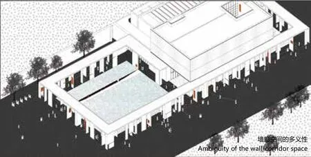
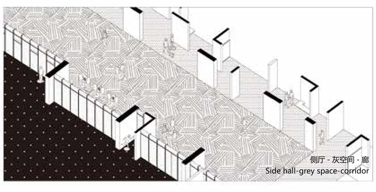

墙-廊Wall-corridor

基本单元与组合Basic unit and combination
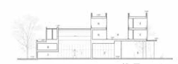
剖面图 1 Section 1

剖面图 2 Section 2

天窗详图Detail drawing of skylight detail

屋顶天窗与光影变化Roof skylights and changes in light and shade

