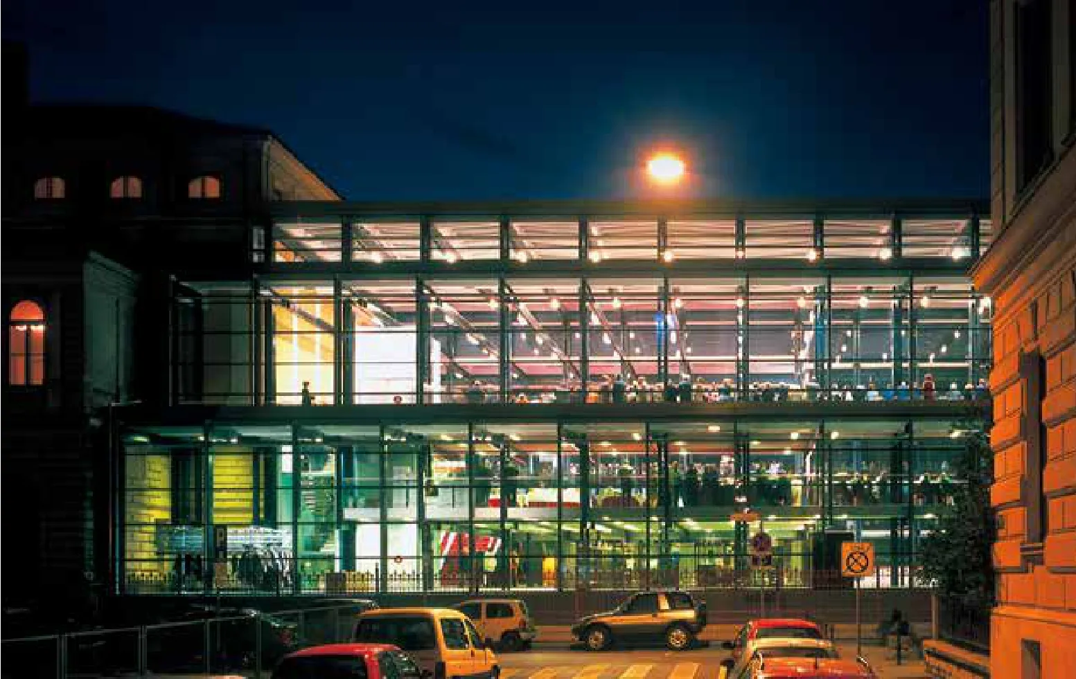
国家美术馆中心部分
2017-12-27斯洛文尼亚卢布尔雅那
斯洛文尼亚卢布尔雅那
国家美术馆中心部分
Central Part of the National Gallery
斯洛文尼亚卢布尔雅那
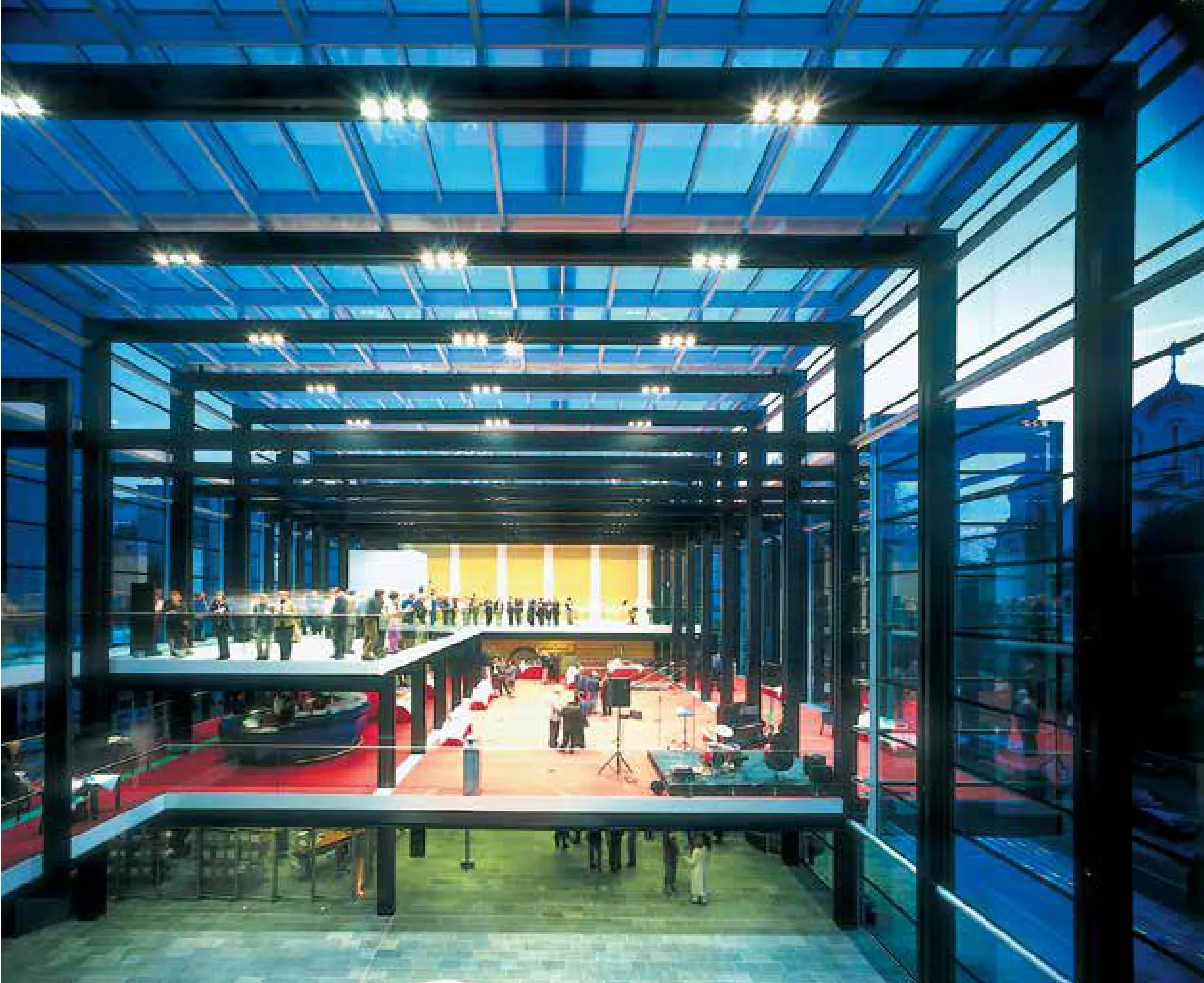
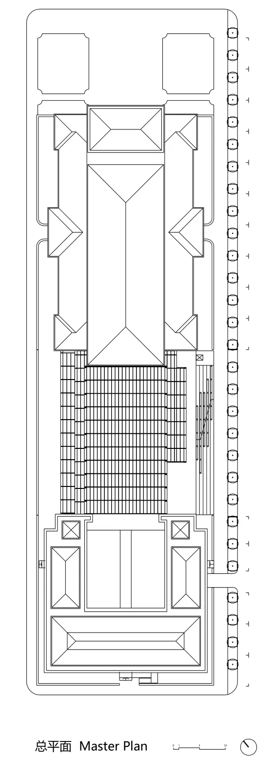
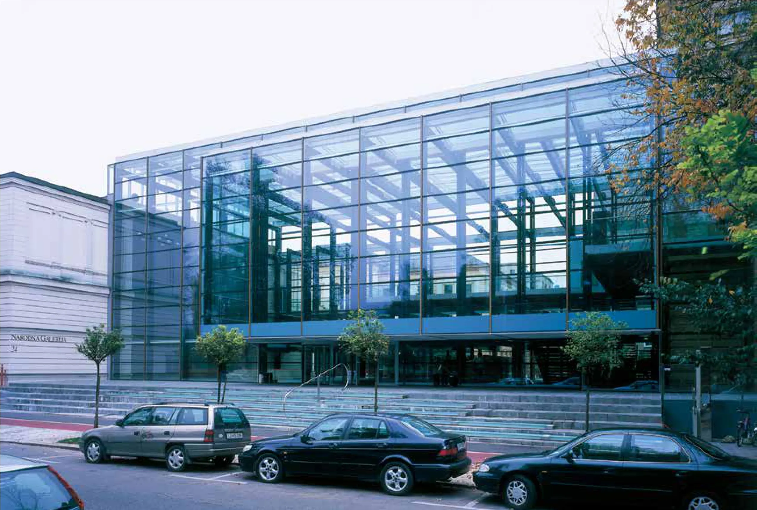
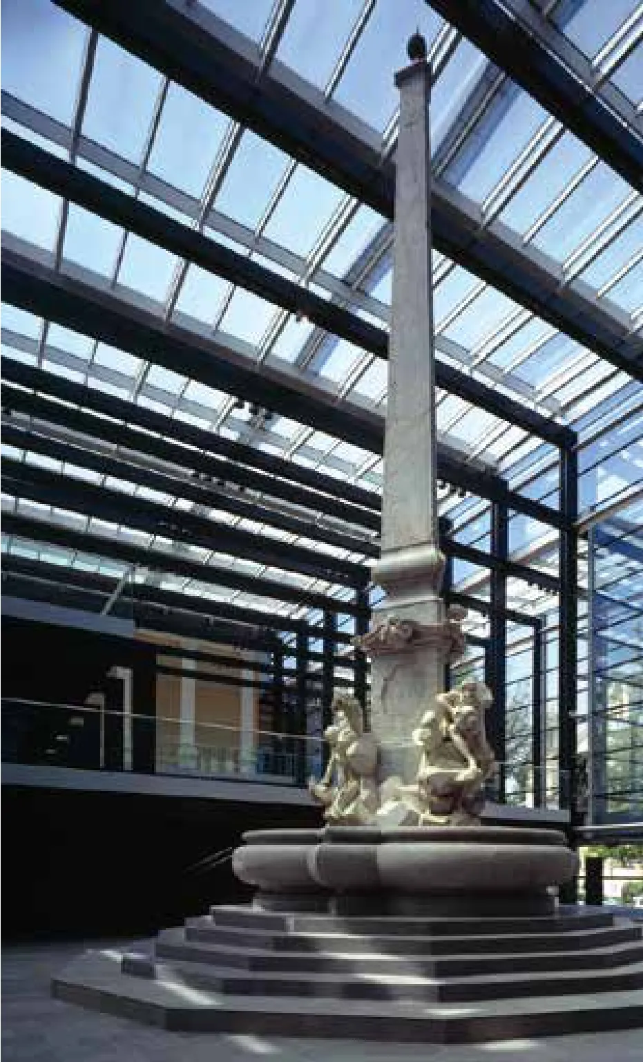
项目的主题是将国家美术馆现有的两幢建筑连为一体,为具历史纪念意义的罗巴喷泉设计安置场地,以及规划一块独立的场地供美术馆举办公共活动(开幕式、会议等)。改造后,两幢建筑间原有的距离不复存在,这似乎有些荒诞和不合理。该项目完全是一个独立的解决方案,即使建筑间的距离不同于此,仍然能够解决这一问题。两幢建筑间的土地原先被设计成一座花园,从视觉上将市中心与蒂沃利公园连接在一起。建设方要求在尽量不破坏这一视觉效果的前提下进行改造,因此,新翼楼的占地面积、高度、朝向和通透度已被事先设定。美术馆位于非主干街道的尾端,这使得游客很难找到大门的位置所在。两幢建筑间的翼楼起到入口的作用是,既可用作活动举办场所,斯洛文尼亚巴洛克式建筑最杰出的建筑遗产之一—罗巴喷泉(1743-1751年)亦坐落于此。考虑到国家美术馆原有的两幢翼楼内已设有普通的艺术品展馆,我们并未将新翼楼设计成展馆,而是尽量通过控制光线、视野、室内环境和湿度,赋予其明显不同的氛围。由于新翼楼自身是一个有着不同氛围的大空间,穿梭于两幢旧翼楼之间的游客可以在此驻足小憩,眺望远处,体验卢布尔雅那的大千万象,抑或观望美术馆往来不息的人群,又或欣赏罗巴喷泉。因而,新翼楼与现有美术馆封闭的建筑风格完全不同。入口大厅处具历史纪念意义的巴洛克式罗巴喷泉一改原有的中心位置,不再被束缚于这座历史悠久的古城的中心,游客们不再将其视作城市的装饰品,而是纯粹的艺术品。我们使用三组钢结构件在水平视野方向搭建了一个简单和开放的空间,而在垂直方向搭建了一个更为复杂的空间。尽管新翼楼实质上是一间大房间,但穿梭于不同楼层之间,游客会感觉到空间品质在不断发生变化,我们将其称作影像结构效应。我们额外新建了一个楼层用作活动举办场地。新增的夹层使得整个空间在高度上更为复杂,同时赋予美术馆新的功能,将其转变为卢布尔雅那别具一格的公共客厅。新翼楼分三层向外延伸,即现有翼楼、夹层(作为活动举办场地并铺有红地毯)和顶层(连接两幢建筑的艺术展馆,整个楼层采用中性色调)。我们在设计时特意相对降低了入口空间的高度,以便与无边无际的天空形成反差。游客进入美术馆前依次经过的接待室、衣帽间和零售商店,天花板的高度同样较低。但当游客一踏上通往下一层(夹层公共空间)的楼梯后,天花板的高度骤然升高。这将空间分为三个层次——外部的公共空间,入口层的空间较低,到了夹层后,层高变高,公共空间变大。
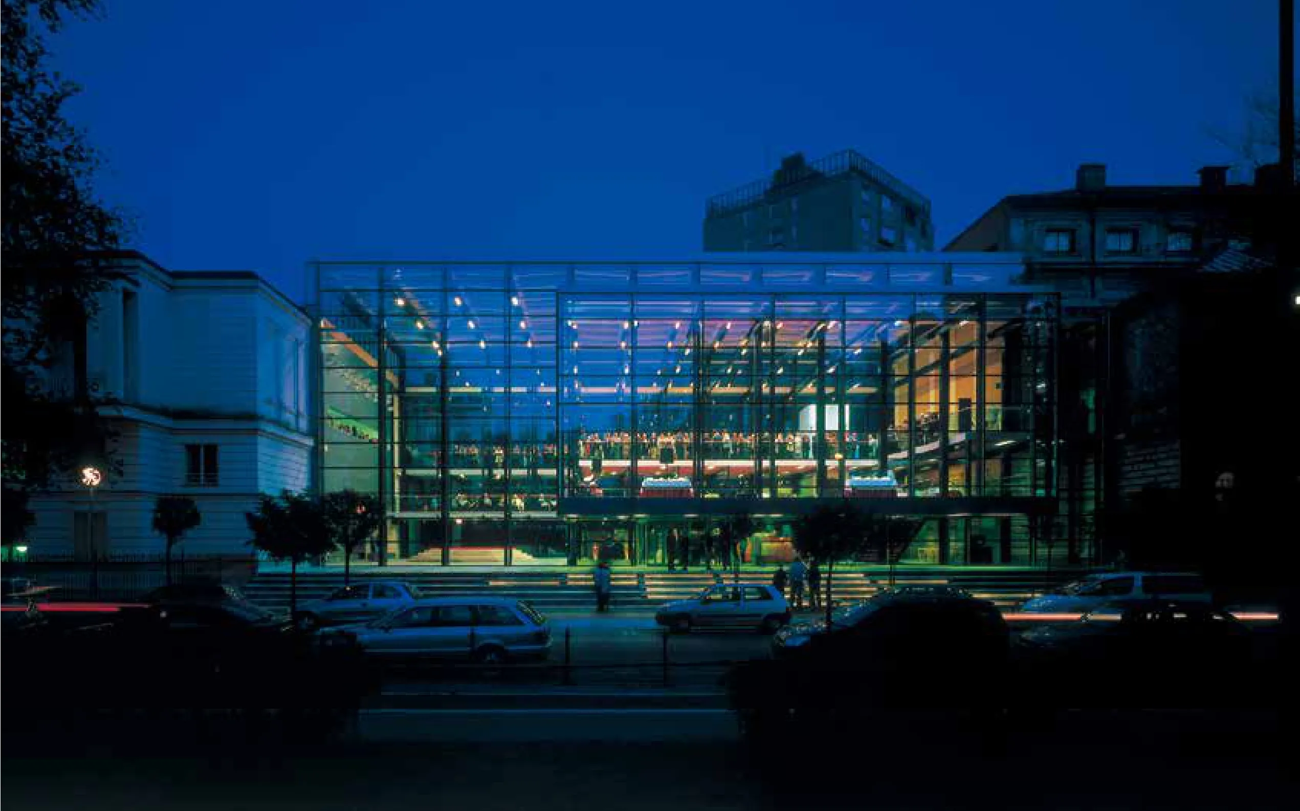
由平行拱肋组成的轻型钢结构搭建成的手风琴状钢架充分保证了新翼楼的通透度,而且不论是由外向内看,还是由内向外看,都能够收获变化多端的景象。钢结构外表由玻璃嵌板包围,两层玻璃嵌板中间是高强度垂直结构件和最低强度水平结构件。两层玻璃部件之间加入由单块面板支撑的特殊双层玻璃部件。三组碳钢结构发挥着多项功能,除支撑建筑物和幕墙外,还负责容纳电气、照明、通风和供暖系统。钢结构框架被着重涂上黑色,强调其作为美术馆主体空间的特点。然而在今天看来,原先设计为问讯处的两个庞大物体(橘黄色吧台和接待处),旨在转变美术馆庄严的气质,增添其幽默色彩,可能已经失去了原有的意义。另一方面,我们通过该项目探索获得的影像结构原理,或者说是通过结构部件赋予某个场所故事感,已被我们用于后续承接的多个设计项目中。
The theme of the project was the linkage of two existing National Gallery buildings, and the development of a place for the monumental Robba fountain, as well as an independent place for the museum’s public events (openings, meetings). The project eliminates the indeterminate distance between the two buildings, deemed to be absurd and irrational. It represents an independent solution that works even if this distance were different.
The plot for the interstice was previously occupied by a garden that permitted a visual connection between the city center and the Tivoli Park. The brief called for a structure that would retain as much of this view as possible, so that the footprint, the height, the orientation, and the transparency of the new wing were predefined. Its location at the end of a street that is not the main artery made itdifficult to find the right spot for the main entrance. The interstice wing functions as an entry and event space, and the space where the Robba Fountain (1743-51), one of the most important pieces of Slovenian Baroque heritage, is exhibited. Whereas the two older wings of the national gallery contain generic galleries for displaying works of art, with controlled light, views, climate, and humidity, the interstice wing is not an exhibition space, a fact that we tried to express by giving it a tangibly diferent atmosphere. The new wing feels different from the enclosed condition of the existing museum as it is one large space featuring diverse micro ambiances, where visitors moving from one building to the other can pause,breathe, look out, and experience a set of ever-changing perspectives of the city, people inside and outside the building, and the fountain. The focal point of the entrance hall, the monumental Baroque Robba Fountain, is positioned o ff center in the space, and thus liberated from its specific central location in the old historic city, enabling visitors to see the monument in a different lightnot just as a part of the city decor, but as an autonomous work of art. We used three sets of steel frames to create a plain, open space in the direction of the view and a more complex space in the longitudinal and vertical directions. Even though the new wing is essentially one big room, one sense the constantly shifting spatial qualities when moving through the different floors: we call this the effect of the cinematic structure. We also introduced an additional floor, which can be used as an event space. This mezzanine floor makes the space more complex in terms of heights and introduces an additional program to the gallery, which turns it into a kind of public living room of Ljubljana. The interstice part extends over three floors: the existing wings; the mezzanine floor as the event space with red carpet flooring; and the upper floor connecting the gallery spaces of both buildings, with a neutral colored floor. We played with the height of the entrance space, which we made relatively low,to create a contrast to the unbound sky outside. The reception area, wardrobe, and shop, which form a preparatory spatial sequence for visitors entering the museum, also have lower ceilings. But once visitors proceed to the stairs leading the next level, to the open space of the mezzanine-the ceiling height increases dramatically. This creates a three-fold sequence of open space outside, followed by the low space of the entrance, and leading on to the higher and more open space of the mezzanine.The light steel structure consisting of parallel ribs that form an accordion-like series of frames lends the interstice maximum transparency and provides ever-changing views from both the outside in and the inside out. This structure is completely enveloped in glass panels with emphatic vertical and minimal horizontal structural elements between the two layers of glazing. Special double-glazed units were developed together with the support of a single panel is integrated into space between two glazing units. Three sets of black steel frames have several functions. Besides supporting the building itself and its curtain facade, the frames house the electrical, lighting, ventilation, and heating systems. The structural frames are accentuated with the dark color, thus making the structure the main spatial feature of the gallery. From today's perspective, the two over sized orange objects of the bar and the reception desk, which we intended as points of orientation and as a humorous addition to disrupting the solemnity of the space, may have lost some of their former meaning. On the other hand, the principle of a cinematic structure, or the idea of giving a story to a certain space through its structural elements, which we explored with this project, is a concept that we have used in many subsequent commissions.
