什切青爱乐音乐厅,什切青,波兰
2016-04-09建筑设计巴罗齐韦加建筑事务所ArchitectsBarozziVeiga
建筑设计:巴罗齐/韦加建筑事务所Architects: Barozzi/Veiga
什切青爱乐音乐厅,什切青,波兰
建筑设计:巴罗齐/韦加建筑事务所
Architects: Barozzi/Veiga
Szczecin Philharmonic Hall, Szczecin, Poland, 2014
爱乐音乐厅的建筑是一个复杂的综合体,位于过去的音乐厅建筑所在的基地上,内部容纳一个演奏厅和一个室内乐厅。项目具有很高的综合性,和周边的环境具备相近的特性。建筑的体量、竖直的线条和屋顶的形状都是让音乐厅能与城市街区融为一体的重要内容。
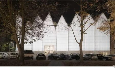
建筑四周的沿街面和屋顶的形状借鉴了中欧地区表现主义建筑的一些形式,具有卓越的表现力。
从外部看,玻璃幕墙使建筑的体量显得非常轻——外表在形式上根据内部功能时而透明、时而不透明。而在建筑内部,沿建筑外围设置的密集的服务区和交流空间创造出建筑与其外部的紧密联系感,同时也留出一大块空白空间供核心部分的交响乐厅和室内乐厅使用。
与建筑物简朴的外观形成鲜明对比的,是内部的主音乐厅如同打造金饰般精心雕琢的华丽外表,这也符合中欧地区音乐厅的传统形式。音乐厅内兼具观赏性和功能性的装饰都采用金叶子覆盖的形式,并且都由当地的工匠来手工打造。出于声学上的考虑,这些装饰元素到舞台的距离均按照斐波那契数列分段设置。
与过去的类似项目相比,什切青音乐厅的设计如同其平面展现的特质一样,体现了高度的自主性。设计希望让建筑既是它所在的环境中的一个部分,同时又能具有独立于环境的不一样的性格。因此,设计不希望发明新的东西,而是试图从根本上再次发现已经存在的事物,挖掘它们新的特质。□(司马蕾 译)
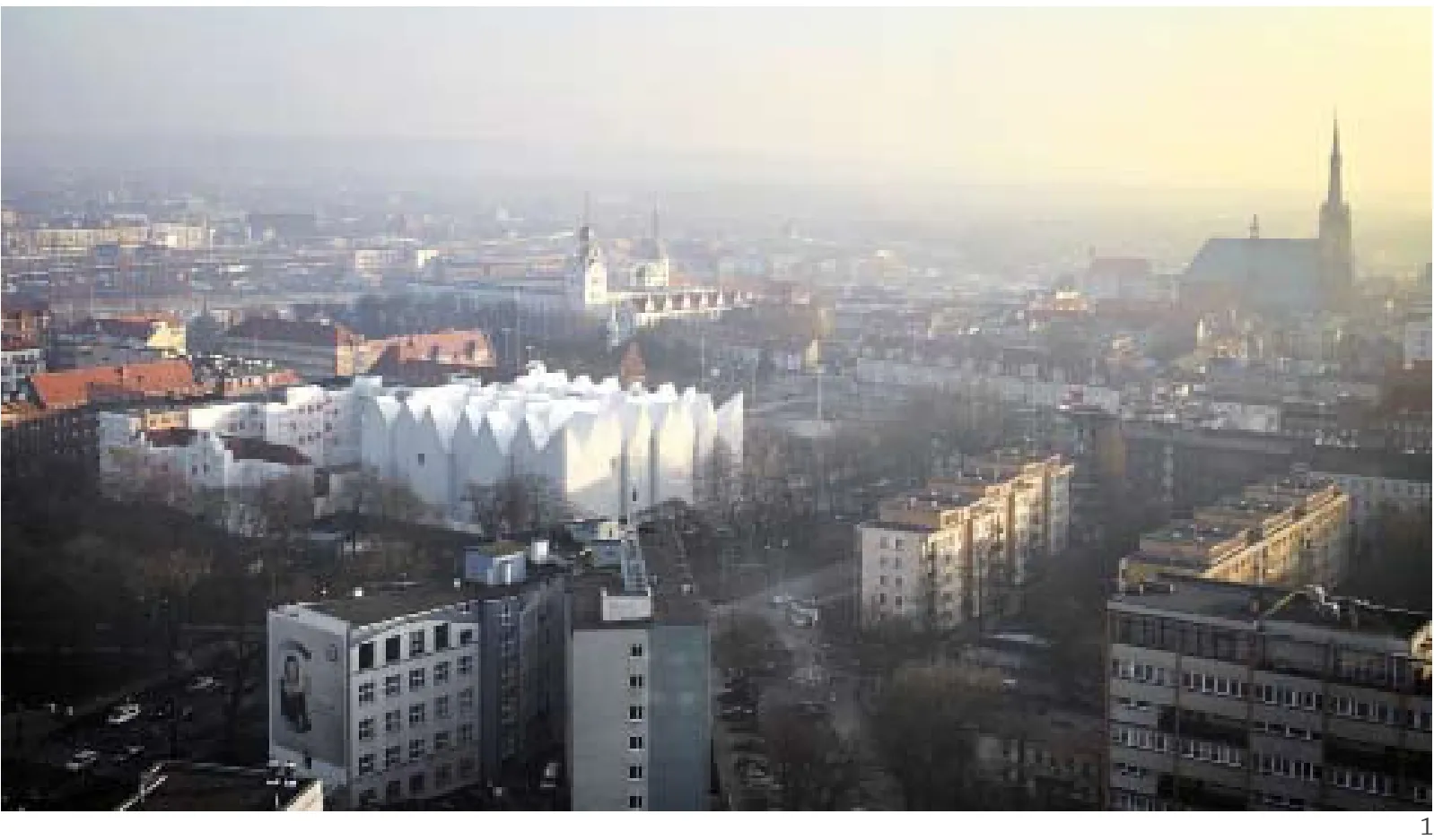

1 鸟瞰/Aerial view
2 爱乐音乐厅立面/Faćade, Philharmonic, Hall
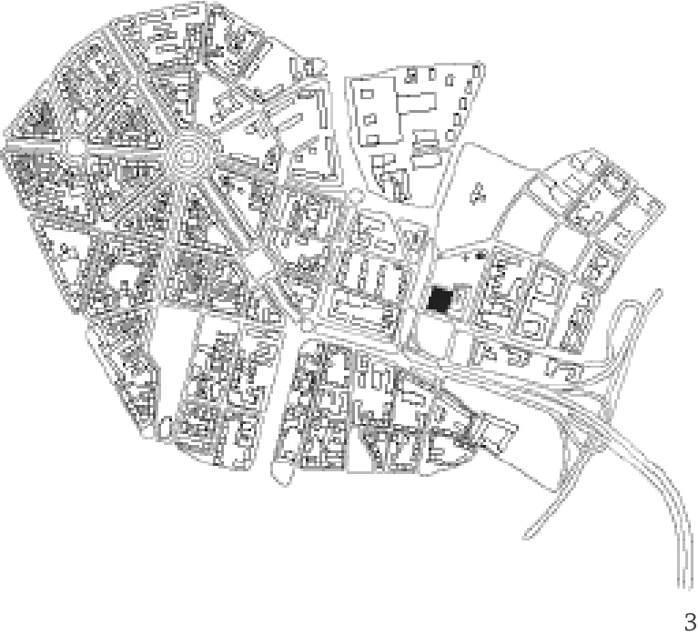
3 总平面/Site plan
项目信息/Credits and Data
主持建筑师/Authors: Fabrizio Barozzi, Alberto Veiga
项目负责人/Project Leaders: Pieter Janssens, Agnieszka Samsel
项目团队/Project Team: Marta Grządziel, Isaac Mayor, Petra Jossen, Cristina Lucena, Cristina Porta, Ruben Sousa
当地建筑师/Local Architects: STUDIO A4 Sp. z o.o., Jacek Lenart
结构工程/Structural Engineers: BOMA S.L., FORT POLSKA Sp. z o.o.
设备工程/Installations: GLA Engineering Sp. z o.o., ELSECO Sp. z o.o., ANOCHE Iluminacion Arquitectonica
声学设计/Acoustics: ARAU ACUSTICA
幕墙设计/Facade: Ferres Arquitectos Y Consultores
总承建方/General Contractor: WARBUD S.A.
音乐厅容量/Concert Halls Audience: 交响乐厅/Symphony Hall: 951; 室内乐厅/Chamber Hall: 192
基底面积/Site Area: 3800m2
使用建筑面积/Usable Floor Area: 13,000m2
体积/Volume: 98,200m3
设计竞赛时间/Competition: 2007
预算/Budget: 118,918,000 Zloty (approx. €30,000,000)
开工时间/Start of Construction: 2009
竣工时间/Completion: 2014
摄影/Photos: Simon Menges

4 爱乐音乐厅转角/Main corner, Philharmonic Hall
The Philharmonic Hall that houses a concert hall and a chamber music hall is a very complex building with the same space as the former music building. This is a synthetic project that shares identifiable traits with its surrounding context. Mass, verticality and the shape of the roo fl ines are dominant, connecting the hall with the rest of the city.
The expressive preeminence of the building, concentrated along its perimeter and the pattern that shapes its roof, results from the influence of some of Central Europe's expressionist architecture.
From the outside, the building is perceived as a weightless volume in which the glass facadesometimes translucid, sometimes opaquetransmits expressive qualities depending on the building's use. On the inside, the concentration of the service areas and communication elements along the perimeter creates a sensitive relationship of the building with the exterior while at the same time it delimits a large open space, set aside for the symphonic and chamber music halls to play their main roles.
The apparent austerity of the ensemble stands in sharp contrast with the expressiveness of the main hall, which is conceived as a piece of goldsmith work, in line with the classic approach of Central European concert hall design. The décor-both ornamental and functional, a gold-leaf covered element, has been carried out thanks to the existing local craftsmanship. For acoustic reasons, this element's degree of fragmentation follows a Fibonacci sequence in relation to its distance from the stage.
In contrast to previous projects, Szczecin is designed with the aim of achieving the maximal degree of formal autonomy, like the plan shows. The idea was to materialize a building that is both a speci fi c part of its context and independent from it at the same time. Accordingly, the point was not to invent something, but fundamentally to discover what already exists and reveal a new reality.□
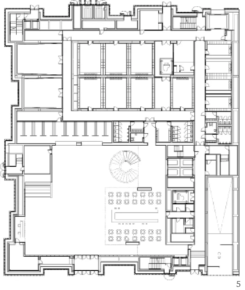
5 首层平面/Floor 0 plan
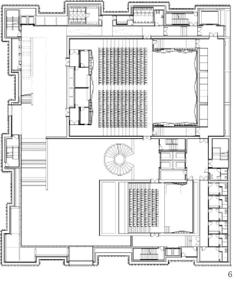
6 二层平面/Floor 1 plan
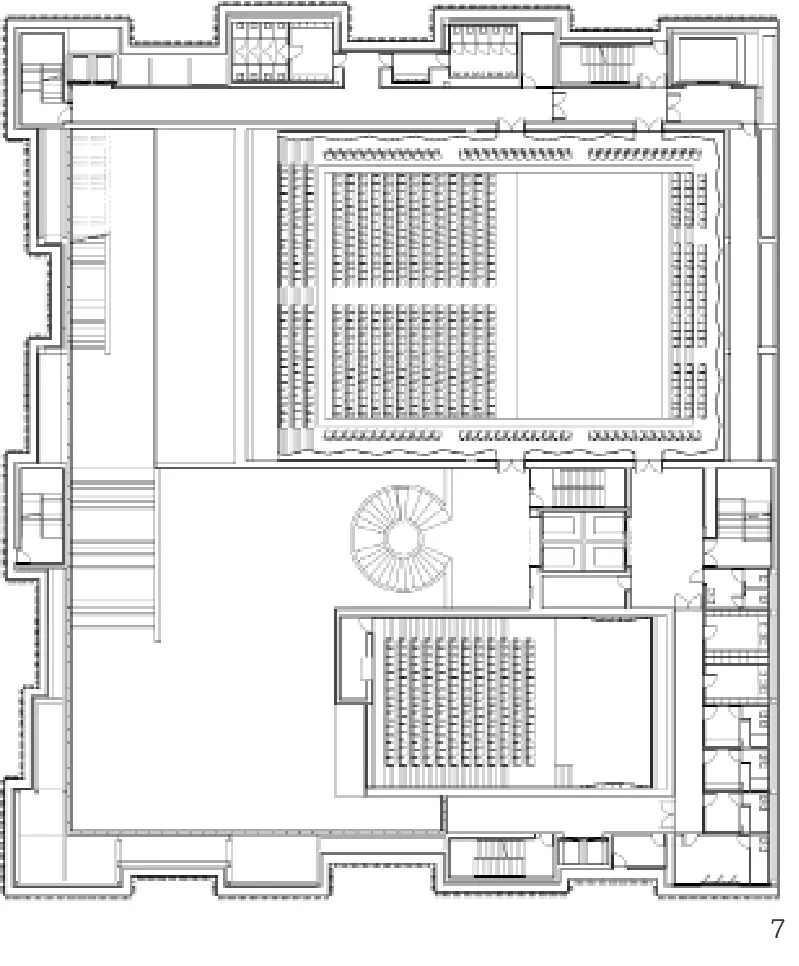
7 三层平面/Floor 2 plan
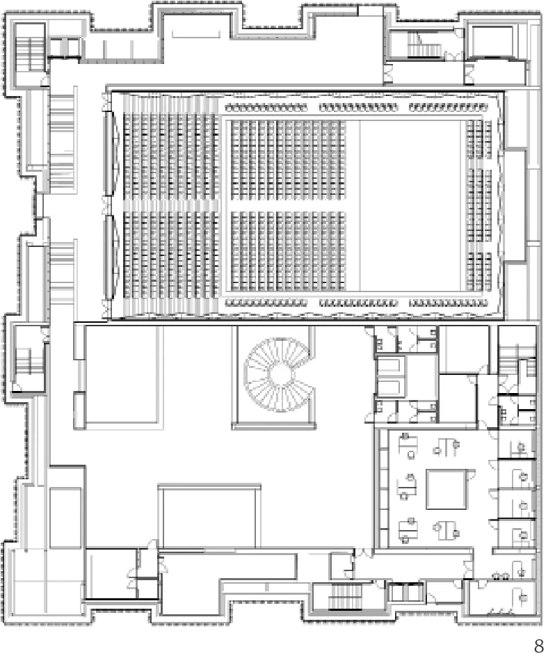
8 四层平面/Floor 3 plan
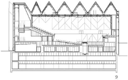
9 交响音乐厅剖面/Section, symphony hall
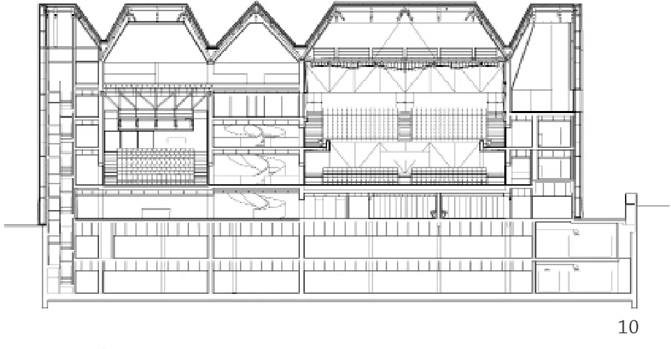
10 交响乐及室内音乐厅剖面/Section, symphony and chamber halls
11 爱乐音乐厅夜景/Night exterior view, Philharmonic Hall
评论
卢向东:正如设计者所申明的那样:设计不希望发明新的东西,而是挖掘已存在事物的新特质。在这个想法下,设计在“听觉”和“视觉”两个层面展开,其中“听觉”主要关乎音乐厅的厅堂设计,而“视觉”主要关乎建筑的形式设计。
如果想要发明新的音乐厅建筑的厅堂设计,了解音乐厅建筑历史的人会明白那是一件极其困难的事情。至今比较成功的音乐厅厅堂模式是鞋盒音乐厅,而其他诸多音乐厅模式的探索却很难达成共识——这很大程度上是由于厅堂的声学设计所决定的。因此,在这个建筑中,设计师很坦率地接受了音乐厅建筑的历史成果,即鞋盒音乐厅,并且精心打造了室内声学设施——手工制作的金叶子扩散体。
建筑的形式,尤其是屋顶形式显然与周边的建筑相似,考虑了与城市环境的对话,且富有表现力。
总之,这是一个“视觉”和“听觉”兼顾、推陈出新的设计。
Comments
LU Xiangdong: Just as the designer has stated: the project was not meant to make new inventions, but to explore new characteristics of things already in existence. The overall design unfolds on two levels: the acoustic, which is mainly about the auditorium design, and the visual, which largely concerns the design of forms.
Those who know the architectural history of music halls will see that it would be extremely difficult to invent new forms of auditorium. So far a successful type of music hall has been the "shoebox" model; by comparison, experiments with other models have hardly reached any consensus, as the auditorium design is largely dependent on its acoustics. Thus in this project the architect frankly accepted the historical result of music hall architecture, namely the "shoebox" model, and carefully forged the interior acoustic facilities: handcrafted gold-leaf di ff users.
The architectural form has taken into account of the building's dialogue to its urban setting, as revealed in the expressive roof form that bears obvious resemblance to nearby buildings.
Overall, this is a novel design rooted in old model, integrating the visual with the acoustic.
鲍威:莱昂内尔·费宁格的绘画,将欧洲城市最典型的大教堂抽象成了简单的几何体,作品即为形式与色彩的构成。本案与这种表达想法如出一辙,但这里的建筑更加抽象,干脆将色彩也去掉,变成纯净的白色。而唯一让人们可以找到尺度感的就是建筑表皮:垂直向的格栅更加强调竖向的感觉。表皮与建筑室内功能完全脱开,成为极具表现力的元素。这与什切青这样的欧洲城市极为融合,无论是在建筑符号上还是城市尺度上,这种做法无疑给了如何巧妙地用现代语言表达传统意向这一问题以有趣的解答。至于建筑的功能为音乐厅已不重要,或者说,也正是音乐厅这一完全封闭的建筑功能,使其在外形上有如此任性的表现。
BAO Wei: It seems that the architectural expression of this project is paying homage to the paintings of Lyonel Feininger: European cathedrals are abstracted into the composition of simple geometrical shapes such as triangles and quadrangles, although here such e ff ort is pushed even further: it strips away the colors and substitutes them with pure white. To add to this expression, the skin of the building is totally detached from the interior by means of a whole vertical array of louvers, which not only accentuates the verticality of a cathedral image, but also reminds people of the scale of the building. This project fi ts very well into the urban context of the city of Szczecin in terms of both architectural image and urban scale - a rather interesting answer to the familiar question of how to articulate a traditional image with modern vocabulary. The fact that the building functions as a philharmonic hall becomes less important, or rather, it is precisely the enclosed function of the music hall that renders possible a carefree architectural expression on the outside.
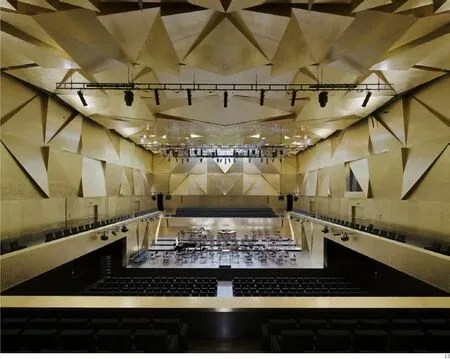
12 交响音乐厅主看台视角/View from the main balcony, symphony hall
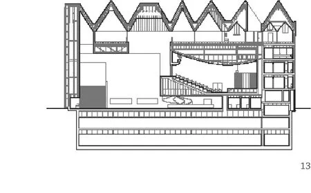
13 室内音乐厅剖面/Section, chamber hall
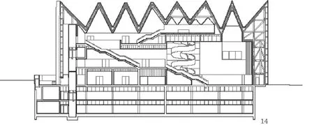
14 主楼梯剖面/Section, main staircase

15 爱乐音乐厅转角/Main corner, Philharmonic Hall
