挪威斯诺赫塔建筑事务所 THE DESIGNFIRM 设计事务所
2015-09-01责任编辑甘海星
责任编辑:甘海星
挪威斯诺赫塔建筑事务所 THE DESIGNFIRM 设计事务所
责任编辑:甘海星
挪威斯诺赫塔建筑事务所
事务所简介 Company Presentation
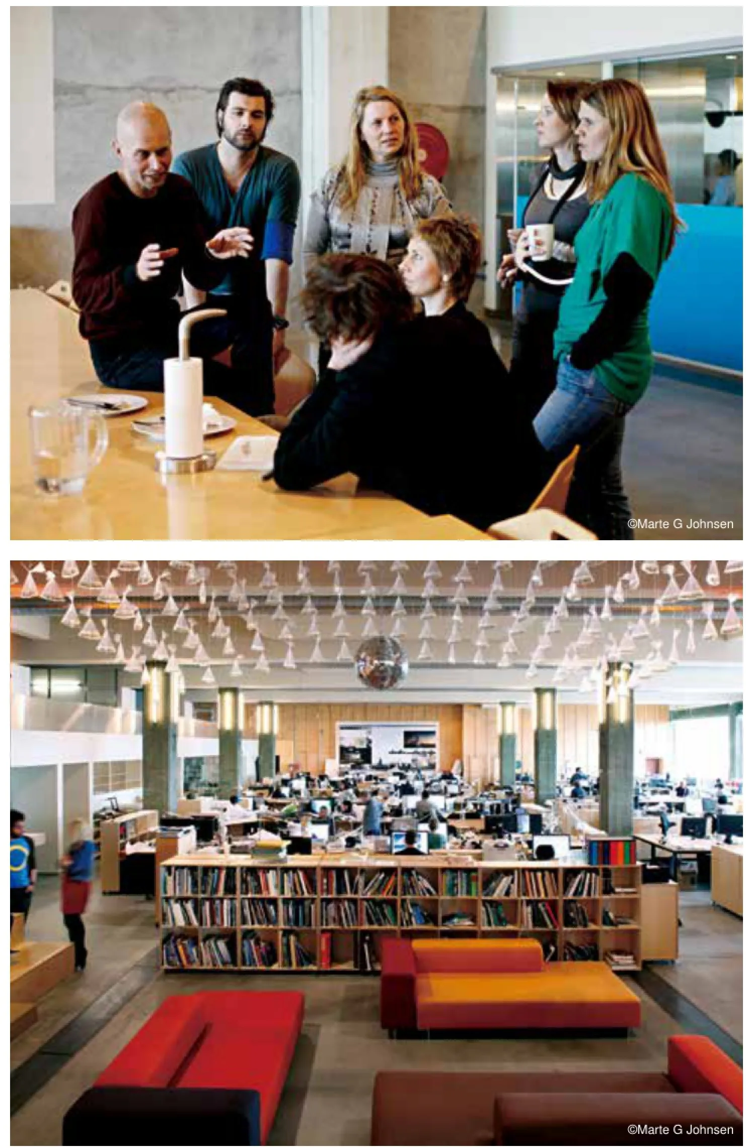
挪威斯诺赫塔(Snøhetta)建筑事务所是一家从事建筑结构、园林建筑、室内设计和品牌设计的国际公司,自1989年成立以来屡获殊荣。其设计原则侧重于跨学科的多行业协作,根据每一项目的具体情况提出不同的设计方案。重视多元化背景与文化也是其建筑设计实践的重要特征。斯诺赫塔建筑事务所由来自世界各地的设计师和专业人士组成,这正反映了这一价值观。
斯诺赫塔建筑事务所实行传统工艺与尖端数字技术同时探索的工作方法——一种对他们的创作过程有促进作用的偶然联系法。设计工作室的核心是一流的艺术造型车间,配有3D原型快速制作设备及可编程制作机器人。这些工具与传统的木工机械相辅相成,使快速造型成为设计过程不可缺少的一部分,并能实现在模拟和数字世界之间进行无缝对接并来回变换的创意。
斯诺赫塔建筑事务所有两个主要工作室,分别位于挪威奥斯陆和美国纽约,目前拥有来自28个不同国家的160名员工。1989年,在赢得国际设计竞标之后,斯诺赫塔建筑事务所接到了其第一单业务——埃及亚历山大图书馆的重建设计。随后十年,又在挪威国家歌剧和芭蕾舞剧院项目中再次中标。2004年,斯诺赫塔建筑事务所受托设计美国纽约世贸中心遗址唯一的文化建筑——“美国911国家纪念博物馆”,并在纽约设立了一个常驻机构。斯诺赫塔建筑事务所目前正在参与遍布于欧洲、亚洲、非洲、大洋洲和美洲的50多个项目。
斯诺赫塔建筑事务所于2004年和2009年分别获得了阿卡汗建筑奖和密斯·凡·德·罗奖(Mies van der Rohe Award)。其挪威国家歌剧和芭蕾舞剧院设计方案,获2009年全球建筑奖之最佳文化建筑奖和2010年欧洲城市公共空间奖。
斯诺赫塔建筑事务所致力于园林建筑、建筑结构、室内设计和平面设计等方面的跨学科综合实践。通过研究与直觉相结合,将通常所认为的挑战化为机遇,并在创作过程中对社会和政治环境因素加以考虑,这正体现了他们设计的品质和实力。
斯诺赫塔的方法侧重于建筑与空间的对话,相互呼应。他们对场地固有特征和条件进行慎重考虑,从而得出确保每一设计的最佳切入点。真正有空间与内涵的项目往往带来令人惊喜的互动,创造新颖而永恒。
斯诺赫塔建筑事务所崇尚互动。他们的所有作品,无论是自然的还是人为的,都努力增强他们的空间感与存在感,以及他人和事务所所处物理空间的关系。艺术博物馆、驯鹿观测馆、城市场所和玩具屋都同样成为关注的目标。是物质而不是潮流在推动他们的设计思想。
在过去的25年里,斯诺赫塔一直致力于全球一些重要的教育、城市建设和文化项目。他们的优势是包容性工作方法、人际交往和社会可持续发展的价值观。该方法确保了针对具体场地提出具体解决方案,满足客户和用户对于引人入胜的公共空间的需求。
Formed in 1989, Snøhetta is an award-winning international architecture, landscape architecture, interior architecture, and brand design frm. The practice is centered on a trans-disciplinary approach where multiple professions work together to explore differing perspectives on the conditions for each project. A respect for diverse backgrounds and cultures is a key feature of the practice; refecting this value, Snøhetta is composed of designers and professionals from around the world.
Snøhetta’s working method practices a simultaneous exploration of traditional handicraft and cutting edge digital technology - a serendipitous relationship that drives its creative process. At the core of the design studio is a state-of-the-art modeling workshop equipped with 3D rapid prototyping capabilities and a large, programmable manufacturing robot. Alongside traditional woodworking machines,these tools enable rapid prototyping to become an integral part of the design processes, and allow ideas to move seamlessly between analogue and digital worlds and back again.
Comprised of two main studios, in Oslo, Norway and New York,USA, the practice currently has 160 employees from 28 different nations. In 1989, Snøhetta received its frst commission to re-invent the great Alexandria Library in Egypt, after winning an international design competition. This was followed a decade later by another competition-winning proposal for the Norwegian National Opera and Ballet. In 2004, Snøhetta was commissioned to build the only cultural building on the World Trade center memorial site, and a permanent offce was then set up in New York. Snøhetta is currently involved with more than 50 projects in Europe, Asia, Africa, Oceania, and the Americas.
In 2004 the company received the Aga Khan Award for Architecture,and in 2009 it was honored with the Mies van der Rohe Award. The World Architecture Award, best Cultural Building 2009, and European Prize for Urban Public Space in 2010, both for the Norwegian National Opera and Ballet.
Snøhetta is committed to an integrated trans-disciplinary practice of landscape architecture, architecture, interiors, and graphic design. The quality and strength of identity provoked by its designs is achieved by incorporating research with intuition, leveraging what are often perceived as challenges into opportunities, and factoring the social and political environment in the creative process.
Snøhetta’s approach focuses on the dialogue between building and place, each informing the other. The inherent character and conditions of any site are carefully considered to provide a sound point of departure for each ensuring design. Projects truly of place can foster meaningful and often surprising interactions, creating something simultaneously new and timeless.
Snøhetta values human interaction. All of its work strives to enhance its sense of place, identity, and relationship to others and the physical spaces Snøhetta inhabits, whether natural or human-made. Art museums, reindeer observatories, urban places, and dollhouses receive the same attention to purpose. Essence, rather than trends drive its thoughts.
For over 25 years Snøhetta has been working internationally on a number of important educational, civic, and cultural projects. Snøhetta's strength is its inclusive working methodology and values of human interaction and social sustainability. The methodology ensures a site-specifc solution is created that meets client and user needs for a successful and engaging public space.
挪威Karmøy渔业博物馆 Karmøy Fishing Museum
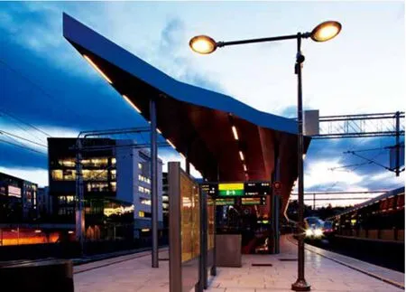
挪威吕萨克车站 Lysaker Station, Norway
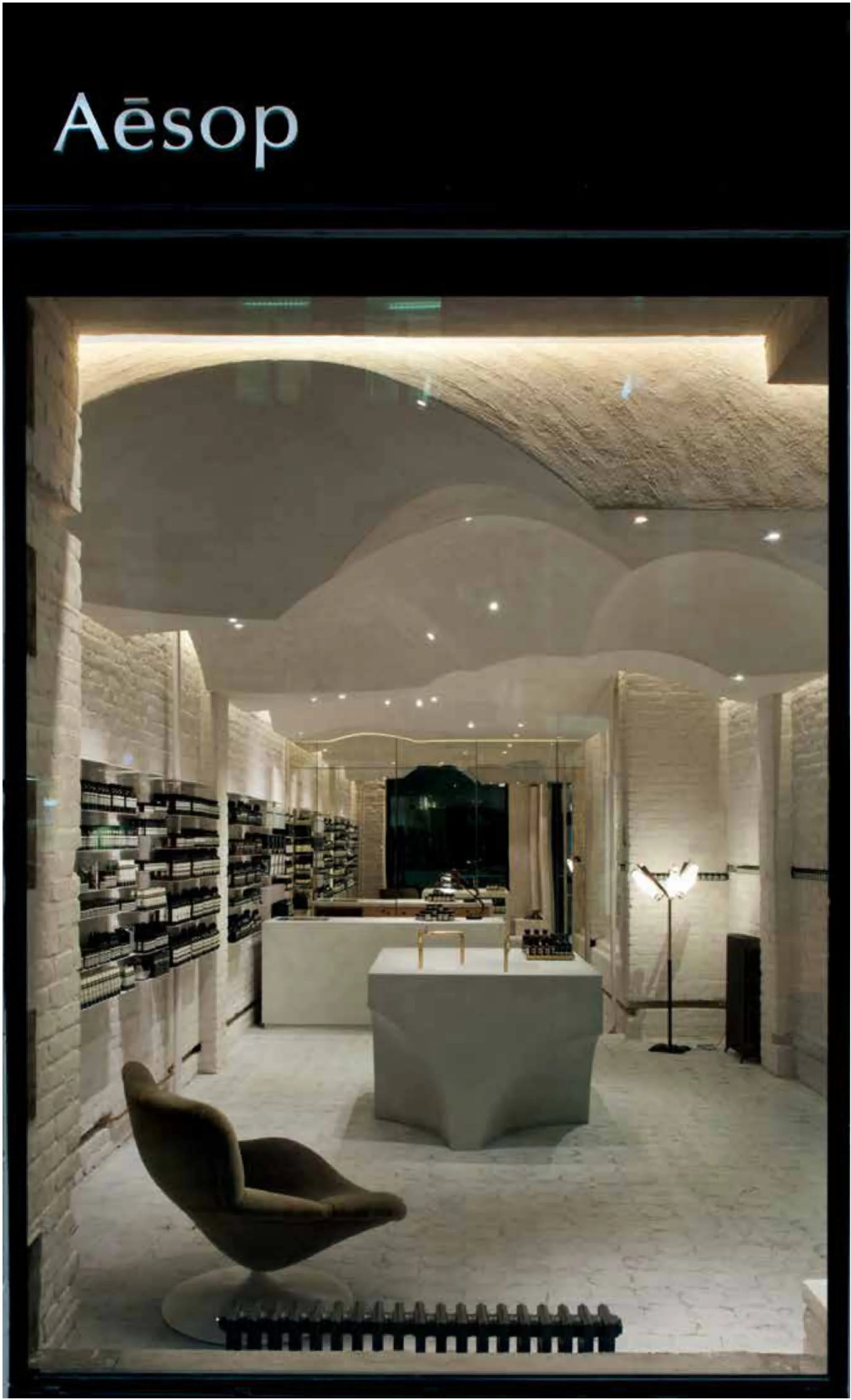
伊索商店室内设计
地点:挪威奥斯陆
业主:伊索商店
类型:零售商店
面积:66平方米
状况:2014年完工
设计范围:室内
Aesop
Location: Oslo, Norway
Client: Aesop Typology: Retail
Size: 66 m²
Status: Completed 2014
Scope: Interior
挪威国家歌剧和芭蕾舞剧院
地点:挪威奥斯陆
业主:教会和文化事务部
建设业主:Statsbygg(政府建设局)
最终用户:挪威国家歌剧和芭蕾舞剧院
项目状况:2008年完工
总面积:38 500平方米
绘图:斯诺赫塔建筑事务所
Location: Oslo, Norway
Client: Ministry of Church and Cultural Affairs
Building Client: Statsbygg (The Governmental Building Agency)
End User: The Norwegian National Opera & Ballet
Status: Completed, 2008
Gross Area: 38 500 m2
Drawings: ©Snøhetta
该歌剧院是中标方案的具体实现。竞标方案包含四幅图,分别解释了建筑的基本概念。
“防波堤”
歌剧和芭蕾在挪威是历史不长的艺术形式,这些艺术形式在全球随着环境而演变。Bjørvika半岛是港口城市的一部分,历史上是挪威与其他国家交流的大门。海洋的“彼”和陆地的“此”之间,看似具有真实的限制分界线,又好像具有象征性的门槛。这个门槛的实现形式为陆和海交汇线上的防波堤,实际意义是挪威和外部世界之间的联系界面,艺术与日常生活之间的交汇线。跨越门槛,艺术就融入公众生活之中。
“工厂化”
为参加设计竞标,我们制定了基本的设计方案。斯诺赫塔建筑事务所建议歌剧院的设施应建造为合理规划的自备“工厂”,在规划阶段以及投入使用后既有功能性,又有灵活性。规划阶段已证明这种灵活性极其重要:许多房间和套间按最终用户的意图进行了用途调整。这些改造虽然改变了建筑物的功能性,但不会影响结构。
“地毯”
投标方案要求,歌剧院应具有高标准的建筑质量,并表达出其象征意义。我们于是提出体现这一象征意义的创意:即全民团结、人人共享、平易待人和全面开放的理念。为了基于这一理念而体现其象征意义,我们希望能够让歌剧院以宽阔宏伟的气势出现在人们眼前,因而在建筑物顶部设计有“地毯状”水平面和斜面。这块“地毯状”屋面天台又构成了一道亮丽的城市风景线,它以水平延伸而不是高耸入云的手法体现其象征意义。无论是这次竞标的基本方案还是最终建筑,都结合了防波堤、工厂和地毯这三个要素。
城市位置
歌剧院是该城区规划改造的重点。至2010年,要将建筑附近繁忙的车流转移到峡湾下面的隧道。鉴于其建筑规模和审美形象,歌剧院距该区其他建筑物有些距离。大理石屋面斜角构成了观赏城市和峡湾景观的巨大公共空间。
歌剧院的正面面向西北,从峡湾往南有一段很大的距离,这使该建筑的轮廓能够清晰地显现出来。从阿克斯胡斯城堡和城区网格方面看,该建筑将峡湾和东面的艾克贝格(Ekerberg)山联系在一起。从中央火车站和弗雷德里克(Chr.Fredriks)广场朝歌剧院方向看,巨大的斜面覆盖住峡湾及其岛屿的东部,十分壮观。
该建筑物把城市和峡湾,都市氛围与自然景观联系了起来。
建筑物的东部是栉比相邻、各种各样的“工厂”。
人们可以看到建筑内部的活动:上层是芭蕾舞排练室,工作坊与街面相平。将来,它与生机勃勃的城市新区相连,带来更多的都市气息。
与艺术家合作
对于斯诺赫塔建筑事务所而言,与艺术家密切合作一直是建筑项目的重要组成部分。早在竞标阶段,就邀请艺术家进行合作,并希望从设计阶段之初开始合作。斯诺赫塔建筑事务所力图避免由艺术家对建筑进行“装饰”的模式,而是让艺术家、工匠和专业人员进行公开交流,以各种方法构画出重要建筑元素。对于该歌剧院,建筑师打算通过协作来完成大型大理石屋面斜角和铝包立面设计。
早期参加石屋顶合作设计的艺术家包括KristianBlystad, KalleGrude和JorunnSannes。一年后,根据国有资金建设项目指南,正式成立了综合艺术设计委员会。该委员会聘请了Astrid Løvaas和Kirsten Wagle等艺术家进行金属包覆元素方面的合作设计。
选材
选材的比重、颜色、纹理和温度一直是建筑设计的重要因素。斯诺赫塔建筑事务所的建筑风格采用叙事手法,由材料形成空间的确定元素,并使用多种材料,从不同的细节和精度入手,体现其建筑风格。
早在竞标之初,就为该歌剧院项目指定了三种主材:铺设“地毯”式的白色大理石,“防波堤”所用木材和 “工厂”所用金属。在该项目的进行过程中出现了第四种材料——露出“地毯”下侧的玻璃,并予以特殊的关注。
石材
经过国际性竞标,选中了意大利La Facciata大理石。同其他大理石一样,它具有色彩永久绚丽的共性,即使受潮也是如此。而且在稳定性、密度和寿命方面达到技术质量要求。Campolonghi大理石加工厂家有专业能力,对于这样一个庞大而复杂的工程,完全具备所要求的技术实力和经验。
“地毯”的可用面积约18 000平方米。其细节设计很重要:建筑师希望它不要与建筑物的主拱相冲突,但同时又能在近处充分体现出其引人入胜之处。与艺术家一起讨论并提出了几种替代方案,最后才确定为不重复的特殊图案,把浮凸区、特殊切口、各种表面纹理和和具体细节融入图案,旨在有力地表达主体的几何形状。
木材
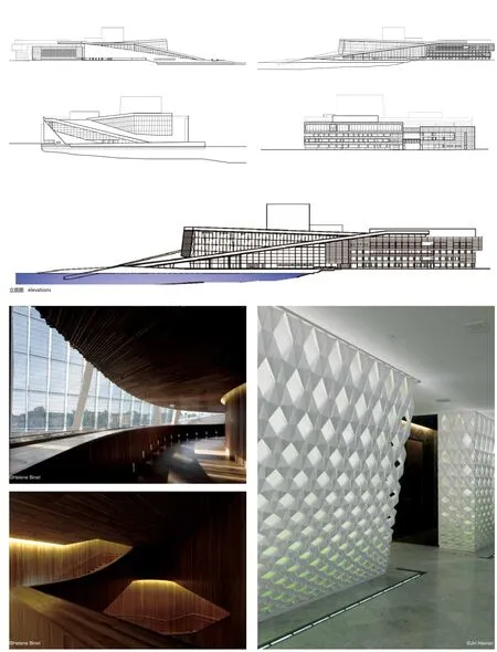
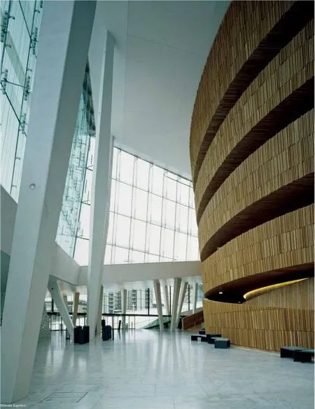
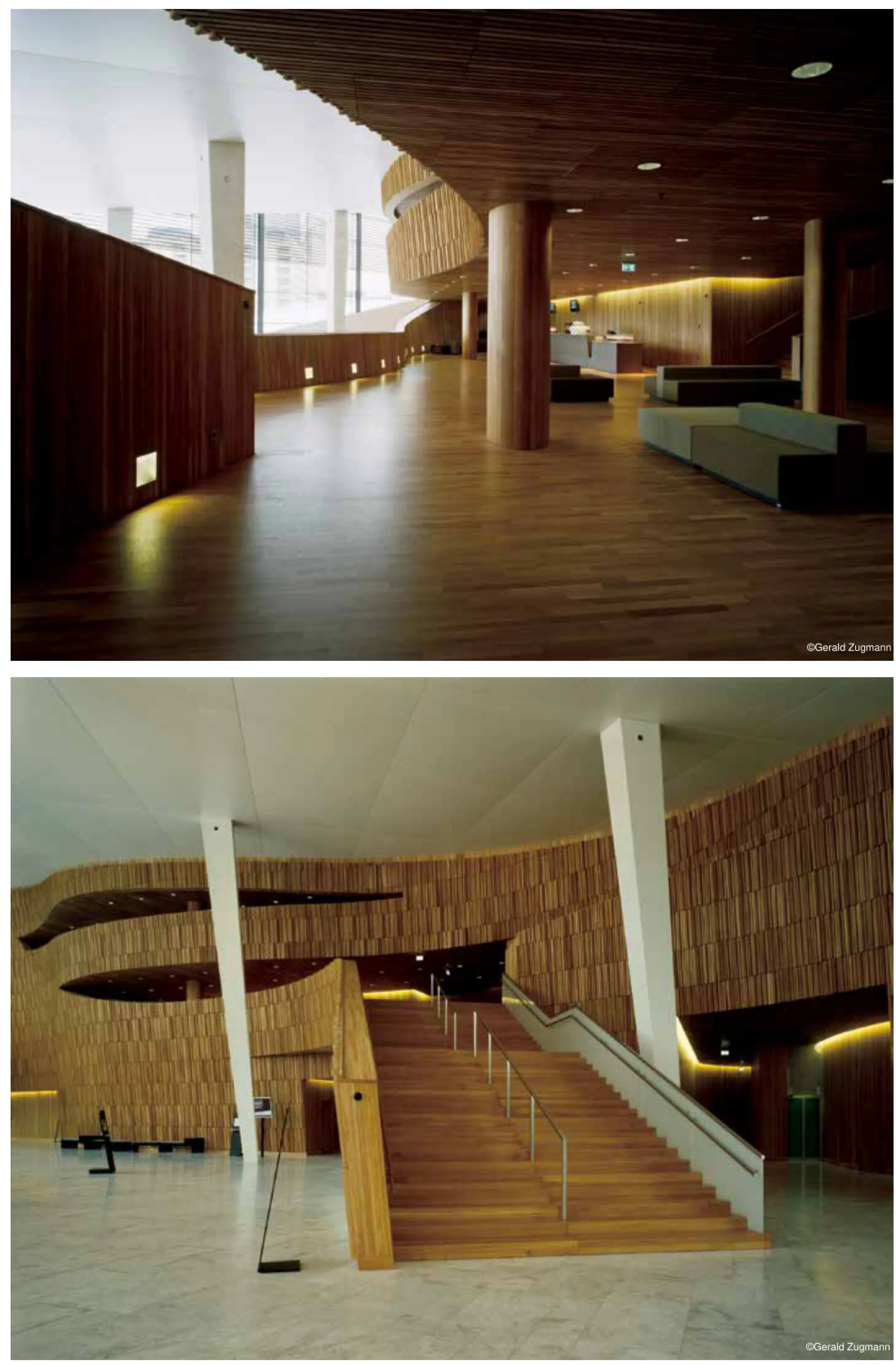
无论是“防波堤”还是主礼堂都以橡木作为主材。采用的橡木具有变化的浅色表面。礼堂所有地板、墙壁和天花板都使用橡木。防波堤具有由锥形接合面有机组合而成的复杂几何形状,也是门厅空间内的重要消声器;为了实现这些目标,防波堤由较小元素组成,便于处理几何形状变化和吸音。
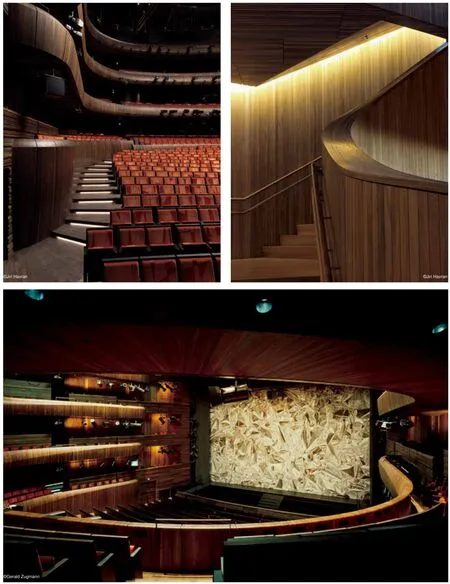
出于多种原因,礼堂里面采用橡木:致密的橡木很容易成形,具有稳定性和触摸感。橡木已经用氨处理成暗色调。在本设计中,橡木也用于地板、墙壁和天花板,以及阳台正面和反声器。
金属
歌剧院有很长的寿命。这意味着需要对简单而现代感的金属包层进行重新评估和设计,为此,我们联系了多家工厂和车间。
考虑到美观、寿命、延展性和平板面的加工之后,最后选中铝板加工的面板。为了进一步改善面板的质量,开始了与两位艺术家合作的过程。
设计团队最初瞄准工业模块化的面板,但面板本身应该具有更佳的外观质量。面板分别冲压加工成凸球形和凹锥形。由艺术家基于古老编织技术开发出这种凹凸搭接模式。
总共设计了八块不同的面板,所以随着灯光的不同角度、强度和颜色的变化,视觉效果也发生变化。
玻璃
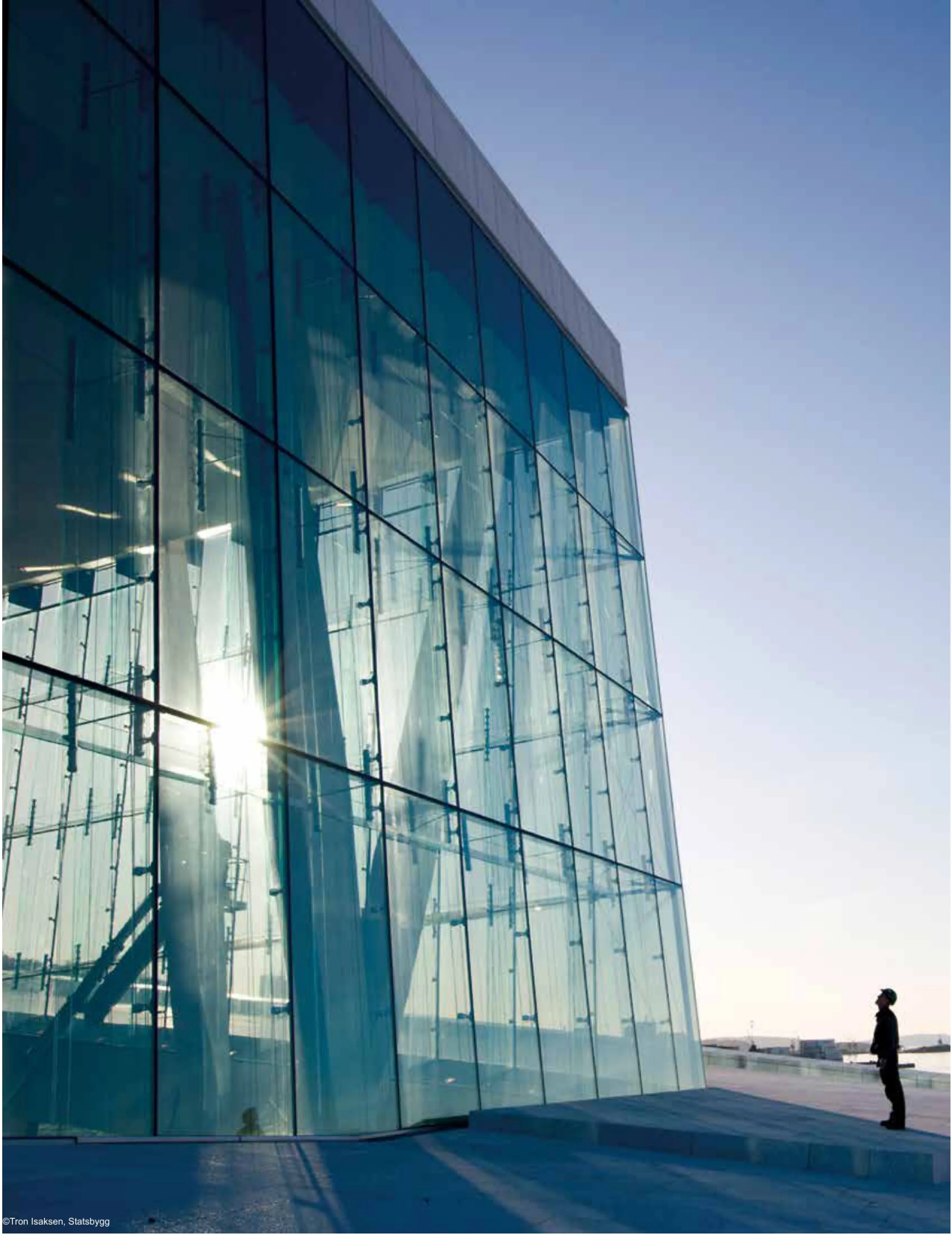
在建筑物的南,西,北三面,门厅上方主要是高空玻璃幕墙。在项目早期就意识到这种玻璃工程比以前设想的还要重要,白天、夜晚,它们的外表面都会闪闪发光。
玻璃幕墙高达15米。建筑师的意图是设计一种玻璃建筑,采用尽可能少的钢柱、框架和支撑。解决方案是用玻璃块与夹在里面的少量钢夹一起组成层板。
由于希望为大面板衔接处加细接缝,对玻璃的刚度要求增加。而这种厚玻璃往往相当绿而不透明。因此,决定为歌剧院的外墙采用低铁玻璃。
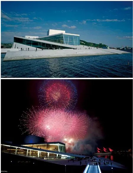
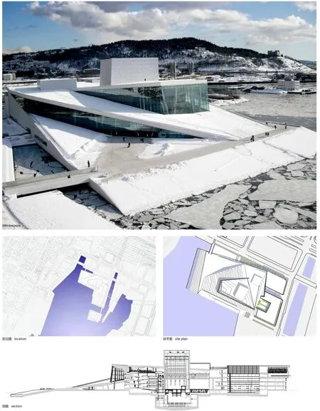
The opera house is the realisation of the winning competition entry. Four diagrams,which were part of the entry, explain the building's basic concept.
"The wave wall"
Opera and ballet are young art forms in Norway. These art forms evolve in an international setting. The Bjørvika peninsula is part of a harbour city, which is historically the meeting point with the rest of the world. The dividing line between the ground 'here' and the water ‘there' is both a real and a symbolic threshold. This threshold is realised as a large wall on the line of the meeting between land and sea, Norway and the world, art and everyday life. This is the threshold where the public meet the art.
"The Factory"
A detailed brief was developed as a basis for the competition. Snøhetta proposed that the production facilities of the opera house should be realised as a selfcontained, rationally planned ‘factory'. This factory should be both functional and fexible during the planning phase as well as in later use. This fexibility has proved to be very important during the planning phase: a number of rooms and room groups have been adjusted in collaboration with the end user. These changes have improved the buildings functionality without affecting the architecture.
"The Carpet"
The competition brief stated that the opera house should be of high architectural quality and should be monumental in its expression. One idea stood out as a legitimation of this monumentality: the concept of togetherness, joint ownership,easy and open access for all. To achieve a monumentality based on these notions we wished to make the opera accessible in the widest possible sense, by laying out a ‘carpet' of horizontal and sloping surfaces on top of the building. This carpet has been given an articulated form, related to the cityscape. Monumentality is achieved through horizontal extension and not verticality.
The conceptual basis of the competition, and the fnal building, is a combination of these three elements - The wave wall, the factory and the carpet.
Urban situation
The opera house is the frst element in the planned transformation of this area of the city. In 2010 the heavy traffc besides the building will be moved into a tunnel under the fjord. Due to its size and aesthetic expression, the opera house will stand apart from other buildings in the area. The marble clad roofs cape forms a large public space in the landscape of the city and the fjord.
The public face of the opera house faces west and north - while at the same time,the building's profle is clear from a great distance from the fjord to the south. Viewed from the Akershus castle and from the grid city the building creates a relationship between the fjord and the Ekerberg hill to the east. Seen from the central station and Chr. Fredriks sq., the opera catches the attention with a falling which frames the eastern edge of the view of the fjord and its islands.
The building connects city and fjord, urbanity and landscape.
To the East, the ‘factory' is articulated and varied.
One can see the activities within the building: Ballet rehearsal rooms at the upper levels, workshops at street level. The future connection to a living and animated new part of town will give a greater sense of urbanity.
Collaboration with artists
For Snøhetta, close collaboration with artists has always been an important part of building projects. As early as the competition stage, artists were invited in as collaborators, and the wished to continue this from the beginning of the design phase. Snøhetta have tried to avoid having artist apply ‘decoration' to the architecture, preferring to allow for an open dialogue between artists, artisans and professionals with various approaches to important building elements. With the opera house, the architect intended that both the large marble clad roofs cape and the aluminium clad facades should be approached as collaborative endeavours.
An early collaboration was established for the stone roof with artists: Kristian Blystad, Kalle Grude and Jorunn Sannes. One year later, in accordance with the guidelines for state funding building projects, a committee for integrated artwork was established. This committee engaged the artists Astrid Løvaas and Kirsten Wagle to collaborate on the design of the metal cladding elements.
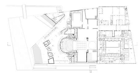
首层平面 ground floor plan
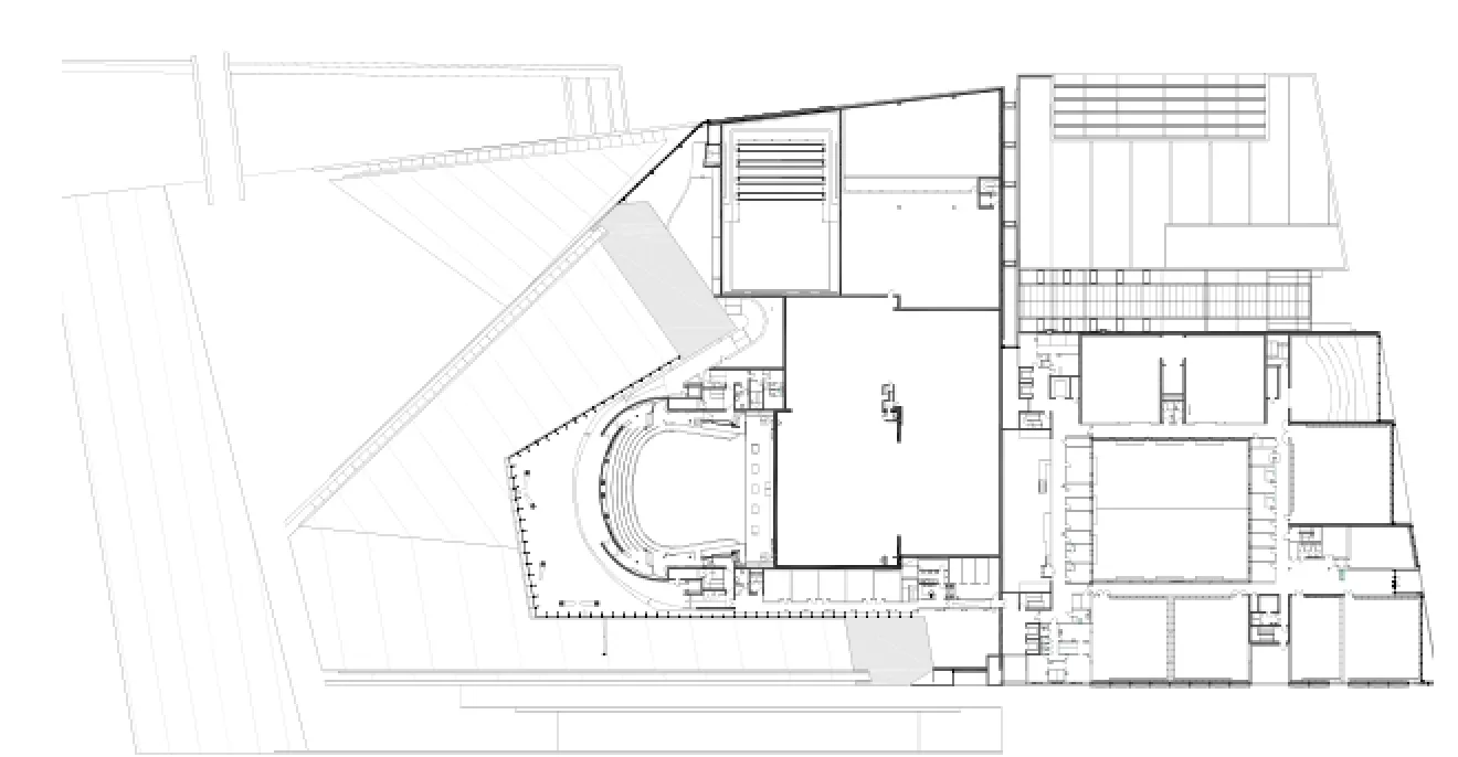
三层平面 second floor plan
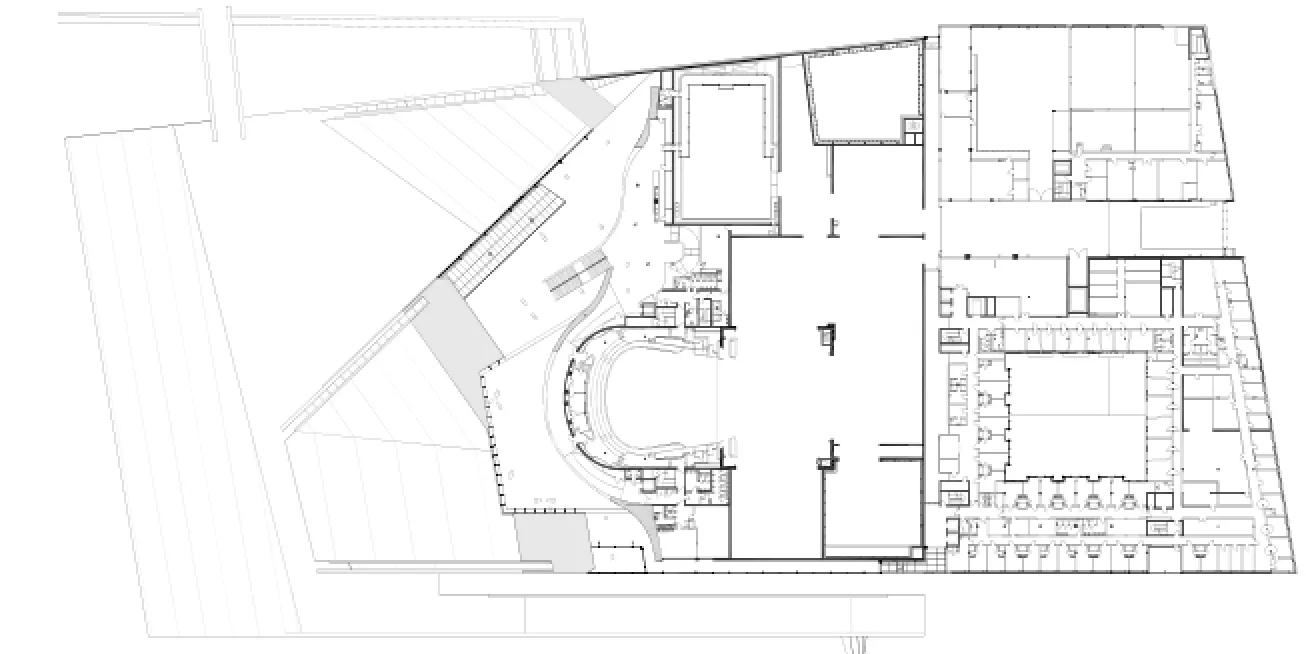
二层平面 first floor plan
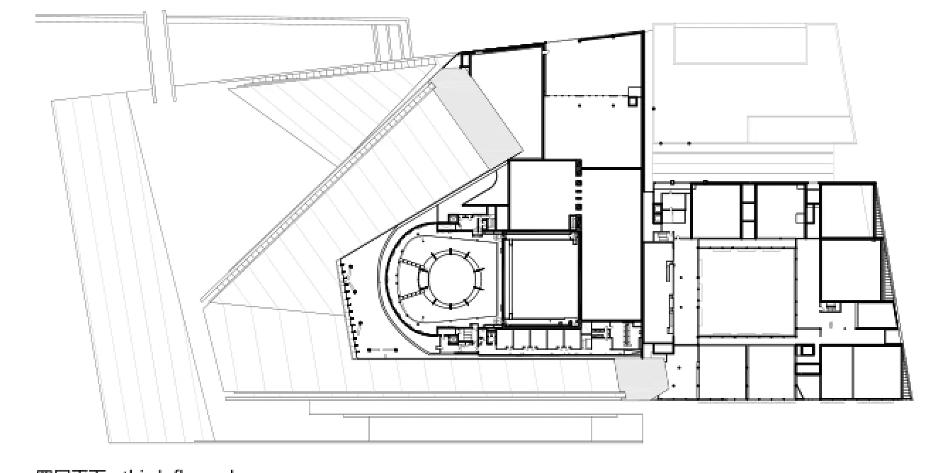
四层平面 third floor plan
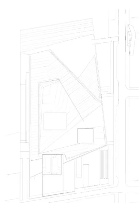
屋顶平面 roof plan
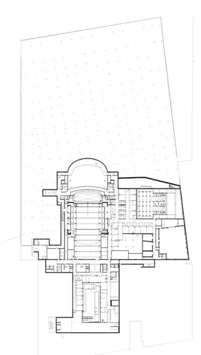
地下层平面 underground level plan
Choice of materials
The materials, with their specific weight, colour, texture and temperature, have been vital to the design of the building. Snøhetta's architecture is narrative. It is the materials which form the defning elements of the spaces. It is the meeting of the materials which articulates the architecture through varied detail and precision.
In the opera house, three main materials were specifed as early as the competition entry: White stone for the ‘carpet', timber for the ‘wave wall', and metal for the ‘factory'. During the continued work on the project, a fourth material, glass, which allows for the exposure of the underside of the ‘carpet', has been given specifc attention.
Stone
After an international tender competition, the Italian marble, La Facciata, was chosen. This is a stone which, in common with other marbles, retains its brilliance and colour even when wet. It has the necessary technical quality in terms of stability,density, and longevity. The producer, Campolonghi, has had the professional ability,capacity, and experience necessary for such a large and complex project.
The accessible area of the ‘carpet' is approx. 18,000 m2. Its detailed design has been important: the architect desired that it should not interfere with the general dorm of the building but that it simultaneously was articulated enough to be interesting at close quarters.
Together with the artists several alternatives were proposed before a particular non repetitive pattern with integrated raised areas, special cuts, various surface textures, and specifc details were designed to articulate the main geometry.
Timber
Oak has been chosen as the dominating material for both the ’wave wall’ and the main auditorium. For the wave wall it has a light and varied surface. Oak is used throughout for the foors, walls and ceilings. The wave wall has a complex organic geometry made up of joined cone shapes. It is also an important acoustic attenuator within the foyer space. To achieve these goals it is made up of smaller elements which can deal with the changing geometry and provide acoustic absorption.
Inside the auditorium oak has been chosen for a number of reasons: It is dense,
easily formed, stable and tactile.
The oak has been treated with ammonia to give a dark tone. Here too oak is used for foors, walls, and ceilings, as well as balcony fronts, and acoustic refectors.
Metal
An opera house is designed and built to have a long lifespan. This means that a simple, modern metal cladding, such as we associate with factories and workshops, needs to be re-evaluated and redesigned.
After a consideration of aesthetics, longevity, malleability and the possibility to make very flat panel, aluminium was chosen. To give the panel further quality, a collaborative process was begun with two artists.
The design team initially aimed for an industrial modularity but that the panels themselves should have greater visual quality. The panels were punched with convex spherical segments and concave conical forms. The pattern was developed by the artists based on old weaving techniques.
In all, eight different panels were designed which give a constantly changing effect depending on the angle, intensity and colour of the light playing on them.
Glass
The high glass facade over the foyer has a dominant role in the views of the building from the south, west, and north. Early in the project it was realised that this glass faced was more important than previously assumed, both during the day and night when it would act as a lamp illuminating the external surfaces.
The glass façade is up to 15 meters high. It was the architects' intention to design a glass construction with an absolute minimum of columns, framing, and stiffening in steel. The solution was to use glass fins where minimised steel fixings are sandwiched inside the laminates.
The requirements for the glass's stiffness increased due to the desire for large panels and slim joints where the panels meet. Thick glass of this sort tends to be quite green rather than transparent. It was therefore decided that the façade of the opera house would use low iron glass.
挪威野生驯鹿中心展馆
地点:挪威多夫勒
业主:挪威野生驯鹿中心
类型:无键结构
面积:90平方米
项目状况:2011年完工
设计范围:建筑、景观和室内绘图:斯诺赫塔建筑事务所
Location: Hjerkinn, Dovre, Norway
Client: Norwegian Wild Reindeer Centre
Typology: Keyless structure
Size: 90 m²
Status: Completed 2011
Scope: Architecture, Landscape and Interior Drawings: ©Snøhetta
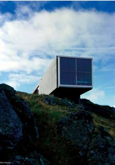
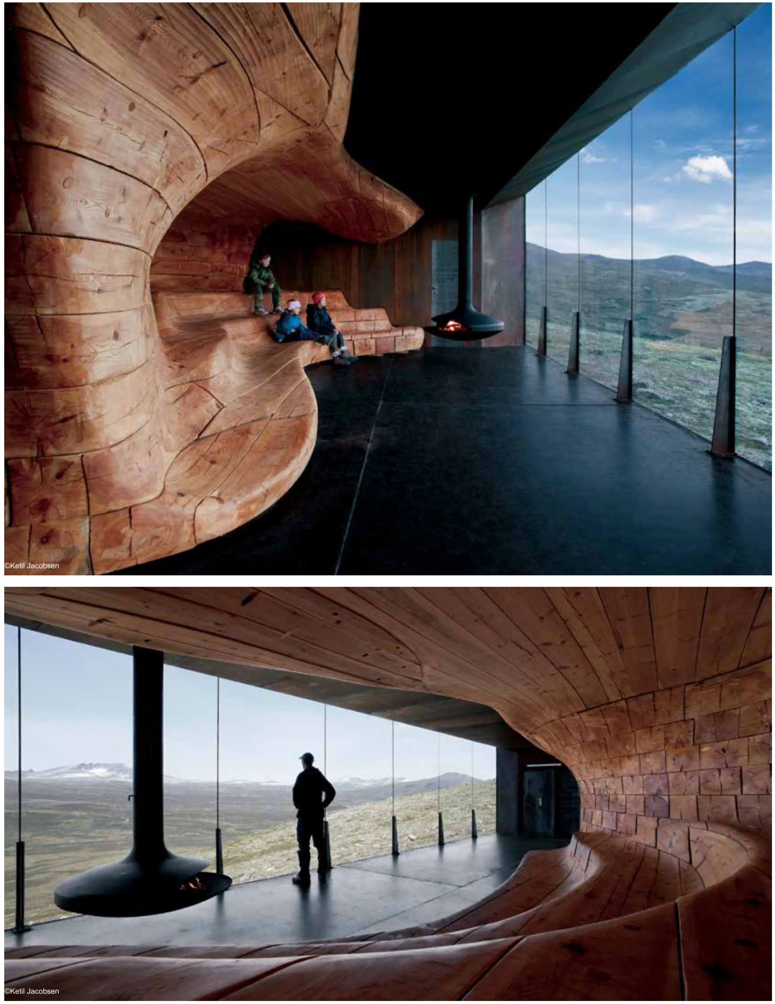
斯诺赫塔建筑事务所设计的挪威野生驯鹿中心,位于多夫勒山脉国家公园外一个很美的地方,海拔约1250米,俯瞰山峦。
75平方米的建筑主要是为登山向导向学校学生和游客讲解多夫勒山高原独特的野生动物和历史时提供场所。
多夫勒山脉是野生驯鹿、麝牛和北极狐的家园,也是许多珍稀动植物的自然栖息地。在漫长的历史长河中,旅行者来来往往,狩猎的传统、采矿、军事活动也在这片土地上留下了各种印记。如今,现代旅游和娱乐也塑造了这个地方的文化景观。多夫勒山脉在挪威人的意识中也占据了重要的地位。民族传说、神话、诗歌(易卜生)和音乐(格里格)都赞美了这片神秘、永生、辽阔的土地。挪威宪法缔造者的名言“意见一致、忠贞不渝,除非多夫勒山倒塌!”
具有文化特色的神秘的自然景观是建筑理念的基础。建筑设计基于坚硬外壳与柔软的有机内核的对比。木质的内里置于粗钢铁玻璃的方形结构中。内核塑造成被风和流水等自然力量腐蚀的石头或冰块。外墙和内部空间营造出一个安全而温暖的聚会场所,同时游客观看风景。
为抵御严酷的气候,相当大一部分设计重点放在材料的质量和耐久性上。庇护所简洁的外形和对自然材料的使用也沿袭了当地的建筑传统。同时,在建造的过程中,也采用了新技术以便获得现代功能。木质核心的产生基于数字三维模型,采用机器人控制的大型的铣床。
挪威野生驯鹿中心是一栋坚固的建筑,它改良了当地建筑传统,提供了游客聚集的地点,丰富了多夫勒山脉的独特美景。
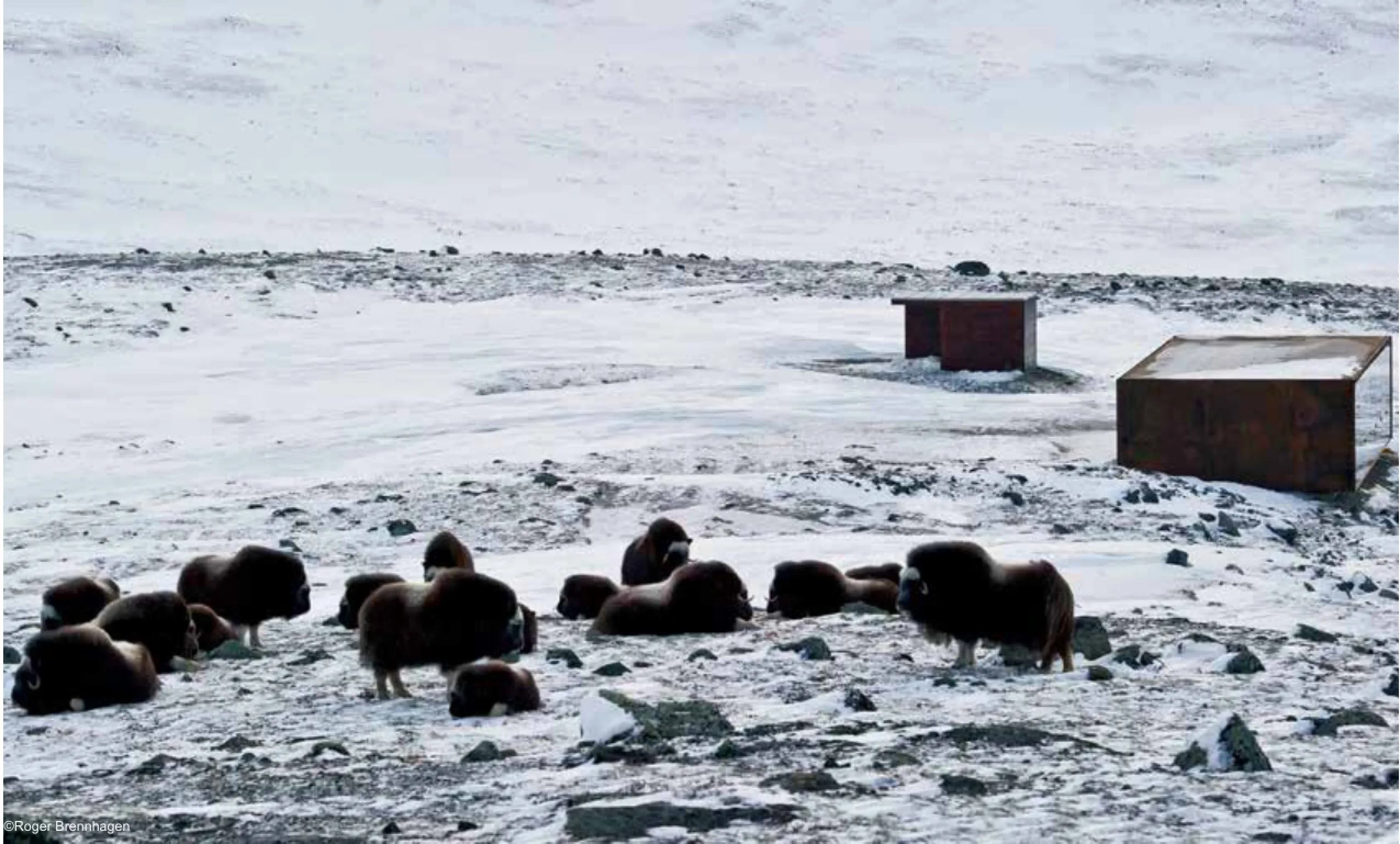
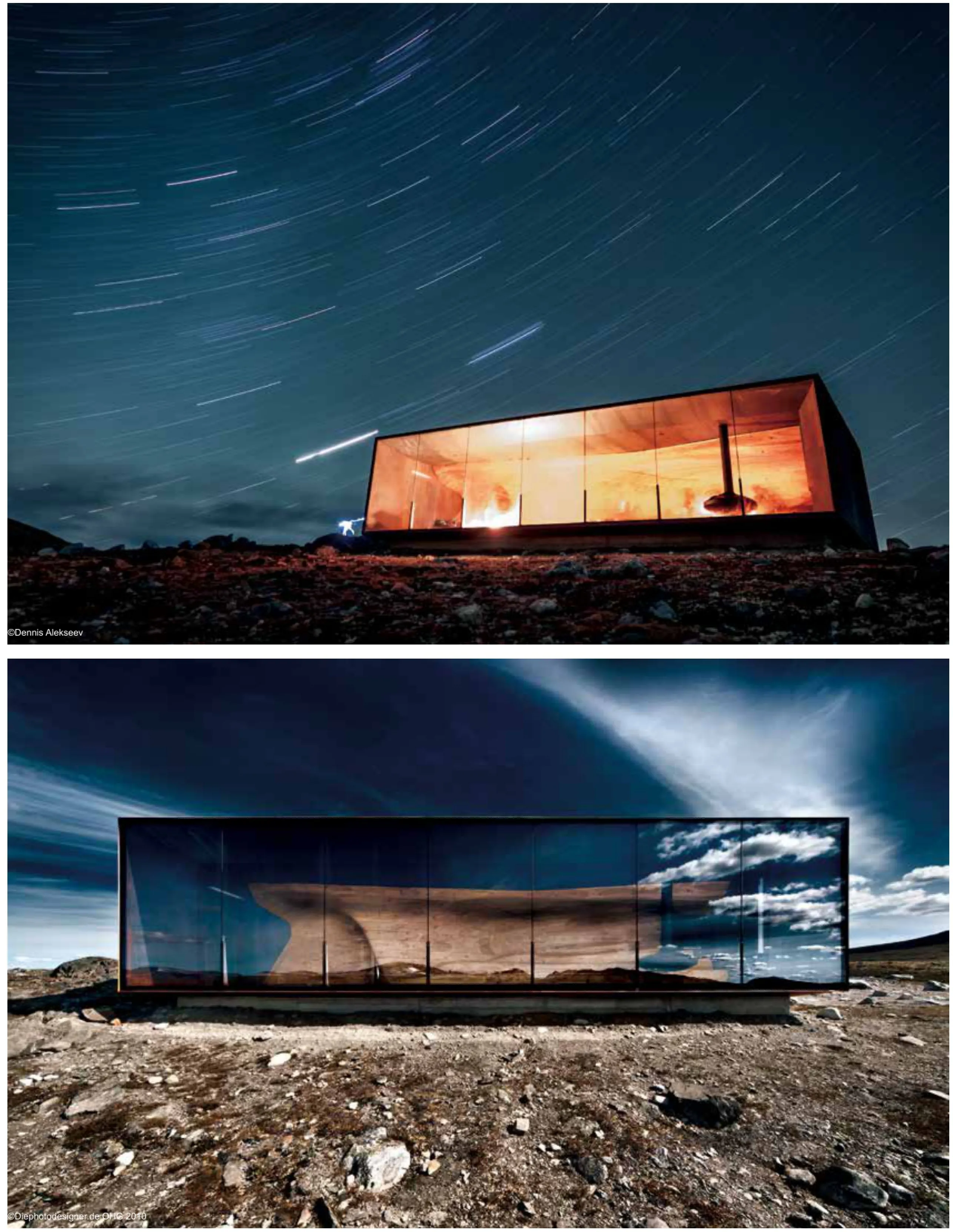
The Norwegian Wild Reindeer Pavilion sits on a spectacular site on the outskirts of Dovrefjell National Park at around 1250 meters above sea level, overlooking the mountain, Snøhetta.
The main purpose of the 75m2 building is to provide shelter for school groups and visitors as mountain guides lecture about the unique wildlife and history of the Dovre Mountain plateau.
Dovrefjell is home to wild reindeer herds, musk oxen, arctic foxes and a variety of endemic botanical species. A long history filled with travellers, hunting traditions,mining and military activities have left their mark on this land. Today, modern tourism and recreation continue to shape the cultural landscape of this place. Dovrefjell also holds signifcant importance in the consciousness of Norway. National legends,myths, poetry, music, and pilgrimages celebrate the mystic, eternal, and grounded qualities of this robust place. The founding fathers of the Norwegian constitution are “agreed and faithful, until the fall of Dovre!”
Natural, cultural and mythical landscapes form the basis of the architectural idea. The building design is based on a contrast between a rigid outer shell and a soft organic-shaped inner core. A wooden interior is placed within a rectangular frame of raw steel and glass. The core is shaped like rock or ice is eroded by natural forces like wind and running water. Its shape creates a protected and warm gathering place, while still preserving visitor's access to spectacular views.
Considerable emphasis is put on the quality and durability of materials so that the building can withstand the harsh climate. The shelter's simple form and use of natural building materials reference local building traditions. And at the same time, new technologies will be utilized to bring modern effciency to the fabrication process. The wood core will be manufactured using a large scale robot-controlled milling machine based on digital 3D models.
Tverrfjellhytta is a robust building that refnes local building traditions, provides a protected gathering place for the visitors and enriches the unique landscape of Dovrefjell.
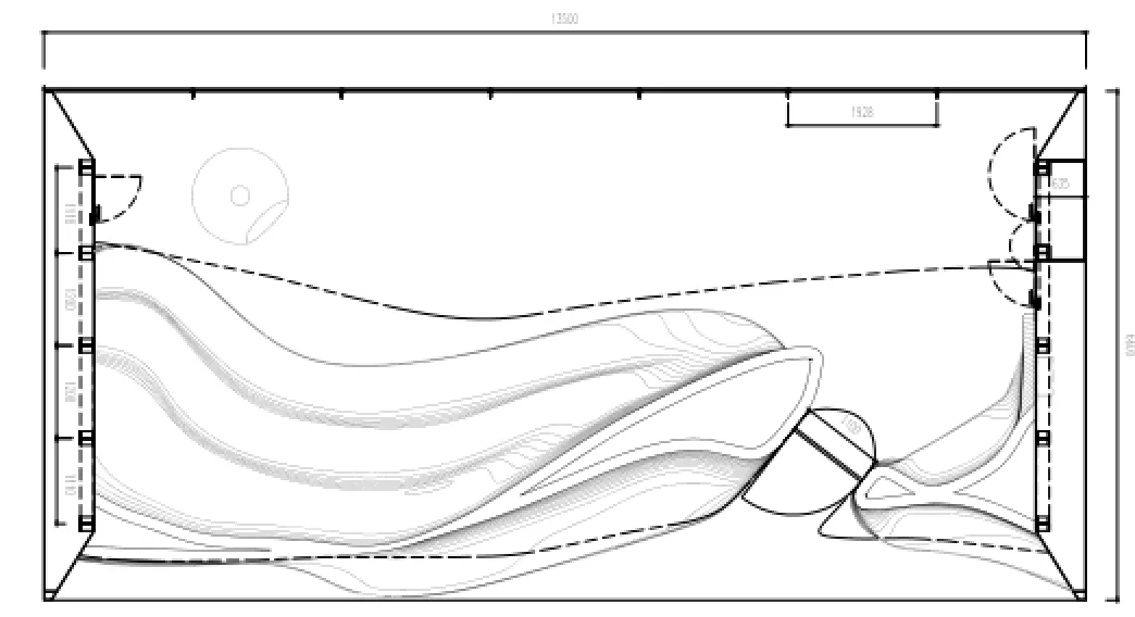
平面 plan

南立面 south elevation

北立面 north elevation
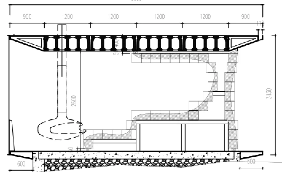
剖面 typical section
条码区B.10.1 - 德勤总部
地点:挪威奥斯陆
业主:Oslo S Utvikling
类型:办公楼
面积:20 000平方米
项目状况:2013年完工
设计范围:建筑、景观与室内
绘图+模型:斯诺赫塔建筑事务所
Location: Oslo, Norway
Client: Oslo S Utvikling
Typology: Offce building
Size: 20 000 m²
Status: Completed 2013
Scope: Architecture, landscape, interior
Drawings+model: ©Snøhetta
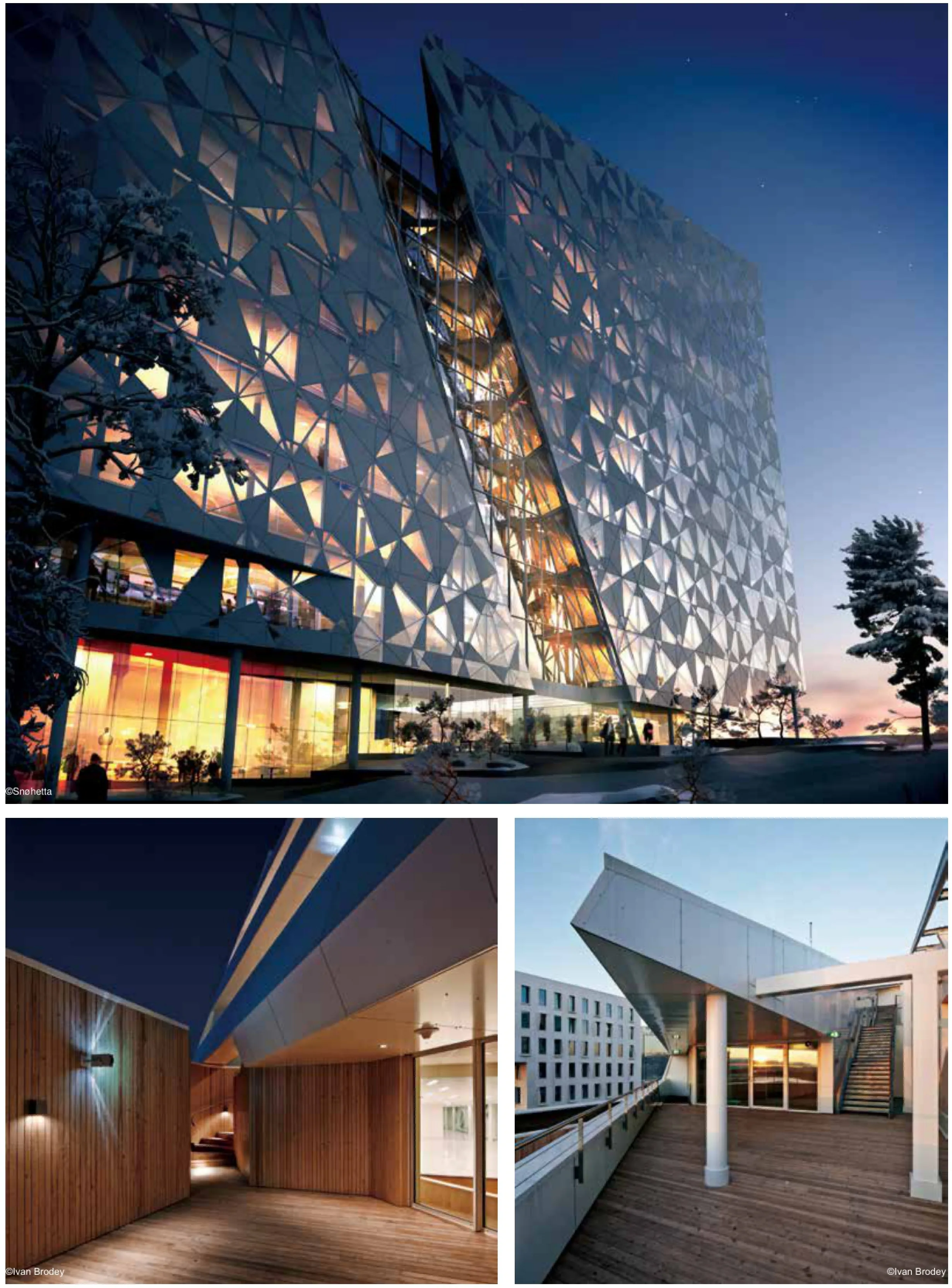
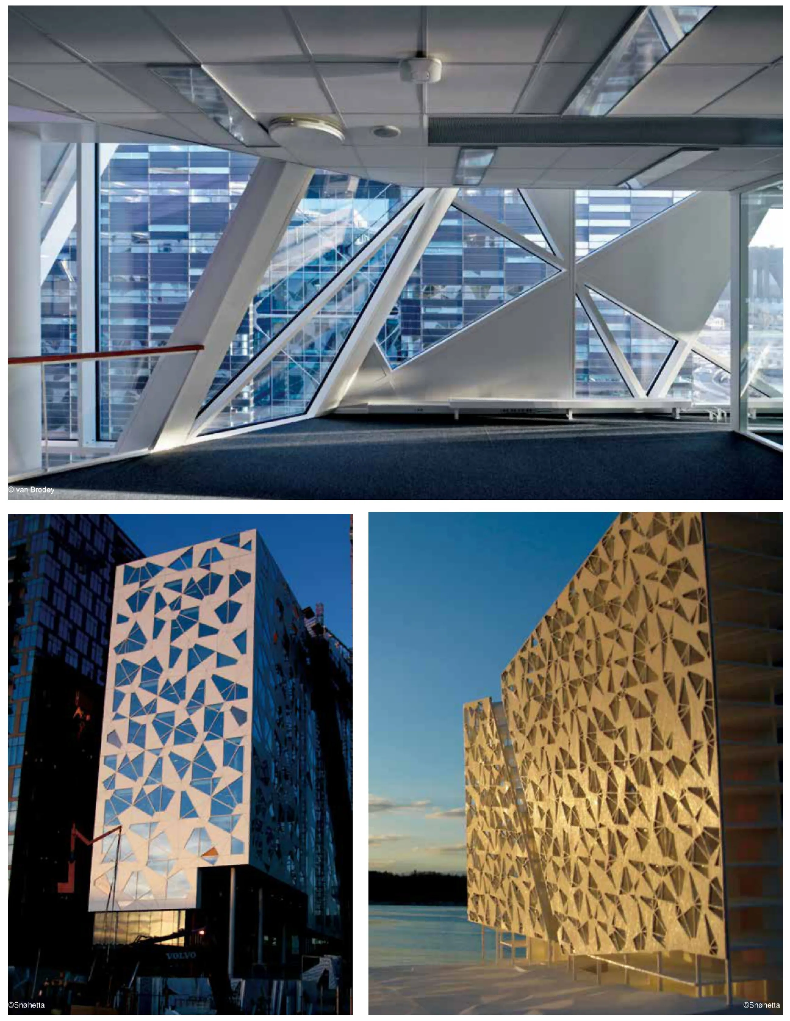
2007年,斯诺赫塔建筑事务所接受委托设计了现位于Bjørvika中央车站的西侧“条码”区的一栋办公楼。
大楼的底下两层有商店、餐饮店,室外区域配有户外餐饮设施。2楼至11楼为办公室,12楼至15楼层为食堂和会议室,旁边配有绿色屋顶露台。
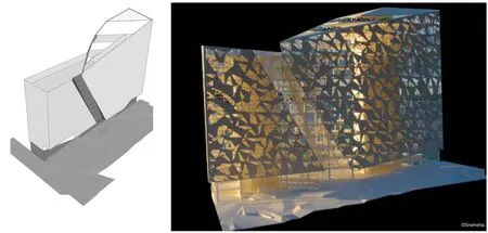
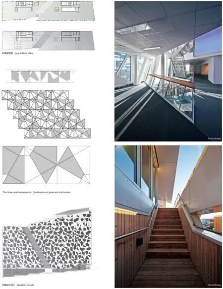
建筑设计融合了建筑的内部规划与场地的外部限制以及创造雕塑风格建筑的想法。大楼的外形和高度与条码区总体规划原则一致。外墙采用交叉垂直平面主题,让人联想到蕾丝面料。外墙系统仅由四种不同的面板构成;无论如何,外墙所表达的内涵是丰富的。
条码区规划制度中的观景廊限制了在大楼横向上斜切楼顶区域内的建筑物高度。地面上的另一个横向切割便于行人从奥斯陆中央车站穿过大楼。这一人行道也体现了中央车站区域和通向Dronning Eufemias街之间的街道高低差异。
Snøhetta was in 2007 commissioned to draw an office building with a site that lies on the west side of the Central Station in Bjørvika, in the “Barcode” - area.
The two lowest foors of the building will have shops and refreshment areas, the belonging outdoor areas will have supplementary outdoor refreshment facilities. From the 2nd to 11th foor there will be offces and 12th to 15th foor will hold a canteen and conference rooms with adjacent green roof terraces.
The building's design merges the building's internal program with the external limitations of the site and a desire to create a volume that has sculptural in form. The footprint and height of the building complies with the Barcode master plan principles for the area. The facades introduce a theme of surfaces crossing in horizontal and vertical planes, giving associations to lace fabric. The system of the facades is built up of only 4 different panels; despite its rationality the façade expresses richness.
A sight corridor in the planning regulations of Barcode limits the height of the buildings in an area that cuts diagonally across the roof in the transverse direction of the volume. Another cross direction is made on the ground level, enabling the pedestrians from Oslo Central to cross the building. This pedestrian route also conveys the difference in street level between the Central Station area and the lower level towards Dronning Eufemias street.
美国“9.11”国家纪念博物馆
地点:美国纽约市
业主:9.11国家纪念馆
类型:文化及游客中心
面积:50 000平方米
项目状况:2014年完工
合作建筑师:Adamson Associates
设计范围:建筑、景观和室内
Location: New York, NY, USA
Client: National 9/11 Memorial
Typology: Culture & visitor orientation center
Size: 50 0002
Status: Completed May 2014
Associate Architect: Adamson Associates
Scope: Architecture, landscape & interior
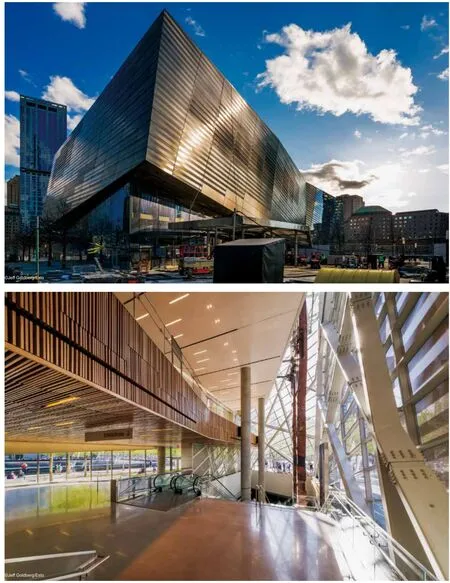
2004年,斯诺赫塔建筑事务接受委托设计美国纽约世贸双塔纪念广场上的唯一文化建筑——“9·11”国家纪念博物馆。此后几年,项目几经变化,但它仍是一个文化机构,为游人提供舒适的环境。建筑设计体现了与纪念广场横向展开的平面特色的细致呼应,同时也提供了一个充满活力的有机体,以便游客在更广的意义上来思考遗址与城市。斯诺赫塔建筑事务所创始合伙人Craig Dykers认为“我们的愿望是让游客找到城市日常生活与纪念碑独一无二精神特质之间的自然入口。当人们深入建筑之中,可感受到被其引领一直走到遗址的其它地方去体验”。
斯诺赫塔建筑事务所的设计一直都是探索环境造就的特色。WTC纪念一直承载着历史的权力,又饱含对未来的新希望。这个地方承载着受它的影响而又无法忘记与纽约人们亲密联系的世界各地人们的记忆与梦想。
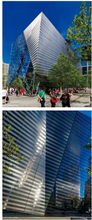
博物馆的一些特质似乎让人联想起原来的双子塔,另一些时候,这些念头只是些暗示而已。高反光率的外表能够反映变化的四季,以及一年四季博物馆的不同特征。倾斜、反光的、透明的表面鼓励游人走进、触摸和凝视建筑。
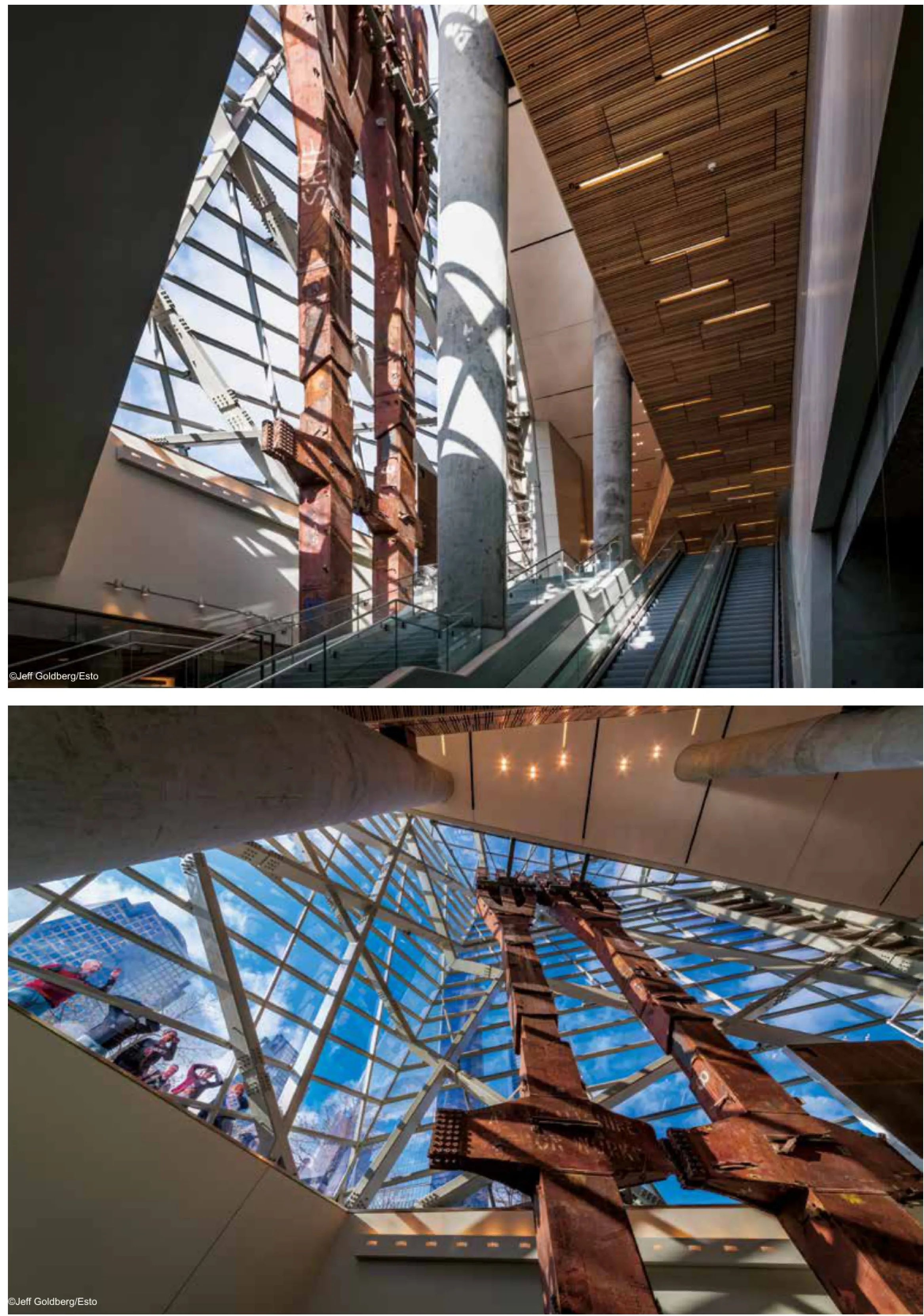
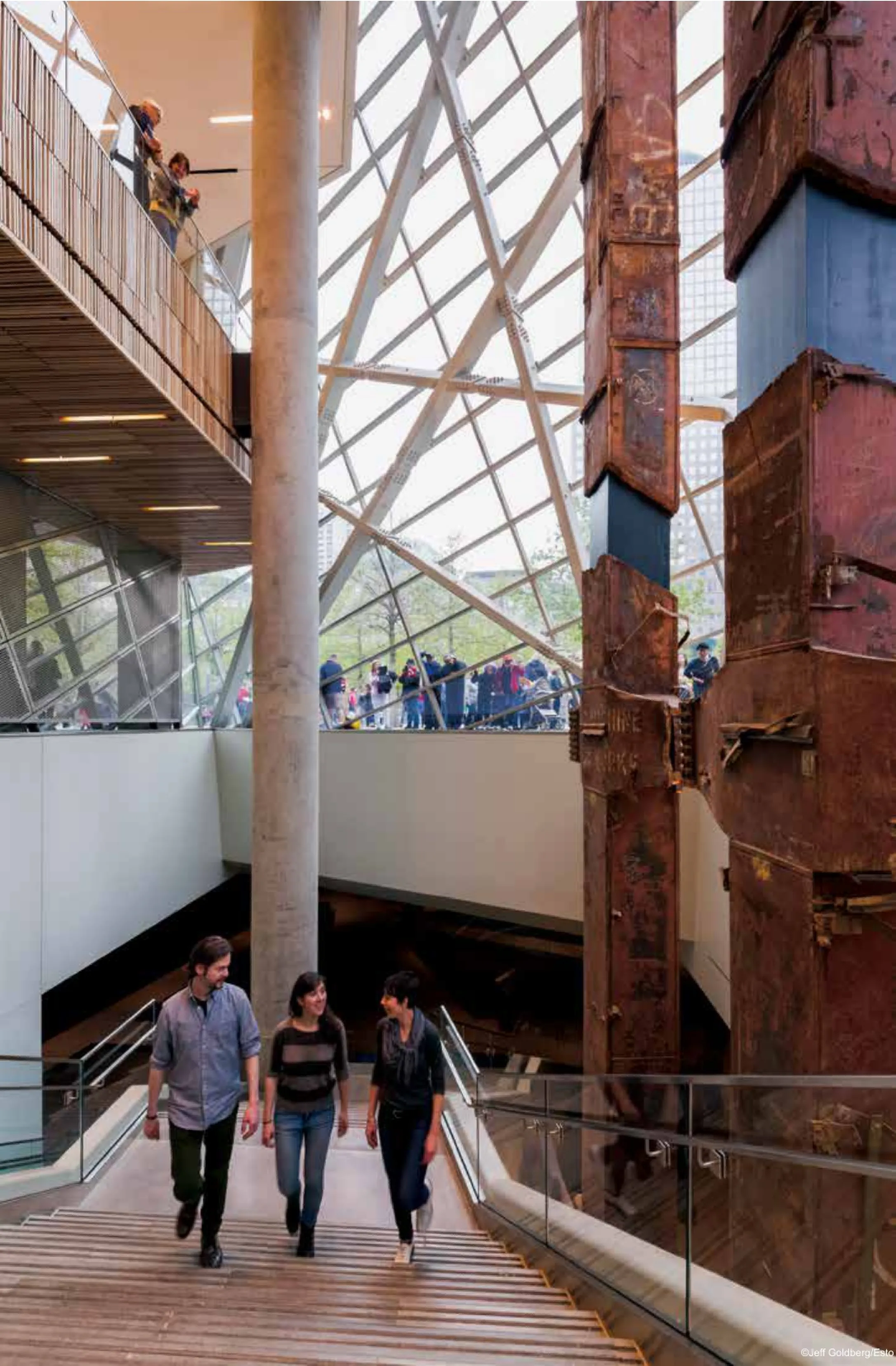
一旦进入,游客穿过博物馆的中庭可以看到其他同行者,在身体与心理上开始了从上空到地面转变。中庭里面矗立从被摧毁的双子塔中整理出的两根柱子。虽然它们已从原有位置移走,也没有了以往的功能,但它们寓意深刻和富有美感的姿态,是
遗址的标志。博物馆的用材明亮通风,日光可以进入博物馆的下层,博物馆与地面的关系微妙,同样的无重量,但却充满了希望。
斯诺赫塔建筑事务所设计的这座纪念博物馆,映衬着纪念广场上简洁的水池与树林,是一个视觉上可以接近的朴素的建筑,它完全融入了纪念性这一设想。低处的水平形式以及向上的构造使其成为沟通两个世界的桥梁:纪念馆和博物馆、地面之上与地面之下、光明与黑暗、集体与个人。此外,它也与地下的Path车站、博物馆和地铁站联通。
介于水平广场与垂直极限之间,它是摩天大楼与广场之间的基石。斯诺赫塔与客户合作建造了纪念馆宝石般条纹的外观,让建筑与游人产生强烈的共鸣,并在视觉和建筑上建立与周边城市环境的联系。纪念广场的平面被纪念馆的玻璃中庭打破,由此游客可以进入地下博物馆,并从上面提供采光。
纪念广场的名称是“倒影虚空”:当游客穿越广场来到方形水池时,他们的目光就为人工瀑布吸引,看到四周的人工瀑布汇入主水池,然后再流入第二方形水池最终进入池中央的深渊,这是对“9·11”悲惨事件带来的巨大虚空的物质反映,相比之下,斯诺赫塔建筑事务所设计的纪念博物馆则反映在:此时此刻、天气、树木、周围的建筑,特别是前来纪念馆的所有游客。在广场,人们俯视纪念喷泉,思考过去,对过去致意。在纪念博物馆,人们则朝前朝上看,勇敢地、充满了希望地思考现在与未来。
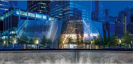
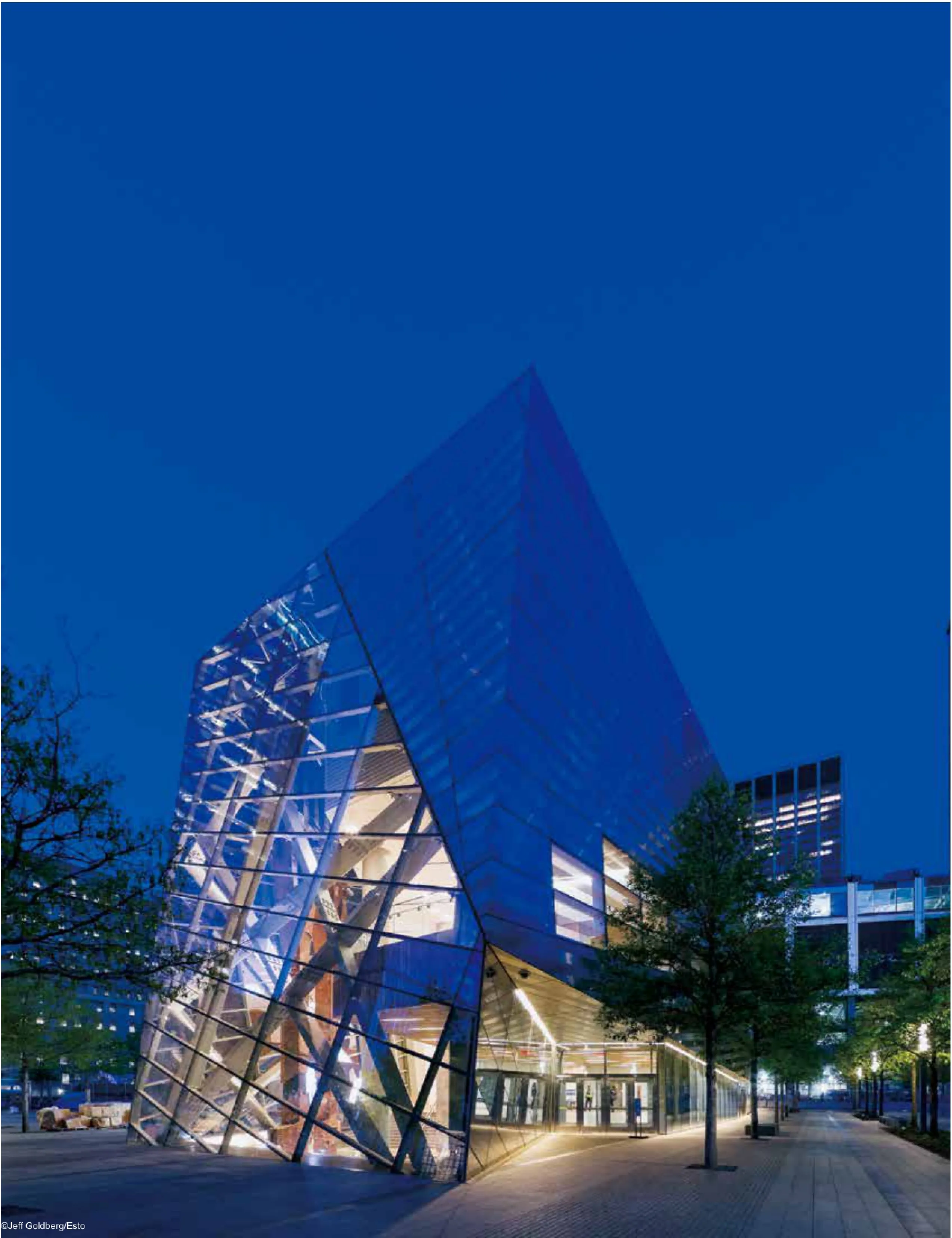
In 2004, SNØHETTA was commissioned to design the only building on the memorial plaza. In the years since, the program has changed several times,however it has remained a cultural facility dedicated to visitor comfort and orientation. The design for the building embodies a careful reaction to the horizontal character of the memorial plaza’s design, while also providing the area with a lively organic form that allows the visitor to imagine the site and city in a broader sense. According to Snøhetta's Founding Partner, Craig Dykers, “Our desire is to allow visitors to find a place that is a naturally occurring threshold between the everyday life of the city and the uniquely spiritual quality of the Memorial. It is important that people physically engage with the building and feel that it helps lead them on to other areas of the site and other thoughts about their experiences there.”
Snøhetta's design approach has always been characterized by an exploration of context. The WTC Memorial site carries with it both the power of its history and a new hope for the future. It is a place that conveys the memories and dreams of people around the world who are affected by its presence without forgetting its intimate connection to the people of New York.
Certain characteristics of the Museum Pavilion will seem reminiscent of the original towers, while at other times these notions are only alluded to. The alternating refective treatment of the façade will mirror the changing seasons, revealing the Pavilion's differing qualities throughout the year. Inclined, refective and transparent surfaces encourage people to walk up close, touch and gaze into the building.
Once inside, visitors look out through the Pavilion’s atrium to see others peer in, and begin a physical and mental transition in the journey from above to below ground. Within the atrium, stand two structural columns rescued from the original towers. Although removed from their former location and function, they mark the site with their own profound and aesthetic gesture. The Pavilion's light and airy materials allow daylight into the Museum below grade, commemorating the Pavilion’s tenuous relationship with the ground, equal parts weightless and hopeful.
Complementing the power and simplicity of the pools and the trees, Snøhetta has designed a visually-accessible, unimposing, building which is fully integrated into the Memorial site. With its low, horizontal form and its uplifting geometry the Pavilion acts as a bridge between two worlds - between the Memorial and the Museum, the above and below ground, the light and dark, between collective and individual experiences. It also bridges over separate structures: the Path station, Museum and subway station below.
Between vertical and horizontal extremes, it is a stepping stone between skyscrapers and the plaza. The Pavilion's jewel-like, striped façade was developed in collaboration with the Client to allow the building to have a strong resonance for the visitor as well as providing visual and architectural connection to the surrounding urban environment. The flat plane of the Memorial Plaza is pierced by the glass Atrium of the Pavilion,which allows visitors to enter the below-grade Museum and bring with them sunlight from above.
The name of the Memorial Plaza is “Refecting Absence.” As visitors cross the Plaza and approach the perimeter of the pools their gaze drops to watch the water cascading into the main pools, then fowing further over the second rim into the inner void. It is a physical refection of the monumental absence created by the tragic events of September 11. By contrast,Snøhetta's Pavilion reflects presence: the present moment, the day, the time, the weather, the trees, the surrounding buildings, and especially all the visitors present at the Memorial. While they look down into the Memorial fountains to contemplate and pay respect to the past, they look straight ahead and up at the Pavilion to refect on the present and the future, bravely and with hope.
“编织”文化中心
地点:瑞典于默奥
业主:Väven i Umeå AB/Balticgruppen AB
类型:文化建筑
当地建筑师:White Arkitekter AB
面积:27 000平方米
项目状况:2014年完工
设计范围:建筑、景观和室内
绘图:斯诺赫塔建筑事务所
Location: Umeå, Sweden
Client: Väven i Umeå AB/Balticgruppen AB
Typology: Cultural building
Local architect: White Arkitekter AB
Size: 27 000m2
Status: Completed 2014
Scope: Architecture, landscape & interior
Drawings: ©Snøhetta & White Arkitekter AB
“编织”文化中心是“桥间城市”的市区发展项目的一部分。该新开发项目是默奥城市翻新的重要催化剂,旨在打造Ume河沿岸的文化区。
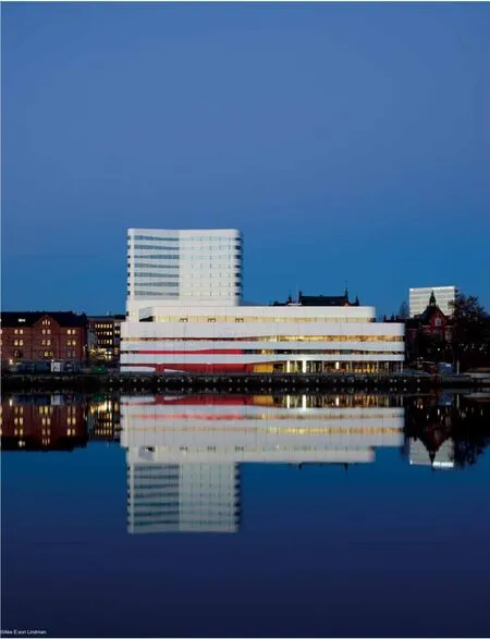
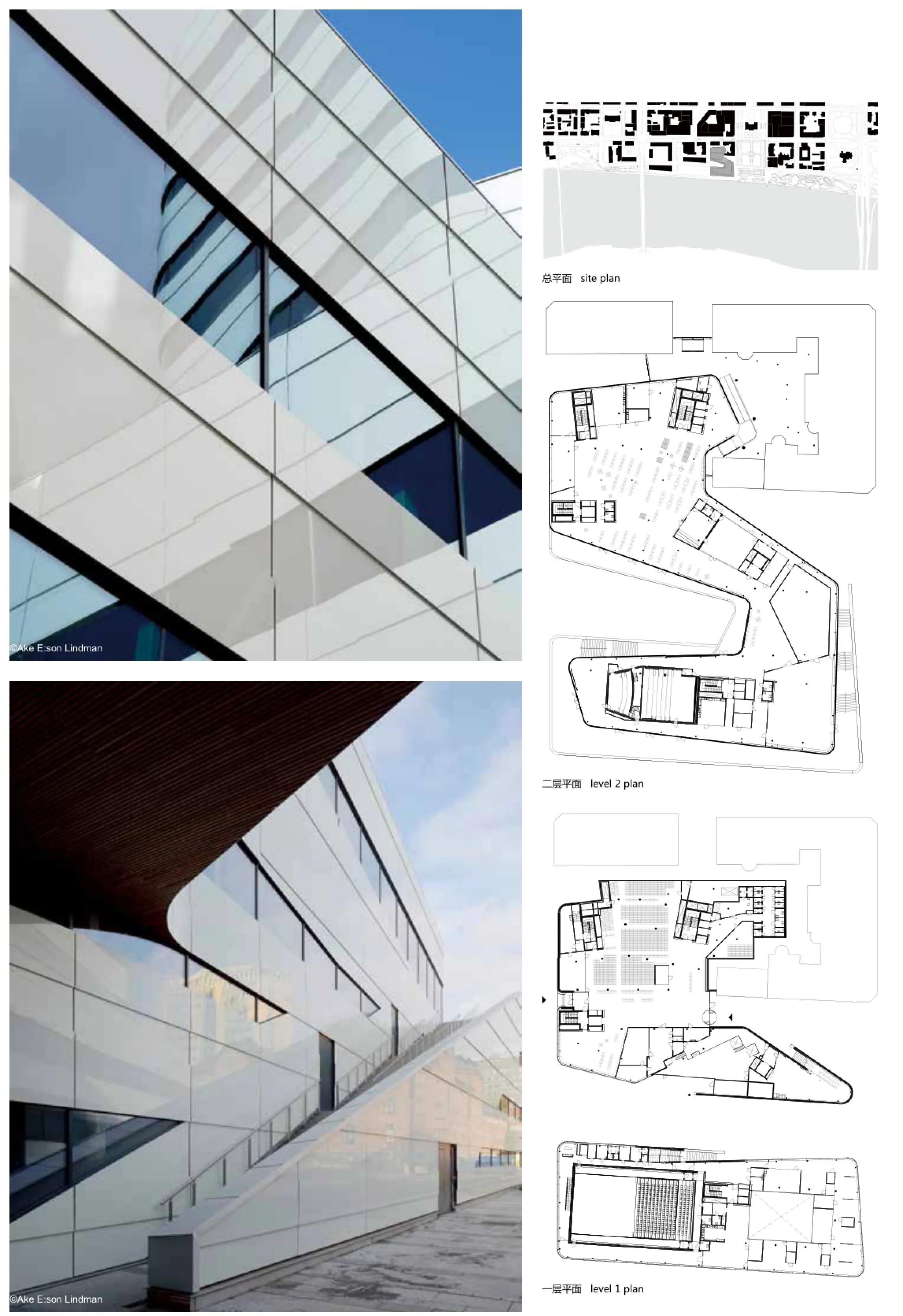
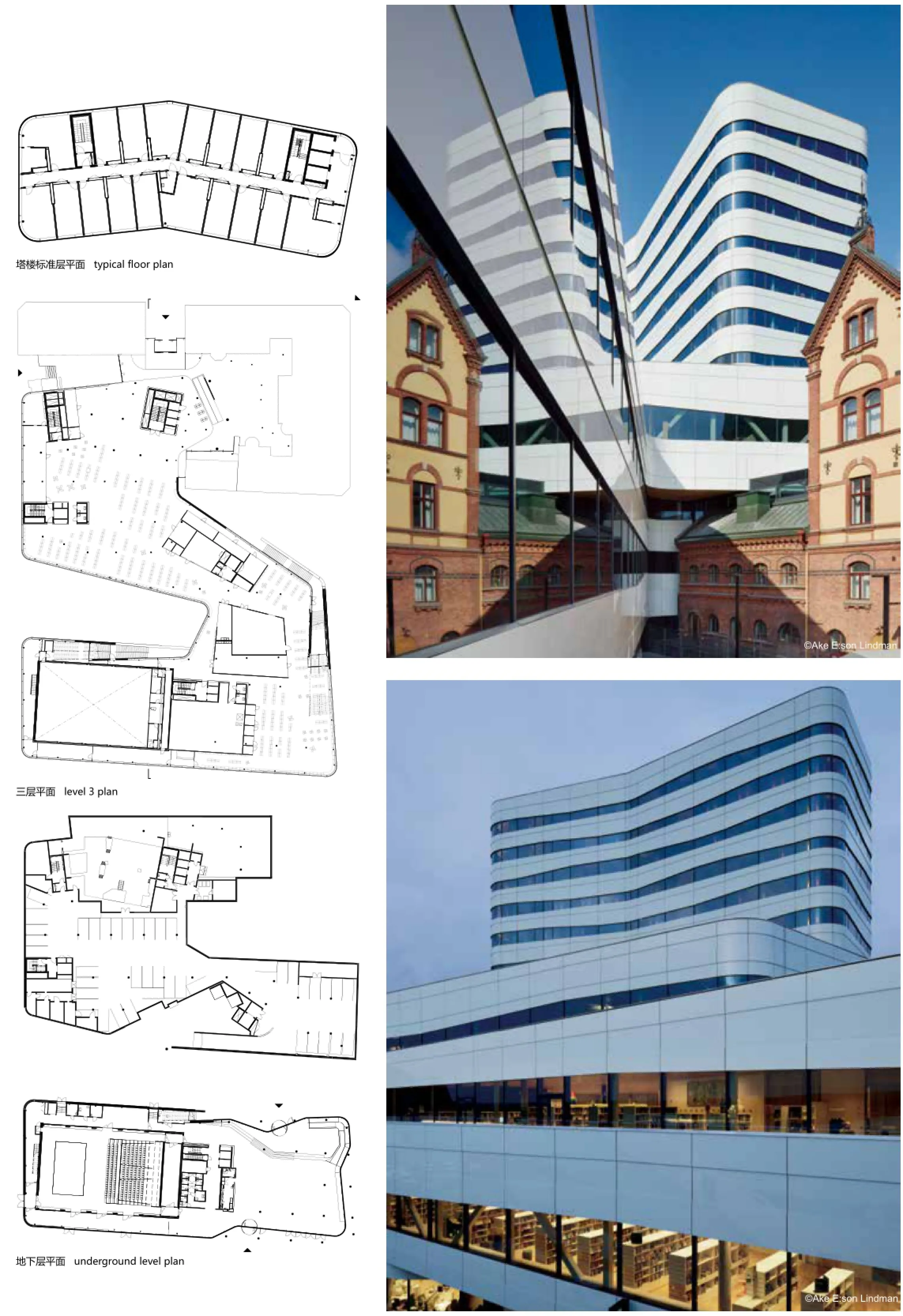
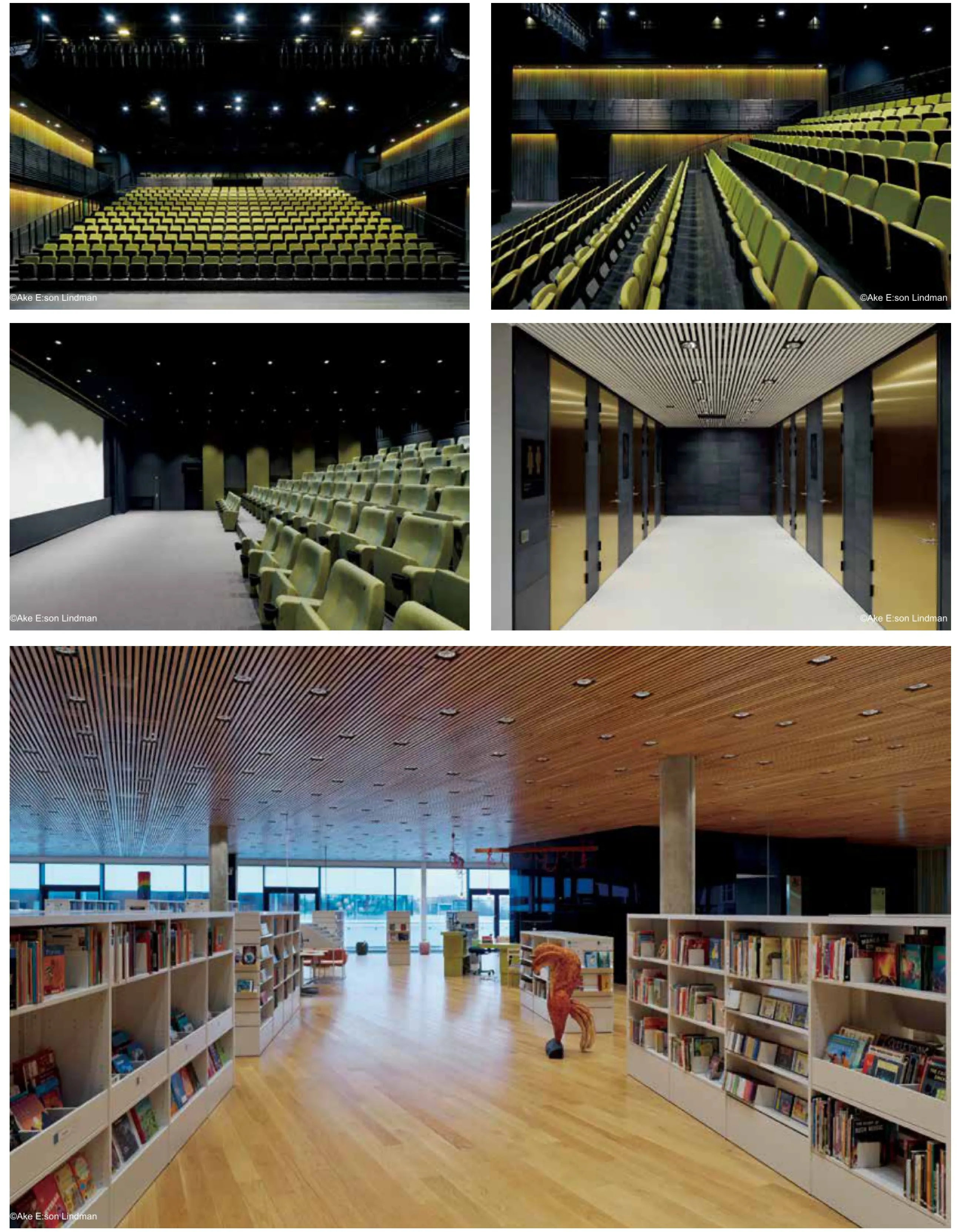
编织文化中心位于默奥市中心,毗邻Ume河上的市政厅公园。斯诺赫塔建筑师事务所与White ARKITEKTER AB合作设计的新文化中心覆盖市中心的整个街区。该新建筑融合了多个文化项目和不同的功能(故名Väven,瑞典语的“编织”),提供了一个共同的舞台。建筑物外观和楼层体现了文化、文学、知识、社交、娱乐和餐饮功能的融合。
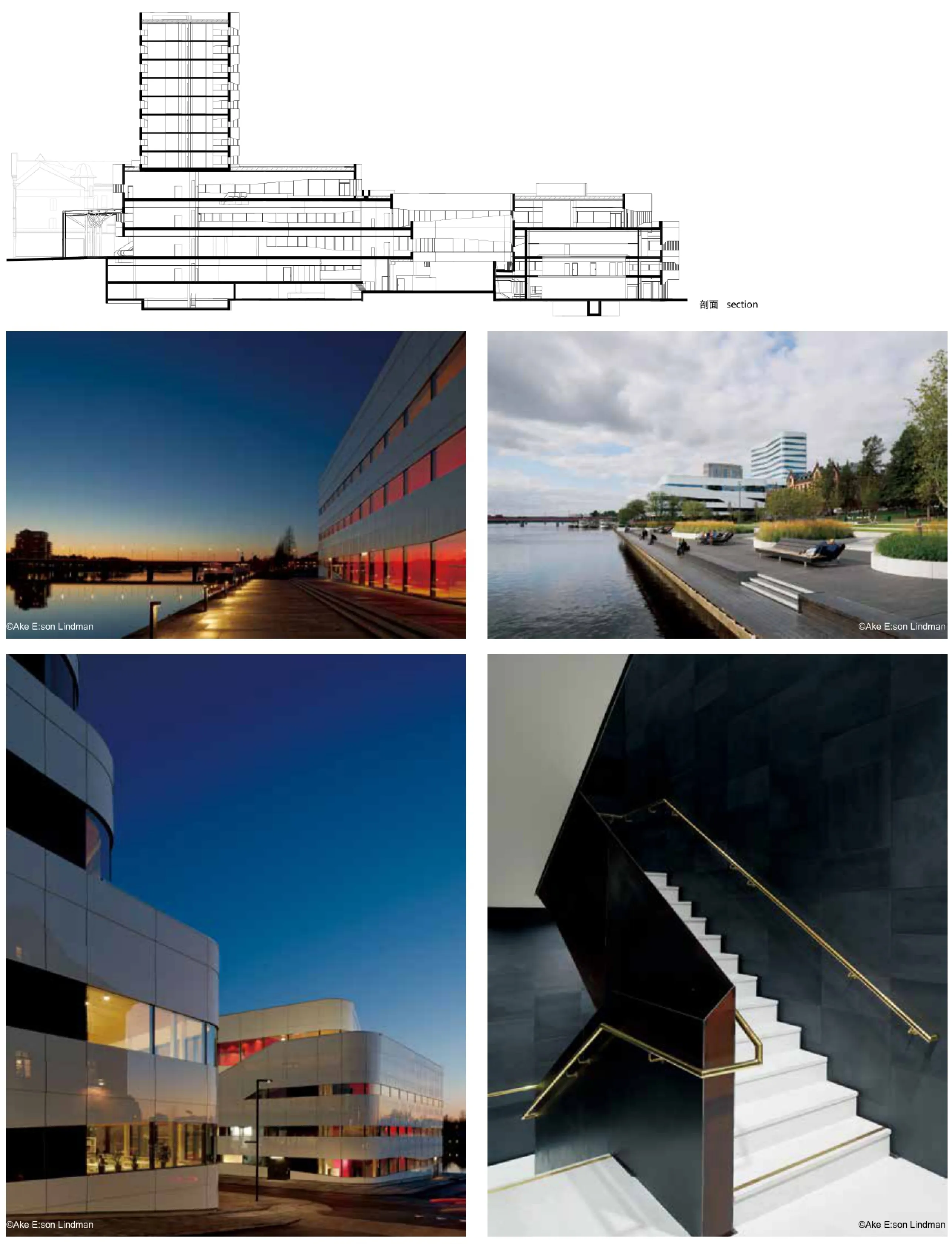
建筑物的一部分位于现有城市网格围限的场地,另一部分在码头区域——功能是暂时的,但使用灵活。设计吸取了建筑物的原定用途以及场地特征。编织文化中心集综合楼各公共功能于一体。总体体验强调由各部分组成的整体,建筑人性化,打破内部功能与公共空间之间的障碍。
编织的概念不仅体现在文化的方方面面,而且存在于建筑许各种的功能之中,包括酒店、会议中心、黑箱剧场、博物馆和图书馆,规模大,但姿态统一。将建筑各种功能“包裹”于同样的表面是取得此种效果的方式,其中各种稍稍移动的外墙圈构成外围,形成强烈的图形对照。建筑也融入城市,位于现有的城市画面之中,高层部分可以俯瞰城市,低层部分融合于城市之中。
同时,建筑理念形成时还参考了默奥当地常见的桦树。封闭部分就像是桦树上的白色树皮,而开放的玻璃幕墙则像是树皮剥裂处露出的黑色树干。鉴于这两个概念以及建筑反映周围人群、天空和河流从而与周围环境沟通的设想,因此选择玻璃为外墙的主要材料。
The cultural center Väven is part of an urban development project - the City between the Bridges. The new development is seen as an important catalyst for Umeå's urban regeneration, and it aims to create a cultural area along the river Ume.
Väven is located in Umeå's city center, next to the town hall park on the river. The new cultural center covers a whole block in the heart of the city. Designed by Snøhetta in collaboration with White Arkitekter AB, this new building weaves (hence the name Väven, meaning ‘weave' in Swedish) multiple cultural programs and activities together, providing one common stage. A weave of culture, literature,knowledge, socializing, recreation, and food is expressed in the building's facades and levels.
One part of the building lies on a site defned by the existing city grid, while the rest occupies part of the quayside - a zone characterized by transient activity and fexibility of use. The design takes its cues from the building's intended use, as well as the characteristics of the site. Väven unifes various public functions in one complex building.
The overall experience emphasizes a whole made up by many parts, giving the building a human scale,braking down the barriers between internal activities and public space.
The concept of weaving is not only present in the cultural aspects, but also in the many different functions of the building, including hotel, conference center, black-box theatre, museum, library, and many others, with one large, unifying gesture. This is achieved by ‘wrapping' the manifold functions of the building in one homogenous façade, consisting of varying and slightly shifting façade bands forming the building envelope and creating a strong graphical reference. The building also weaves into the city -in between, above, and below the existing city picture.
At the same time, the reference of the birch trees, a tree typical for Umeå, was used in creating the concept. The white bark resembles the closed parts of the building, while the darker areas symbolize the open, glazed parts. These two concepts, as well as the wish for a building that communicates with its surroundings by refecting the people around, the sky, and the river, led to the choice of glass as the main material for the façade.

小詹姆斯·亨特图书馆
地点:美国北卡罗来纳州
业主:北卡罗来纳州立大学图书馆
类型:图书馆
执行建筑师:Clark Nexsen(原PBC+L)
项目状况:2013年完工
设计范围:建筑、景观和室内
Location: Raleigh, North Carolina, USA
Client: NCSU Libraries
Typology: Library
Executive Architect: Clark Nexsen (formerly PBC+L)
Status: Completed 2013
Scope: Architecture, Landscape and Interior
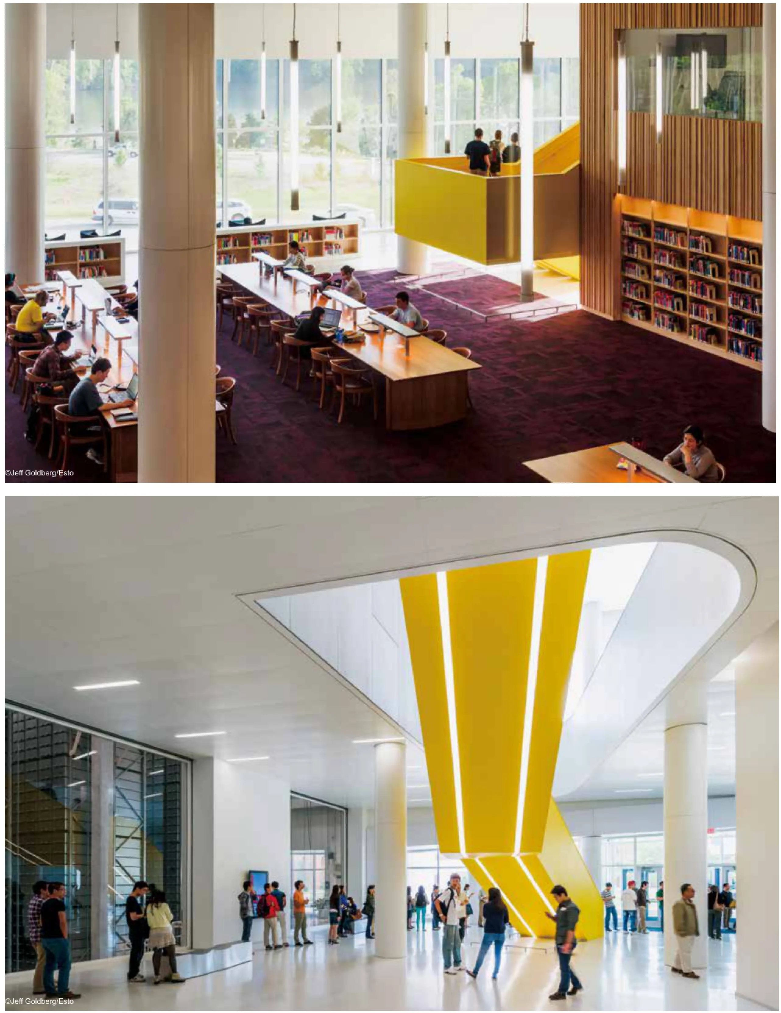
2013年7月,斯诺赫塔建筑师事务所与北卡罗来纳大学当地建筑师Clark Nexsen(原PBC+ L)合作设计的北卡罗莱纳州立大学新小詹姆斯·亨特图书馆获得了2013年图书馆建筑奖,这是美国建筑师学会和美国图书馆协会认可的优秀设计奖。
为了设计这个新建筑,斯诺赫塔建筑师事务所与当地建筑师Clark Nexsen以及北卡罗来纳大学(NCSU)图书馆密切合作,树立先进技术协作学习空间的新标杆。它既是州立的知识库也是社会的大学校园中心。亨特图书馆包含新兴问题的研究所——前北卡罗来纳州州长詹姆斯·亨特(James B. Hunt)领导的智囊团、学术办公室、可视化和数字媒体实验室和礼堂。建筑设计旨在让高校通过民主化方式获得驱动经济的技术而取得决定性的竞争优势。
图书馆是动态的、不断变化的。虽然亨特图书馆显然是一个传统范畴内的当代结构,但不同之处是它提供了影响周围环境的前瞻性平台。技术创新和方案创新都升华成学习经验的一部分,并为用户提供一个多功能和激励性的环境。
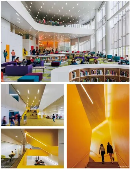
所以有楼层的大型开放的学习室都用透明楼梯相连,强调除了严谨的研究领域还有互动和社会性的环境。各种各样的研究和学习环境以及技术严谨的实验室,超越了当前以学习为主的一贯模式。装备五彩缤纷并动感十足家具的“颠覆性”学习空间毗邻传
统的学习室。建筑的设计意识到这里既是一处社会交往的聚集点,也是一个激发创意的孵化器。
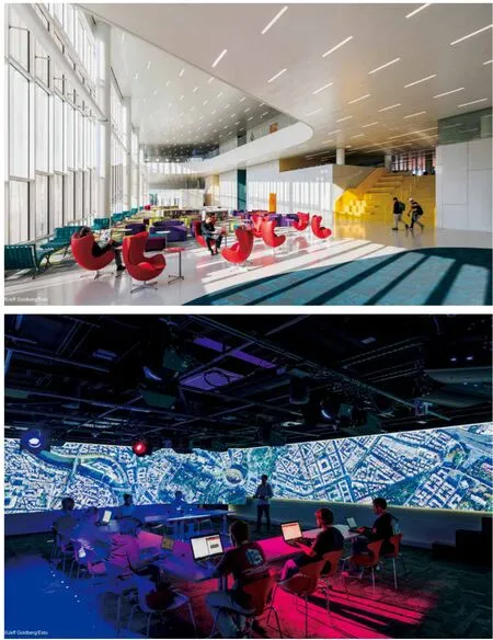
整个图书馆也处处融入了各种技术。交互式数字和高清视频显示屏传递编程和现场输入信息。游戏实验室作为视频游戏设计和开发项目的测试实验室,并为学生提供有趣的学间休息区。高科技展柜使得用户可以尝试新技术,借用最新电子设备。工作人员区域集中在一层楼上,而不是分散在各楼层。
亨特图书馆还为其200万册藏书采用了名为“BookBot”的自动化存储和交付系统。这项性价比高且节省空间的措施减少建筑面积达20万平方英尺,让大学有更多的预算和图书馆空间划拨到实现技术和协作学习的空间。
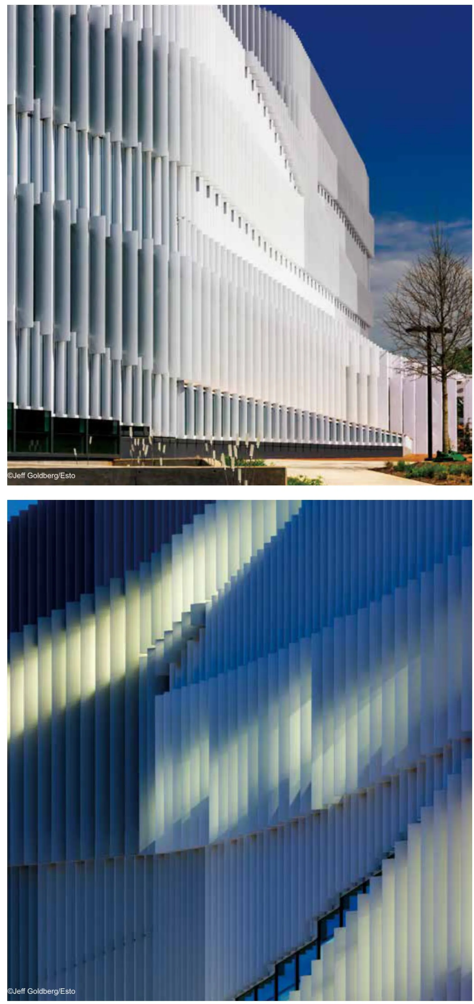
LEED银色大厦提供充足的自然采光,户外工作场所和附近湖泊的景致开阔。许多可持续发展的设计功能都集中到建筑中,包括烧结玻璃和固定的外部铝板遮阳系统有助于减少吸热,同时视野最大化并尽量采用环境的自然光。
天花板安装的主动式冷梁和辐射板用于供暖和制冷,收集系统则将雨水用于花园和屋顶绿化。
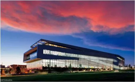
In July 2013, the new James B. Hunt Jr. Library at North Carolina State University, designed by Snøhetta in collaboration with local architect Clark Nexsen (formerly PBC+L), received the 2013 Library Building Award from the American Institute of Architects and the American Library Association in recognition of design excellence.
For the design of the new building, Snøhetta and Clark Nexsen worked closely with the NCSU Libraries to set a new benchmark for technologically sophisticated collaborative learning spaces. It serves both as NC State's second main library and the intellectual and social heart of the university's Centennial Campus. The Hunt Library also houses the Institute for Emerging Issues, a think tank led by former North Carolina Governor James B. Hunt, academic offces, visualization and digital media labs and an auditorium. It is designed to be a decisive competitive edge for the university by democratizing access to the technologies driving our economy.
Libraries are dynamic and continually changing. While clearly a contemporary structure within a traditional context, the Hunt Library provides a forward-thinking platform for infuencing its surroundings. Both technical and programmatic innovations are celebrated as part of the learning experience and provide a versatile and stimulating environment for the user.
Generous open spaces connect all floors of the library and open stairs emphasize an interactive and social environment alongside more focused study areas. A wide variety of study and learning environments and technology-focused experimental labs go beyond the now ubiquitous model of the learning commons. “Disruptive” learning spaces with colorful,dynamic furnishings exist adjacent to more traditional study rooms. The building's design recognizes the power of chance encounters and celebrates the role physical space plays in the intellectual stimulation of its users.
Technology zones are integrated throughout the Library as well. Interactive digital surfaces and high definition video display screens deliver both programmed and live-feed information. The Game Lab serves as a testing lab for the video game design and development program, and provides students with a fun study break area. The Tech Showcase allows users to experiment with new technology and borrow the latest electronic devices. Staff areas are consolidated on one foor rather than dispersed in clusters on each foor.
The Hunt Library also employs the use of the bookBot,an automated book delivery system, for the Library's two million volume collection. This highly effective cost and space saving measure reduced the building area by 200,000 GSF, allowing more of the University's budget and library space to be allocated towards technology and collaborative learning spaces.
The LEED Silver building provides abundant natural light,outdoor work spaces and expansive views of the nearby lake. Many sustainable design features are integrated into the building including fritted glass and a fxed external aluminum shading system helps diminish heat gain while maximizing views and ambient natural light.
Ceiling mounted active chilled beams and radiant panels provide heating and cooling while rain gardens and green roofs manage storm water.
亚历山大图书馆
地点:埃及亚历山大省
业主:阿拉伯埃及共和国教育部
类型:图书馆
面积:80 000平方米
项目状况:2001年完工
当地建筑师:Hamza Associates
绘图:斯诺赫塔建筑事务所
Location: El Shatby, Alexandria, Egypt
Client: Arab Republic of Egypt, Ministry of Education
Typology: Library
Size: 80 000 m²
Status: Completed 2001
Local Architect: Hamza Associates
Drawings: ©Snøhetta
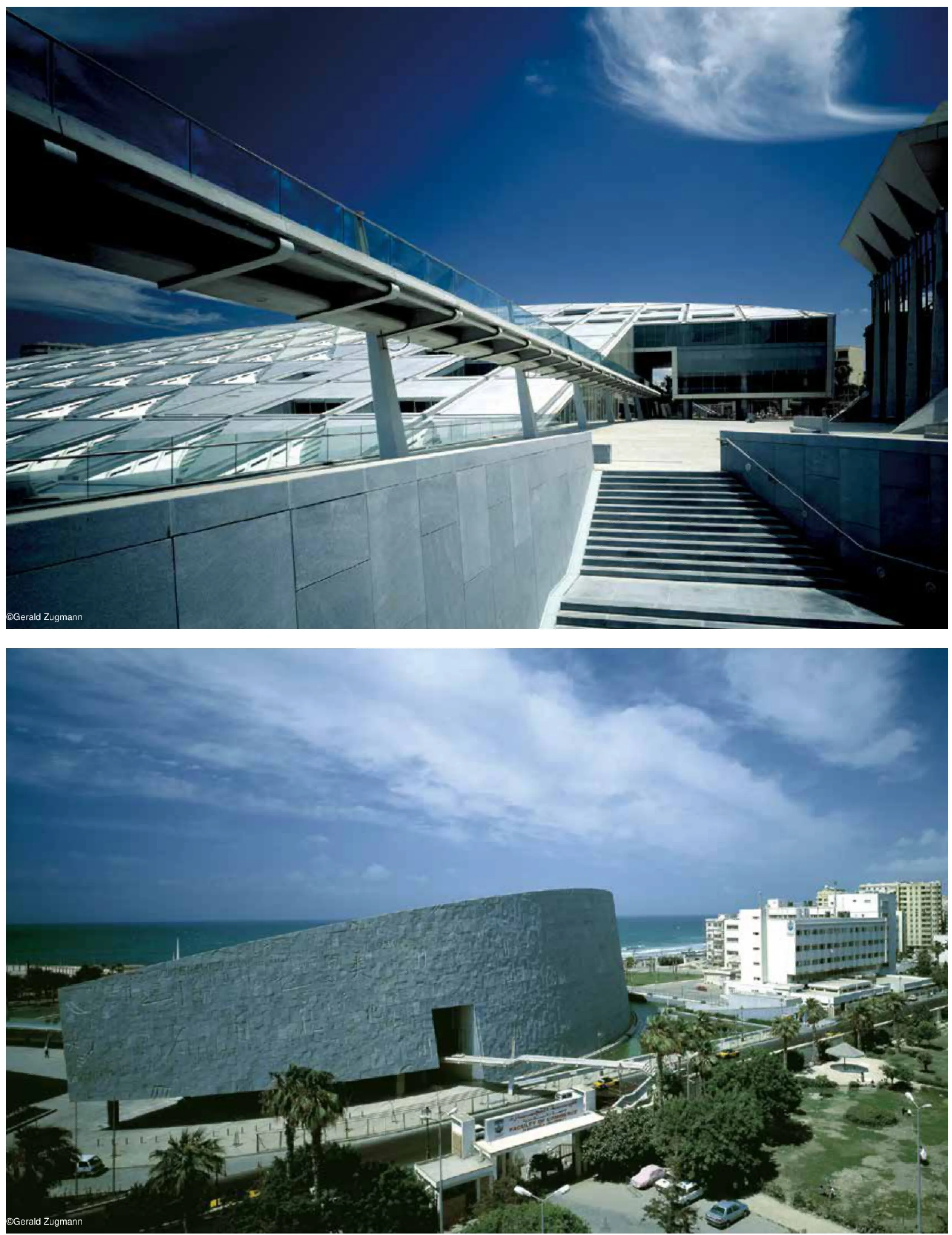
该图书馆建在亚历山大城市的历史中心,一个位于古老港口边的宽广场地上。11层的图书馆可藏书400万册,通过压缩储存,这个数字在将来可以上升到800万册。
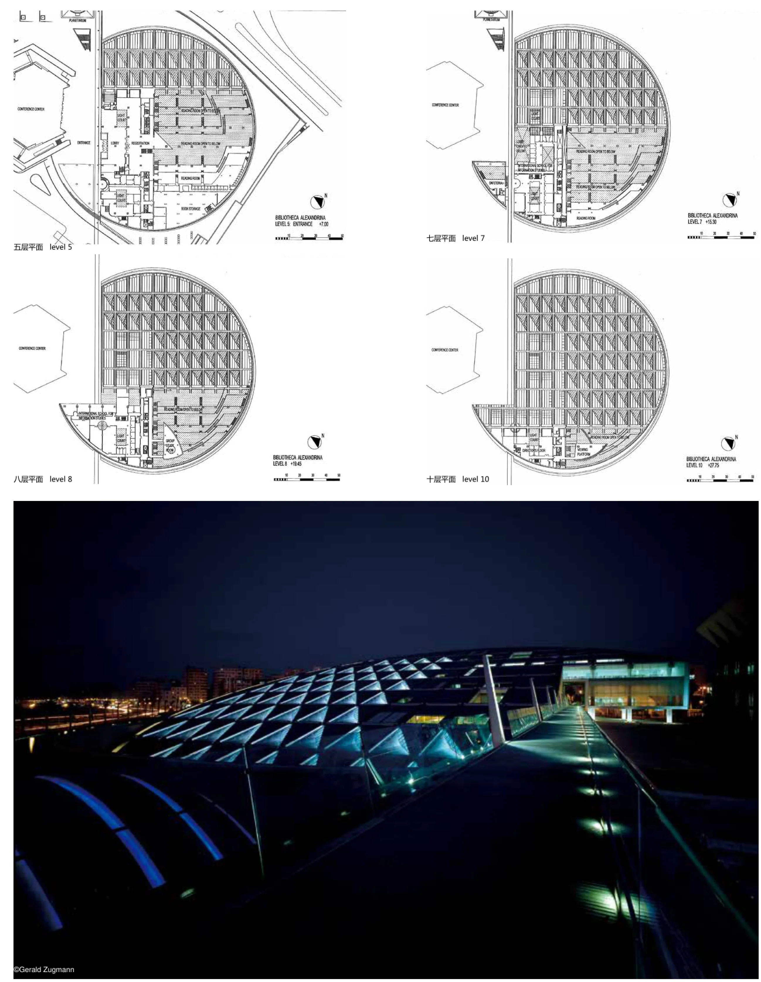
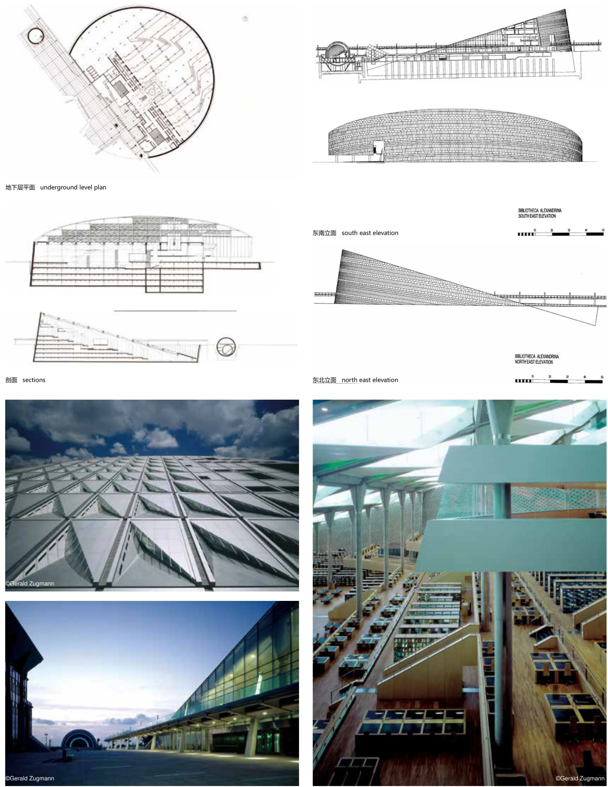
20000平方米的开放式阅览空间可容纳2000名读者,超过图书馆一半的体积,一共有7个平台,规模全球最大。通过朝北的立式屋顶天窗间接采光,这个宽敞的空间不会直接暴露在阳光下,因此不会损害书籍和手稿。与按采用传统图书馆规划的许多最近竣工项目相比,台阶分布式阅览空间的设计,大大减少了图书检索时间。
同一层的阅读区与书架相邻配置,每一层都放置有书架,紧挨上一层。这样一来,坐在两层交界处的读者,不仅可以享受最佳自然光线并欣赏巨大的空间,而且靠近相关的图书存储区。在整个阅览空间中重复这一概念,形成巨大的环形阅览空间,且设施齐全,采光均匀。此外,最新数字信息设施进一步增强该建筑的效果。
除了藏书设施,图书馆还有其他文化和教育功能,包括一个天文馆、几个博物馆,一个信息科学教育点和各种保护设施。青年图书馆可对年轻学生和游客开放。此外,新的会议中心连通该场所现有的礼堂,使得该图书馆成为学习和交流中心。
会议中心像一个巨大的倾斜轮盘,直径跨距160米,高达32米,同时最低处潜入地面以下约12米。开放的外部广场和环绕建筑的倒影池,一座行人天桥将城市连接到附近的亚历山大大学。
新馆的设计既永恒又大胆。沿圆形的亚历山大港,其庞大的圆形唤起知识随时光流动的周期性。它闪闪发光的倾斜屋顶让人回忆古代亚历山大灯塔,是城市学习和文化的新符号。
随着落地和升空,图书馆在明显运动轨迹中体现出时光冻结的时刻。与运动同步,矗立史无前例的宏伟石建筑。在6000平方米的弯曲建筑外墙上装饰有花岗岩,刻有从世界各民族语言字母表中选择的字母,铭文仔细显示该图书馆的基础附文、语言。
新图书馆馆的设计采用了最先进技术的最新解决方案,包括世界上最杰出的基础和结构设计之一。其室内也经过精心设计,满足用户四个季节的舒适性。先进的解决方案也用于减轻自然灾害,如地震和火灾的影响。
亚历山大图书馆将成为这个历史悠久城市中心未来发展的催化剂。开发项目已经开始,滨海公路正在经历全面改造,项目邻近地区正处于重塑。本图书馆的目标是振兴城市和地区,成为新的学习和文化中心,朝圣之地,长盛不衰之所。
The 80,000 square meter Bibliotheca is built on a magnifcent site alongside Alexandria's ancient harbor in the historic center of the city. The 11-story library can contain up to 4 million volumes of books, a fgure that can be expanded up to 8 million in the future by the use of compact storage.
The 20,000 m2open reading room for 2000 readers, the largest of its kind, worldwide, occupies more than half of the library volume and is stepped over seven terraces. Indirectly lit by vertical, north facing skylights in the roof, the spacious room will not be exposed to direct sunlight that is harmful to books and manuscripts. The terraced reading room design reduces book retrieval time considerably, compared to traditional library planning employed in many recently completed projects.
Reading areas and stacks are arranged at close proximity at the same level, the stacks being placed at each terrace level, underneath the next higher terrace. This way, the readers who are sitting at the terrace edge, enjoy maximum exposure to natural light and grand views of the space while being in close proximity to the associated book storage area. This concept is repeated throughout the room and creates a large amphitheater with a large variety of evenly lit reading facilities. The building is further augmented by up-to-date digital information facilities.
In addition to the library facilities, the Bibliotheca also contains other cultural and educational functions including a planetarium, several museums, a school for information science, and conservation facilities. A Young Person's Library is available for younger students and visitors. Added to this a new conference center is linked to an existing auditorium on the site, making the Bibliotheca a centerpiece for both learning and debate.
Characterized by its circular, tilting form, the building spans 160 meters in diameter and reaches up to 32 meters in height, while also diving some 12 meters into the ground. An open plaza and refecting pool surrounds the building, and a footbridge links the city to the nearby University of Alexandria.
The design of the new library is both timeless and bold. Its vast circular form alongside the circular Alexandrian harbor recalls the cyclical nature of knowledge, fuid throughout time. Its glistening, tilting roof recalls the ancient Alexandrian lighthouse and provides the city with a new symbol for learning and culture.
As it descends into the earth and reaches upward to the sky the library manifests within its apparent movement a frozen moment in time. Synchronous with this movement stands a grand stone edifce of historic proportions. The 6000 m2wall is carved with alphabetic inscriptions from throughout the world in a careful display of the library's basic proviso, language.
The new library's design has employed the most up-to-date engineering solutions and includes one of the world's most distinguished foundation and structural designs. Its interiors are carefully designed for the comfort of the user during all seasons. State of the art solutions have been employed to mitigate the effects of natural disasters such as earthquake and fre.
The Bibliotheca Alexandrina will be the catalyst for future developments in the historic city center. Signs are already underway, the Corniche road is undergoing a complete renovation and areas adjacent to the project are undergoing remodeling. The Bibliotheca is intended to revitalize the city and the region as a new center for learning and culture, a place of both pilgrimage and long-term viability.
培特·达斯博物馆
地点:挪威阿尔斯塔海于格
业主:KF Petter Dass Eiendom
类型:博物馆
面积:1 350平方米
项目状况:2007年完工
设计范围:建筑、景观与室内
绘图:斯诺赫塔建筑事务所
Location: Alstahaug, Norway
Client: KF Petter Dass Eiendom
Typology: Museum
Size: 1 350 m²
Status: Completed 2007
Scope: Architecture, landscape, interior
Drawings: ©Snøhetta
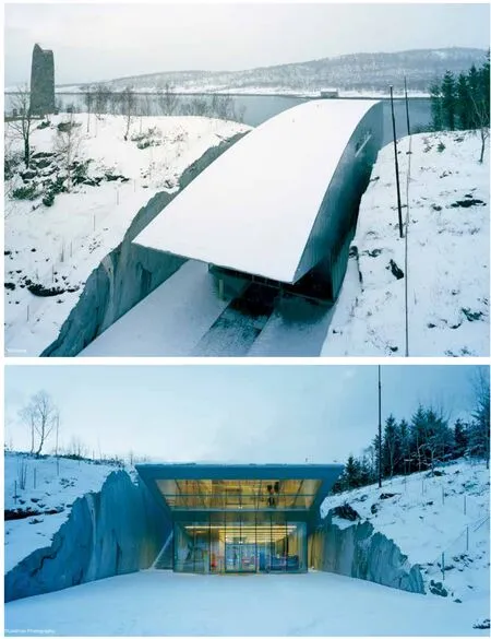
培特·达斯是一位牧师和作家。从1689年直到1707年去世,他都生活和工作在挪威北部。培特·达斯与穷苦渔民建立了紧密的联系,他的诗歌和他无所畏惧、开放的个性使他成为挪威的传奇人物。
阿尔斯塔海于格以其建筑、墓地和田野形成了美丽的人文景观。业主决定在教区牧师住所和老教堂附近建造一个新的博物馆。斯诺赫塔建筑事务所建议选址靠近老教堂,在教堂和大海之间的狭窄山脊上挖开一个长70米宽15.5米的开口,建立一个连接教堂入口的亲密空间和西边壮丽景观的场所。
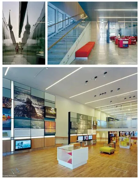
建筑确定建在这个开口中,屋顶的形状折射出山脊的曲线。建筑物的地面层是透明的,二楼的展览空间是用一种有组织的“茧“进行封闭。在展览厅的东端,人们可以俯看到历史的教堂绿色,而在展览厅的西端,则可以欣赏到永恒的海岸景观。通过这种方式,建筑就可以把地和天、昔和今结合起来,正如培特·达斯在他的作品中写到的一样。
该博物馆的建筑面积是1 350平方米,它包括首层的大厅、礼堂和二层的咖啡厅;以及一个三楼的大型展览空间。
Petter Dass was a clergyman and a writer. He lived and worked in North Norway from 1689 until his death in 1707. Petter Dass established strong ties with the poor fshing population. His poetry and his fearless, open personality made him a legendary character in Norway.
Alstahaug with its buildings, cemetery, and fields forms a beautiful cultural landscape. The client decided to build a new museum, adjoining the vicarage and the old church. Snøhetta suggested the site, close to the old church. With a wire saw, a 15.5-meter-wide and 70-meter long cleft was cut in the narrow ridge between the church and the sea, establishing a site that connects the intimate space by the church entrance and the imposing landscape to the west.
The building is positioned in this cleft. The shape of the roof refects the curve of the ridge. At ground level, the building is transparent, while the frst foor with the exhibition space is enclosed in an organic “cocoon.” At the east end of the exhibition room one can look down on the historical church green, while at the west end one is confronted by the timelessness of the great coastal landscape. In this way, the building combines — as Petter Dass did in his writing — earth and sky,past and present.
The foor area of the building is 1.350 m2. It contains a lobby, auditorium, and café on the frst foor;and a large exhibition space on the second foor.
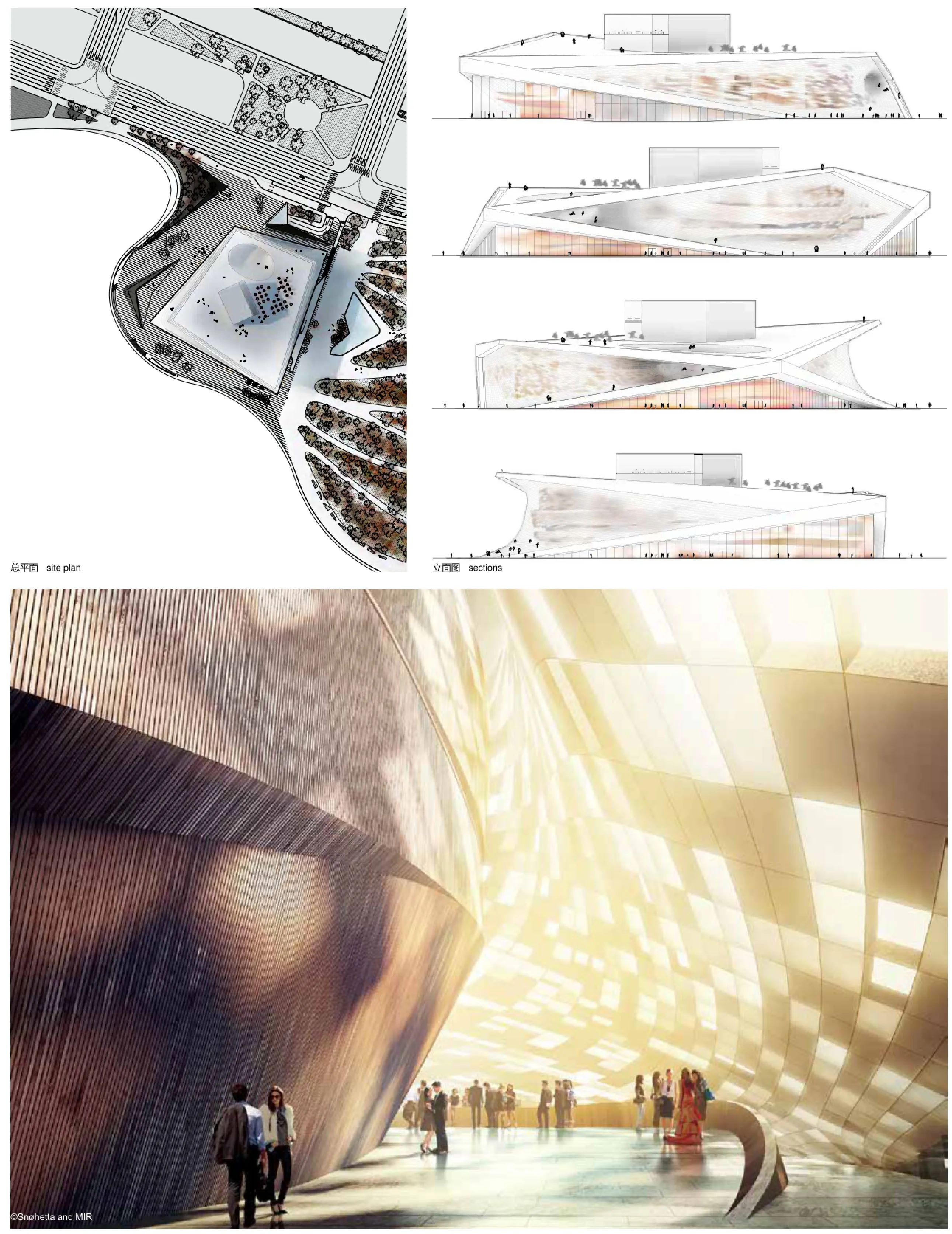
釜山歌剧院
地点:韩国釜山
业主:釜山市政府
类型:歌剧院
面积:48 000平方米
项目状况:设计竞赛一等奖,施工中
当地合作者:Ilshin建筑师事务所
设计范围:建筑、景观与室内
绘图:斯诺赫塔建筑事务所
Location: Busan, South Korea
Client: Busan Metropolitan City Government
Typology: Opera house
Size: 48 000 m²
Status: Competition 1st prize, in progress
Local partner: Ilshin Architects
Scope: Architecture, landscape & interior
Drawings: ©Snøhetta
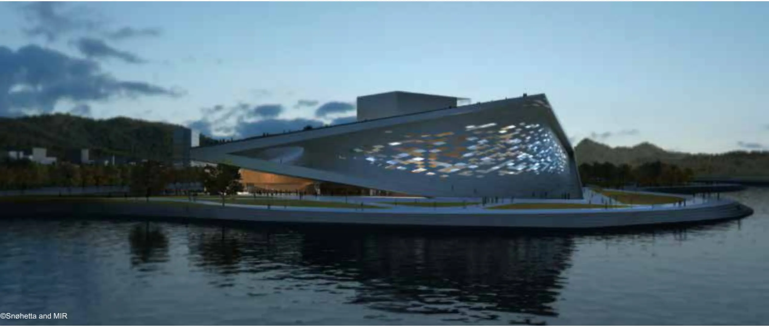
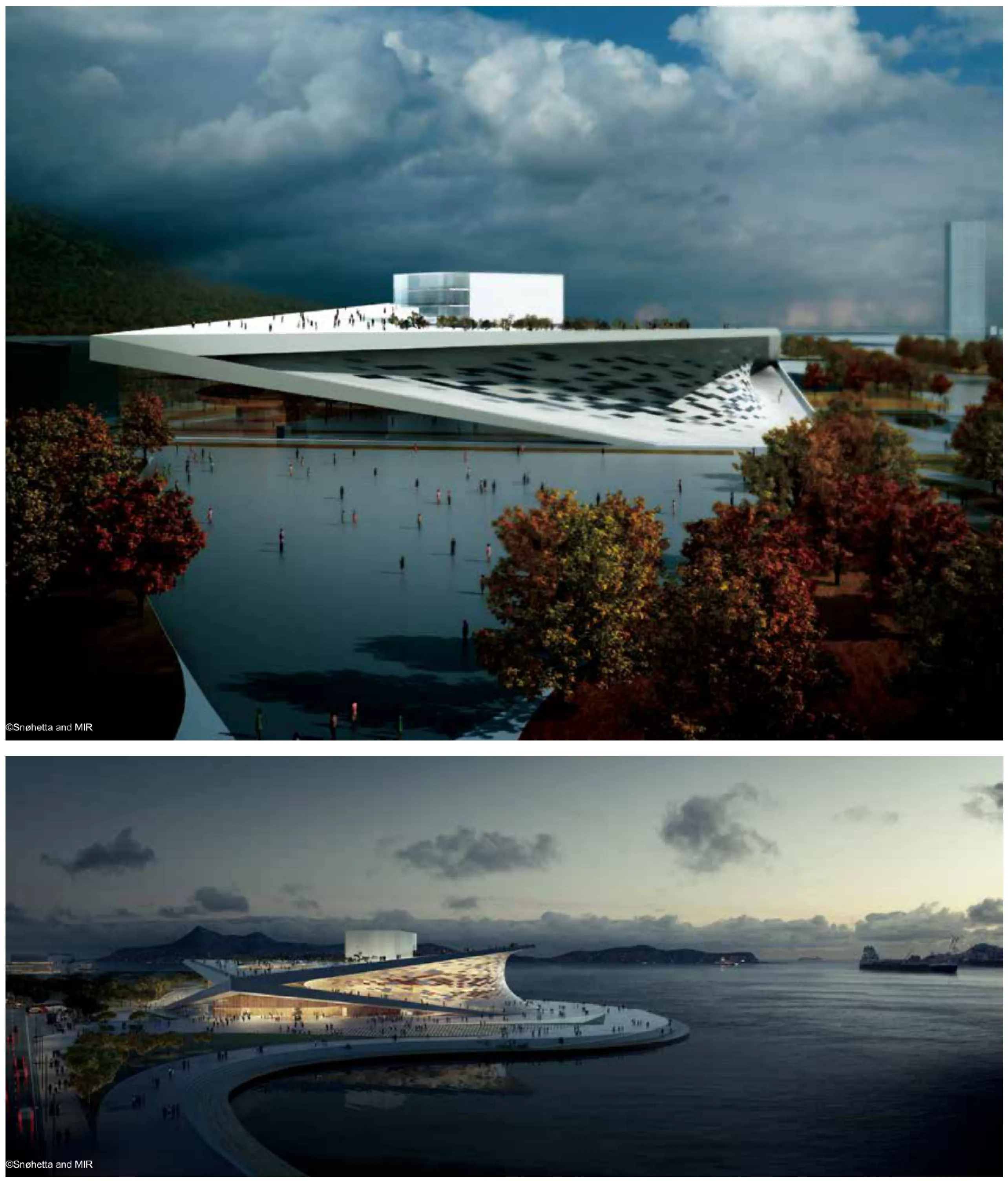
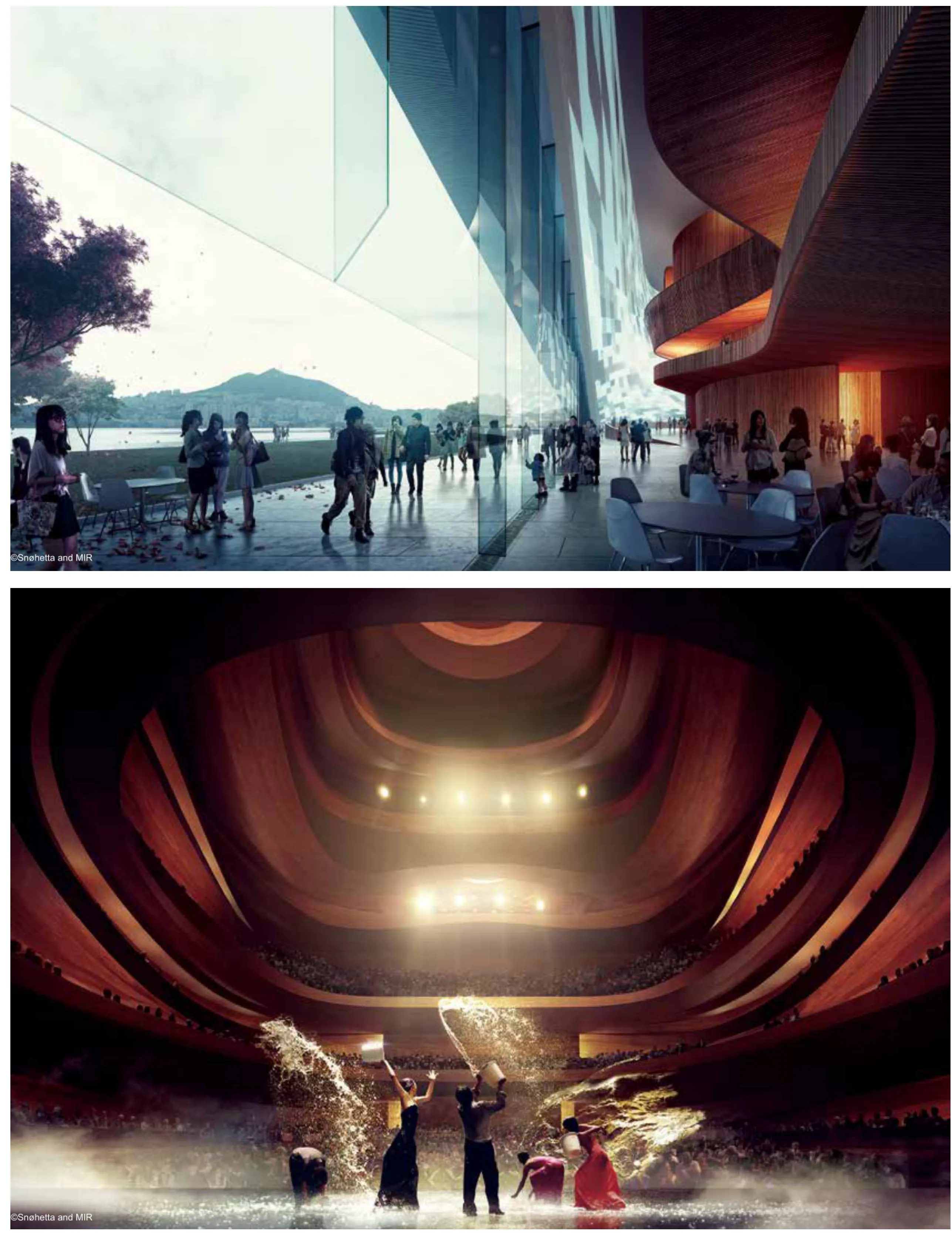
在斯诺赫塔建筑事务釜山歌剧院的设计中,歌剧不再是精英们被动享受的场地,而变成互动性的民主空间,回应公众的渴望与兴趣。新的歌剧院位于韩国釜山海滨开垦的土地,将促使釜山这个历史上的工业区转变为釜山人的公共空间。
建筑形式来源于其所在的环境和文化。布局参照Kun(天)和Kon(地)交汇再与Kam(水)相遇之意。这些经典八卦元素极好地描绘了现场的地理,同时也表明在历史和哲学关系上对韩国文化的重要意义。在斯诺赫塔的设计中,表面的轻微弯曲就像轻微变形的卦片,以一种微妙的方式彼此轻触和交汇。
歌剧院的大厅构思源自一种乐器,与歌剧音响和回声精确形成共鸣。与门厅墙壁一样,观众席也用樱桃木的实心面板构成。在地平面上,釜山歌剧院则尽可能设计成开放式。门厅空间围绕建筑朝向大海的两侧。房子门厅、餐厅和花坛公共入口的正面位置都处于相同水平面。
有特色的斜坡弯道通向屋顶的第二层公共景观。游客可以在屋顶上行走,好像建筑因为占据空间而对公众回馈。
横跨在两个公众平面之间,并涵盖了公共功能的是一层柔软的流动表皮,为门厅提供保护和透明度,连贯地连接地平面与屋顶平面,一气呵成。
With the design of the Busan Opera, the opera is no longer a passive playground for the elite but becomes interactive, democratic space, responding to the public's ambitions and interests. Located on reclaimed land on the city's waterfront, the new Opera help will convert the historically industrial area into a public space for Busan.
The form is derived from its own context and culture. The layout refers to Kun (Heaven) meeting Kon (Earth)which again meet Kam (Water). The classical trigrams of these elements describe this site exceptionally well, whilst also referring to the historical and philosophical relationships of great importance to Korean culture. The slight bending of the surfaces in Snøhetta's design are the bars of the trigrams slightly deformed to touch and meet each other in a subtle manner.
The Opera hall is conceived as a musical instrument, precisely formed to resonate with the operatic acoustics and resonance. As with the foyer wall, the auditorium is to be constructed from solid panels of Cherry wood.
The Busan Opera House is designed to be as open as possible on the ground level. The foyer space wraps around two sides of the building towards the sea. This level is the location for main front of house foyer, restaurant and public entrance to the Parterre.
The characteristic onramps lead to a second public scape on the rooftop, giving back to the public what the building's footprint occupies by allowing the visitors to walk on its roof.
Spanning between the two public planes and enveloping the public functions is the soft flowing skin, offering protection and transparency to the foyer within and linking the ground plane to the roof plane in an unbroken movement.
阿卜杜勒阿齐兹国王世界文化中心
地点:沙特阿拉伯达兰
业主:沙特阿美公司
类型:文化中心
面积:100 000平方米
项目状况:施工中,预计2015年完工
绘图:斯诺赫塔建筑事务所
Location: Dhahran, Saudi Arabia
Client: Saudi Aramco
Typology: Cultural center
Size: 100 000 m²
Status: Under construction, expected 2015
Drawings: ©Snøhetta
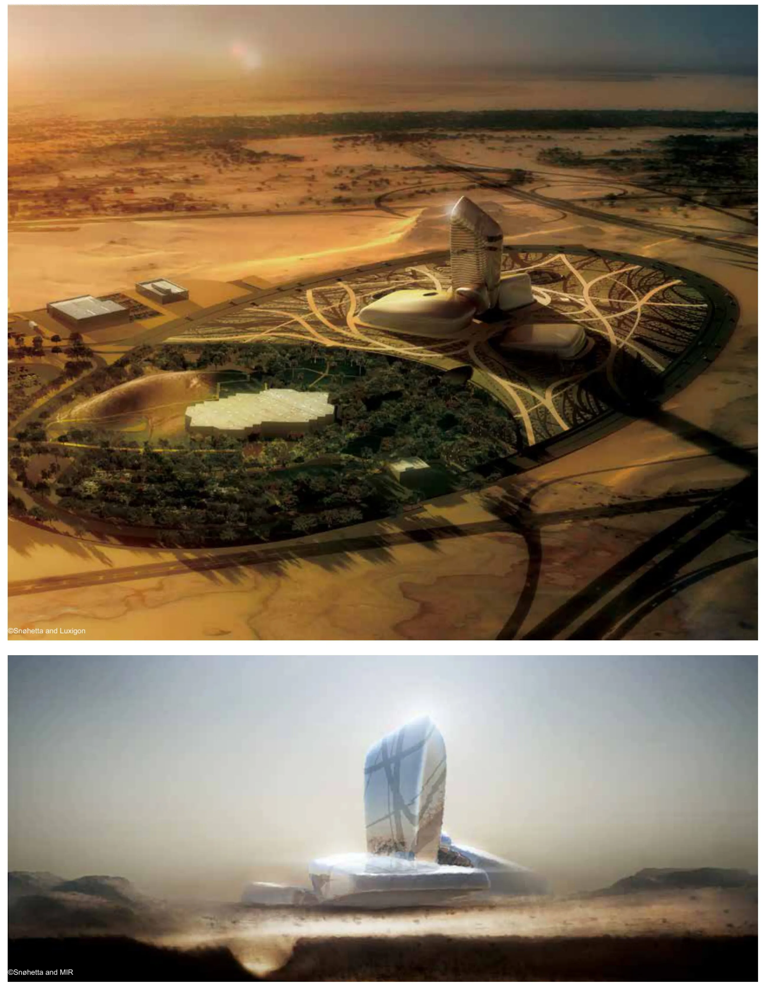
阿卜杜勒阿齐兹国王世界文化中心是沙特阿美石油公司为促进王国文化的发展而推出的一个大胆的新举措。2007年,应邀参加建筑设计竞标后,斯诺赫塔建筑事务所中标,获得了这个著名文化设施的设计权。
文化中心位于沙特东部达兰省,开展广泛的文化活动服务当地居民,是地区、全国和全球范围内的文化地标。建成后,项目将包含约45 000平方米的各种文化设施,包括礼堂、电影院、图书馆、展览馆、博物馆和档案馆。
礼堂将容纳1000观众,可广泛用于各种文化活动,包括歌剧、交响音乐会、音乐剧和演讲等,还有小电影院。这里将是沙特王国一个无与伦比的艺术表演场所。
文化中心的图书馆将成为学习中心,满足各种年龄段和各种类型读者需求的约300000册图书,将免费向读者开放。
大展馆将容纳大型巡回展览,并提供社交活动、宴会和会议设施。博物馆和档案馆便于将中心充满活力的文化生活联系到过去和社会最基层。这正是该中心的构想宗旨。
建筑理念基于以下六个观点:
过去与未来
文化来源于过去,没有文化沉淀,任何团体或公司就不可能创造未来。沙特阿美文化中心采用的设计同时包含过去和未来,着眼于当下。方案从建筑表现和内在逻辑两方面都发掘过去,展望未来。
内外
理念是指要既内向又外向。地平面以下,博物馆和档案馆围绕楼内深井布置,向内才能探知沙特阿美公司和沙特阿拉伯王国的文化和知识。地平面以上,建筑组合体伸出地面,连接外面的世界。
宝库和灯塔
博物馆和档案馆位于地平面以下,在受保护的环境中是真正的知识宝库,为后人储藏知识。然而,图书馆、儿童展厅和游客中心表现为世界各地学者的灯塔。
多元化和统一性
设计采取复杂组合体的形式,由许多单独和分散的组件组成。通过相互依存创建平衡与和谐。每个组件都塑造为独特而量身定制的实体,符合和表达自身的个性化需求和要求。
团队合作
每一组件都是必不可少的,一切都相互依存和依靠。由此产生的组合体是团队合作的表现。每一部分都可不断调整,以适应个体化的具体需求。这种灵活形式不是一般的或总体的,而是具体的和个体的。
能源概念
组合体的平衡与和谐不是静态的,而是动态的,是团队合作精神的表现,最重要的是发现包括沙特阿美公司和沙特阿拉伯人在内所有人的正能量。为石油先驱者在恶劣条件下的坚定耐力和辛勤劳动而发出感叹,载入记忆。
The King Abdulaziz Center for World Culture is a bold new initiative on the part of the Saudi Aramco Oil Company to promote cultural development within the Kingdom. Following an invited architectural design competition in 2007, Snøhetta has been selected to design this prestigious cultural facility.
Located in Dhahran, in the eastern province, the cultural center will provide for a wide range of activities serving the local population and becoming a cultural landmark on a regional, national, and global horizon. When completed, the project will contain some 45.000 m2 of diverse cultural facilities, including an auditorium,cinema, library, exhibition hall, museum, and archive.
The auditorium will seat 1000 visitors and will provide for a wide range of events ranging from opera, symphony concerts, musicals, and speeches etc. Together with the smaller cinema, this will be an unrivalled venue for the performing arts in the Kingdom.
The library will become a center for learning containing some 300.000 books on open access, and catering for all ages and categories of users.
The great exhibition hall will accommodate large scale travelling exhibitions, as well as providing the setting for social events, banquets, and conferences. The museum and archive facilities connect the vibrant cultural life of the center to the past and to the very roots of the society from which this center is conceived.
The architectural concept is based upon the following six concepts:
The Past and the Future
Culture grows out of the past, without culture no community or company can create a future. The design for the Saudi Aramco Cultural Center embraces both past and future, captured in the present. Both in terms of architectural expression and internal logic, this proposal digs down into the past and reaches up in to the future.
Introvert and Extrovert
The concept is both introverted and extroverted. Below grade, the museum and archive functions are grouped around the inner void, looking inwards to the truths and knowledge to be found within Saudi Aramco and the Kingdom of Saudi Arabia. Above the grade, the composition reaches out of the ground, connecting to the world beyond.
Repository and Beacon
Located below the grade, the museum and archive becomes a true repository of knowledge in protective surroundings and stored for posterity. In contrast, the Library, Children's Exhibit, and Visitor Centre are expressed as beacons to scholars across the world.
Diversity and Unity
This design takes the form of a complex composition, consisting of a number of individual and discrete components. Balance and harmony is created through interdependence. Each component is fashioned as a unique and tailor-made entity,conforming to and expressive of its own individual needs and requirements.
Teamwork
No one component can be removed. All are interdependent and rely upon each other. The resulting composition is an expression of teamwork. Each part can be endlessly adjusted to suit the individual and specifc needs. This form for fexibility is not general or universal, but specifc and individual.
Energy
The balance and harmony of the composition is not static, but dynamic, expressive of the teamwork, and above all of the energy to be found in the people that comprise Saudi Aramco and Saudi Arabia. Evoking wonder and bearing memory of the steadfast endurance and hard labor under severe conditions in the pioneer striking of oil.
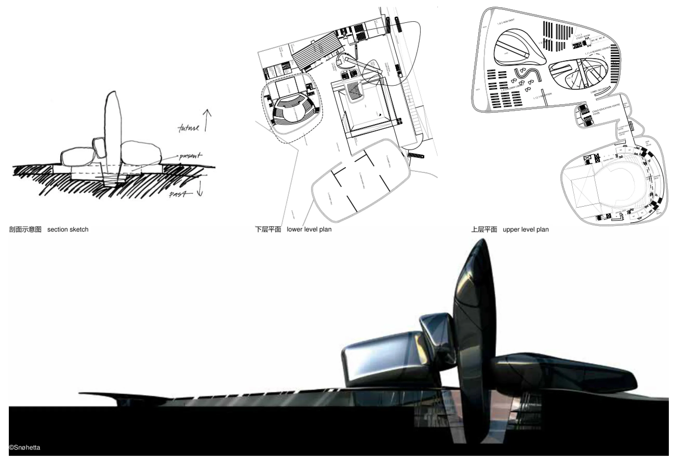
蒙蒂尼亚克拉斯科岩壁艺术国际中心——拉斯科岩洞博物馆四期
地点:法国蒙蒂尼亚克
业主:Conseil Géneral de la Dordogne
土地面积:53 065平方米
总建筑面积:6 307.70平方米
项目状况:施工中
绘图:斯诺赫塔建筑事务所
Location: Montignac, France
Client: Conseil Géneral de la Dordogne
Land area: 53 065 m2
Total foor surface: 6 307.70 m2
Status: Under construction
Drawings: ©Snøhetta
拉斯科IV(四期)项目的背景
法国多尔多涅省Vézère谷是史前的圣地,包含15个主要景点,全部都列入了联合国教科文组织(UNESCO)世界遗产名录。拉斯科岩洞雕刻是最重要的旧石器时代岩壁艺术群之一,数量和作品的卓越品质都首屈一指。
协调保护人类历史上独一无二的遗产与每年接待大量游客的矛盾,经过数十年的反思和倡导,拉斯科四期项目应运而生。
拉斯科岩洞发现于1940年,于1948年向游客开放。但是很快就出现了改变原貌的初步迹象,于是,从1963年起就禁止游客进入岩洞。在随后的几年中,所进行的研究都视遗产保护为第一要务;千百年来虽保持完好,但仍然如此脆弱。
现在,为了再次向公众开放拉斯科这一宝贵的科学和文化财富,产生了复制的设想。首先在离原址200米处,对岩洞(公牛厅)进行了部分复制的拉斯科一期。拉斯科二期于1983年向公众开放。随着复制技术的发展,2008年在蒙蒂尼亚克建成了一个重要的展览馆——拉斯科国际展览馆,也称为拉斯科三期,展示了岩洞中殿的景观——拉斯科二期中尚未出现再现的画廊。至今,本期展览仍然在世界各地巡回展出。
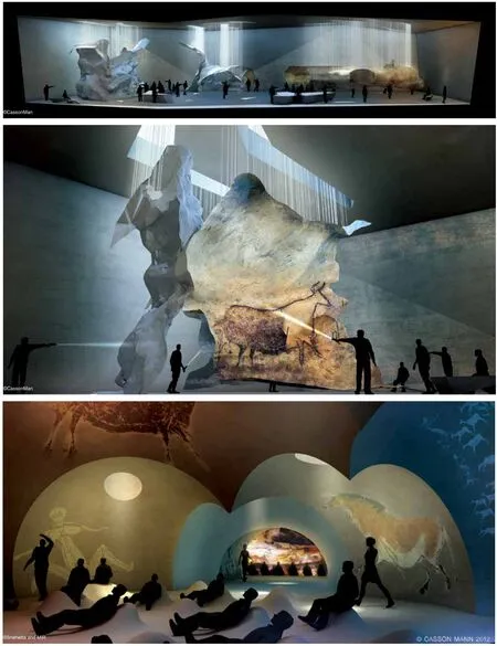
2010年为庆祝发现拉斯科岩洞70周年,蒙蒂尼亚克岩壁艺术国际中心——拉斯科项目宣布上马。该艺术中心称为拉斯科四期,将在这一特殊景点的知识推广方面开创一个新阶段。这是一个旨在容纳几乎全部原岩洞(公牛厅、中轴画廊、通道、轴、后殿和中殿)的复制品,连同数字化呈现和岩壁艺术解说空间在内的大型项目。
一般说明
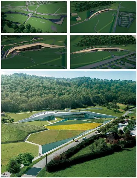
占地总面积达到6.5公顷的蒙蒂尼亚克——拉斯科岩壁艺术国际中心,呈长向布置,建筑在山脚绵延,地面面积约11 400平方米(1.14公顷),其中楼板面积8 635平方米。在拉斯科大道(部级公路RD704)另一侧的土地用作停车场(168个车位)和夏天旺季才开放的额外售票点。
建筑平均高度8米,在最长点长约500米,而它在最宽处达70米。屋顶采用破折线,与山峦起伏相呼应。屋顶设计是项目的一个强大元素,因为它有助于实现景观断裂和裂缝的想法,这也是在楼层建筑设计创作中常表现的想法。
项目选址因地就势,扎根于山并与它建立一种有机连贯。屋顶的水平偏到后墙的右侧,对应于土地的天然水平。半掩埋的建筑因此与景观融为一体。后部逐步过渡并消失在森林中,而完全透明的正面外墙朝山谷大幅敞开。
材料的选择也符合这种愿望,从建筑到景观,因地制宜。地板(内部和外部)、墙壁和整体屋顶方面,未经全面处理(简单)的材料唤起矿物的世界、山丘和岩洞的岩石。此外,由于制造结合了自然元素和人为技术,辅以混凝土结构则反映拉斯科的本质和精髓:使用自然造型的岩洞作为对人类祖先行为和思想的支持。
项目的辅材——玻璃在朝东区域的正面和屋顶上占主导地位。玻璃与混凝土一起产生一系列对比效果:不透明和透明度、明和暗、简单和复杂、粗糙和光滑。平衡有助于营造设施独特的现代感。
用途和功能在蒙蒂尼亚克——拉斯科岩壁艺术国际中心为新的拓展,作为解说中心。与“博物馆”的传统字面意思不同,解说中心不展示作品的全部,而是旨在强调和解释某一景点及其文化财富。这就是建筑、景点和教学功能在此相得益彰的原因。
采用全面的方法构思项目,深思熟虑,其中景观、建筑和舞台布景视为一个整体,与参观叙事和情景关系密切。数字和互动式解说起着关键的作用。利用RFID和Wi-Fi技术的单体装备是名符其实的“导游”。在整个行程中,每位游客都可以收集适合其年龄和知识水平的内容和信息,以及他们感兴趣的主题。
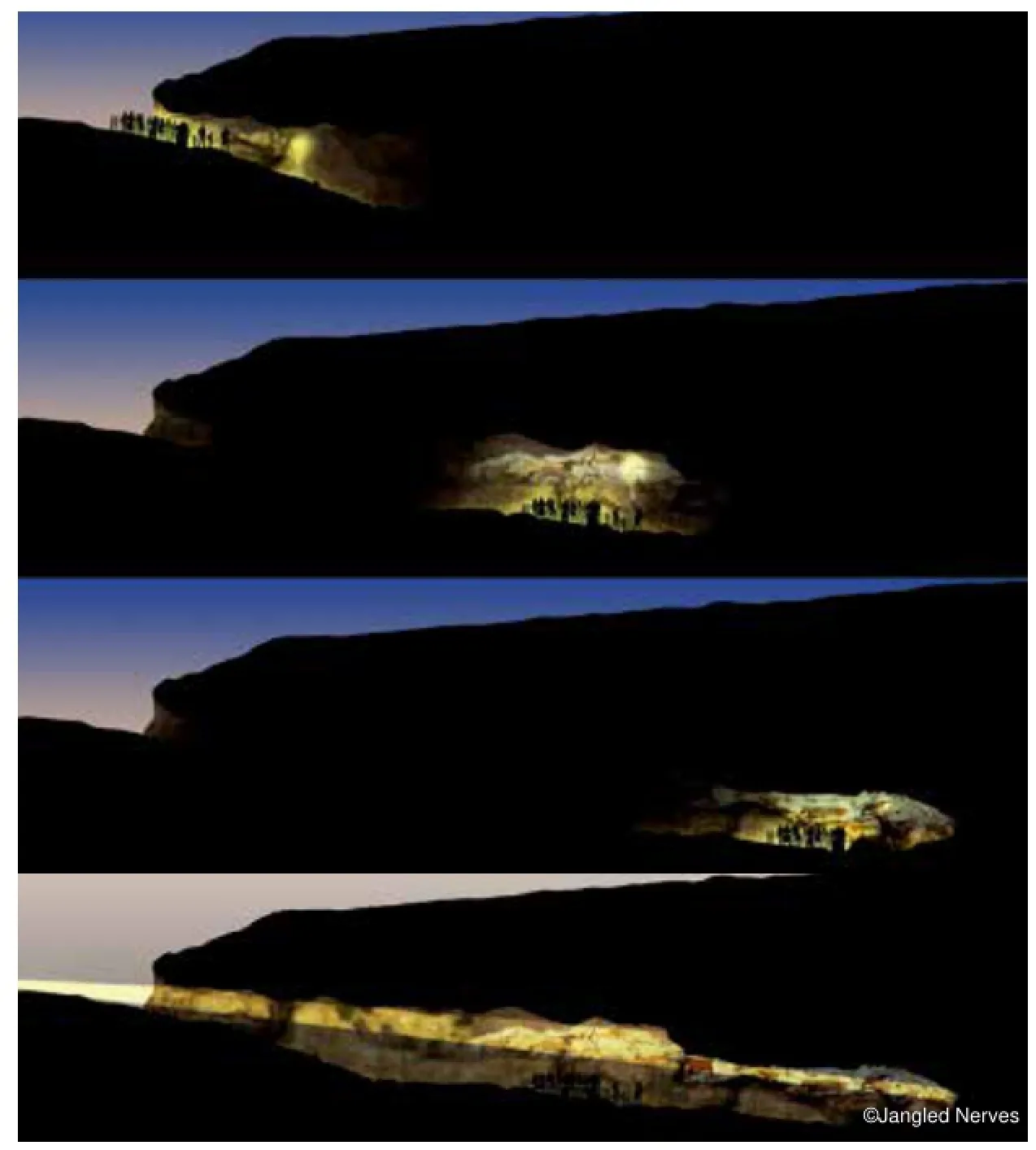
在项目的尺度上,因为建议游览行程清晰和简单以及按功能或服务的分类识别各特定氛围,游客很容易在项目整体规模上感知各种空间差异。每种氛围都有一定的意义,与传递给游客的信息相宜。例如,靠山的位置和黑暗使得展览空间更是若隐若现,而公务接待、转运和餐饮空间则沐浴在自然光中,让人一目了然。这种氛围变化和光照强度差异,以同样的方式在下降和提升之间、内和外之间、地和空之间、自然与文化之间交替变换,让人联想到岩洞经历,并与之进行广义上的类比。
Origins of the Lascaux IV project
The Vézère valley in Dordogne, France, is a mecca of prehistory. It contains about 15 major sites, which are all on the UNESCO World Heritage List. The Lascaux cave has one of the most important groups of Paleolithic rock wall art, both by its number and by the exceptional quality of its works.
The Lascaux IV project is in line with the decades of reflections and initiatives focused on reconciling the safeguarding of a heritage that is unique for the history of humanity, and at the same time give access to a large number of people.
The Lascaux cave, discovered in 1940, was opened to visitors in 1948. Very quickly,however, the frst signs of alteration were observed, and its access was prohibited in 1963. In the years that followed, the research undertaken made the preservation of the heritage the frst priority; kept intact for thousands of years and nonetheless so fragile.
Concurrently, the desire to transmit this invaluable scientifc and cultural wealth of Lascaux to the public, resulted in the idea of a replica. A frst work, which partially reproduced the cave (Hall of Bulls), was completed 200 meters from the original. Lascaux II opened to the public in 1983. Through the development of replica techniques, a major exhibition was mounted in Montignac in 2008. Lascaux: The International Exhibition, also called Lascaux III, revealed scenes appearing in the cave's nave - a gallery that had not been represented in Lascaux II. Today, this exhibition is still traveling throughout the world.
It was in 2010, for the 70th anniversary of the Lascaux cave's discovery, that the International Center of Rock Wall Art of Montignac-Lascaux project was announced. This center, called Lascaux IV, will inaugurate a new phase in the promotion of the knowledge of this exceptional site. It is a large-scale project whose aim is to house the virtually complete replica of the original cave (Hall of Bulls, Axial Gallery,the Passageway, The Shaft, the Apse, and the Nave), accompanied by a digital presentation and rock wall art interpretation spaces.
General description
The land dedicated to the siting of the International Center of Rock Wall Art of Montignac-Lascaux extends over a total area of 6.5 hectares. The long building stretches out at the foot of the hill, over a ground surface area of about 11,400 m2 (1.14 hectares) with a floor area of 8,635 m2. The land on the other side of the Avenue de Lascaux (departmental road RD 704) is earmarked for parking (168 places) and an additional ticket window for the summer period with its many visitors. The building, with an average height of 8 meters is about 500 meters at its longest point. It expands to 70 meters at its widest point. The roof features a gentle broken line, which echoes the hill's undulation. This roof design is a strong element of the project because it helps materialize the idea of a fault, a fssure in the landscape, an idea that is also expressed in the architectural writing of the foors.
Playing with the site's topography, the building is anchored in the hill with which it establishes a sort of organic continuity. The level of the roof, to the right of the rear wall, corresponds to the level of the natural land. The semi-buried building thus blends in with the landscape. The rear disappears in the relief and the forest, while the totally transparent front façade generously opens onto the valley.
The choice of material was made in line with this desire for a building-landscape, which fts into the geography and which splits it. The foors (interior and exterior), the walls, the roof monolithic aspect. The unfnished treatment of the material evokes the mineral world, the rock of the hills and the cave. Due to its fabrication combining natural elements and human techniques, concrete moreover recalls the essence of Lascaux, where cavities modeled by nature were uses as a support for the gestures and thought of the frst human beings.
The project's second materiality, glass, dominates in the façade and the roof of the orientation area. Together with the concrete, it produces a series of contrasting effects: opaqueness and transparency, light and shade, unfnished and sophisticated, rough and smooth. Their balance helps give the facility a unique contemporary feel.
As to uses and functions, International Center of Rock Wall Art of Montignac-Lascaux is an interpretation center. Unlike a museum in the traditional meaning of the word, an interpretation center does not exhibit collections of works, but has the objective of highlighting and explaining a site and its wealth. That is why architecture, site and pedagogic vocation are intrinsically combined here.
The project was thought out using a holistic approach in which the landscape, the architecture and the scenography are considered a whole, in a close relationship with the narration and the scenario of the visit. Digital and interactive mediation plays a key role. Individual equipment using RFID and Wi-Fi technology are genuine tour guides. Throughout the itinerary, each visitor can collect contents and information adapted to his age, his level of knowledge, and the themes that interest him.
On the scale of the project as a whole, the visitor easily perceives the difference spaces through the clarity and simplicity of the itinerary proposed and through the identifcation of certain atmospheres with function or service categories. Each ambience is meaning-laden and fits the contents delivered to the visitor. For example, the exhibition spaces are more ensconced in the hill and in darkness, while the public reception, transition and restaurant spaces are bathed in natural light. These variations in atmospheres and intensities, in the same way as the alternations between descent and ascension, between inside and outside, between earth and sky, between nature and culture, bring to mind the analogy with the cave experience in the broad sense.
马吉癌症康复中心
地点:苏格兰阿伯丁郡
业主:马吉癌症康复中心
类型:凉亭式建筑
面积:花园/露台 350平方米/270平方米
项目状况:2013年完工
设计范围:建筑、景观与室内
绘图:斯诺赫塔建筑事务所
Location: Aberdeen, Scotland
Client: Maggie's Cancer Caring Centre
Typology: Pavilion
Size: 350 m² / 270 m2garden & terrace
Status: Completed 2013
Scope: Architecture, landscape & interior
Drawings: ©Snøhetta
背景
2011年,斯诺赫塔建筑事务所应邀设计新的阿伯丁马吉癌症康复中心(阿伯丁Forester山医院的附属康复中心)。马吉癌症康复中心不是治疗中心,而是有相同情况的癌症诊断患者和家属会面、接受帮助和指导的地方。中心有6名员工,访问量每天各不相同。
地点
中心在Westburn大草地边缘,是一座独立的房屋。场地与马吉医院既有归属关系又有独立性。房屋的位置朝着绿色的原野美景,视野开阔,西面和南面阳光充足。
架构
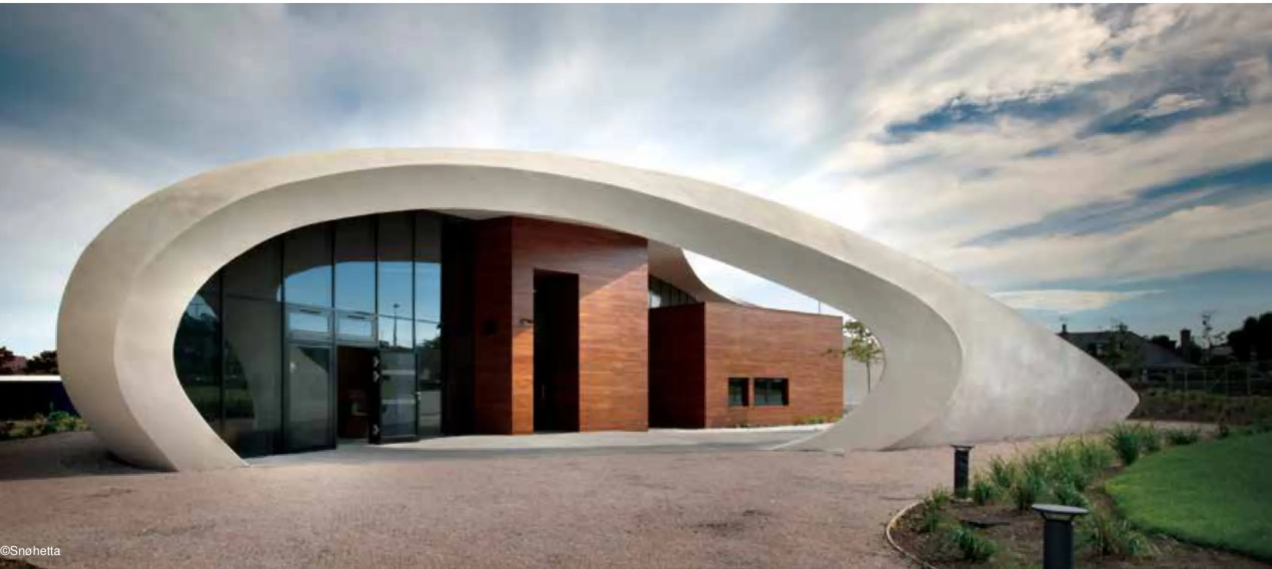
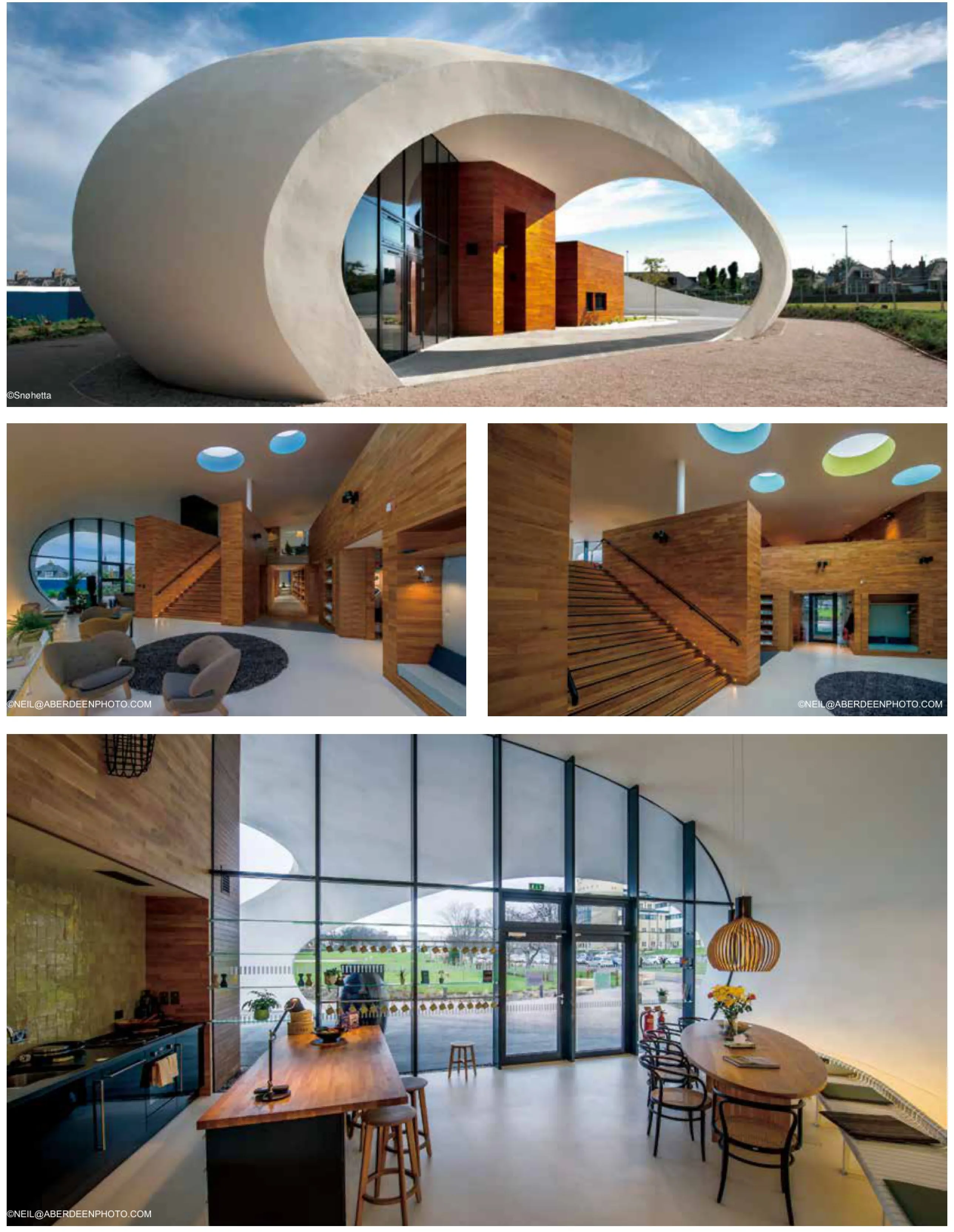
起初的设计概念是简单的结构形成外墙。外墙内进行了三次关键的分隔,只留出北部入口,西南部的中庭,东面则完全敞开,采光好。此外,外墙有五个不同尺寸的穿孔让顶部阳光射入室内。白色的外墙形成了一个大空间,封闭,但同时朝公园和天空开放。在此空间的中央是一个独立的橡木屋把大空间分成四个区域:西南部一个宽敞的户外空间、北面是厨房、东边是个大客厅、南边是另一个客厅。
所有房间都与封闭的外墙相通,成为房屋的社交房间。此外,在橡木屋的顶部有一个阁楼,设有可以看见整座房舍的康复中心办公室和会议室。而治疗室、技术室和卫生间则位于橡木屋内。
外墙是混凝土的原始结构。它包括三层:混凝土层、隔离层和粉刷层,全是靠手工喷涂或装饰。中央的橡木屋为木框架结构,以橡木包裹而已。
室内装饰
中心内部是外墙与内核的交汇处,是外墙与内核形成的空间。坚硬的混凝土石膏选材明智、外表柔和,而有角的内核则包覆软木。这个空间是所有装饰元素的起点。
马吉康复中心在人们生活困难的时候提供帮助。因此,重要的是里面有亲切的气氛,且具有一定的封闭性。临床不是关注的重点。不同分区的空间有利于不同时段的社交活动和私人谈话。普通的茶杯、壁炉、书籍和艺术品布置旨在使人们团结在一起。所有可移动家具的选择强调亲切感和安全性。
中央橡木屋的结构具有一系列嵌段,用作长凳和书架。沙发靠垫以及用对比色涂漆和贴瓷砖表面打破木材的主导地位。沿外墙,里外各有白色钢板制作的长椅,作为支撑台和座位,室内装修和可遮风雨的室外空间相互联系。中心室内外挂有BårdBreivik,KristianBlystad, KjellNupen和NicoWiderberg等挪威艺术家的作品。还有几件当地艺术家的作品。
风景
建筑所在位置的草地种满了各种香料植物。高高的观赏草种在路堤边上,朝向草地。Westburn路旁有成排的树木还有一些枫树使得整个场所郁郁葱葱。
新种植的山毛榉是入口标志,与现有的成排树木形成变化和对比。室外技术室被红豆杉树桩包围,室外成排的太阳能电池板与常青的寄生植物和鹅卵石小径上的椅子都融合到景观的整体布局中。
房屋的中心是不可或缺的可遮风雨的室外空间。这里的地面是坚硬和柔软的组合,中央栽有绽放的樱桃树。
Background
Snøhetta was in 2011 asked to draw the new Maggie's Cancer Caring Center, a center associated with Forester hill Hospital in Aberdeen. Maggie's is not a treatment center,but a place where people diagnosed with cancer, as well as their families, can meet others who are in the same situation, and receive help and guidance. The center has six employees and a varying amount of daily visitors.
Location
The center is a detached pavilion at the edge of a big grass feld, the Westburn Field. The site creates both belonging and independence from the hospital for Maggie's. The location of the pavilion gives it a great view towards the green feld, with plenty of sun from south to west.
Architecture
The starting point for the concept is a simple form creating a shell. Three strategic cuts have been made in the shell, making up the north entrance, the south-west atrium, and a generous opening for lights to the east. Furthermore, the shell has fve perforations of different sizes giving top light for the interior. The white shell creates a big room which encapsulates, at the same time as it opens up towards the park and the sky. In the middle of this room is a detached oak core which divides the big room into four zones;a generous outdoor room south-west, a kitchen to the north, a big living room east, and another living room to the south.
All these rooms have a connection to the encapsulated shell, and they make up the social rooms of the house. On the top of the core there is a mezzanine foor with offce spaces and a meeting room with a view of the whole house. Therapy rooms, technical rooms, and toilets are located inside the core.
The shell is a primitive structure built in concrete. It consists of three layers; concrete,isolation, and stucco, which all are sprayed and crafted by hand. The core is a timberframe construction clad with oak.
Interior
The center's interior is created as the shell and the core meet - in the spaces they make. Material-wise, the softly shaped shell is given a hard concrete plaster, while the angular core is clad with soft wood. This span is the starting point for all elements of décor.
Maggie's offers help in a diffcult time in people's life. It is therefore important that the atmosphere inside has a homely and enclosing character. Nothing clinical should be in focus. The rooms' different zones facilitate for community, for private conversations, and for alone-time. Generous tea cups, a fre place, books, and art, are intended to bring people together. All movable furniture is chosen to emphasize intimacy and security.
The structure of the core has a series of embedded segments, which are utilized as benches and book shelves. Upholstered cushions as well as painted and tiled surfaces in contrasting colors are used to break the dominance of the wood. Along the shell,inside and out, runs a long, white steel bench that works as a support bench and seating. It creates a link between the interior and the shielded outdoor space. The center has artworks of Norwegian artists both indoors and outside. Bård Breivik, Kristian Blystad, Kjell Nupen, and Nico Widerberg are represented. There are also several pieces by local artist.
Landscape
The grass feld on which the building is located is dominated by various grass spices. Tall-growing ornamental grasses are planted in a delimiting embankment towards the grass feld. The existing line of trees alongside Westburn Road is supplemented with additional maple trees to create a lush delimitation to the feld.
A group of newly planted beech marks the entrance and creates a variation and contrast to the existing line of trees. An outdoor technical room is surrounded by a yew hedge,and the row of outdoor solar panels is integrated in the landscape’s overall pattern of perennial boarder and gravel paths with benches.
The heart of the pavilion is an integral and sheltered outdoor space. The foor here is a combination of hard and soft surfaces with a centrally planted blooming cherry tree.
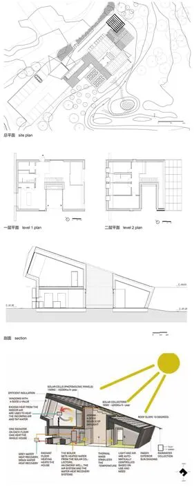
零排放样板房
地点:挪威拉尔维克
业主:Optimera and Brødrene Dahl (Saint Gobain)
类型:零排放示范建筑
面积:220平方米
项目状况:2014年9月17日完工
设计范围:建筑、景观与室内
绘图:斯诺赫塔建筑事务所
Location: Ringdalskogen, Larvik, Norway
Client: Optimera and Brødrene Dahl (Saint Gobain)
Typology: Zero Emission Demonstration Building
Size: 220m²
Status: Completed September 17, 2014
Scope: Architecture, landscape & interior
Drawings: ©Snøhetta
斯诺赫塔建筑事务所是ZEB(零排放建筑研究中心)的积极合作伙伴。ZEB“多功能舒适样板房”(ZEB Multi-Comfort House)由斯诺赫塔建筑事务所、斯堪的纳维亚半岛最大的独立研究机构SINTEF、ZEB合伙人Brødrene Dahl和Optimera合作完成。房子看上去是独户家庭住房,但建造的意愿是将它作为展示平台,以便学习采用综合可持续性解决方案建造优良住房的建筑方法。
为了达到ZEB-OM的等级目标,项目需要记录并验证二氧化碳零排放。建筑通过安装在围护结构上的光伏发电板和太阳能集热板生产可再生能源,代替发电站产生的能源,以此抵消燃烧化石燃料产生的碳排放量,并以此方式减少了其他温室气体的排放。关注建筑材料的碳排放代表了一个新的研究方向,这是建筑迈向可持续发展时代的重要驱动力。
东南朝向的特性
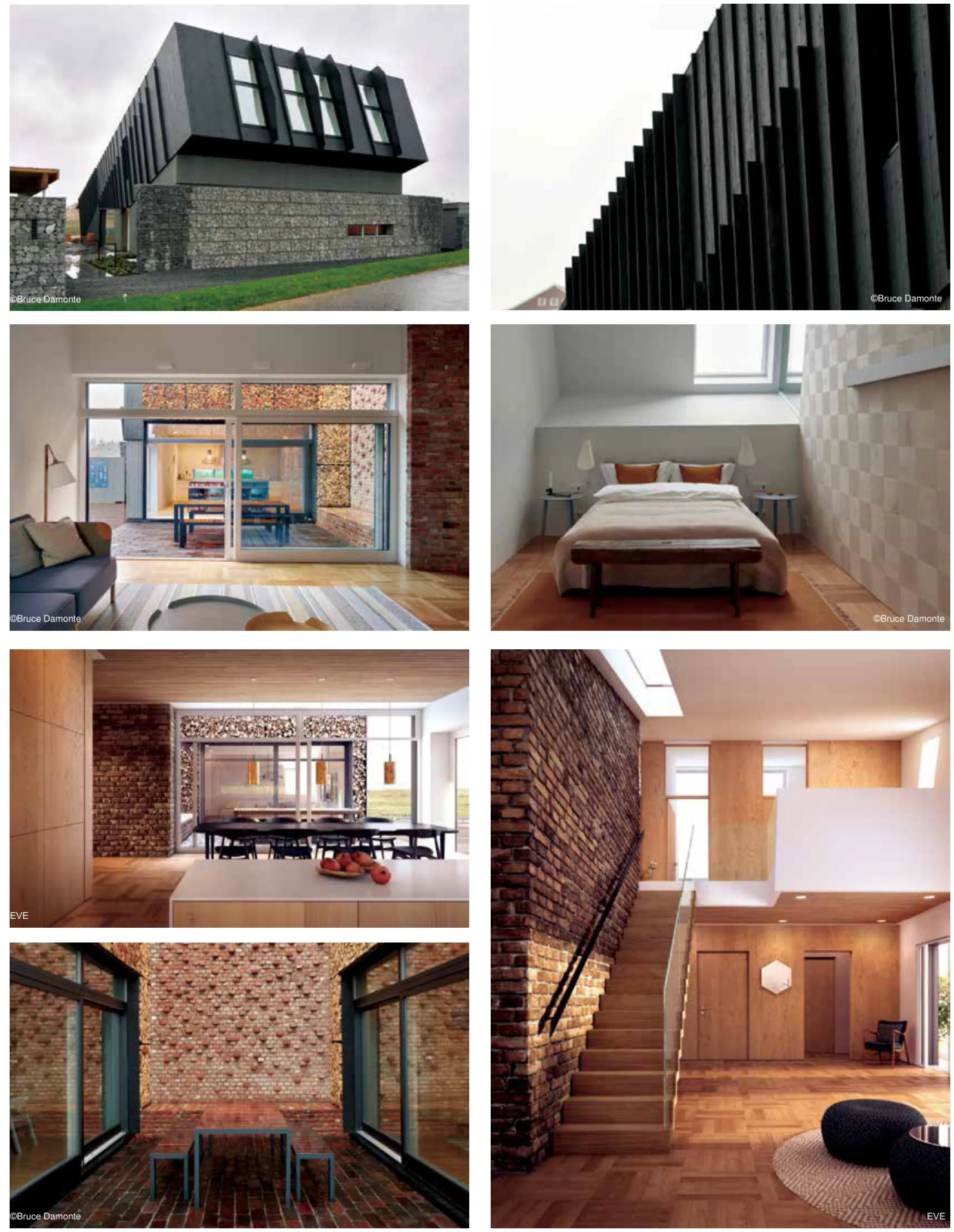
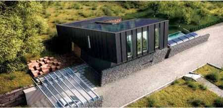
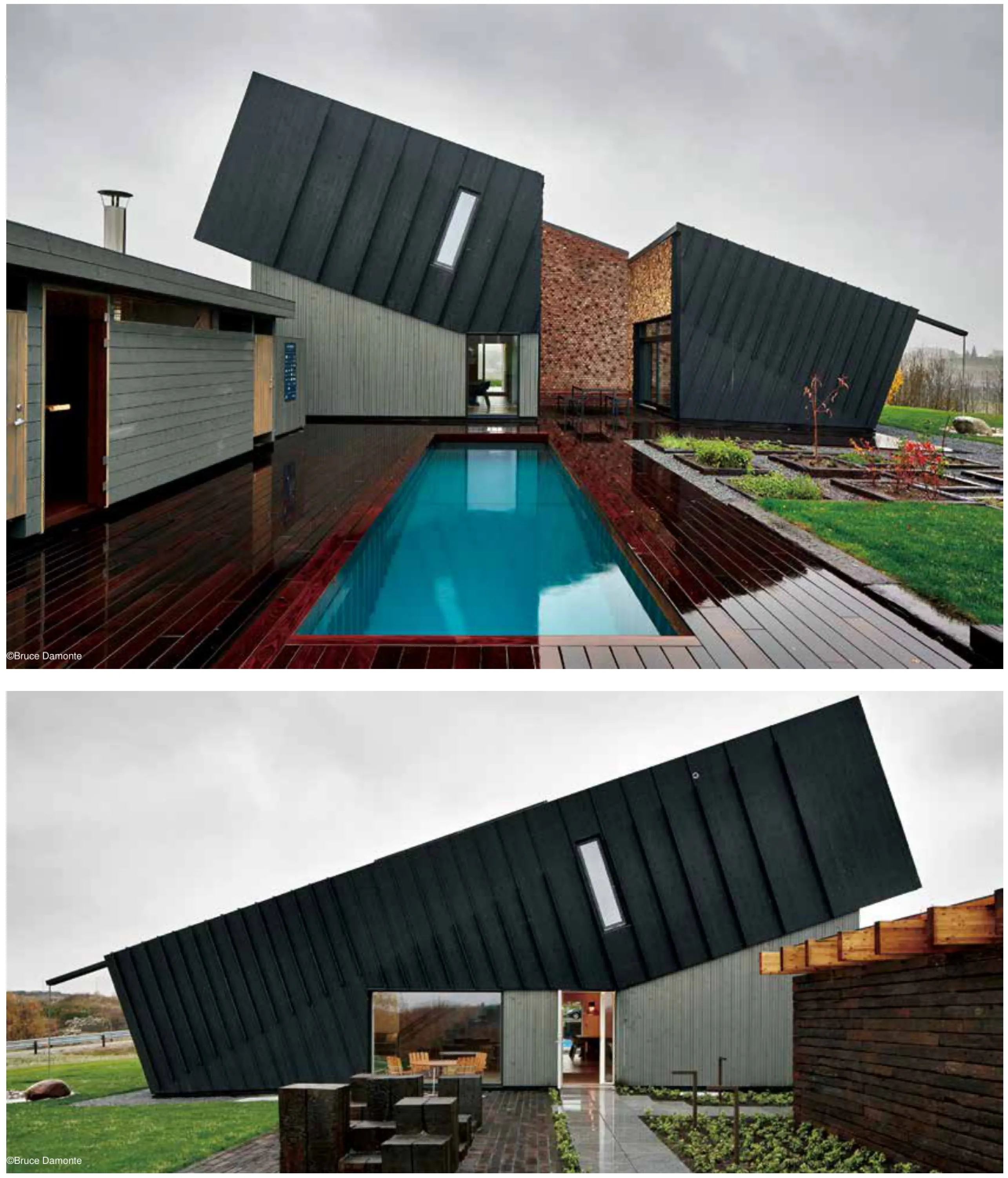
房子位于花园之中,东南朝向,斜屋顶上安装了太阳能电池板和集电极。屋顶安装的能源设备以及地面上地热井提供的地热能源不仅能满足一年内家庭的能源需求,而且有盈余的电力提供给电动汽车。为了实现这个目标,建筑和技术必须共同确保最优化的舒适性和能源使用。
日光、视野以及与景观及室外空间的亲密接触缓解了在平衡密封墙壁与窗户的需求。通过玻璃面、朝向、房子几何形状和体积,并选择具有良好隔热特性的材料,取暖和制冷问题自然而然得到解决。室内装饰材料的选用在于材料对保证室内气候和空气质量的贡献以及审美的特质。
露天中庭
早春或是深秋,屋主都可以在装有壁炉和配备家具的露天中庭中享受户外就餐的乐趣。在安装了世界上最先进的家庭设施的房子里,在木柴和砖块砌成的墙体围护的房间里有种小屋生活的温馨。
景观
景观采用花园形式。游客围绕建筑散步可以发现房屋独一无二的元素。花园里有一个游泳池和利用太阳能过剩热量的淋浴器、用木柴加热的桑拿房和与遮蔽周边环境的储藏室。东侧早餐点可以看到邻近农田的景色,用回收木块铺砌的地面给人以宾至如归感觉。
环保雄心和设计过程
在设计过程中,环保方面的雄心壮志创造了新的参数。新工具投入使用,各学科的工作紧密联系,并且文件工作的要求比以往任何时候都更为苛刻。在早期开发阶段,高度尤其专注于材料选择是前所未有的,因此产生了跨学科的创新设计流程。如此雄心勃勃的环保项目的设计是新技术知识驱动的结果,包括关于新技术、当地能源、材料和建筑技术及在该位置其他资源的知识,以及有利于最佳能源利用而精心选择的布置和朝向。
该项目专注于通过不可计量的特质使建筑维持家的感觉。在设计过程中,同等考虑了业主情感和归属方面的需求与能源需求。土地赐予了人们各种可以全年享受的空间,包括小规模生产食物的果树林和菜园。
Snøhetta is an active partner within ZEB (The Research Center on Zero Emission Buildings). The ZEB Multi-Comfort House is a cooperation between Snøhetta,Scandinavia's largest independent research body SINTEF, ZEB partner Brødrene Dahl, and Optimera. The volume of the house describes a single family house,however, the building is intended for use as a demonstration platform to facilitate learning on building methodology for plus houses with integrated sustainable solutions.
To achieve ZEB-OM classification the project is required to document and verify a minimum of 100% CO2 offsetting. Renewable energy production via photovoltaic and solar-thermal panels integrated in the building envelope enables offsetting of carbon emissions generated by the burning of fossil fuels in power stations. By offsetting in this manner we reduce emission of other greenhouse gasses simultaneously. Focus on carbon emissions associated with building materials represents a new direction in the vital drive toward a sustainable construction industry.
Characteristic tilt to the southeast
The house in the garden has a characteristic tilt towards southeast and a sloping roof surface clad with solar panels and collectors. These elements, together with geothermal energy from energy wells in the ground, will serve the energy needs of the family house and generate enough surplus to power an electric car year-round!For this to become a successful reality, architecture and technology must come together and ensure optimization of both comfort and energy use.
Daylight, view, and contact with landscape and outdoor space is reconciled with the need for balancing sealed walls and windows. Heating and cooling is solved passively through placement of glass surfaces, orientation, house geometry and volume, and choosing materials with good thermal characteristics. Materials used on interior surfaces have been chosen on the basis of their ability to contribute to good indoor climate and air quality as well as aesthetic qualities.
Outdoor atrium
An outdoor atrium with freplace and furnishing opens for outdoor dining from early spring to late fall. A feeling of cabin life, in one of the world's most advanced family houses, in a room with walls of stacked frewood and bricks.
Landscape
The landscape is formed as a garden where visitors can walk around the building and discover the elements that make this an exceptional family house. The garden has a swimming pool and shower utilizing solar-generated thermal heat surplus, a sauna heated with frewood, and storage rooms as shielding from neighbours. A breakfast spot on the eastern side with a view to neighbouring farmland is paved with recycled timber blocks, creating an inviting surface.
Environmental ambitions and design process
High environmental ambitions create new parameters in the design process. New tools are put to use, the academic disciplines work closer together, and the requirements for documentation are more demanding than ever. In particular,the high focus on choice of material in early development phases is new, and it generates innovative design processes on a multidisciplinary level.
The design of such an ambitious environmental project is driven by knowledge of new technologies, local energy sources, materials and building techniques, and other resources at location, as well as intelligent placement and orientation in a way that facilitates optimal utilization of energy resources.
The project has a strong focus on retaining home-like qualities through nonquantifiable properties. Emotive comfort and sense of wellbeing have governed the design process to the same extent as energy demands. The grounds employ a variety of spaces that can be enjoyed year-round, with the inclusion of fruit trees and vegetable gardens to accommodate small scale food production.
