阿基米亚和孟菲斯·设计色彩
2012-08-30CinziaFerrara意大利菲拉拉巴勒莫大学建筑系
文/ Cinzia Ferrara(意大利 菲拉拉巴勒莫大学 建筑系)译/陈 欣 郑 慧
While some challenged and disapproved of what the design field did in the 1970s and 1980s, it was able to count on fertile ground full of people who were prepared to take risks and show visionary – and sometimes utopian –courage. This outlook was welcomed and shared not only by designers themselves, who joined together in collectives and studios, but also by their clients, with the worlds of manufacturing and business. Efforts were made to create synergies both by designers who kept a close eye on the world of industrial production and by companies which realized the importance of maintaining relations with the world of design.Poltronova1The Tuscan furniture manufacturer appointed Ettore Sottsass as its art director in 1957 and it also worked with Superstudio and Archizoom. It supported experimentation by the designers, which led to the creation of new forms (sometimes bringing about new types of furniture, such as the Superbox line) through the use of new materials (such as plastic laminates) and the establishment of authentic new vocabulary.and Abet Print2This Piedmontese manufacturer is now known as Abet Laminati. It uses different colours and decorative elements to produce an endless range of plastic laminates. The company was founded in the late of 1950s and it worked with figures including Ettore Sottsass, Alessandro Mendini, Mario Bellini, Enzo Mari and Joe Colombo.led the way in this sense.
They had diff erent takes on the irreplaceable role of companies, which contributed to the development of Italian design and gave it concrete form through its production work.This occurred thanks to the joint presence of three main elements/factors: modern materials and technology, companies with great foresight,and visionary designers. Within the field of manufacturing, it was common to fi nd a shared approach that made it possible to go from an idea to production. Outside the fi eld, this process was aided by widespread interest and international recognition of Italian design,which was deemed worthy of entering the hallowed ground of museums, including those on the other side of the Atlantic. This waseven the case with the more rebellious design output of the time1In 1972, Emilio Ambasz organized a large exhibition on Italian design at MoMA in New York that was entitled ‘Italy: The New Domestic Landscape’. Alchimia displayed some of its designs in the Bau-Haus exhibition in Milan in 1979. Memphis showed its first designs at the Arc ’74, a showroom in Milan, in 1981.. The ground was also made fertile for experimentation and manufacturing by technological innovation and by research and production of materials. Numerous new materials – such as plastics, foams and resins– were introduced onto the market, and there were also many fi nishes, processing techniques and tones for them, which became an area of investigation for design. There were many combinations of diff erent synthetic and natural materials to be found in the most provocative projects by Alchimia and Memphis. These pairings rarely followed convention, were farfetched at times and were often daring. In their spirit, they brought to mind the earlier experiments of the Bauhaus, in the search for new expressive forms through a deliberate lack of continuity in the objects made. The materials employed in the more experimental design during the period in question were artificial, composites, natural and unusual,because they were used in a completely diff erent context from their normal setting. They were industrial materials such as galvanized sheet metal, aluminium, neon tubes, printed glass and celluloid. The open-minded search for these materials involved investigation of their inherent sensory qualities and it took place for Memphis ‘…within germinating cultures,where signs still have an element of sexiness and a bittersweet fl avour about them and they off er pleasant, surprising thrills because they still totter hesitantly in a sort of antenatal limbo,since they have yet to be fi lled with symbols and meanings’ (Radice, 1984, p.67). This discussion of materials may seem to stray from the topic of Memphis and Alchimia’s use of colour and the value that they attributed to it.
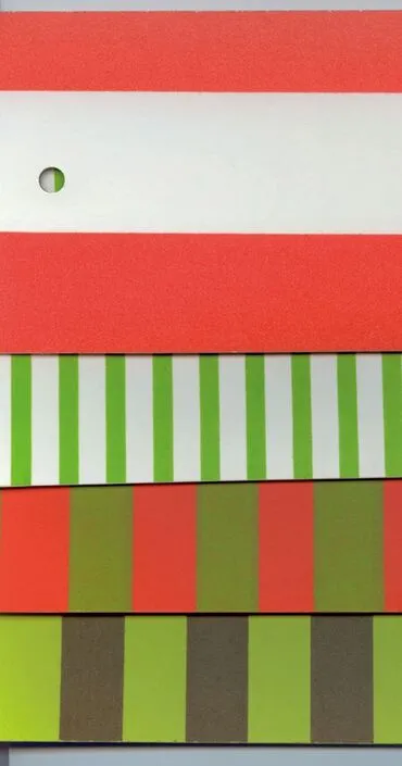
Fig.2 laminati2 Laminated, texture and colour, Abet Print,historical collection of Poltronova, ’70.
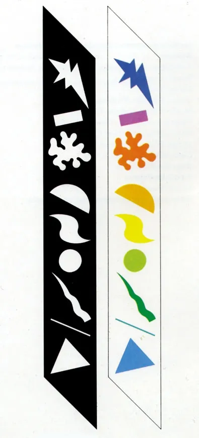
Fig.2 Alchimia, stilemi.Alchimia, Stilemi.1982
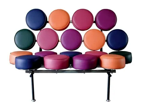
Fig.18 george-nelson-marshmallow00_1clock George Nelson e Irving Harper, Marshmallow,sofa, Herman Miller, 1956.
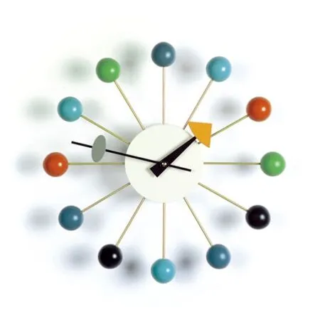
Fig.19 george-nelson-ball-clock George Nelson, Ball, clock, Howard Miller Clock Company, 1947 (ca.).
However, their colours were profound and they penetrated the fi bres of both synthetic and natural materials, completely fi lling them.
Rather than just serving as a simple medium,the material gave substance to the chromatic mass, whether it was two- or threedimensional.‘The first definition of colour is this sort of abstraction and impalpability. However, there is also colour that becomes material, and at fi rst sight it is very often a superfi cial material.Then there are other colours that are solid and heavy: a block of basalt is black all the way through. Colour becomes mass, material and substance’ (Mendini, 2004, p.293). In order to gain a complete understanding of the work of Alchimia and Memphis, it is necessary to consider the historical backdrop at the time of their formation.
An important role was played by the spread of the pop culture1The culture’s origins lie in Pop Art, which appeared on the Italian scene in 1964 at the Venice Biennale, where the works of American artists from the movement were displayed.in Italy and with it the consumer culture and the means of expression of mass communication. Archigram in the UK and Metabolism in Japan used this culture as input for their design work, and it was in this form that it was fi rst encountered by young Italian designers, who joined together in a number of avant-garde groups2Examples include Archizoom, UFO, 9999 and Superstudio.. They soon moved on from emulation and developed the capacity to experiment and design independently, in stark contrast with the academic culture and its tired aesthetic principles. They loudly demanded immediate adaptation to a new situation through a utopian outlook, which provided the starting point for work and was used in a critical and realistic manner (Branzi, 1983, p.48). Alessandro Mendini and Ettore Sottsass were the respective leaders of the Alchimia (1979) and Memphis(1981) groups, which followed the path already marked out by Italian Radical Design and brought about genuine pacifi c and obstinate cultural revolutions thanks to visionary capabilities which allowed them to join together the past and the present, the natural and the artifi cial, the archetype and the copy, tradition and innovation, and even – in their intentions at least – the aristocratic and the common.They differed from the Radical groups that preceded them in their capacity to deal not only with the design process itself, but also with the other paradigms3The paradigms of industrial design are generally summed up by the following four elements: design, production, sale, consumption (De Fusco, 1985).associated with it by Renato De Fusco. They managed to ‘tame’ the great utopia and make it into a malleable material for industrial production that was highly symbolic even though it was trapped in a designed form.Furthermore, they managed to embrace the lesson of design primario (leading design),which went beyond the vision of the designed object that could be broken down into a form,structure and function. In their vision, they also included the world of sensory perception, so the body was no longer seen as a purely passive receptor that was dominated by reason: it became an active tool of cultural elaboration. In 1977, Clino Castelli drew the ‘Sweet diagram of Gretl’1The diagram was based on a study of the hall in the only building designed by Ludwig Wittgenstein (together with Paul Engelmann, a pupil of Adolf Loos), which he planned for his sister Margaret Stonborough-Wittgenstein in Vienna between 1926 and 1928. The diagram shows and gives measurements for all of the immaterial volumes in the space, which are defined by the masses of light, heat, smell, sound, and colour., which contained data recorded through the parameters of subjective perception in order to establish the objective environmental quality of inhabited space. If the parameters change, so must the design tools (as covered by design primario), which act as paradigmatic systems containing elements to support design without restraining it in any way. An example is Colordinamo2The manual was designed by Andrea Branzi, Clino T.Castelli and Massimo morozzi and produced for the Montefibre Design Centre in 1975. The two subsequent editions (which were backed by many companies, including Abet Print, Ariston, Bassetti, B&B, Kartell, Zanotta and Zucchi)were published in 1976 and 1977.(Morozzi, Branzi, Castelli, 1977),a manual for professional use based on colour studies. It is an important aesthetic research project that takes the form of a colour chart. It contains 40 hues chosen around a central theme3The themes chosen for the creation of the colour ranges in the three editions of Colordinamo were:‘the colours of energy’ in 1975, ‘presynthetic colours’ in 1976, and‘permanent colours’ in 1977., which are accompanied by technical and cultural information and tools for their use. The three editions of the manual are unlike other publications of their kind as they focus on a theme rather than anticipating matters.
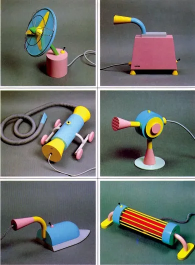
Fig.21 Michele De Lucchi,home appliances,lacquered wood prototypes made for the Milan Triennale, Memphis, 1979.
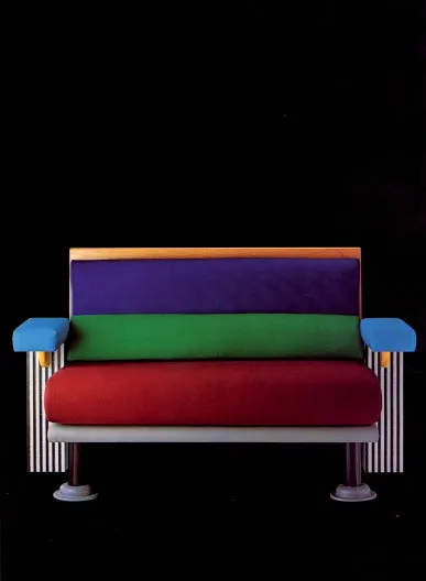
Fig.27 Michele De Lucchi, Lido, armchair, Laminato Print HPL, Memphis, 1982.
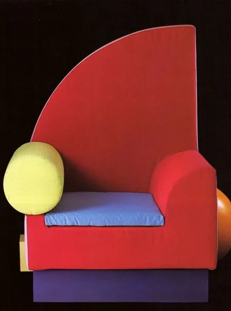
Fig.28 Peter Shire, Bel Air, armchair,Memphis,1982.
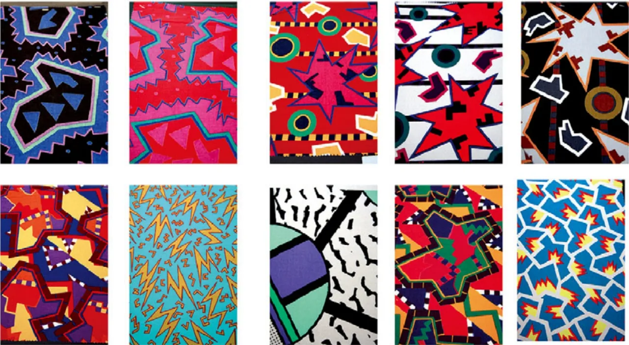
Fig.33 Nathalie Nathalie du Pasquier, fabric, Memphis, 1981.
They were distributed throughout Europe and made an important, innovative contribution to colour design, while introducing Italians to the Munsell system and colorimetry. ‘The colours of energy’ from the palette of the fi rst edition of Colordinamo were the result of thermal imaging of objects in which colours were used to show the measurable levels of heat and energy, thus giving ranges of warm and cold hues. The readings of colours were not given by their natural values. Instead, tools and media reprocessed and reproduced them, giving what Andrea Branzi (1983) called ‘the colour of colour’ (p.81).
The ‘Colours of energy’ came along before the colour range that would become known through the introduction of colour television in Italy in 1977, with the original tones being reproduced using the three additive primary colours (red, blue and green) on screens with complex pixels. The parameters changed, the tools changed and so did the colours, which were seen by designers as an independent system with their own cultural and expressive identity4This Identity, which has an active influence on the quality of the products and the environment, has a value which is largely separate from the function of the object and the material with which it is built: it is more of a cultural added value, which makes up a genuine new environmental culture.(Morozzi, Branzi, Castelli, 1977). The colours that were used during this period were the result of developments in the chemical industry and research in the field of plastic materials and paints. This research led to the introduction onto the market of a number and range of colours that not only allowed designers to count on artifi cial hues, but also to choose and design colours, like any other component of an object.
Colour went from being a final element to complete a project to a ‘semi-processed good’, or even a cell5‘We have almost reached the point where we study the cells that make up objects more than objects themselves as individual entities.Materials and decorative elements are the cells of objects and they are part of this process.’ This statement by Michele De Lucchi can be extended to colour, which was considered an integral part of the molecular structure of the object (Radice, 1984, p. 87), which played a part in every step of the design process, just like the form and materials.
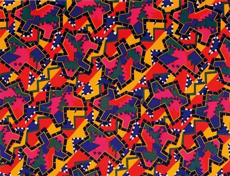
Fig.30 nathalie-du-pasquier-1982-gabon Nathalie du Pasquier, fabric,Memphis, 1981.
Alchimia’s1The Alchimia studio was founded in Milan in 1976. Alessandro and Adriana Guerriero (neither of whom are architects) were the driving force behind its creation and they were joined by Alessandro Mendini, Ettore Sottsass, Lapo Binazzi, Franco Raggi and Michele De Lucchi.research immediately focused on the surface, ‘the skin’ of the object, through the use of colour and the revival of decoration.
Instead of a reassuring tool to give a ‘warm’appearance and feel to the cold, artificial surfaces of objects, it was an operative tool that prevented things from being taken for granted and introduced ambiguity,irony and provocation alongside material and colour processes.The decoration that Mendini called a ‘form of visual writing’ was a means of amplifying colour and making the surface ‘optically descriptive’, sensitive and communicative. The Memphis2The Memphis group was founded by Ettore Sottsass Jr. in 1981 and it brought together architects and designers such as Martine Bedin,Matteo Thun, Michele De Lucchi, Andrea Branzi, Marco Zanini, Aldo Cibic, George Sowden and Natalie Du Pasquier,some of whom (Sottsass and De Lucchi) had already been part of Alchimia. It was initially called The New Design, then it adopted the name of the American city of Memphis, a place of music, the cultural melting pot, rebellion and the new world, after the release of the Bob Dylan song Stuck inside of Mobile with the Memphis Blues Again, which the group of designers listened to repeatedly in Sottsass’ studio on Via San Galdino in Milan.group started to design without favouring any specifi c style,form, colour or texture. They experimented and blended all kinds of genres, shapes, materials3They chose modest coated composite materials that rejected the comforting notion of furniture that would last over time in favour of a contemporary view of furniture with a limited lifespan, like that of the people that chose, used and consumed it.and colours. Countless references can be seen in the use of colour in Memphis projects, including:the expressive power of industrial and synthetic colours and the fl uorescent and acrylic hues of pop art; the multi-coloured design of George Nelson4Sottsass worked in his study for a month during a stay in America in 1956.; the colours of India5Sottsass and his wife Fernanda Pivano visited India in 1961 during a long trip that lasted three months.cular structure of the object (Radice, 1984, p. 87; the colour trialled in the Superbox furniture/containers6The items of furniture were originally designed and made as little models and appeared in the article Katalogo mobili (Trini, 1966). They were subsequently made by Poltronova, but the company only produced the most simple models in the range of containers.; and the experience with Olivetti, which led to the creation of the Valentine (1968), which will always stand out due to its impudent poppy red colour. ‘Alchimia always expressed itself in a problematic, multidisciplinary manner and its work revolved around doubt, criticism and self-criticism. Memphis chose the path of a strong, calm, reassuring, establishment image’ (Mendini, 2004, p.94). Alchimia and Memphis have a lot in common. They both designed highly experimental objects with great narrative and symbolic power that were made in extremely small production runs. However,there are also many significant differences between them. Strangely, the use of colour and decoration is both a common feature and an area where they diff ered hugely. For both groups it was a central, important part of the design process for objects/goods, which were given artifi cial tones with electronic, chemical and modern colours. However, for Alchimia the use of colour and decoration took on an almost pictorial value with greater ties to the creative language of humans, whereas for Memphis it had a mechanical feel that was connected to the programmed language of machines.One could talk about the profoundness of the superfi cial by Alchimia and the superfi ciality of the profound by Memphis, to use and mirror an expression by Mendini (1981). It is impossible to conceive of an item by Alchimia or Memphis being deprived of its colour and reduced to a mortifying black and white shadow of itself.The two groups made colour into a fully fl edged design material with great narrative capabilities.It was an essential component whose absence would be felt like an amputated limb rather than just an unexpected blanching eff ect. ‘For me, a colour is like a word. Colours are words.Stories can be told with colours and colours tell stories’ (Sottsass, 2007, pp.47-48).
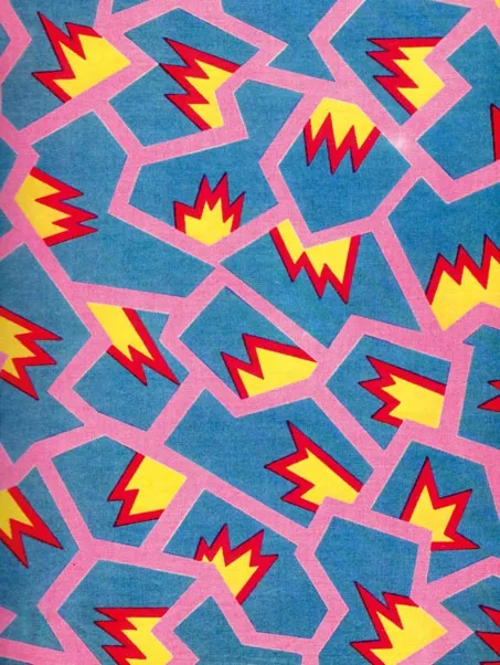
Fig.31 memphis_nathalie du pasquier Nathalie du Pasquier, fabric,Memphis, 1981.
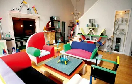
Fig.31 Memphis-Milano_Design_Collection A setting furnished with items by Memphis.
译文:
尽管八九十年代的设计领域所获得的成就受到过挑战和质疑,但有着大批人才活跃在这块沃土之上,这些人勇于承担风险,有着卓越的远见以及——有时有些乌托邦式的——勇气。这种观点不仅受到那些参与团体工作和成立工作室的设计师们的欢迎和拥趸,同时也受到全球制造业和商业界人士的青睐。设计师们密切注意着世界的工业生产,公司企业提高了意识,与设计界保持紧密联系,两者企图打造联合效应。家具制造商Poltronova1Poltronova 是一家意大利托斯卡纳的家具制造商,在1957年任命埃托雷·索特萨斯为其艺术总监,开始与超级工作室(Superstudio)和阿基佐姆小组(Archizoom)合作。和Abet印刷厂2Abet Laminati是一家意大利皮埃蒙特的家具制造商。它善于使用不同的颜色和装饰元素来设计出无穷无尽的塑料层压板。该公司成立于1950年代后期,曾与众多设计大家合作,包括埃托雷·索特萨斯、亚历山德罗·门迪尼、马里奥·贝里尼,恩佐·马里和乔·科伦坡。的合作是该方面的杰出代表。
在成立公司的基础上,他们各取所需,这样的模式更好地发展了意大利的设计,并使设计得以以产品的形式稳固成形。现代材料与科技,拥有远见的公司和充满想象力的设计师,三者联袂促成了这样的发展模式。将想法转化成产品的渠道相同,这样的事情在生产领域内十分普遍。在该领域外,人们对设计的广泛兴趣和国际对意大利设计的认可也助长了创意的萌芽。它们甚至被认为可以摆放到包括大西洋另一边在内的那些神圣的博物馆里去。随着越来越多大胆前卫的设计的出现3,这一切显得越发理所当然。科技的改革,材料的研发和生产,使得实验与制造拥有了更加肥沃而宽广的设计空间。大量的新型材料被引入市场,例如塑料、泡沫和树脂,加上成品、制造工艺和色调运用的不同,都成为了设计的研究对象。阿基米亚和孟菲斯正努力寻找着各种由合成物与自然材料相结合的新鲜刺激的玩意儿。这些组合从不循规蹈矩,有时牵强附会,更常常大胆离奇。他们继承了包豪斯建筑学派的精神,故意使物品缺少连续性,从而来寻找新的表达形式。在实验性的讨论期间,所选用的材料既有人工的、合成的以及自然材料,也有些不同寻常的材料,因为使用它们的场合非比寻常。有如镀锌金属片、吕、霓虹灯管、印刷玻璃和赛璐珞之类的工业材料。通过对这些材料内在感官的研究来扩展它们的用途,并且孟菲斯“...在文化萌芽的阶段,符号仍带有性元素和苦中带甜的味道,它们也给人带来愉悦和刺激,因为它们在被冠以象征和意义之前,仍旧在某种出生前的状态中踟蹰蹒跚。”(雷迪斯,1984,p.67)。关于材料的讨论似乎偏离了孟菲斯与阿基米亚对于色彩的使用以及他们对颜色所做出的贡献的主题。
然而,他们对色彩的掌握透彻深刻,对人造纤维和自然材料的特性洞若观火,将它们融会贯通。
这些材料无论二维还是三维,相比作为简单的媒介,它们都更像是色彩的大杂烩。
“色彩首先给人的印象是抽象而不可感知的,但也有转化成材料的颜色,通常乍一眼看来都是很普通的材料。有一些材料坚固而厚重,如玄武岩通身发黑。颜色成了形,成了材料和物质。”(孟迪妮,2004,p293)。想要更加全面地了解阿基米亚与孟菲斯的作品,知道他们组建的背景则非常有必要。
流行文化4这种文化起源于波普艺术(Pop Art),最早出现在1964年威尼斯双年展的意大利展区。双年展展出了激进设计运动中美国艺术家的作品。在意大利的传播起到了相当大的作用,并随之产生了消费者文化和各种通讯交流工具。英国的建筑电讯派和日本的新陈代谢主义将这种文化输入进他们的设计作品中,许多意大利设计家在这样的形势下与之邂逅,并加入了许多先锋派小组1设计前卫组织包括超级工作室(Superstudio)和阿基佐姆小组(Archizoom),UFO,9999等等。。不久,他们就从单纯的模仿成长为自身拥有能力进行独立的实验和设计的设计师,与其学术文化以及疲软的审美原则形成了鲜明对比。他们怀揣着乌托邦的理想,想要尽快转变,形成新的格局。于是,人们用更加苛刻而现实的眼光,开始了新的设计工作(布兰茨,1983,p48)。亚历山德罗·门迪尼(Alessandro Mendini )和埃塔·索特萨斯( Ettore Sottsass )分别是阿基米亚(1979)和孟菲斯(1981)的领导人,延续意大利激进设计的道路。通过他们的远见,过去与现代,自然和人工,原型和仿制品,传统与革新甚至——至少在意图中体现出的——贵族与平民相互融合在了一起,从而掀起了一场平和而又持久的文化改革浪潮。激进组织与他们不同,不仅拥有更加出色的设计能力,该组织的雷纳托·德·弗斯科(Renato De Fusco.)还将其与其他范式2工业设计的模式一般是以下四个元素的总和:设计、生产、销售、消费(De Fusco,1985)。联系在了一起。他们成功“驯服”了伟大的乌托邦主义,并将其转化为工业生产所需要的可锻造的素材,这些产品即使被赋予了设计形态,仍极富象征意义。除此以外,他们成功地掌控了新兴市场(潮流设计)的走向,在那里,设计作品已经突破了自身,成为可以细分成形式、架构和功用的产品。在他们的设想中,他们还要将感官体验引入进来,从而让身体不再是受到理性左右的接收器,它变成了主动对文化进行阐述的工具。在1977年,克里诺·卡斯蒂利(Clino Castelli)绘制了“格莱特舒适图”3这个图是基于路德维希·维特根斯坦所设计的唯一一座建筑物大厅的研究。这个建筑是维特根斯坦于1926-1928年间替他的姐姐和保罗·恩格尔曼--阿道夫·卢斯的学生共同设计的。,通过对主观感受参数数据的记录,从而得出栖居地的客观环境质量。一旦参数发生改变,设计工具也必将发生变化(即在新兴市场上所广泛使用的工具),这种工具作为范例体系包含了支持设计而绝不局限它的元素。《色彩动力机》4这是基于对空间里的所有非物质(包括光、热、气味、声音和色彩)的测量数据结果的图。这份手册是由 Andrea Branzi, Clino T.Castelli and Massimo morozzi 于1975为了Montefibre设计中心而设计的。在众多著名公司的支持下,包括 Abet Print, Ariston, Bassetti, B&B, Kartell, Zanotta and Zucchi,1976年和1977年又出版了两个后续版本。(莫利慈、布兰茨、卡斯特利,1997)是一本基于色彩研究供专业用途的小册子。这是一项重要的美学研究,以彩色图表的形式呈现。它包含40种围绕着一个主题5三个版本的Colordinamo的小册子所选择的主题分别是:“能量的色彩”(1975)“合成前的色彩”(1976)“永久的色彩”(1977)(即"the colours of energy","pre-synthetic colours","permanent colours")。选取的颜色,附带有技术和文化信息和工具供其使用。三个版本的小册子与其他同类型的刊物不同,它们关注一个主题而非期待中的事物。
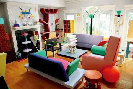
Fig.40 Memphis-Milano_Movement A setting furnished with items by Memphis.
它们对整个欧洲都做出了贡献,并将蒙赛尔体系和比色法引进意大利,对色彩设计做出了重要、富有创新意义的贡献,来自《色彩动力机》第一个版本颜料的“能量的色彩”是物体热量成像的结果,色彩用来体现热量高低程度,因此能够呈现一系列冷暖色调。这种色彩的反映并非来自物体本身的自然属性,而是通过工具盒媒体重新处理和再生成了它们,这被阿德里亚·布兰茨(Andrea Branzi)称为“色彩的色彩”(p81).
1997年意大利引入彩色电视机以后,色域才为人所知。在此之前,‘Colours of energy’这个概念早已出现。从那以后,参数改变了,工具改变了,颜色也会随之改变。设计师们把这些作为一个有特定文化身份,极富表现力的独立系统6这种身份对产品和环境的质量有着积极的影响,它的价值很大程度上是独立于物体的功能和物体本身的材料。它更多的是一种文化附加值,构建了真正的新环境文化。(莫罗兹,布兰奇,卡斯泰利,1977)。在此期间可供使用的颜色通常是化工行业的发展以及塑料材料和油漆领域的研究成果。这些研究促成种类繁多、范围广阔的色彩市场的形成。可供设计师们选择的色彩不再局限于人工色彩,他们还可以像设计某个物体的零部件一般设计色彩。
色彩从完成一件作品的最终元素转变成为一种“半成品”,甚至是作品的“细胞”1“比起研究物体作为独立存在的实体,我们对构成物体的细胞的研究更多。材料和装饰元素是设计作品的细胞也是设计过程的一部分。”米歇尔·德·卢基的这句话也同样适用于色彩,色彩也是设计作品不可分割的分子结构。 (Radice, 1984, p. 87)。与形式和材料一样,色彩参与设计的每一个步骤。通过使用色彩和复兴装饰,阿基米亚2阿基米亚工作室于1976年在米兰成立。虽然亚历山德罗和阿德里安·格历日罗(Alessandro and Adriana Guerriero ),但是他们是其背后主要的推动力。工作室的成员还包括亚历山德罗·门迪尼(Alessandro Mendini),埃托雷·索特萨斯(Ettore Sottsass),法兰哥·拉吉(Franco Raggi)以及米歇尔·德·路奇(Michele De Lucchi.)。的设计师迅速集中对物体表面,或者说是物体的“皮肤”进行研究。
色彩不再是一种可靠的工具,使物体的人造表面给人们一种温暖或者冷冰冰的感觉。而是一个有效的工具,改变人们对设计作品那种想当然的态度,并和材料一起给作品加入了模糊、讽刺和挑衅的味道。设计大师设计大师亚历山德罗·门迪尼称装饰是“视觉写作的一种形式”,一种放大色彩、使物体表面可以用光学描述、可传达信息的手段。孟菲斯3孟菲斯集团创立于1981年,创始人为埃托雷·索特萨斯。他召集了一群建筑师和设计师,如玛蒂娜·贝丁(Martine Bedin),马泰罗(Matteo Thun),米歇尔·德·路奇(Michele De Lucchi),安德里亚·布兰奇(Andrea Branzi),马可·扎尼尼(Marco Zanini),安东·西比克(Aldo Cibic),乔治·索登(George Sowden)和娜塔莉·杜·帕斯奎 (Natalie Du Pasquie)。他们中的一些人(如索特萨斯和德·路奇)曾经是阿基米亚设计组织的成员。这个集团最初的名字是新设计,后来才改成孟菲斯--美国城市的名称。孟菲斯是音乐,文化大融合的城市,一个充满叛逆气息的新世界。改名主要是因为这群设计师们在索特萨斯的工作室中反复聆听美国歌手鲍勃·迪伦的歌曲《困在汽车内时孟菲斯蓝调再次响起》(Stuck inside of Mobile with the Memphis Blues Again)。集团的设计不偏袒任何特定的风格、形式、颜色或者纹理。他们尝试将各种风格、形状、材料4他们选择了适度的涂层复合材料,反对家具可以无限使用的说法。与关于家具现代的观点相同,即家具的使用寿命就像选择,使用家具的消费者的生命一般有限。和颜色混搭在一起。孟菲斯集团的众多设计作品的色彩运用都可以证明这一点。比如波普艺术中工业和合成颜色的表现张力与荧光和丙烯酸颜料的组合;乔治·纳尔逊的五颜六色的设计5;印度色彩6;索塔萨斯设计的Superbox系列家具7Superbox系列的家具最先以小模型的形式出现在Katalogo mobili(1966)这篇文章中,随后由Poltronova公司生产,但是这家公司只生产这一列容器中最简单的模型。/容器艳丽的色彩;还有索特萨斯为奥利维蒂公司设计的“情人”(Valentine)便携打字机(1968),“红”成经典。阿基米亚设计集团总是以多学科,持怀疑态度的姿态出现,它的设计作品都围绕着质疑、批评和自我批评这样的主题。而孟菲斯设计集团则树立了坚强、镇定、可靠的形象(门迪尼,2004年,p.94)。其实,阿基米亚和孟菲斯的设计有很多相同之处。他们的设计作品实验性极高,叙事和象征力量极强,所以注定了设计作品不可以大批量生产的命运。但是二者也有很多较大的差异。奇怪的是,色彩的使用和装饰既是设计中最平常的部分却又是二者差别最大的方面。对于这两个设计集团来说,色彩使用和装饰都是设计过程的中心和重要内容,人为地给予物体电子、化学和现代颜色。就阿基米亚而言,色彩的使用和装饰更多体现在图案的价值以及与人类创造性语言的联系;而对孟菲斯来说,更多的是和机器的编程语言相关联,给人一种机械化的感觉。人们可以谈论阿基米亚设计肤浅的深刻性,也可以谈论孟菲斯设计深刻的肤浅性。这影射了门迪尼1981年提出的一个观点。要欣赏阿基米亚或者孟菲斯的设计作品,却全然不考虑物体的色彩或者将其简化到影子的黑白色,这是万万不可的。这两个设计组织都将色彩融入到极富叙事能力的材料中去。色彩是设计缺一不可的组成部分,少了色彩,作品将给人一种像残肢的感觉,不仅仅只是像漂白后苍白无力的感觉。“对我来说,一种颜色就是一个单词。多种颜色可以构成词组、句子。故事可以通过颜色表达,颜色可以讲故事”(索特萨斯,2007,pp.47-48)。
