shinyChromosome:An R/Shiny Application for Interactive Creation of Non-circular Plots of Whole Genomes
2019-03-07YimingYuWenYaoYupingWangFangfangHuang
Yiming Yu ,Wen Yao *,Yuping Wang ,Fangfang Huang
1 National Key Laboratory of Wheat and Maize Crop Science,College of Life Sciences,Henan Agricultural University,Zhengzhou 450002,China
2 National Key Laboratory of Crop Genetic Improvement,National Center of Plant Gene Research(Wuhan),Huazhong Agricultural University,Wuhan 430070,China
KEYWORDS Genomic data visualization;Non-circular whole genome plot;Shiny application;Graphical user interface;shinyChromosome
Abstract Non-circular plotsof wholegenomesarenatural representationsof genomic data aligned along all chromosomes.Currently,there is no specialized graphical user interface(GUI)designed to produce non-circular whole genome diagrams,and the use of existing tools requires considerable coding effort from users.Moreover,such tools also require improvement,including the addition of new functionalities.To address these issues,we developed a new R/Shiny application,named shinyChromosome,as a GUI for the interactive creation of non-circular whole genome diagrams.shinyChromosome can be easily installed on personal computers for own use as well as on local or public servers for community use.Publication-quality images can bereadily generated and annotated from user input using diversewidgets.shinyChromosomeisdeployed at http://150.109.59.144:3838/shinyChromosome/,http://shinyChromosome.ncpgr.cn,and https://yimingyu.shinyapps.io/shinyChromosome for online use.The source code and manual of shinyChromosome are freely available at https://github.com/venyao/shinyChromosome.
Introduction
Biological data analysis is a challenging task in the postgenomic era.Data visualization isfrequently utilized to convey concepts,communicate new discoveries,summarize and analyze data,as well as develop hypotheses.Circos plots are a common method of visualizing genomic data in a circular format and dozens of tools have been developed to generate Circos plots[1—4].Linear representations of whole genome data along all chromosomesare another common genomevisualization format used to display the relationship between experimental data and genome annotation in a variety of species.Although several tools have been developed to create noncircular plots,number of such tools is much lower compared to that of the tools for creating circular plots.chromPlot and IdeoViz are two R packages that are designed to visualize whole genome data along all chromosomes in a non-circular format[5,6].However,only a limited number of plot types with few customization options can be produced by chromPlot or IdeoViz[7].ggbio isa powerful R packagethat can visualize local or global genomic data in both circular and non-circular formats[8].However,to create non-circular whole genome diagrams with multiple data panels using ggbio,users are required to set the position and size of each data panel by themselves.Developed using R base graphics,karyoploteR is a versatile R packagethat can also create non-circular genome plots[7].Typically,an ideogram is first created by karyoploteR,and other datasets are then added sequentially to createdifferent plots,which can bedisplayed in either thesameor different panels.The regions of different panels are defined by r0 and r1 parameters,which are inspired by the min and max radiusparametersused to definedifferent data tracksin Circos plots.Chromosomes are restricted to be aligned along the horizontal axis by karyoploteR,in spite of the frequent requirement to align all chromosomes along the vertical axis for the visualization of genomic data.Comparison of data across two genomes using a plot with one genome aligned along the horizontal axis and the other aligned along the vertical axis is widely used to demonstrate the regulation of gene expression by expression quantitative trait loci(eQTL),the interactions between different genomic regions identified by Hi-C sequencing,and the synteny between different genome assemblies[9—11].However,none of the tools mentioned above can create two-genome plots.Moreover,all these tools are diff icult to use for users without coding experience,since they all require users to write their own code.Although commonly used as graphical interfacesto create non-circular plots,the Integrative Genomics Viewer(IGV)and the University of California at Santa Cruz(UCSC)Genome Browser aremainly used to visualize genomic datasets only in specific genomic regions[12,13].
Here,wepresent shinyChromosome,anew R/Shiny application with a graphical user interface(GUI)designed to facilitate the interactive creation of non-circular whole genome plots of any species.Users can also make use of the diverse widgets in shinyChromosometo customizetheappearanceof output plots.
Method
R is a widely used programming language for biological data analysis,graphic representation,statistics,and data reporting(https://www.R-project.org/)[14].shinyChromosome is written completely in R,so R users can modify or extend its code to f it their own need.The shinyChromosome application consists of two functional parts,ui.R and server.R.The former(ui.R)defines the interface of shinyChromosome,the widgets to accept input data,and options from the user.Subsequently,the latter(server.R)creates the plots based on the input data and options.
ggplot2,a major graphics representation package in R,is used in shinyChromosome to produce non-circular whole genome plots[15].Typical input data to create a non-circular whole genome plot contain values across many genomic regions or genomic positions within the same genome.The input data can be represented graphically in different formats,including scatter plot,line plot,bar chart,heatmap,and many others.These plots can be easily created using ggplot2 and combined to produce compound plots.
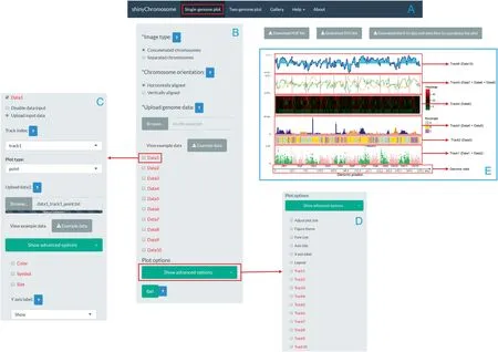
The Shiny package is used to build the graphical interface of shinyChromosome.The shinyChromosome application containsf ive main menus(Figure1).The‘‘Single-genome plot”and‘‘Two-genome plot”menus are the two main functionalities of shinyChromosome and are responsible for producing the non-circular whole genome plots.The‘‘Gallery”menu displays 65 example figures that can be generated using shinyChromosome.The‘‘Help”menu provides instructions for the installation and usage of shinyChromosome,as well as input data formatting requirements and a comprehensive user manual for shinyChromosome.The‘‘About”menu provides a brief introduction to shinyChromosome and a list of the R packages used by shinyChromosome.
Results
shinyChromosome was developed using ggplot2,which is a modern data visualization package based on the grammar of graphics in R[15].The GUI of shinyChromosome was designed using Shiny,which isan R packagefor building interactive web applications using pure R code.
shinyChromosome can createsingle-genome plots by aligning genome data along all chromosomes of a single genome and can create two-genome plots to compare data from two genomes(Figure 1).For plots aligned along a single genome,a dataset with two columns,representing the IDs and lengths of all chromosomes,respectively,separated by commas,tabs,or other delimiters,is required to define the frame of the plot(Figure 1).Then,1—10 non-overlapping tracks can be created and aligned along all chromosomes.As many as 10 datasets can be then uploaded and distributed to one or more tracks.Based on the nature of the dataset and user-specified inputs,these tracks can then be displayed by different plots,including scatter plots,line plots,bar charts,rectangles,and heatmaps,as well as segment,text,and chromosome ideograms(Figure 1).Combinations of different types of plots can be created in the same track to producecomplex linear representationsof the genomic data.The required formats of input datasets to create different types of plots are described in the‘‘Input data format”menu of theshinyChromosomeapplication.Userscan choose to arrange all chromosomes separately or to concatenate all chromosomes in the sequential order and align all chromosomes along the horizontal or vertical axis.Widgets are provided to tunethe height of each track and thedistances between different tracks.

Figure 1 Overview of shinyChromosome and a single-genome plot created with shinyChromosome
For two-genome plots,all chromosomes of one genome are concatenated in thesequential order and aligned to thehorizontal axiswhileall chromosomesof theother genomeareconcatenated in the sequential order and aligned to the vertical axis(Figure2).Two datasetsarerequired to definethetwo genomes aligned to thehorizontaland vertical axesseparately.Both datasets should beformatted in the same way as thedataset used to definetheframeof asingle-genomeplot,includingtwo columns with onefor the IDsand theother for thelengthsof all chromosomes.Another dataset can then be uploaded to create specific plots to demonstrate the synteny between two genomes or the interactions between different genomic regions of the two genomes.Each row of the dataset defines the positions of the two genomes—i.e.,the position of one genome aligned along the horizontal axis and the position of the other aligned along the vertical axis.Previously,we identified 70,858 quantitative trait loci(QTL)that regulated theexpression of 66,649 small RNAs in an F2population of rice[9].Using this dataset(https://doi.org/10.5061/dryad.9d030),we employed shinyChromosome to produce a scatter plot to demonstrate the regulation of the expression of this set of small RNAs by the list of QTL(Figure 2).Concatenation of all chromosomes of each genome,adjustment of chromosomepositionsof allgenomes,coloration of allpoints,and addition of chromosomelabelsalongboth axes were accomplished by shinyChromosome automatically.
Diverse widgets can be used to customize the appearance of the generated plots according to main plot color and color transparency,point symbol and size,width and type of different lines,shading colors used to f ill the areas under lines,as well as border colors of bars,rectangles,and heatmap,etc.The titles and tick labels of both axes can also easily be edited by users.In addition,a legend could be added on the right or at the bottom of the plot generated for each dataset.The height and width of the created plot could also be modif ied easily.In addition,18 different themes are provided to annotate the generated plots.A theme is a set of predefined figure options that allows changing the overall appearance of a plot with a single command.Moreover,R scripts to reproduce plots created by shinyChromosome are provided to users for additional modifications,which can also be integrated with other scripts for further downstream analysis.
Discussion

Figure 2 A two-genome plot created using shinyChromosome
shinyChromosome is a user-friendly GUI for users with limited programming experience to interactively create noncircular plots of whole genomes.The design philosophy of shinyChromosome is similar to that of karyoploteR.All chromosomes are aligned along an axis to which other datasets are added.karyoploteR is implemented using the R base graphics system,whereas shinyChromosome is implemented in R using the ggplot2 system.Compared to karyoploteR,shinyChromosome permits thecreation of thetwo-genomeplots asshown in Figure 2.No more than 10 datasets can be input into shinyChromosome, which is the major limitation of shinyChromosome at present.Nevertheless,we believe that 10 input datasets are adequate to create a non-circular plot for most of current studies.Moreover,karyoploteR is prepared as an R package while shinyChromosome is provided as a GUI.As a result,karyoploteR is intended for users with significant R coding experience,while shinyChromosome caters for users without any coding experience.To further extend the application of shinyChromosome,we built an R package named shinyChromosomeR (https://github.com/venyao/shinyChromosomeR),utilizing the core scripts of shinyChromosome.Users with significant R coding experience can choose to use the shinyChromosomeR package to create non-circular whole genome diagrams with more than 10 input datasets.
Sixty-f ive example figures generated by shinyChromosome areprovided in the‘‘Gallery”menu.Thesefiguresdemonstrate the functionalities and range of usage of shinyChromosome.The input data f iles used to create each example figure are provided with proper f ilenamesindicating the track index and the plot type of each input f ile.shinyChromosome could be used to rapidly create non-circular whole genome diagrams from scratch with default parameters and randomly assigned colors.Moreover,with the various widgets provided,publicationquality figures can be readily created by shinyChromosome.
shinyChromosome can be used online at http://150.109.59.144:3838/shinyChromosome/,http://shinychromosome.ncpgr.cn/, and https://yimingyu.shinyapps.io/shinyChromosome/without installation.Users can also install and run shinyChromosome on their own computers without uploading data to online servers.Advanced users can also deploy shinyChromosome on local or public web servers to provide online use to other users.
Availability
The source code of shinyChromosome and example datasets are availableat https://github.com/venyao/shinyChromosome.The dataset used to create Figure 2 was from Supplementary f ile 7 of our previous study[9]and is available in Dryad at https://doi.org/10.5061/dryad.9d030.
Authors’contributions
WY conceived the project.YY and WY developed the software with the help form YW and FH.WY wrote the manuscript with the contributions of YY,YW,and FH.All authors read and approved the final manuscript.
Competing interests
The authors declare that they have no competing interests.
Acknowledgments
This study was supported by the research start-up fund to topnotch talents of Henan Agricultural University(Grant No.30500581),China.
杂志排行
Genomics,Proteomics & Bioinformatics的其它文章
- In Memory of Vladimir B.Bajic(1952—2019)
- Deep Learning Deciphers Protein—RNA Interaction
- DeepCPI:A Deep Learning-based Framework for Large-scale in silico Drug Screening
- Gclust:A Parallel Clustering Tool for Microbial Genomic Data
- I3:A Self-organising Learning Workf low for Intuitive Integrative Interpretation of Complex Genetic Data
- CIRCexplorer3:A CLEAR Pipeline for Direct Comparison of Circular and Linear RNA Expression
