乌纳营地加建及翻新,特伦,瑞士
2018-03-05建筑设计伊索于翁德尔
建筑设计:伊索·于翁德尔
Architect: Iso Huonder
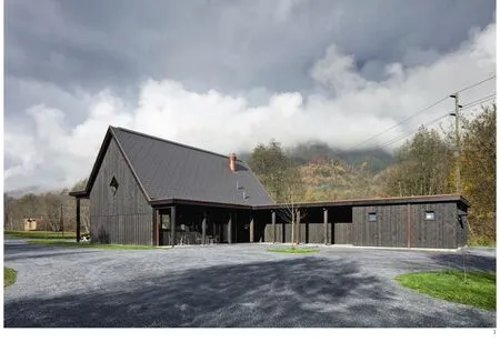
1 外景/Exterior views
这座由伊索·于翁德尔设计、颇具诗意的建筑,很大程度上是基于对一个特定场地潜力的清晰判断。他提及地方历史的时候与提及氛围和潜在参照物的时候一样多——这是一个谨慎的分析。一座建筑物不仅是一个设计出来的形状,也是材料的构成,这一点非常重要。他所使用的材料很原始,并且与建筑的构造紧密相关。但其组织建筑材料的方式包含着对一个地方可能样子的想象——对建成空间的想象。
于翁德尔创造了一个相遇的空间,在这里人们可以会面和交流。他使建筑对自然做出回应,并定义了空间。于翁德尔设计的特伦营地项目包含林地里的两个体量:一个包含接待处与餐厅的主要建筑,还有一个公共浴室“Prau Lung”。这个主建筑坐落在最高点“Prau America”。它用其鲜明的剪影创造出了视觉焦点和平衡点。就像传统的当地木建筑,餐厅优先位于一片林间空地。餐厅位于地段北侧,后面还有一个池塘。屋顶作为居室和住宿的象征,形成了中心。建筑朝向西南方向——也就是傍晚太阳的方向开放,主入口和餐厅就在这里。
公共浴室“Prau Lung”包含4个单体和1个用于洗澡、淋浴、清洁的屋顶层。4个单体呈风车状排布,人可以从各个方向进入庭院。主入口位于建筑西侧。内部是一个亲切的庭院空间。人们可以在中心碰面,在咖啡机旁碰面。冬天,这部分空间会关闭。
极重要的设计目标之一,是帮助当地经济发展。所以所有的材料和劳动力都来自于当地,生产于当地,甚至连建筑的功能都是为了让营地为特伦村庄当地的经济做出贡献。(陈雨潇 译)
The poetic architecture of Iso Huonder is very much based on a clear vision of the potential of a specific site. He refers as much to the history of a place as to the atmosphere and possible references:a careful analysis. Very important is that the architecture is not just a designed form but also that it is the constructed material. The materials he uses are authentic and have something to do with the construction of the building. But how he assembles the building materials goes with imagination of a possible vision for a place.
Huonder creates spaces of encounter where people can meet and interact. He reacts with his buildings to the landscape and defines the space.Huonder's project for the camping in Trun consists of two volumes in wood: a main building with reception and restaurant and a bathhouse "Prau Lung". The main building is situated at the highest point "Prau America". It creates with its strong silhouette the visual focus and the balance point. Like the traditional local wooden buildings the restaurant is situated at the first forest glade. The restaurant building is situated on the northern side of the spot with the pond in its back. A roof as a symbol of shelter and accommodation forms the centre, The building opens itself to southwest where the evening sun is. Here the main entrance with the restaurant is situated.
The bathhouse "Prau Lung" contains an ensemble of four volumes with a roof for washing,showers and cleaning. A courtyard typology of four volumes organised as a windmill where people can enter from all sides. A main entrance is on the west and formulates at the western side. The inner space is an intimate courtyard space. People can meet in the centre and meet at the coffee machine. In the winter the volumes are closed.
An important design ambition was to help the local economy to grow. So all material and work force are local and locally produced. Even in the use of the building it is the aim that the camping contributes to and strengthens the local economy of the village of Trun.
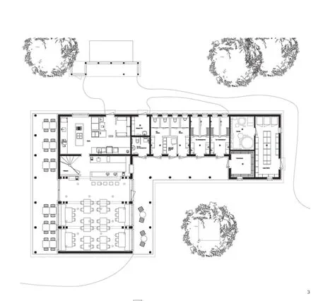
3 接待与餐厅/Reception and restaurant
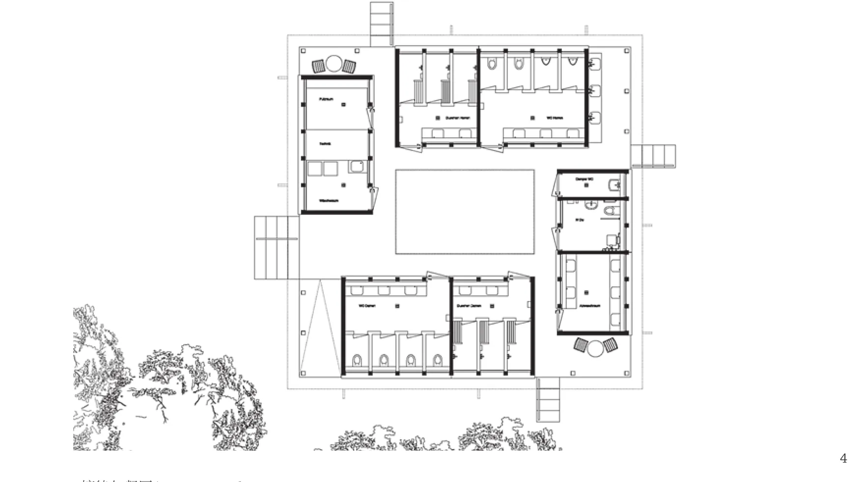
4 浴室/Bathing area
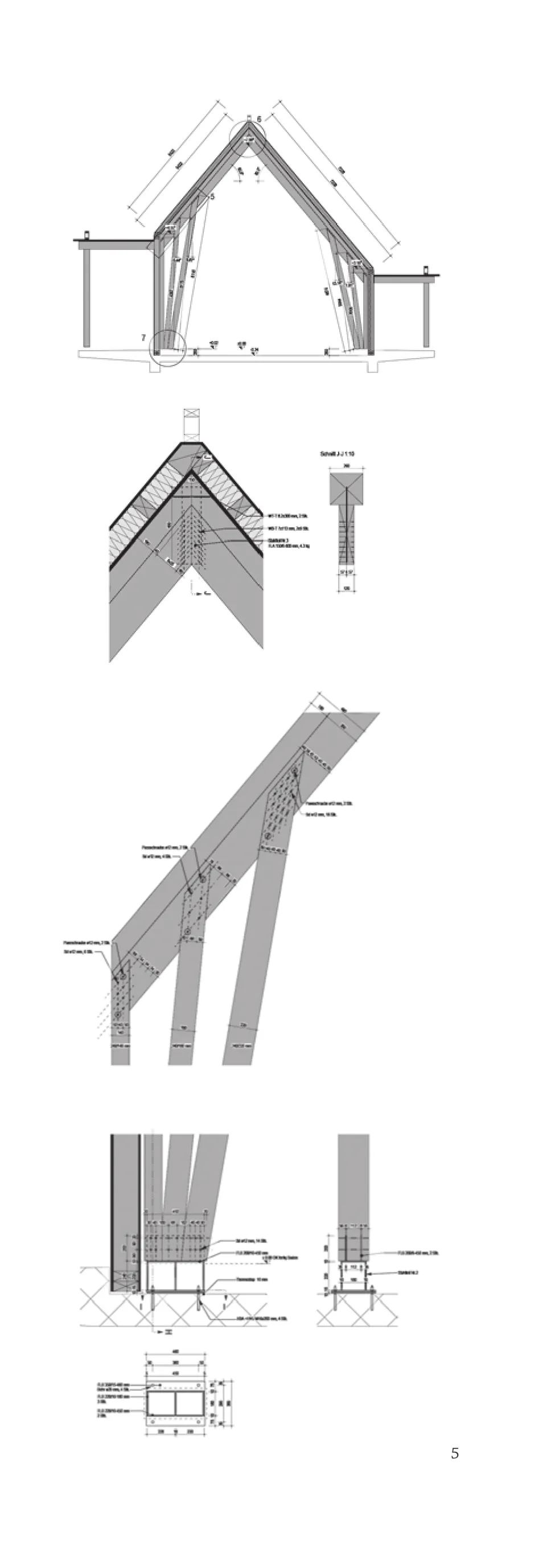
5 构造细部/Structural details

6 夜景/Night view
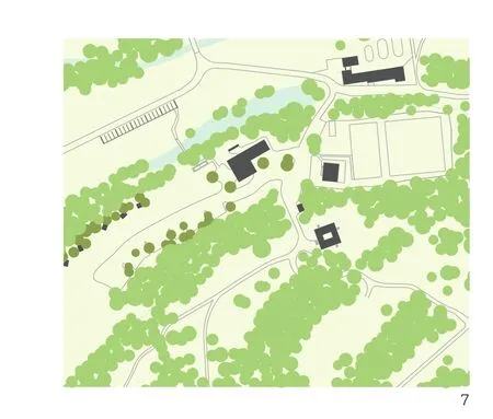
7 总平面/Site plan
郭廖辉:两个建筑物在景观中的空间布置和朝向都和使用相关,各自统领一片树木包围的区域。两种类型呈现出不一样的场地角色,作为一个空间高耸的餐厅,8m左右高的体量,中世纪教堂般的屋顶坡度,在一个由帐篷和房车组成的“建筑群”里就有了城市层面的意义。我们很显然地能够将不对称性和餐厅的开放方向关联起来,室内的结构和窗洞的大小因此也变得不对称,试图在消解尖顶下高耸空间所带来的宗教感。天花的不均匀尺寸和吊灯的位置还没有产生互相定义的关系,除此之外,我们也很难理解菱形窗的说服力。洗手间的体量是一个低矮的合院,平面均质,结构清晰,与餐厅一样,对内外木材差异的强调过于明显而显得有些刻意了。
邹欢:小木屋是人们对游客驿站的普遍期待,用木结构来实现这个建筑再妥帖不过。温暖、轻松、朴素而自然,游人在此憩息,体会郊野自然空间与建筑空间的融合共生。木结构本身的建造和构造细节的直接体现也因此顺理成章,建筑就要用建筑的语言表达。外立面材料颜色深沉稳重,与背景连绵起伏的山峦遥相呼应,排水管和遮阳帘的明亮色彩又为建筑增添了些许俏皮的时尚感。室内完全暴露松木本色,仿佛能够闻到松香的气息,使小木屋的建筑体验完美呈现。注意天花的处理,刻意留出的材料接缝形成水平方向具有韵律感的深色线条,加强了透视,突出了高大空间,堪称点睛之笔。

8 室外休息区/Outside lounge area
Comments
GUO Liaohui: The special arrangement and orientation of the two buildings in the landscape are all related to the use, each leading an area surrounded by trees. The two types present different roles of site. As a towering restaurant with a height of 8 meters and the roof slopelike middle age churches, it obtained a meaning at city level in a "building group" consisting of tents and ravages. We can obviously link the asymmetry with the openning direction of the restaurant. From that,the indoor structures and the sizes of windows also became asymmetrical, trying to dispel the religious sense of the towering space under the spires. The inhomogeneous sizes of the ceilings and the positions of the chandeliers have not yet formed a relationship of mutual defination. Other than that, it is also difficult to understand the persuasiveness of the diamond shaped windows. The block of the bathroom is a low courtyard,with homogeneous plan and clear structure. Same as the restaurant, the emphasis on the difference between the wood inside and outside is too obvious and looks a little deliberate. (Translated by CHEN Yuxiao)
ZOU Huan: Wooden cabins are the most common expectation for tourist stations. There's nothing more suitable than wooden structure to achieve this building with. Warm, easy, simple and natural, visitors come here to rest, to experience the symbiotic fusion of wild natural space and architectural space. The direct expression of construction details of the wooden structure itself is therefore logical. Architecture should be expressed in the language of architecture. The material colours of the facades are heavy and steady,echoing with the background of rolling mountains. The bright colours of the drainage pipes and the shading curtains add a playful sense of fashion to the building.Inside, the original colour of pine wood is completely exposed, as if you can smell the scent of rosin. This expresses the architectural experience of the cabin perfectly. If you pay attention to the treatment of the ceiling, you'll find that the deliberately kept material jointings for rhythmic dark lines in the horizontal direction. They strengthened the sense of perspective,highlighted the high space, and can be taken as the essence of the design. (Translated by CHEN Yuxiao)

9 柱子细部/A detail of pillar

10 洗手间/Restroom
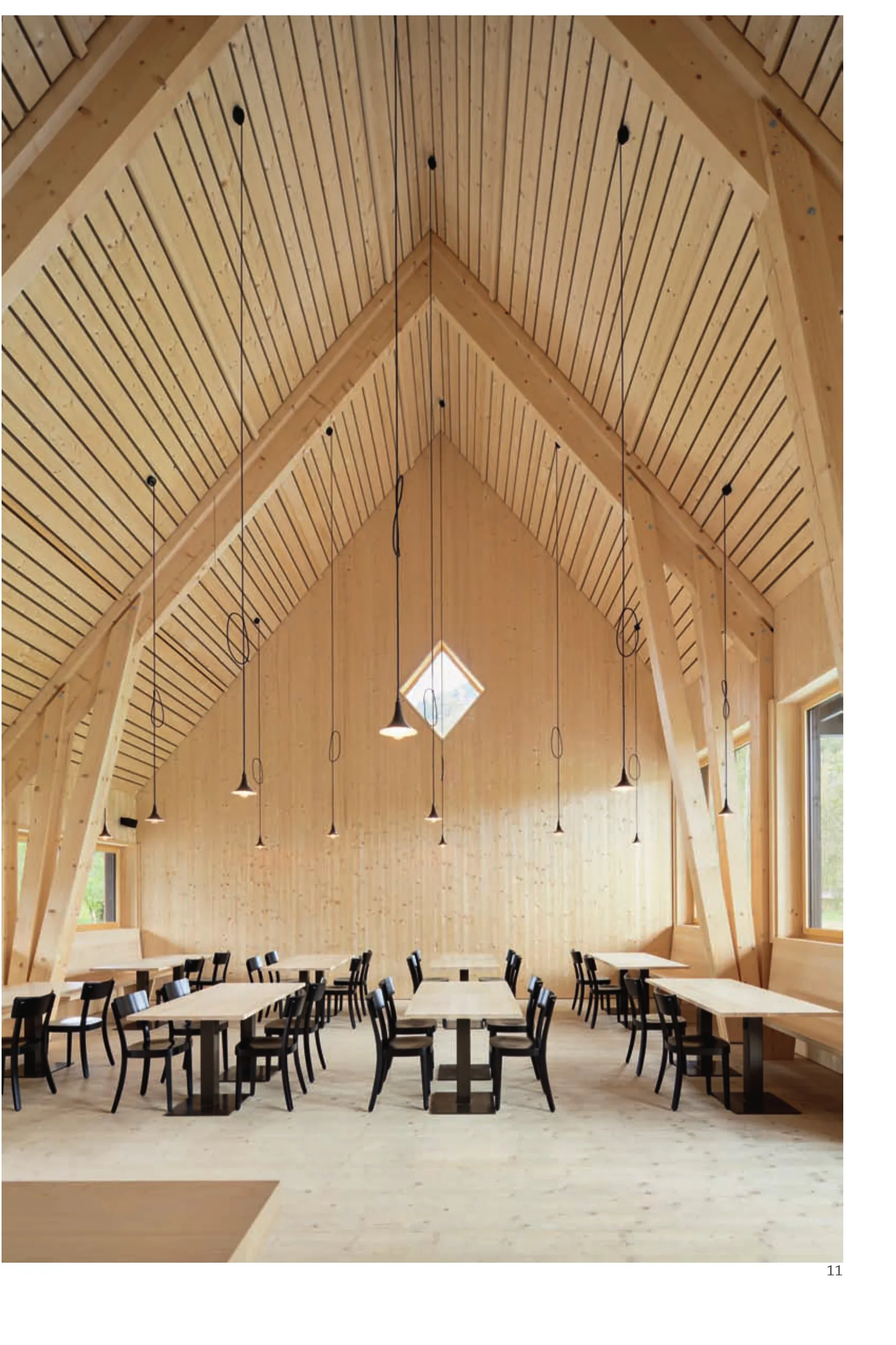
11 内景/Interior view
项目信息/Credits and Data
客户/Client: Campadi
结构工程/Structural Engineer: Walter Bieler
景观设计/Landscape Architect: Lorenz Eugster建造周期/Building Year: 2015-2016
摄影/Photos: Ralph Feiner
