安特施塔斯办公楼,圣加伦,瑞士
2018-03-05建筑设计科琳娜梅恩马克阿曼
建筑设计:科琳娜·梅恩,马克·阿曼
Architects: Corinna Menn, Mark Ammann
建筑师科琳娜·梅恩关注的是材料、结构和生活与主体结构相关的特质,以及场地的文化和建筑类型的可能性。在设计中,她的重点在于营造清晰的体系,不仅使建筑师的设计成为最重要的东西,还有建成的体系及其空间效果。
办公楼的区域位于一战前世界领先的纺织品生产厂和仓库所在的位置。屈耶尔与莫泽、普夫勒加尔德与黑费利等著名瑞士建筑师,以及世界闻名的结构工程师罗贝尔·马亚尔设计建造了这座建筑。马亚尔探索了新的混凝土施工方法,并创造出了优美的建筑结构。直至今日,这些建筑都是楚楚动人的,并塑造了项目所在地的街道空间。
这个项目的主要思路源于其结构。建筑中所有的作用力都传到了前后立面上,所以无需内墙或柱子。天花是V形折板结构,因此不用更多的梁,在V形空间的上部还为建筑设备和基础设施留出了空间。立面上的支撑柱位置越高就越小。每根柱子都需要承载更少的重量。在顶层上是集会空间。回挑的楼板为各边提供了阳台的空间。从结构上看,天花改变了它的方向,并将作用力传到建筑各边的防火墙上。在这里,结构从短边转向长边。能够敞开的阳台是室内空间的终结。这个跨度需要一种连接构造。在内侧可以看到不加修饰的做法,而外侧覆盖着保温层和砖层。
粗野的建筑做法形成了外向性的表达。(尚晋 译)
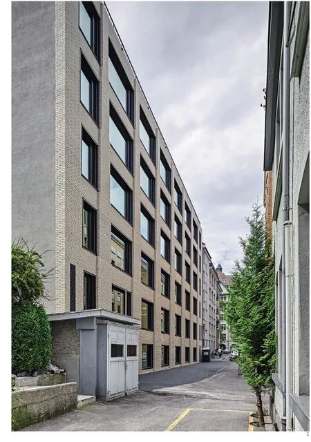
1 后侧外景/Exterior view from the back side
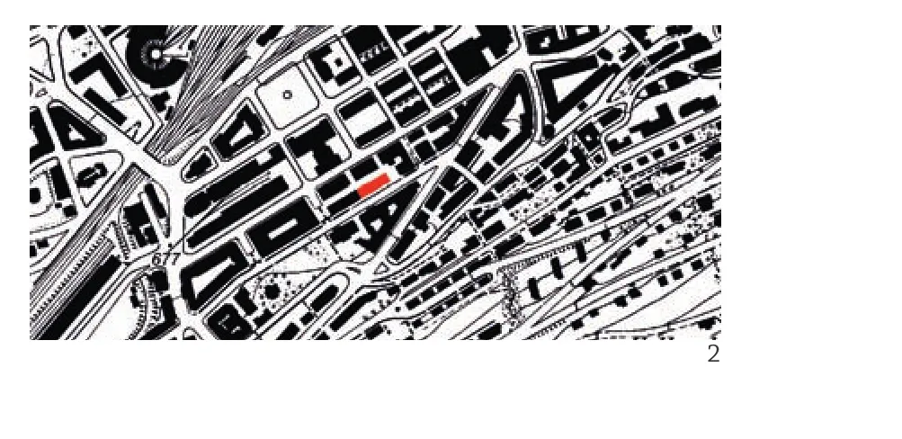
2 总平面/Site plan
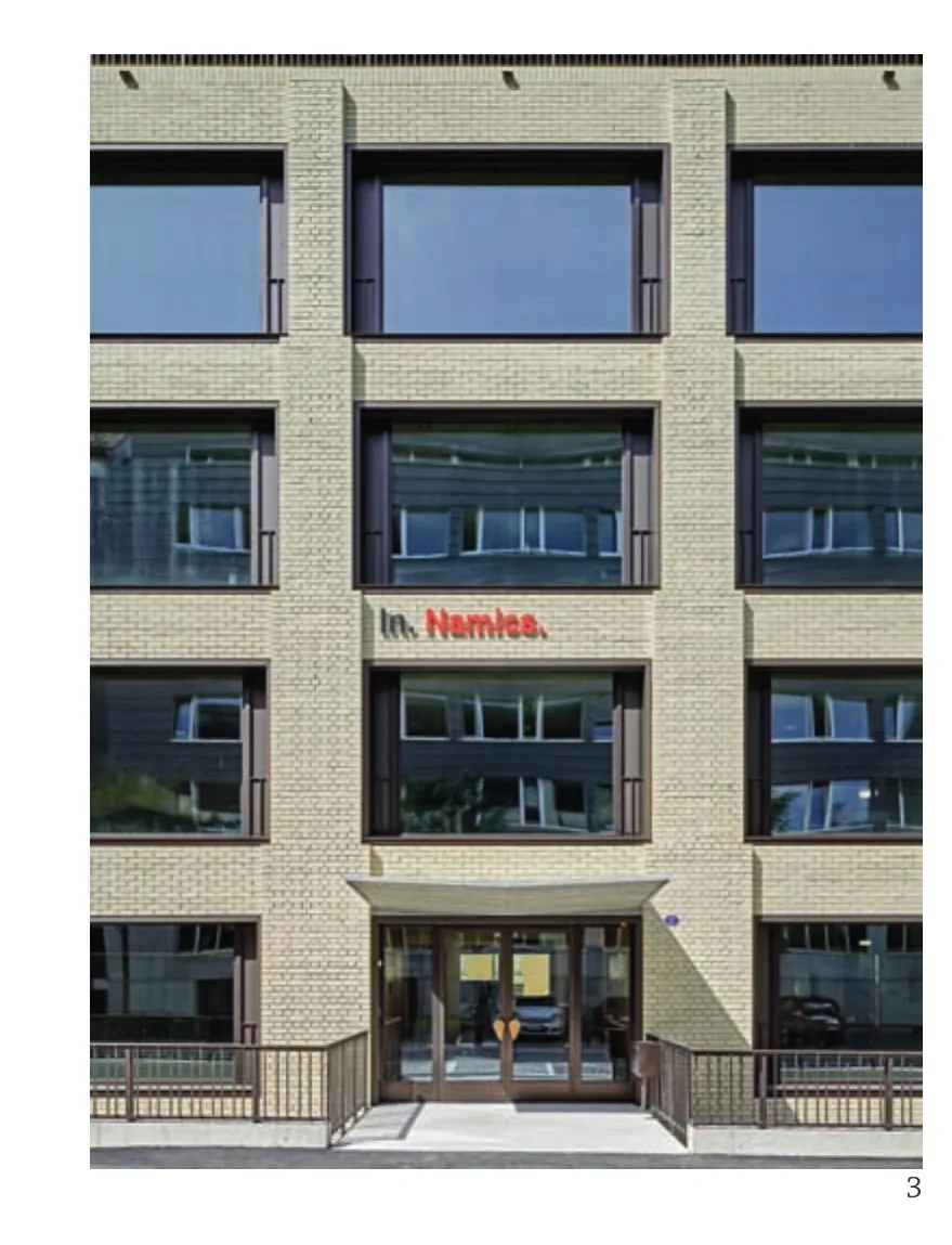
3 立面细部/Detail of facade
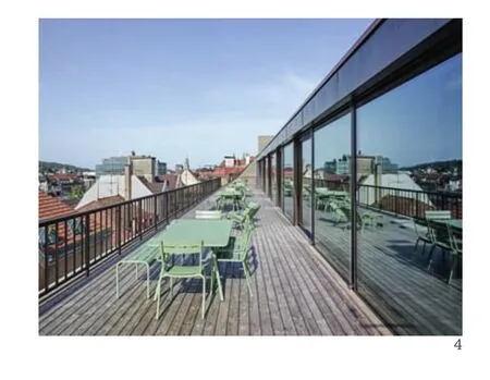
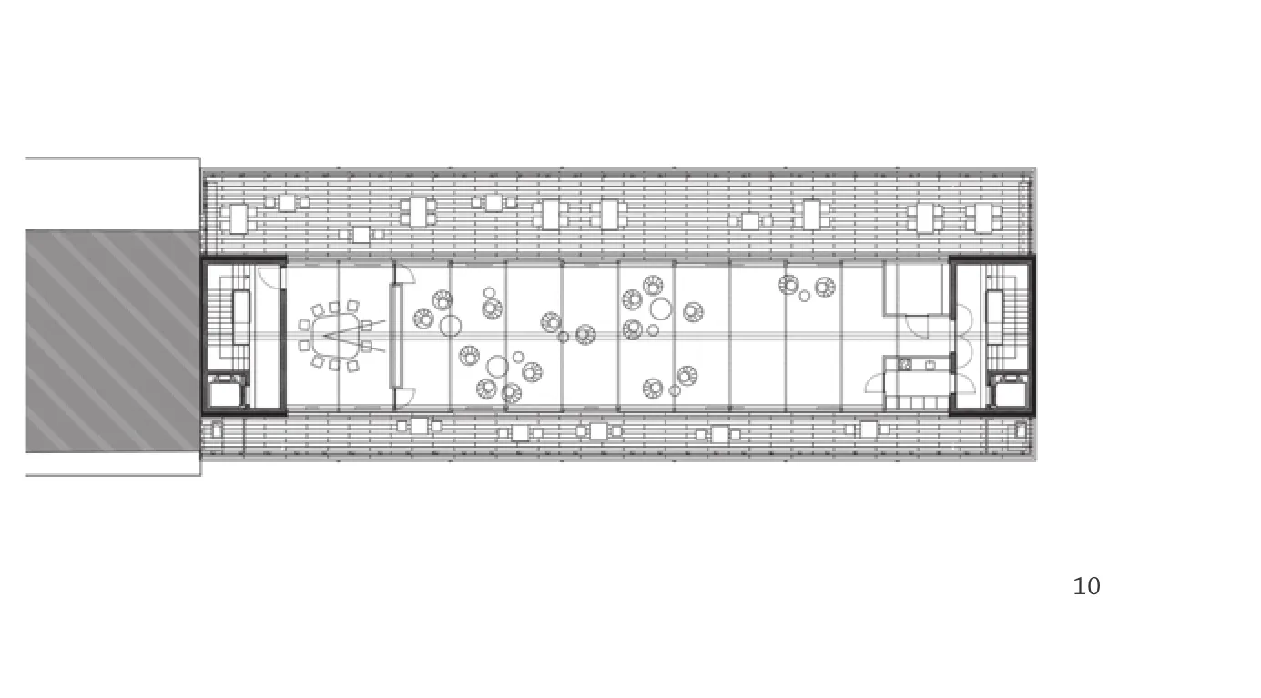
4 屋顶露台/Rooftop terrace
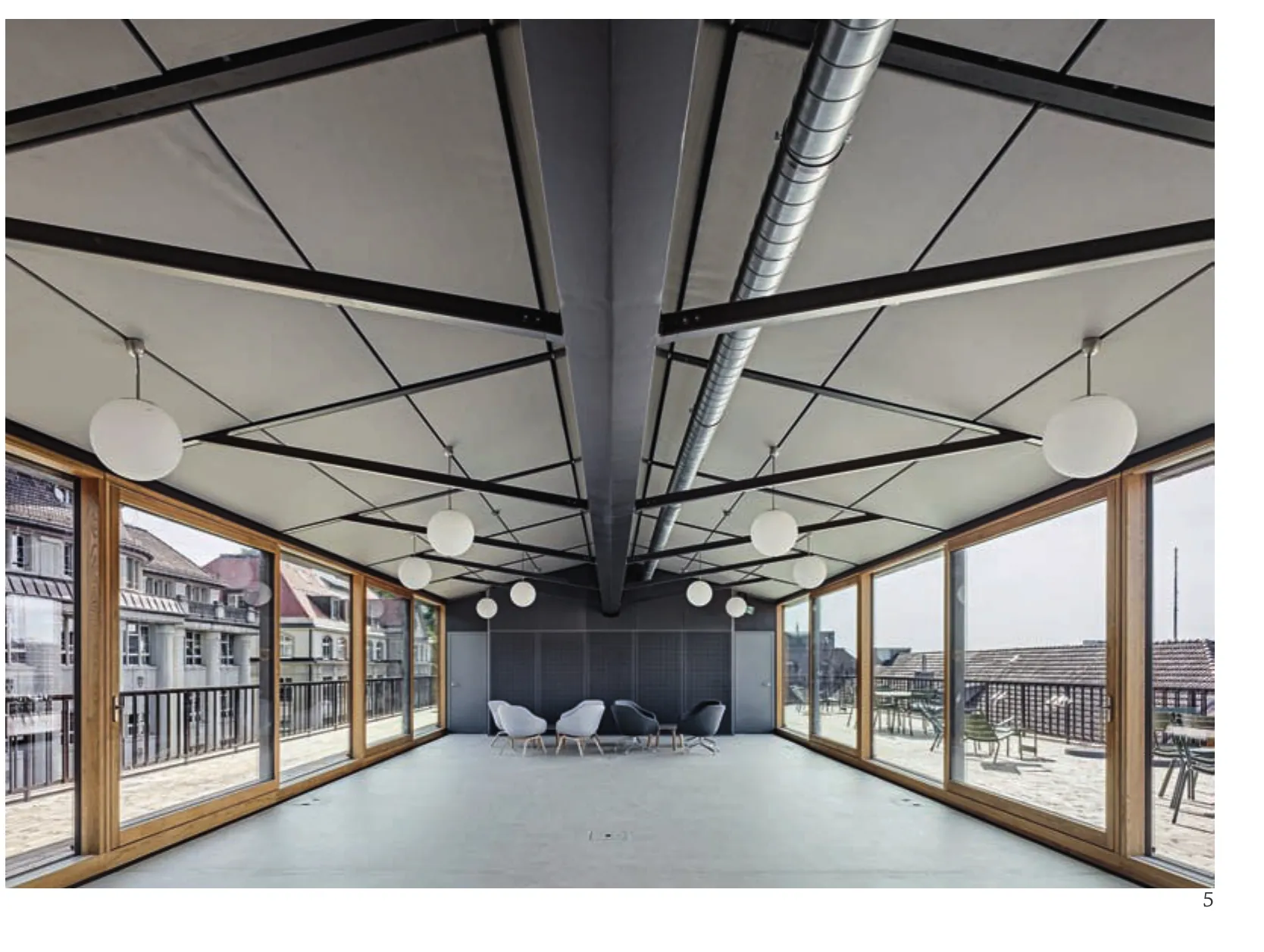
5 屋顶及公共空间/Roof and public space
项目信息/Credits and Data
客户/Client: ASGA养老基金会/ASGA Pension Fund
结构工程/Structural Engineer: Andrea Pedrazzini (Ingegneri Pedrazzini Guidotti), Lugano in collaboration with Borgogno Eggenberger
施工/Construction: 2014-2017
摄影/Photos: Roger Frei
The architect Corinna Menn focuses on the essence of material, structure and living in relation to the main structure and the cultural and typological possibilities of the site. In her designs she is interested to build up clear systems where not the design of the architect is the main important thing,but the built up system and it's spatial achievements.
The office building is situated where previously world leading textile producers around before the First World War had their production and storage. Leading Swiss architects like Curjel & Moser or Pfleghard &Haefeli and engineers like the world leading structural engineer Robert Maillart designed and constructed the buildings. Maillart experimented with new construction methods for concrete and developed elegant building structures. Still today these structures are elegant and impressive and those buildings shape the street where the project is situated.
The main idea of the project comes from the structure. All building forces are brought down at the front and the back facade. Therefore no inner walls or columns are necessary. The ceiling is in a V shape folded plate structure. Therefore no further beams are necessary and in the upper part of the V space give space for building equipment and infrastructure. The supporting columns on the facade get smaller the higher it is situated. Each column needs to carry less weight. On the top floor are meeting spaces. The floor springs back to give space for a sun terrace on each side. Structurally the celling changes its direction and brings its forces to the fire protecting walls on each side of the building.Here the structure changes from the short side spanning to the long side. The possibility to open to the terrace gives the inner space a completion. For the spanning a bridge construction was necessary.On the inside the raw construction is visible and on the outside covered with layer insulation and bricks.
The essence of the raw building construction gives the expression towards the outside.
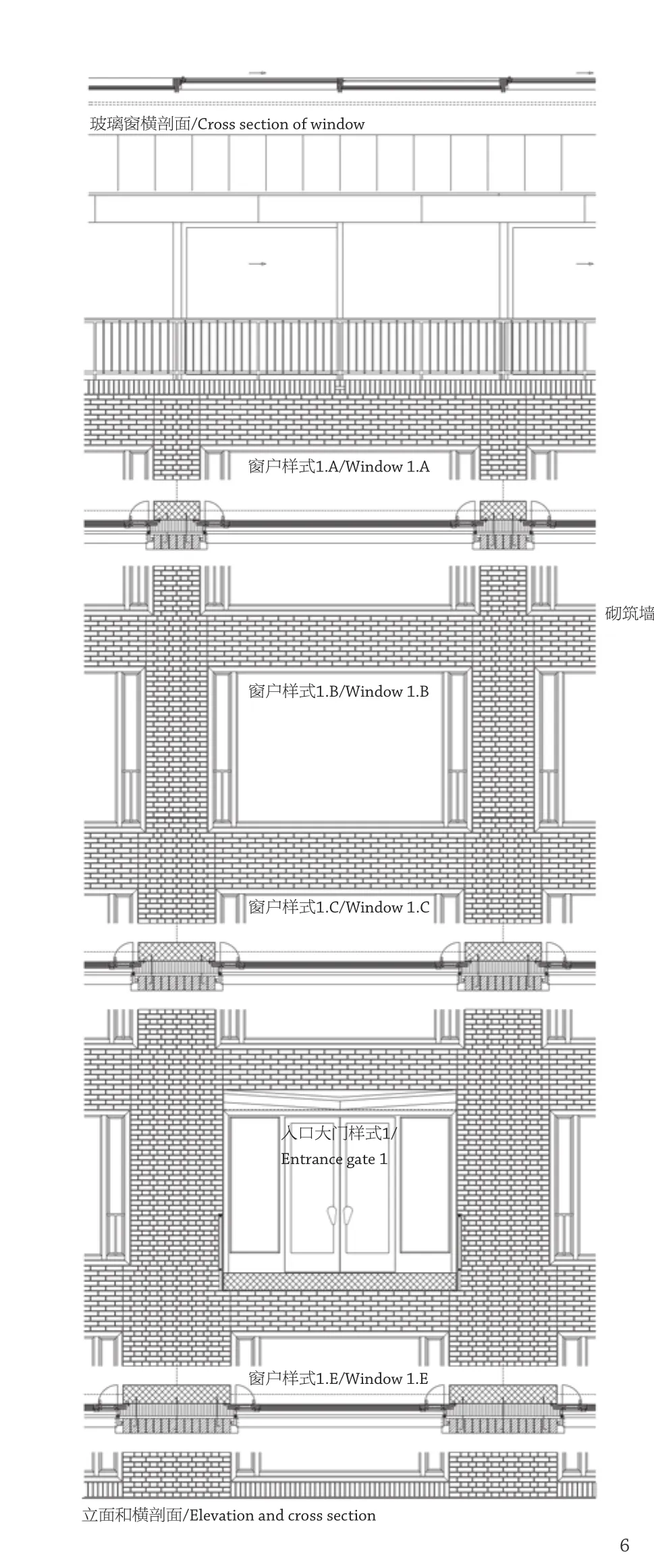
6 立面构造/Facade construction
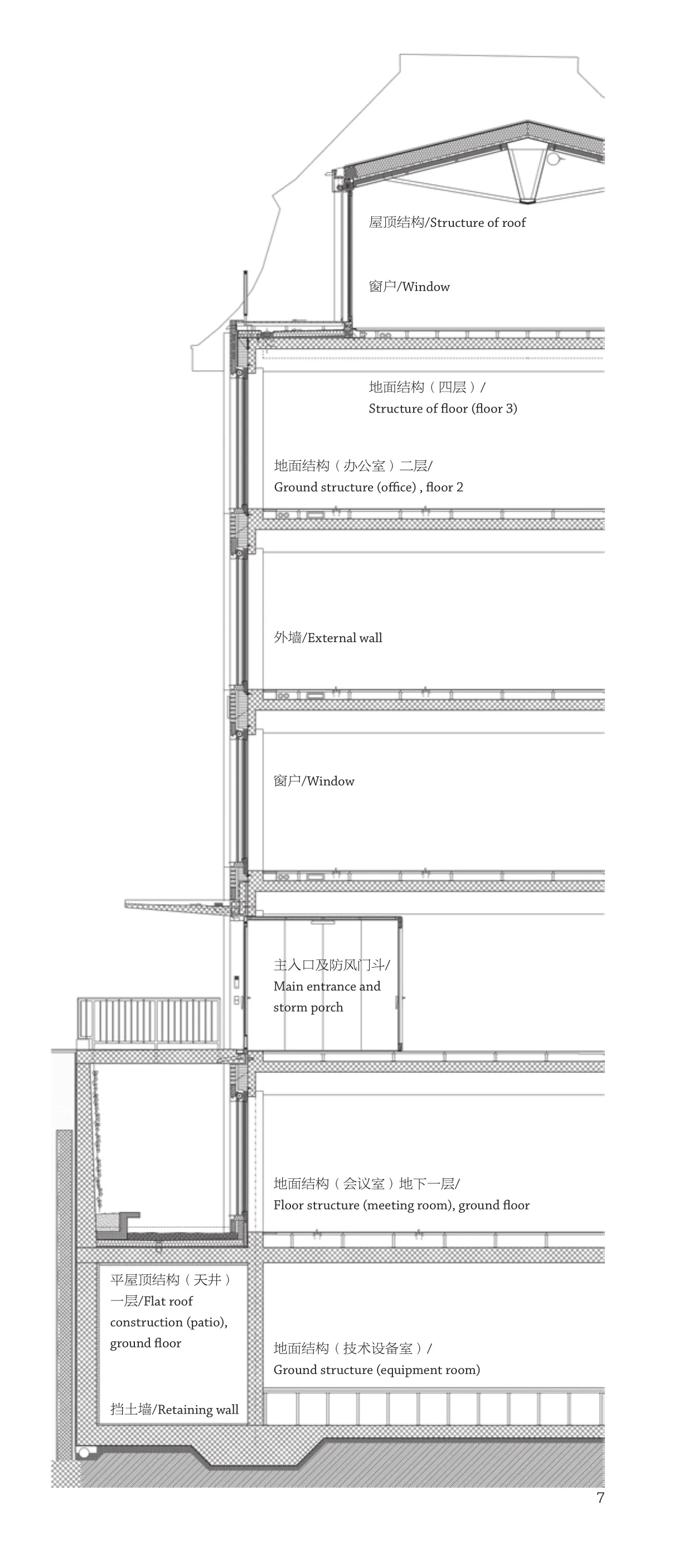
7 剖面构造/Section construction
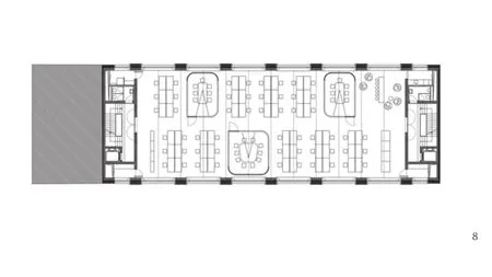
8 办公层平面/Normal office floor plan
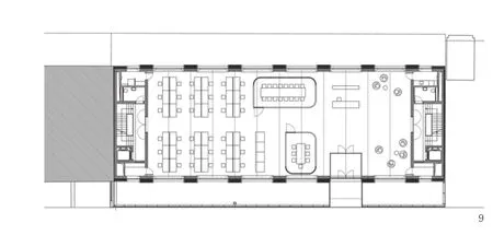
9 入口层/Entrance floor
10 公共屋顶露台/Public roof terrace
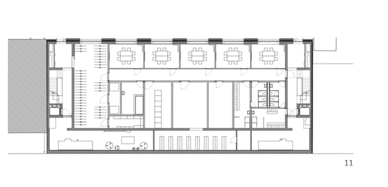
11 地下一层平面/Floor B1 plan
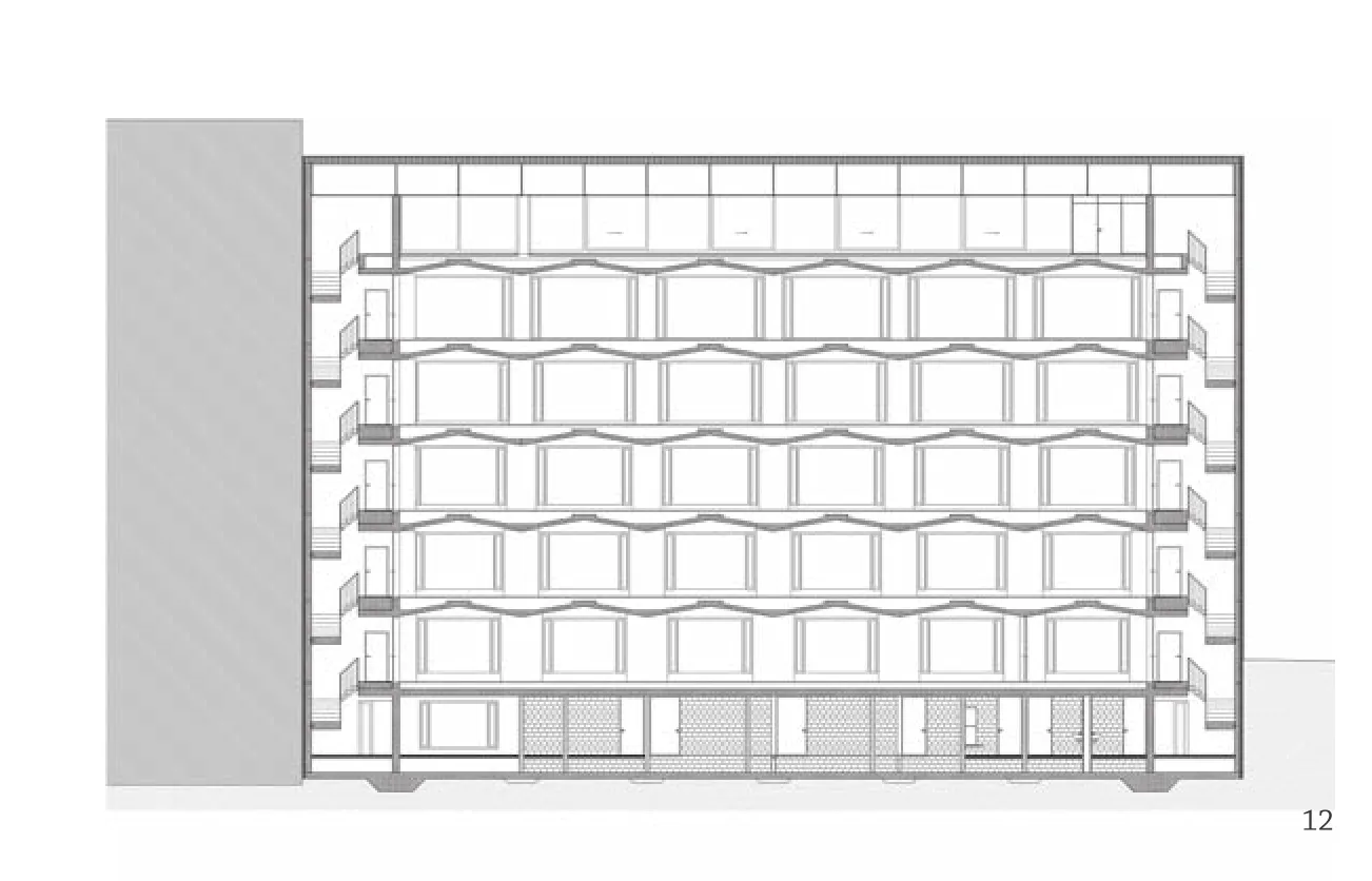
12 纵剖面/Longitudinal section
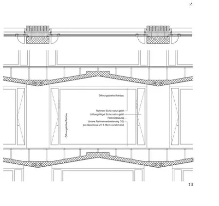
13 折叠屋顶原理示意/Principle section of folded ceiling
评论
白晨:柱子和相应的外饰面砌体,每层收窄一块砖的宽度,继承了相邻建筑的传统结构语言:以截面逐层变小取得稳定性。
建筑两个短边尽头以混凝土核心筒保证建筑整体的刚度。核心筒在屋顶上支撑的长向主梁,似乎是整体结构的关键。
平面大空间的短向没用梁,而用折板跨过,把空间解释为连续而重复的传统神庙式截面。
室内的架空地面,改变了折板的表面,回应人们行动的需求,和现代设备的需求。
胡恒:这是非常优异的办公楼设计。一个核心元素的设定,就将整个建筑“解决”掉。这是我心仪的设计方法。折板楼板是设计的核心,它既创造了室内如海浪般的波形屋顶空间,又顺便将外立面搞定。设计逻辑之严密通畅,令人叹服。结构、空间、材料、细部融为一体,其内在的自恰性甚至发散到户外,让它在街道上都能表现不凡。不过对我来说,这个设计最值得称道的是折板楼板的巨大尺度,以及它在结构与空间上的二合一。在办公楼这类单元重复的建筑(还有集合住宅)里,如何施以大尺度的结构/空间元素,是一项大师的专属课题。而在这个办公楼里,如果室内隔墙都不到顶,屋面保持完整性,那么它就可以跻身“大师作品”的行列了。
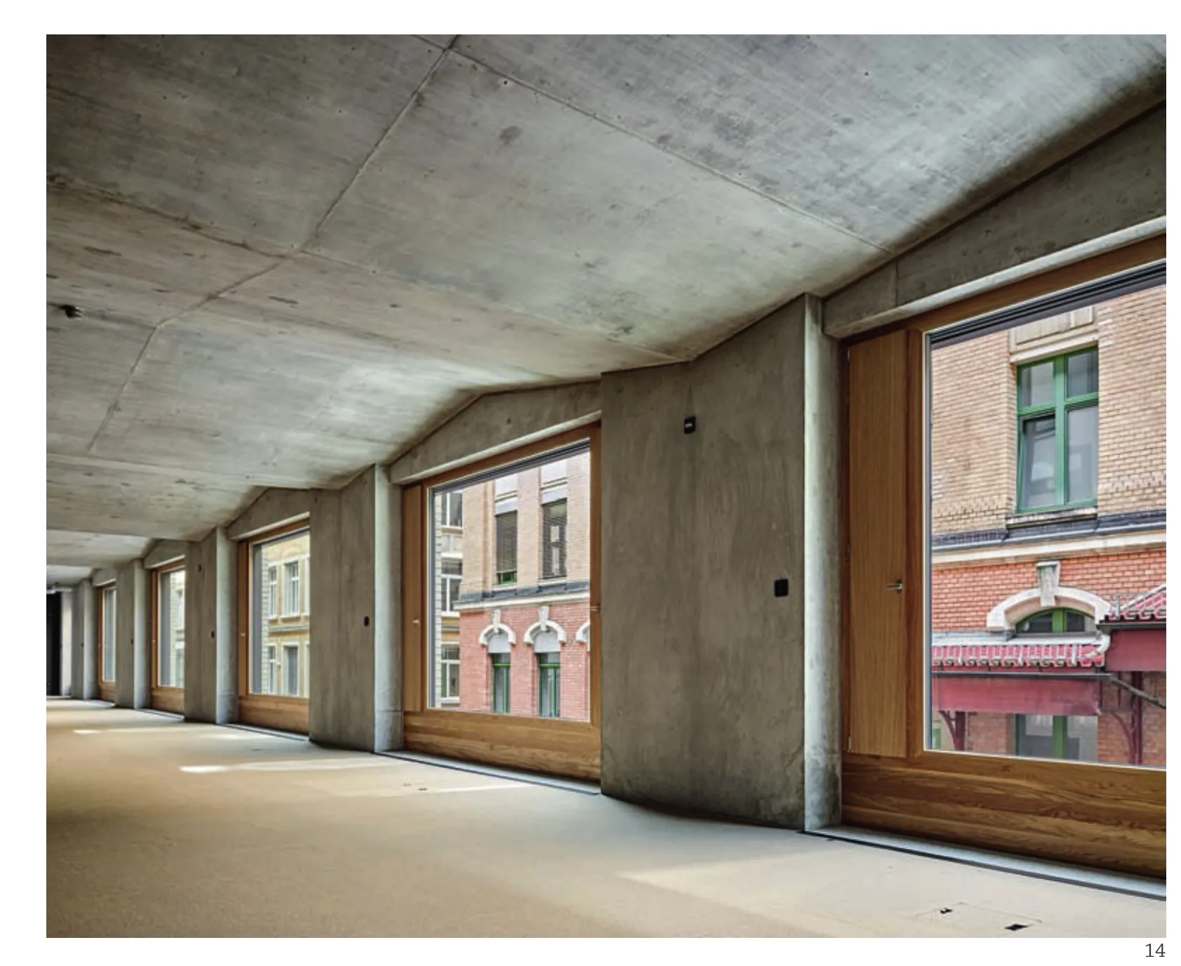
14 办公空间/Office space
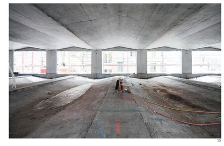
15 施工中的办公空间:混凝土折叠屋面及地面/Office space during construction: Folded ceiling/floor in concrete
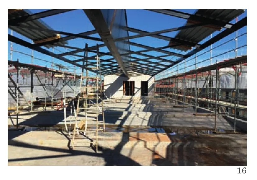
16 施工中的公共露台/Construction of the public terrase on the top
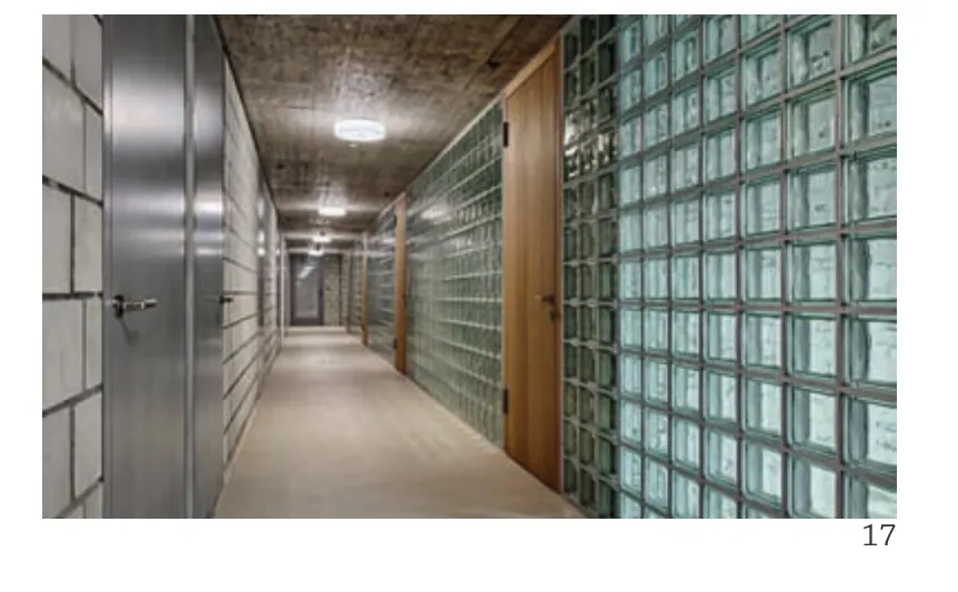
17 位于地下室的走廊/Corridor in the lower part of the basement
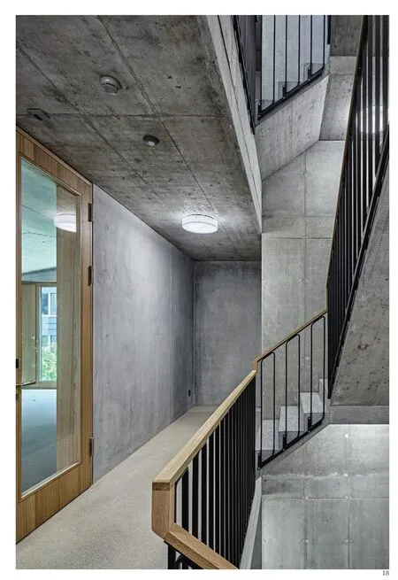
18 楼梯间/Staircase
Comments
BAI Chen: The width of columns, together with the exterior finish bricks, is reduced of one brick length on each level. This is coherent with the traditional structural language of buildings nearby, i.e. to gain stability by the reduction of sectional area.
The two cores are located at the ends of the building,apparently to ensure the rigidity of the whole building.The longitudinal structural beams on the roof, supported by the cores, seem to be the key of the entire structure.
There are no beams in the grand interior space.Instead, the V shape folded plate ceilings transformed the interior space into continuous and repetitive sections reminiscent of traditional temples. The resulting raised floors also changed the folded surface of this structure, responding to the needs of human activities, as well as the installation of modern equipment. (Translated by WANG Xinxin)
HU Heng: This is an excellent office building design:the core element contributes to the design of the entire building. This is my favourite design approach.The folded plate structure is the central to the design.Not only does it create a wavelike indoor rooftop,it also serves as an exterior facade. The logic of the design remains tight and clear, which is impressive.The structure, the space, materials and details have all been integrated into the design. This sense of selfconsistency has even spread to outdoor area, allowing it to stand out on the street. From my perspective,however, the most impressive part of the design is the large scale of the folded plate structure, as well as its ability to combine the structure with space. In architecture projects with repeated units, such as office buildings or amalgamated dwellings, creating a large scale of structure/space has become a topic exclusive to great masters. This office building design could have been a "masterpiece" if its indoor partition walls did not reach the roof and the roof surfaces maintained integrity. (Translated by Dandan Wang)
