国家建筑博物馆BIG迷宫,华盛顿,美国
2016-12-06设计BIG建筑事务所
设计:BIG建筑事务所
国家建筑博物馆BIG迷宫,华盛顿,美国
设计:BIG建筑事务所
一览无余是迷宫?
一座迷宫往往越是深入,路线就越曲折。假如我们将这种套路反转过来,创造一座让人在达到迷宫中心时豁然开朗、一目了然的龙门阵会怎样?从外面看,迷宫的立方体造型将最终的观赏点隐藏在约5.5m(18ft)高的墙之后。从里面看,墙体缓慢向中心降低,以开阔的观赏点终结——让人360°环视自己的来龙去脉。(尚晋 译)
Can a Maze Reveal Itself?
As you travel deeper into a maze, your path typically becomes more convoluted. What if we invert this scenario and create a panopticon that brings clarity and visual understanding upon reaching the heart of the labyrinth? From outside, the maze's cube-like form hides the final reveal behind its 18 foot tall walls. On the inside the walls slowly descend towards the center which concludes with a grand reveal – a 360 degree understanding from where you came and where you shall go.
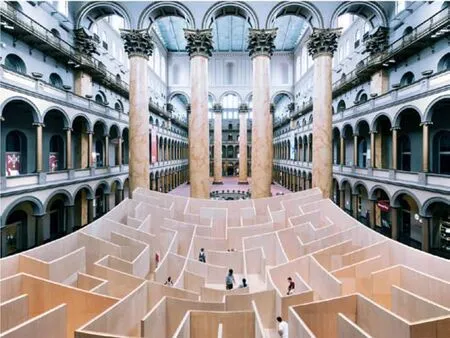
1 鸟瞰/Aerial view
项目信息/Credits and Data
客户/Client: 国家建筑博物馆/National Building Museum
责任合作伙伴/Partners-in-Charge: BjarkeIngels, Kai-Uwe Bergmann
项目负责人/Project Leader: Chi-Chi Lin
项目团队/Project Team: ZiadShehab, Thea Gasseholm, Annette Miller, Iben Falconer
合作方/Collaborators: CoStar Group, Clark Construction Group, DAVIS Construction, Glass Construction, Grunley Construction Company, SIGAL Construction Corporation, GCS, The Home Depot Foundation, ACECO, Robert Silman Associates, Cumming Construction, VJ Associates, Hargrove面积/Size: 346m2
展览时间/Exhibition Time: 2014.7.8-2014.9.1
摄影/Photos: Kevin Allen
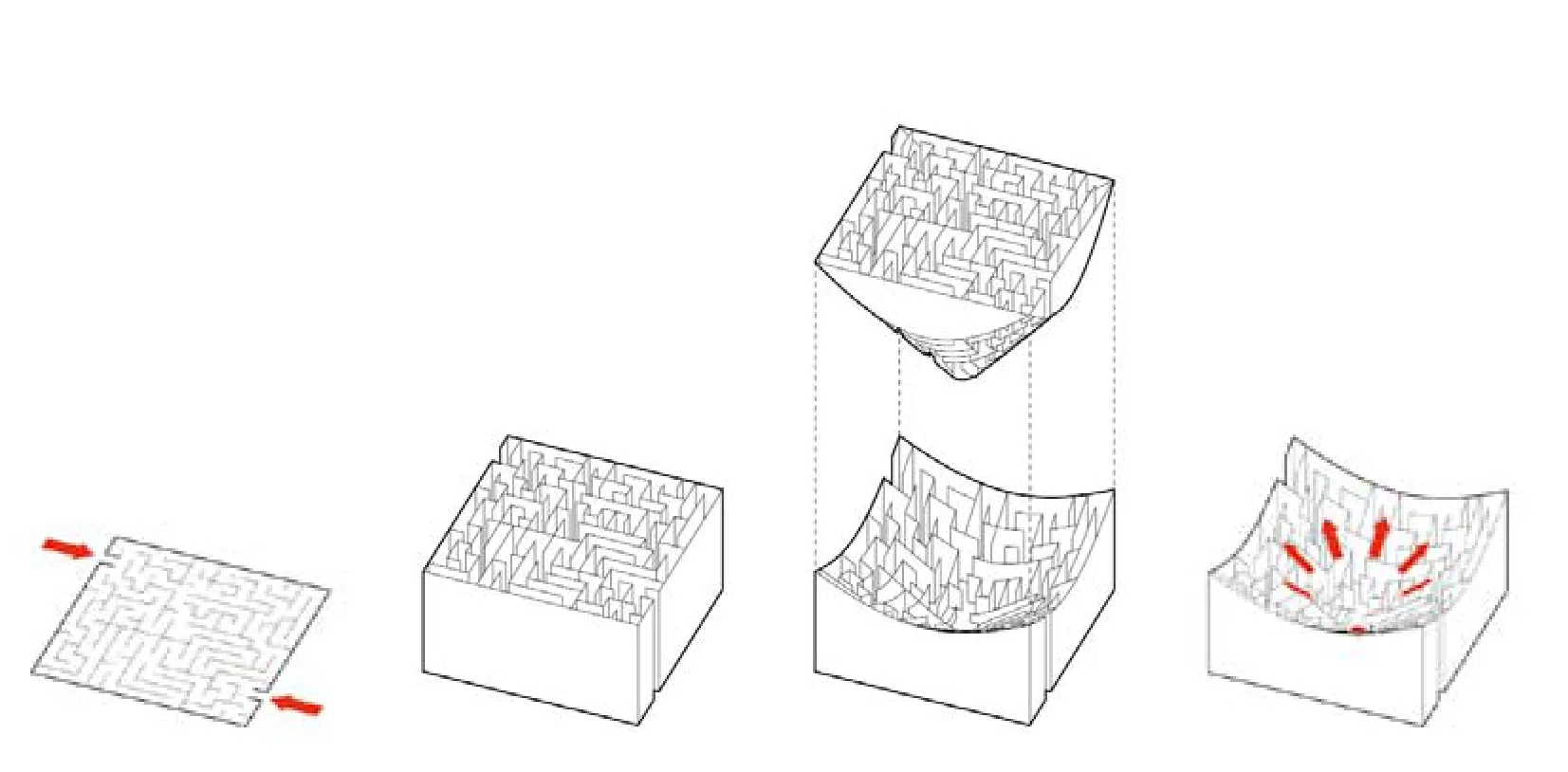
2 分析图/Diagram ©BIG
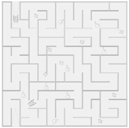
3 平面/Plan ©BIG

4 剖面/Section ©BIG
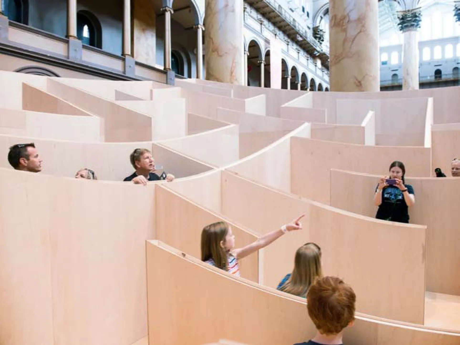
5 墙较矮的区域/Area where walls are relatively slow
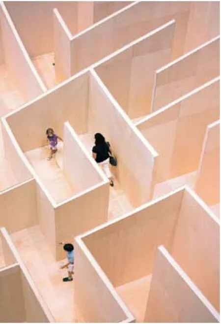
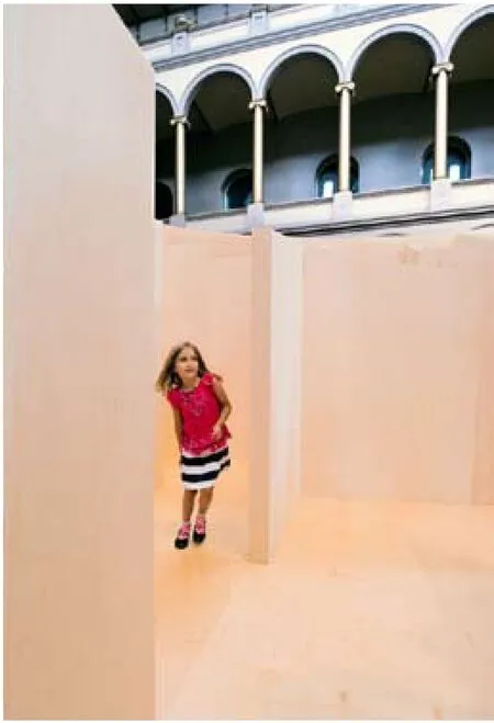
6.7 墙较高的区域/Area where walls are relatively tall
评论
陈屹峰:按BIG建筑事务所的解释,大迷宫像他们其他很多的设计项目一样,兼顾了两种看上去不可调和的状态。构成迷宫的胶合木板墙的高度从迷宫边缘的5m多,逐渐递减至迷宫中心的1m多。参观者刚进入迷宫时视线受限,但随着向迷宫中心趋近,知觉的明晰性在不断增强,而迷宫本身则在逐渐颠覆自身;参观者离开迷宫的知觉体验过程则正好相反。这种近似手法主义的思路和做法,给形式借鉴自历史案例、原本静止稳定的迷宫带来了足够的张力和节奏变化,参观者也会因迷宫的这种矛盾状态而倍感新意。
Comments
CHEN Yifeng: According to the explanation by BIG, the BIG Maze, like many of their other projects, achieves a balance between two seemingly irreconcilable positions. The height of the maze wall that is made of plywood gradually decreases from more than 5m at the perimeter to over 1 m at the center. When the visitors enter the maze, their field of vision is limited, but traveling deeper into the maze brings more clarity; and when they reach the heart of the labyrinth, the maze reveals itself. This kind of Mannerism creates tension and rhythm in the originally static and stable maze that borrows its form from historical precedents. The typical maze-like scenario is inverted. Moreover, visitors will walk out of the BIG maze looking at their world differently.
朵宁:BIG建筑事务所的迷宫是个有意思的悖论:一个异化的迷宫设计,使得迷宫在被探索的途中变成一目了然的通途。如同比亚克·英厄尔斯本人所说,把迷宫的卷曲盘绕转换成清晰引导。
剥离了传统神话中穿迷宫打怪兽的神秘背景,迷宫这种建筑类型的乐趣可能只剩下卷曲盘绕和路途的不确定性。但是一个概念的反转——视觉引导的迷宫——成功地消解了这种迷宫的空间张力。或者说,BIG建筑事务所用抽象智识的乐趣取代了具体空间的乐趣。
这是一种非常具有BIG建筑事务所特点的设计手法。对于大部分没有办法亲身体验设计成品现场,只能在屏幕前阅读图片和设计说明的观众来说,这样的设计无疑更具有传播性。
DUO Ning: The Maze by BIG is an intriguing paradox: a maze that reveals itself in a journey of discoveries. The inverted design transforms the convolution of a labyrinth into a clarity and visual understanding, said BjarkeIngels.
Without the Minotaur waiting at the center of the labyrinth, the excitement of explorations is the convoluted journey into a maze and the uncertainty along with it. In BIG's Maze, an inverted design concept dissolves the tension by creating a visually guided form. In other words, BIG replaces the spatial entanglement with intellectual enjoyment.
This is a very "Bigamy" design strategy. For millions of absent audience who can only browse the images and read the description on screen, this kind of design is more favorable.
BIG Maze at National Building Museum, Washington, USA, 2014
Designers: BIG
