华山游客中心,华阴,陕西,中国
2015-12-21庄惟敏,张葵,陈琦等
华山游客中心,华阴,陕西,中国
Mount Huashan Tourist Center, Huayin, Shaanxi, China, 2011

1 下沉广场及台阶绿化/Sinking square and green steps
华山风景名胜区自然景色雄奇瑰伟,风姿独具,大气磅礴。考虑到华山的这种磅礴气势以及它丰富的人文景观与历史传承,我们采用了尊重自然、尊重华山的设计理念。设计首先严格遵循了华山风景名胜区总体规划的要求,其次也充分考虑了华山未来申报世界自然遗产的可能性。
考虑到大量游客来此旅游都是为了观仰华山,而游客中心仅仅是为其观山提供必要的服务,因此在设计立意上,整个建筑体现了“宜小不宜大、宜藏不宜露”的原则。建筑匍匐在华山脚下,融入用地的自然环境之中。此外,由于华山游客中心承担着服务游客的主要职能,我们认为它是高水准的集游客集散、咨询服务、导游服务、旅游购物、餐饮及配套办公管理等功能于一体的综合性小型建筑,并与关中地区传统文化地位相称的具有文化内涵的重要设计项目。它的建设应该遵循这样几个设计原则:首先,它应该是具有高品位和一定文化内涵的综合性建筑;其次,应该在规划及建筑设计上与周边环境相融共生;再次,应当以人为本,依托良好的自然环境,在保护华山自然风貌的前提下,成为为游客提供便利服务的活动场所。基于这样的前提,我们认为有必要在该项目设计中引入某些独特的规划及设计理念,从而达到设计方法、技术手段和建筑艺术的统一。
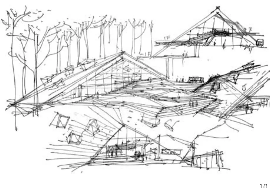
项目用地处于华阴市的主要轴线迎宾大道的南侧尽端、背靠华山,且与北侧的西岳庙遥相呼应。按传统设计思路,建筑应当位于主轴线之上,然而建筑的体量再高也高不过山,华山的山景才是整个景区的主角。因而,城市与山之间的轴线应当以山作为对景,凸显出华山的存在,而建筑恰恰应该是一种退隐的状态。因此,设计一方面采用了斜坡顶的造型语言,以求将建筑与华山融为一体;另一方面将华山游客中心的使用功能一分为二,成为两个部分。其中西侧部分体量较小,作为游客进山通道,包括购票、咨询、导游服务等功能;东侧为餐饮、购物、管理以及其他配套用房,同时兼作出山通道。东西侧两个单体建筑的中间则用一个平缓的、逐渐升起的平台作为连接。这样一种设计使得游客无论站在用地的入口或者场地内的任何一个位置,均能够一览无余地看到华山的秀美风光。两个单体建筑置于两侧、中间连接部分采用平台拾级而上的设计手法既与自然地势相吻合,又是面南的华山景观与面北的城市景观的一种有效衔接。在台阶宽窄、疏密相搭配的平台之上,人们向南看到的是华山的雄姿,向北则可回望城市,其面向的是城市和现代文明,背靠着自然与人文历史传承。建筑依托自然,接纳现代,从而形成自然和文明结合的一种概念。因此,设计充分体现了对环境和建造场所的尊重,使得建筑成为联系自然景观与人文特色、联系传统文化与现代文明的一个载体。
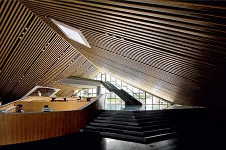
建筑形体采用了带有折线变化的斜坡屋顶,坡屋顶直接落地,在屋顶穿插敷设了一些呈不同角度设置的立方体作为采光单元,隐喻山顶的岩石随意地散落在山坡上,它既具有为室内提供采光的功能作用,又在造型上丰富了整体建筑意象。这一看似随意、实则刻意讲求建筑与自然契合的设计手法,也与张锦秋先生所提出的建筑要与华山相呼应,并建议增加一些有斜坡面的体型,从而形成高低错落有致以及富有活力的指导思想相符合。大平台上也根据使用需要设置了若干方整洗练的玻璃盒子作为采光单元,为大平台下的展览空间提供展陈照明,同时夜晚平台下展览空间的灯光从采光玻璃盒子中透射出来,远眺似繁星点缀,丰富了建筑的表情。大平台铺以产自当地的石材,在形式及质感方面力求与华山尽可能地融为一体,屋面的石材选择也考虑到了关中地区民居建筑的灰色调,在颜色和质感上力求有文脉的呼应。整座建筑造型简约朴素,在满足游客旅游集散等各种内部功能要求的基础上,力求以简洁的体型,减少建筑外传热面积,节省能耗。建筑充分利用了自然采光,有效减少了照明能耗。同时,设计也合理安排了建筑的开窗面积,从而避免因开窗面积过大而带来的采暖和空调能耗的增大。

2 沿下沉广场看建筑全景/View of the main building from the sinking square
华山游客中心坐落在巍巍华山之下,其创作和设计的整个过程始终充满了对华山高尚品德的仰慕、尊崇和敬畏。希望我们的设计与华山的自然大气是贴切的。□
项目信息/Credits and Data
项目负责人/Principal in Charge: 庄惟敏/ZHUANG Weimin
设计团队/Design Team: 庄惟敏,张葵,陈琦,章宇贲等/ ZHUANG Weimin, ZHANG Kui, CHEN Qi, ZHANG Yuben, et al.
场地面积/Site Area: 408,000m2
总建筑面积/Total Floor Area: 8667.5m2
建筑高度/Height: 14.8m
设计时间/Design Period: 2008.8-2009.11
竣工时间/Completion: 2011.4
摄影/Photos: 张广源,王成刚/ZHANG Guangyuan, WANG Chenggang

3 总平面/Site plan
Huashan Scenic and Historic Area is renowned for its unique astonishing landscape and rich cultural heritages. It is just because of the majestic natural and cultural landscape, the overall design concept for the tourist center is to revere nature and respect Mount Huashan. Strictly adhere to the master plan of Huashan Scenic and Historic Area, the design team give substantial consideration to the possibility of the application for World Heritage.
Based on the fact that people's intention of coming here is to admire Mount Huashan, the role of tourist center is just to provide necessary service to the mountain climbing, therefore the design principle is "the smaller the better, to conceal rather than to expose". the project shall crawl at the foot of the mountain, and become part of the landscape. Because of its major role of serving the people, the design team conceives the project as a high-standard small-scale architecture combining different functions such as tourist hub, guide service, tourist info, souvenir shop, restaurant and office. Meanwhile, it has to be a boutique to suit with local Guanzhong culture.
The team follow the three specific principles: Firstly, the project is an integrated project with high grade and cultural value; secondly, the project should co-exist harmoniously with surrounding environment; thirdly, the project is an event space providing convenient services for tourists. Unique ideas of planning and design have to be introduced to reach the integration of design method, technique, and art.
The site is located at the southern end of Yingbin Boulevard, which is the main axis of Huayin City, with Mount Huashan at its back and north-looking to the Xiyue Temple. According to traditional thinking, the building should be located at the main axis, but it is without the realm of possibility that the building can be larger than the mountain. So the team holds the position that the city axis should take Mount Huashan as its focal scene and tries to highlight Mount Huashan as the protagonist of the entire area, while making the tourist centre invisible to the axis. Hence, on one hand, the project shapes into a set of sloped roofs to merge the building with the mountain; on the other hand, the project divides into eastern and western two parts. the relatively small western part is the entry passage, with functions of ticketing, information and guide service; the eastern part is the exit passage, housing restaurant, retail, and other supporting programs. In between eastern and western wings is a gently ascending platform connecting the two wings. One can enjoy the breathtaking view of Mount Huashan at anywhere on the site. these specific design methods of dividing one building into two parts and linking the two with an ascending open terrace not only coordinates with the natural topography, but also acts as an effective linkage between the mountain and the city. When standing on the terrace, facing south one can see the mesmerizing beauty of Mount Huashan, agent of nature and ancient mystery; facing north, one can see the skyline of Huayin City, representative of human and modern civilization. Therefore, the project successfully becomes a nexus connecting human and nature, tradition and modernity. And there comes the idea of a combination of nature and civilization. To respect the environment and place, the architecture becomes the carrier for the unity of nature and culture, past and present.
The eastern and western main structures are shaped into sloped roofs directly touching the ground. Upon the roofs, there are cube-shaped skylight unit scattering around, acting as metaphors of rocks on slopes of mountain. This "rocks" not only provide natural light for indoor illumination, but also enrich the image of the tourist centre. It seems random but integrates the building with the nature. Which corresponds to Master ZHANG Jinqiu's comments and set up a dialogue between the building and the mountain. Moreover, there are also glass boxes on the ascending terrace acting as lighting units to provide lighting for the exhibition space underneath. During nightfall, the light of indoor exhibition space will come out from these glass boxes, like stars glowing in the dark. The terrace is paved with local stone in attempt to merge the texture of the building with Mount Huashan. When selecting material of the stone material for the roof of two wings, the team take the grey colour of local vernacular dwellings into consideration, trying to correspond to the context.
The project adopts simple shapes in order to reduce heat transfer area and energy consumption. the building also takes advantage of natural lights to save energy. Moreover, the area of windows is also carefully arranged, so that the scenario of increased energy cost due to over-large area of window can be avoided.
Lie on the foot of the lofty Mount Hashan, the tourist centre has a design process that is constantly guided by the admiration, respect and worship for Mount Huashan. The team hope the design is consistent with the characteristic of the nature.□

4 设计草图/Sketch

5 平面/Plan

6 主体建筑东侧部分南向效果/East side of the main building

7 建筑南侧候车区及疏散广场/Waiting area and evacuation square on the south of the building

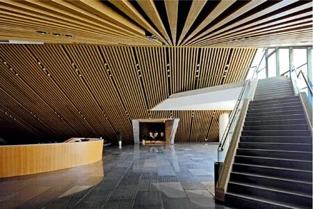
8 售票大厅/Ticket lobby
评论
朱锫:自然的态度
每个特定的场地环境都有其独特的DNA,华山游客中心项目体现了建筑对环境特征的感悟。原始、自然、朴素是这样的环境中最重要的特征,在这里生存的物种和生命却都是大自然塑造的产物。华山游客中心暗合了这一法则,将朴素、原始、自然的态度借助空间和材料呈现出来。
建筑以朴素、谦虚的态度化为地景建筑藏于山间,半露半现,从地面生长出的斜坡屋顶在视觉上消减了建筑体量,使建筑逐步消隐在层次丰富的台地景观中。建筑化整为零,以多个小体量代替单一大体量把建筑分散地铺在场地上,以群体代替个体的处理手法使建筑得以借华山为远景,简洁朴素的形体在似与不似之间与山体产生了对话。内部空间体验延续外部环境特征,朴素,空无。材料以当地石材为基调,力求在质感上融入环境,让朴素自然的态度成为设计的主调。
Comments
ZHU Pei: the Attitude of Nature
Every place has its own DNA which is informed by its specific environment. the Mount Hua Tourist Center project shows how the nature of the surrounding environment inspires architectural design. Primitiveness, naturalness and simplicity are key features in an environment like Mount Hua, where all living creatures are the works of Mother Nature. The Mount Hua Tourist Center observes the laws of nature, embodying its attitude of primitiveness and simplicity through space and materials.
the simple and humbly designed Mount Hua Tourist Center is embedded into the mountain as a piece of land art. the slope roof gives the illusion that the center is growing from the ground and also visually reduces the volume of the building, which gradually integrates the center into a multilayered, terraced landscape. The decentralized tourist center consists of several small parts scattered on the ground instead of one large structure. This approach, breaking the whole into parts, utilized Mount Hua as a backdrop and created a conversation between the simplistic form of the center and its mountain setting. the interior spatial design of the Mount Hua Tourist Center continues the feature of its surrounding environment: simple and sparse. Local stones are the main architectural material for the interior design, allowing it to blend into its surroundings, thus making the simplistic attitude of nature a main feature in the design.(English translation by Dandan WANG)

9 售票大厅/Ticket lobby

10 草图/Sketch

11.12 剖面/Sections
