0505大楼改造翻修,慕尼黑工业大学,慕尼黑,德国
2014-02-20建筑设计希尔德与K建筑事务所
建筑设计:希尔德与K建筑事务所
0505大楼改造翻修,慕尼黑工业大学,慕尼黑,德国
建筑设计:希尔德与K建筑事务所
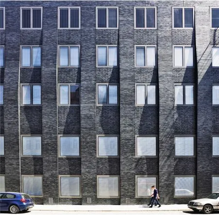
1 外景/Exterior view
弗朗茨·哈特是战后慕尼黑推行技术化建造的建筑师之一。作为建造专业的教授,他将自己对现代主义冷净和功能化的阐释传授给了学生。哈特的砖建筑就是这一理念的证明。想要深入了解他的手法,可以去读他的教材《砖构造手册》。他在慕尼黑工业大学校园里的研究所最近由希尔德与K建筑事务所进行了全面的现代化翻修。结果,这座以表现主义再现的建筑略带讽刺意味地向这位传奇大师致敬。
1963年,哈特与维尔纳·艾希贝格在一处街角建造了一座工厂般方正的混凝土建筑。为了满足建筑的功能,两楼采用了不同的混凝土框架体系来连接,之间有一道明显的分界。框架立柱间的凹槽给了希尔德与K建筑事务所灵感,他们把结构上的差异转化为一种装饰元素。分割新保温砖立面的旧柱网上的扶壁被塑造成形式各异的竖直波浪,从而赋予了建筑一种悬垂的舞姿。波峰上的厚重砖垛由钢支架托起——有些超长的连杆还要特批。这些永久的伸缩带隐藏在缝隙中。扶壁上闪亮的灰色面砖采用顺接。中间的护墙则通过对比突出了砖浪呼啸的气势与诡秘,直到屋顶边缘才终止。这是古代哥特还是现代“哥特”?不管怎样,能让人想起原始立面的只有与墙面平齐的各式铝窗了。
研究所的室内在清空后进行了改造。除了涂有咖喱黄的墙面之外都是素混凝土。天花上喷涂着炫目的金色。虽然现在这座建筑是经济系馆,裸露的混凝土主梁却显露出这座工业大学的特征。两层高的大厅中,新的楼梯为线性的功能空间带来了华丽的间奏。两楼间以前的分隔现在已经封上,并安装了多位艺术家设计的窗户。这种手法不但强化了室内高大空间的美观效果,还可以营造一种宗教气氛。不过对于世人而言,经济不正是一种信仰么?(尚晋 译)
项目信息/Credits and Data
客户/Client: 巴伐利亚自治州/慕尼黑州第二建筑管理局/ Freistaat Bayern/Staatliches Hochbauamt München 2
建设周期/Construction Period: 2008 - 2013
使用面积/Usable Floor Area: 8300m²(主要使用面积/ Main usable area)
建筑用途/Building's Purpose: 教育(办公室和教室)/ Education (offices and classrooms)
用砖类型/Brick Type: 面砖/Facing bricks
摄影/Photos: Wienerberger AG/Michael Heinrich
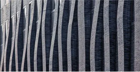
2 立面细部/Details on the facade
Franz Hart was one of the Munich architects who championed technically sound construction in the post-war years. As a professor of building construction, he passed his sober, functional interpretation of modernism on to his students. Hart's brick buildings stood as proof positive of his approach; whoever desired a more in-depth analysis could consult his textbook "Brick: a Technical Handbook". His institute building on the campus of the Technical University of Munich has recently been thoroughly renovated and modernised by Hild und K. The resulting, expressionistically reformulated architecture could be viewed as an ironic homage to the legendary master.
In 1963, Hart, together with Werner Eichberg, built an industrial-looking, angled concrete structure on a street corner. In accordance with the building's function, its wings were composed of two different adjoining concrete framework systems, with a marked break between them. This recess between the frame uprights inspired Hild und K to reinterpret the structural differential as a decorative element. The buttresses in the old column grid that divide the new insulated brick facade are shaped into varying vertical wave patterns, lending the building the dynamic look of a suspended dance motion. The considerable massing of the brick bulges formed at the wave crests is braced with steel brackets; in individual cases the unusually long tie-rods required special permits. Tucked into hollowed-out seams, the permanently elastic bands remain invisible. The shiny grey facing bricks of the buttresses are laid in a stretcher bond. The livelier parapets between provide a contrast and serve to enhance the eerily soaring momentum of the waves that appear to dissipate only at the roof's edge. Is this Gothic or "goth"? The only reminders of the original facade are the variously sectioned aluminium window frames set flush into the wall.
The interior of the institute building was gutted, modified and, aside from the wall surfaces painted a mustard-curry-pickle yellow, left to exhibit a raw concrete aesthetic. The gold-coloured spray-paint on the ceilings is a garish touch. Though the economics department now occupies this building, the exposed concrete girders proclaim in no uncertain terms that this is a technical university. A new staircase in a two-storey foyer interrupts the rectilinear functionality with a lascivious sweep. The old break at the juncture of the two building wings is now closed and outfitted with windows designed by various artists. Though this certainly enhances the aesthetics of the high space inside, it suggests an ecclesiastical purpose as well. For the layman, however, is economics not a matter of faith?
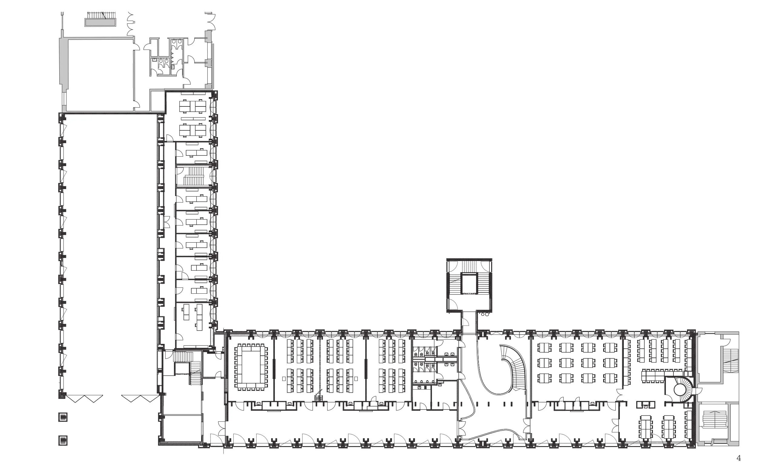
4 平面/Floor plan
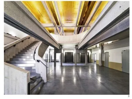
3 内景/Interior view

5 立面/Elevation
评论
鲍威:旧建筑改造往往可以带来出人意料的惊喜。此案门厅弧线的楼梯、连接处的玫瑰窗,都成为原有建筑平淡谦和背景上舞动的亮点。而此案给人带来最大的惊喜还是在立面波浪柱体的营造上:每个柱体在不同高度的突起,这样一个不大的动作一字排列下来,整体形成了微妙的光影效果。改造策略简单干净,实现效果典雅丰富。
杨志疆:这是一个对建于1960年代的现代主义建筑进行整体修缮和改造的项目。建筑师或许继承了德国自门德尔松以来的表现主义传统,试图采用曲线和色彩来激发原有建筑的活力。灰砖砌筑的竖向不同弧度的墙垛在消解原有立面刻板形象的同时,整栋大楼也被其连续的曲线波动所软化,令人想起达利的那幅“融化的时间”。某种意义上,这是用现代艺术的语言,来表达对建筑几何性的一种“戏谑”。但建筑室内弧线形的大楼梯、金色的屋顶以及局部使用的彩色玻璃,只是一种碎片化的点缀,而缺乏整体的设计逻辑。
Comments
BAO Wei: Renovation projects can always bring surprises that we would never imagine with from buildings. In this project, the spirit of the old building is uplifted by flamboyant elements such as curvy staircases in the lobby and rose windows at the building connection.The most striking one is the wavy pillars on the building facade. Nothing is simpler than a gentle bulge of each column at a different height, yet a rich orchestration of light and shadow is achieved when they are arrayed in a linear fashion on the facade. A rich and elegant result is achieved with a simple and clean strategy.
YANG Zhijiang: This is an overall repair and renovation project for a modern building built in the 1960s. Architects have inherited expressionist traditions since Mendelssohn, and have used curves and colors to stimulate the vitality of the original building. Grey brick pilasters with various vertical curves not only resolve the original rigid facade, but also soften the whole building with waving curves, reminding people of Dali's classic painting "Melting Time". In a certain sense, the style used in this building is inspired by the language of modern art and a desire to add some "playfulness" to the building's geometry. However, the interior large-scale curving staircase, golden roof, and the topical use of stained glass, are examples of fragmented decoration and show a lack of holistic design logic.
Conversion and Refurbishment of Building 0505, Technical University of Munich, Munich, Germany, 2013
Architects: Hild und K Architekten BDA
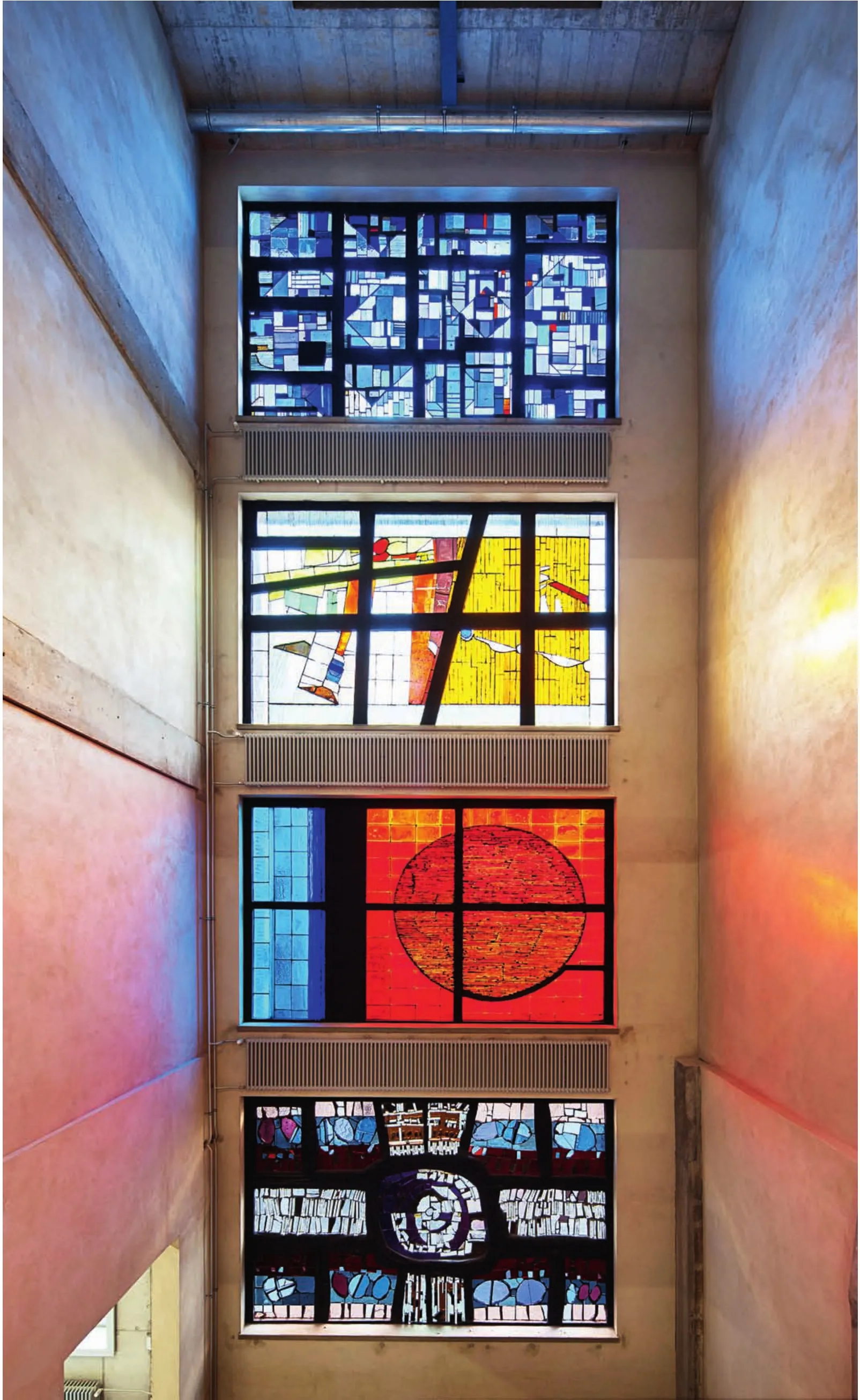
6 内景/Interior view
