布罗德维尤100号大厅,多伦多,加拿大
2019-10-23建筑设计Quadrangle建筑事务所
建筑设计:Quadrangle建筑事务所
Architects: Quadrangle
(王单单 译)
布罗德维尤100 号原是两条繁忙街道拐角处的一个自助存储设施,位于一栋新建公寓楼的下方,曾经是多伦多东区一栋不起眼而处境尴尬的建筑。在对该建筑进行改造时,房地产投资开发集团哈尔马克联手Quadrangle 建筑事务所,针对“新经济型”租户量身打造一座方便出入且具有吸引力的大厅。为了吸引目标用户,哈尔马克想对布罗德维尤100 号大厅做一次大胆的尝试——将其界定为一座创意中心。
布罗德维尤100 号大厅除了毫无存在感,还不易通行:入口通道没有直接的无障碍通道,来访者需拾级而上几英尺才可到达“底楼”,或下行几级台阶前往较低楼层。走廊没有路标或标识导向,进一步造成了混乱,租赁效果不理想。
Quadrangle 建筑事务所的设计任务是通过挖掘该建筑的潜力和历史,同时注入当代精神,整体提升布罗德维尤100 号——让它不仅转变为一个设计巧妙且具有吸引力的空间,还可以充当富有活力的社区中心,更可以作为一项明智的长期地产投资项目。
该设计方案从悬挂在大堂入口上方的招牌入手,明亮的橙色招牌与红砖和灰色砂浆的立面形成对比,既突显了该建筑的特征又明确了入口的位置。而该建筑最大的改动之处是将楼板拆除,把底楼的大部分空间都变为一个引人注目的大厅。设计师们设计了一段之字形的下行混凝土坡道,引导人们前往上面的楼层或地下室层,营造出一种进深感和动感。与该坡道相交的是贴有橙色可视条的下行楼梯以及带木踏板的黑色钢制上行楼梯。这些元素重叠交错,创造了一个具有质感且气派的建筑入口。
设计团队拆除了地板后,取而代之的是一座充满动感的大厅,为这个一度定义模糊的空间注入了新活力。这种富有工业元素的平衡感、怡人的温暖和缤纷的色彩,共同打造了一个建筑入口处。该入口向创造性思维和创新的想法敞开大门,也乐意供人们集会或休息。布罗德维尤100 号向人们展示了通用化设计如何超越无障碍设计:其功能性坡道为轮椅使用者提供了便利,而明亮的色彩则为视力障碍者提供了具有高对比度的路径。□
项目信息/Credits and Data
客户/Client: Hullmark Developments
建筑/室内设计团队/Architectural/Interior Design Team: Richard Witt, Caroline Robbie, Andrea Spencer, Jan Schotte, Julie Mroczkowski, Nariman Mousavi, Matthew Suriano
机电工程/Mechanical & Electrical Engineers: Integral Group
承建商/Contractor: Fox Contracting Ltd.
标识设计/Feature Sign: Pengelly Iron works
照明设计/Feature Lights: Bocci品牌电影/Branding Films: TI Group竣工时间/Completion Time: 2016.01摄影/Photos: Brandon Barré (fig.1,6,7), Ben Rahn/A-Frame (fig.2-3,12-13)
采用57HB05步进电机控制滑块在导轨上的运动速度;量程为1kg NA6型称重传感器输出茎秆回弹力信号;输出电压为0~5V的放大器对称重传感器信号进行放大处理;信号采集器采用日本VR-71双通道电压记录仪,对放大器输出信号进行采集记录;笔记本电脑对采集的数据进行处理分析。
(王单单 译)
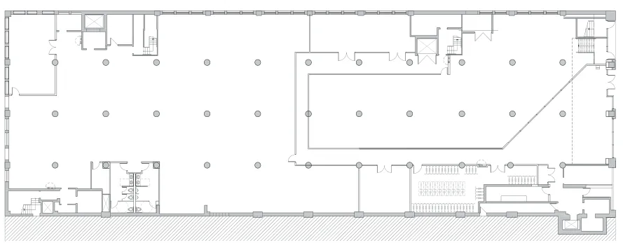
4 首层平面/Ground floor plan
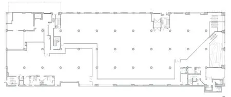
5 二层平面/First floor plan
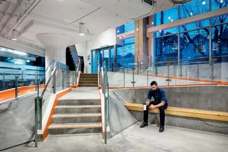
6 业主放弃了可出租的空间,看到了创造有趣的内部景观使布罗德维尤100号成为一个独特地点的价值/Giving up leasable space, the building's owner saw value in creating an interesting internal landscape and making 100 Broadview a distinct address.

7 Bocci吊灯营造出一种亲切感,而橘红色的“地毯”则塑造出个性、视觉清晰度和品牌标识/Handing Bocci pendant lights create a sense of intimacy, while an orange-painted "carpet" gives character, visual clarity and brand identity.
A self-storage facility beneath a new condominium at the corner of two busy streets, 100 Broadview was an unremarkable and rather awkward building in Toronto's east end. For this building's transformation, real estate investment and development group Hullmark engaged Quadrangle Architects with the goal of creating an accessible and attractive lobby, targeting new-economy tenants. To entice the intended demographic, Hullmark wanted to make a bold statement at grade - something that would demarcate 100 Broadview as a creative hub.
Beyond 100 Broadview's virtual invisibility, it was also inaccessible: the entryway denied direct, barrier-free access, forcing users to climb a few feet to the "ground floor" or descend a few steps to the lower level. Hallways lacked signage or wayfinding, creating further confusion and discouraging tenancy.
Quadrangle's mandate for this design was to upgrade 100 Broadview by embracing the building's potential and history, infusing it with a contemporary spirit that would not only transform it into an attractive, well-designed space, but also a vibrant, neighbourhood hub while providing a wise investment in the property in long-term.
Quadrangle's solution starts with a bright orange sign hanging above the lobby entrance, contrasting with the red brick and grey mortar façade, giving the building an identity and clearly marking the entrance. Their big move was to cut out the slab and transform the lion's share of the ground level into a dramatic lobby. They designed a concrete ramp that zigzags downwards, drawing users to both the upper and basement levels with a sense of depth and movement. Intersecting the ramp are stairs downwards, marked with orange visibility strips, and a blackened steel staircase with wood treads leads upwards. These elements overlap, creating a textured and grand entrance to the building.
The team's demolition of the floor plate and the dynamic lobby created in its stead have given new life to this once ill-defined space. This balance of industrial elements, inviting warmth and dynamic colour define an entryway that welcomes creative and innovative thought, as well as congregation and rest. With the featured ramp creating a path for users of mobility devices and the bright colours producing high-contrast pathways for those with visual impairments, 100 Broadview demonstrates how universal design goes beyond mere accessibility.□
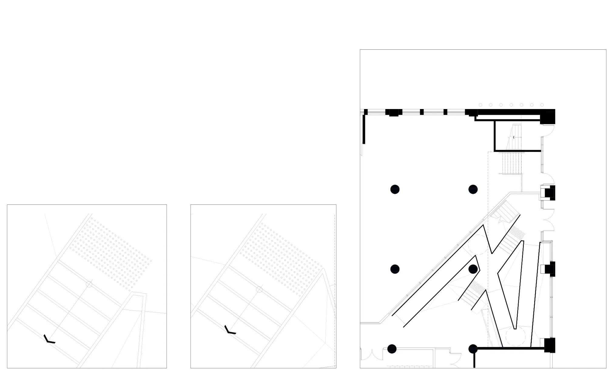
8-10 局部平面/Partial floor plans
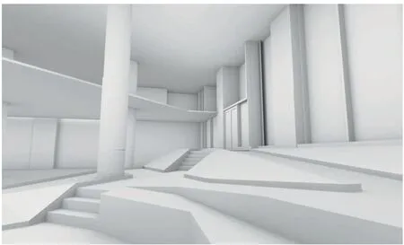
11 楼梯和坡道效果图/Renderings of stairs and ramps (Credits:Quadrangle)
评论
周静敏:该项目形成了一种新的空间形态,楼梯、坡道的组合使得室内地面产生层次错落的起伏,巧妙地连接了3个不同高度的基面层(入口层、底层、低楼层),解决了难以通行的问题。高对比度的色彩运用及标志系统的整合设计,也大大提升了空间的可识别度,这种室内的丰富性、动态感与建筑外部给人的规整性、历史感形成鲜明对比。
同时,高差变化也为建筑入口带来了活力,行走的人流、驻足的人流可以在不同高度层发生视线的交换。可以说,该项目的目的及意义不仅仅是改善无障碍通行,更着力于提升空间的整体性能与品质,创造偶遇的发生,重塑建筑在场地中的生机与活力。
Comments
LYU Xiaoquan: The conversion of an existing building has always been a challenge for both design and construction. By introducing the contemporary spirit to this project, the designer has successfully converted the lifeless, old space into a vibrant community centre. This accessible design focuses on the remodeling of the hall which plays a key role in the project, and employs the accessible pathways with a warning colour to connect the multistorey space that was originally accessed by stairs. Although the zigzag ramps without dual handrails can be inconvenient for people to use, it indeed illustrates a sense of dynamism. The design of the stairs has considered the need for different users, while the detectable tactile paving is added into the beginning of the stairway. Different colours are adopted for the accessible functional rooms on each floor, which allows the style of this architectural design to be simple. Such a design can be deemed to be an exploration of a creative accessible design. (Translated by Dandan Wang)
ZHOU Jingmin: This project has formed a new kind of space formation. The combination of stairs and ramps makes the interior floor have fluctuations of different layers. It skillfully connects three base layers of different heights (entrance floor, bottom floor and lower floor) and solves the problem of di☆culty to pass through. The high contrast use of colours and the integrated design of the sign system also greatly improved the spatial identities. This kind of richness and dynamism of the interior are in sharp contrast with the regularity and historicity of the exterior of the building.
At the same time, the change of elevation also brings vitality to the entrance of the building. The flow of people walking and stopping can exchange looks at different elevations. It can be said that the purpose and significance of the project is not only to improve the access to the disabled, but also to improve the overall performance and quality of the space, create the occurrence of encounters, and reshape the vitality and activeness of the building on the site. (Translated by CHEN Yuxiao)
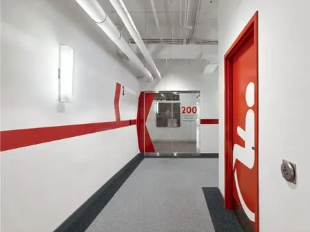
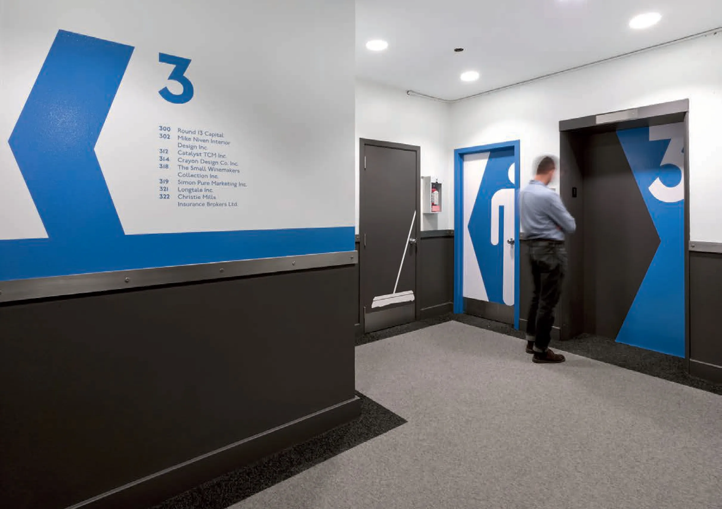
12.13 Quadrangle专门设计了贯穿走廊和共享区域的色彩鲜艳、图标式的导向元素/Quadrangle's custom-designed colourful and icon-based wayfinding elements are carried through the building's hallways and shared areas.
