云天化集团总部,云南,中国
2016-11-14孟建民
云天化集团总部,云南,中国
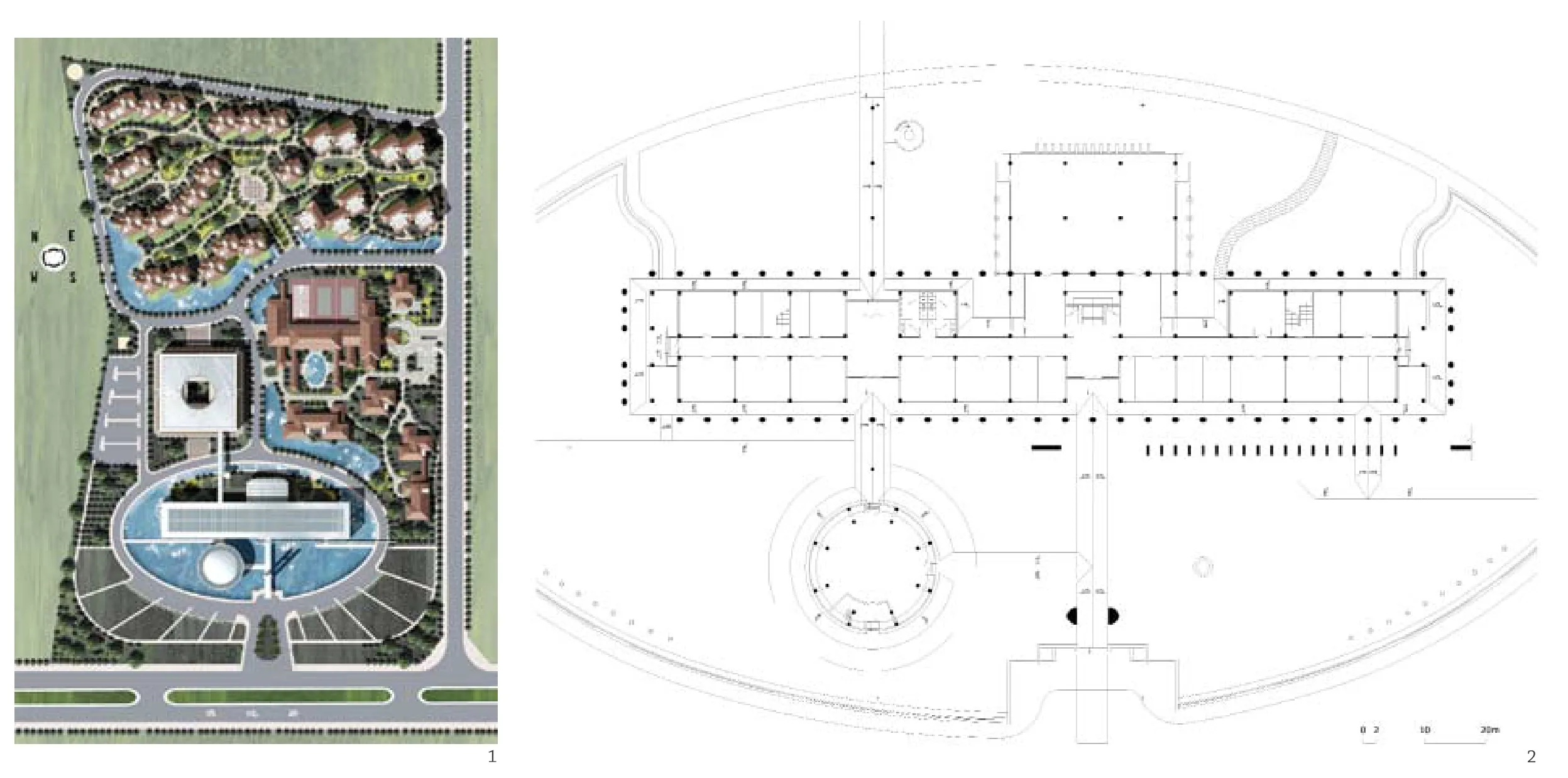
1 总平面/Site plan
2 首层平面/Floor 1 plan
信任是产生好作品的基础。2001年,云天化集团约我去昆明,在第一次短暂的见面后,集团高层就对我们设计团队有着出人意料的充分信任。在接下来的整个设计过程中业主方在设计上给了我们很大的自由度与发挥空间,让我们能高完成度地实现原方案的最初理念。
云天化集团总部大楼并非仅仅是为了实现一个普通意义上的办公场所,而是希望凭借新总部的建设,充分展现企业精神,建立起品牌形象,使之成为其走向市场化、全球化的新坐标。布鲁诺·赛维的“建筑空间论”把空间描述为建筑的“主角”。在这个设计中,水面空间、入口空间、柱廊灰空间、门厅空间、建筑内部空间等经过若干层次的过渡与组织,形成递进的空间序列,产生极具张力的空间效果。
云天化集团历史上与“水”有着不解之缘。业主希望园区内能注重水景的塑造,但并未对其具体的形式做出更严格的限制。我们在总体规划中以“水”作为环境构成的主线,利用空间的收放营造步移景异的效果,办公楼周边逾8000m2的水面,成为建筑外部空间形态的重要构成元素。水体成为一种空间要素,被灵活运用于各种空间的分隔、过渡与整合之中。办公楼前巨大的水面界定出个性的场所空间,加上建筑周边的柱廊序列在建筑与水面之间形成的“灰空间”,共同构筑完美有机、气韵连通的空间层次。建筑入口结合水面元素形成独具特色的入口空间形式。当人们经过水面通道步入建筑时,不但完成空间转化,更完成一次心理过渡,使人充分亲近水面,融入建筑氛围,变化的空间感受更拉近人与建筑的距离。
整个办公科研区域的设计着眼于点、线、面的几何构成,正方与矩形、方形与圆形、直线与曲线的对比,干净利落的布局形态形成简洁大气且变化丰富的空间层次。浮于水面的办公大楼在满足建筑高度不超过24m的条件下,以135m的长度横向展开,形成水平方向的气势。利用金属、玻璃以及石材的搭配组合,通过律动的变形柱竖向序列,使得建筑既尊崇高雅又轻巧通透地舒展于水中。
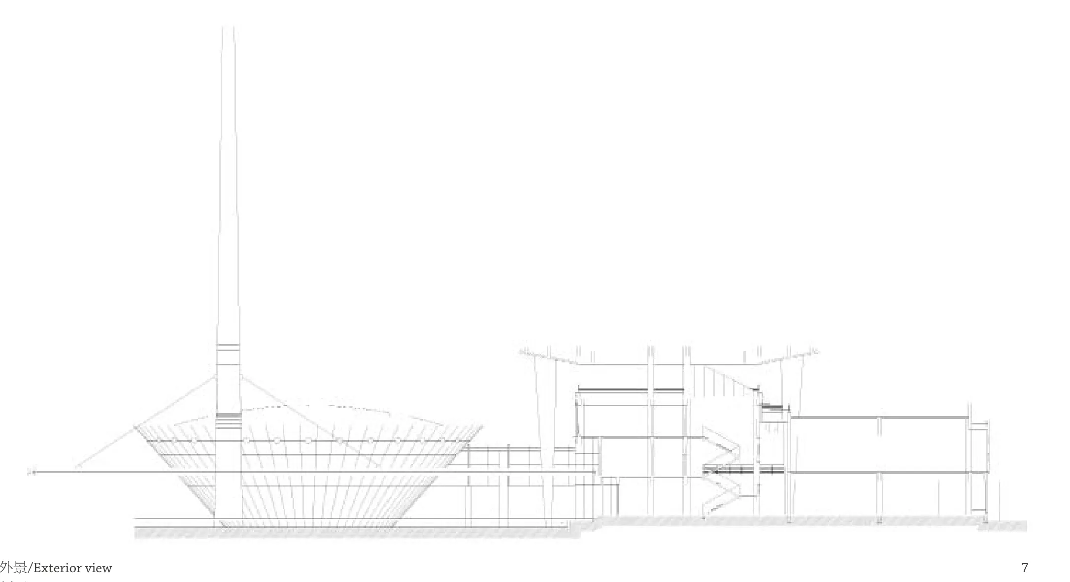
入口处49m高的标志性构筑物,在立面构图中形成垂直与水平、竖向与横向、动与静的强烈对比,打破统一的高度控制,成为制高点,形成起伏变化的天际线,为滇池旅游度假区树立了新地标。
水面上圆形会议厅不仅在平面构图上作为科技楼圆形中庭空间的互补形态,其碗状倒圆台造型也在立面造型上形成极为强烈的虚实对比,既能很好地满足业主方圆桌会议的使用需求,同时以独特的造型营造出特殊的内部空间效果和与众不同的外部空间感受。
静谧的水面、舒展的线条、简洁的形体以及空间划分的数学美,在光与影的变化之中相辅相成,在虚与实的对比之中相得益彰,体现出云天化的行业特征和科学理性之美。□(孟建民 文)
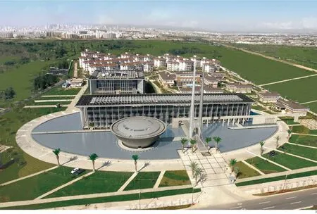
3 鸟瞰/Aerial view
Trust is the basis of masterpieces. In 2001,the Yuntianhua Group invited me to Kunming. After just a brief meeting, the group executives surprisingly placed their full trust in our design team, and the owners have given us great freedom and space in the entire design process, allowing us to achieve the project's original vision.
The Yuntianhua Group does not want their headquarter building to be merely a conventional office building. Instead, they want to show their enterprising spirit and establish their brand image through the construction of the new headquarters,making it the landmark of their marketization and globalization. Bruno Zevi described space in Architecture as Space as the "leading role" of architecture. In this design, the water, entrance, gray colonnade, hall and interior spaces of the building form a progressive spatial sequence after a few levels of transition and organization, creating a spatial efect of great cohesion.
The Yuntianhua Group has an indissoluble bond with water. The owners expect an emphasis on the waterscape around the building, but they did not pose strict limits on the specific form of the waterscape. We used water as the main part of the environmental composition in the overall planning, and the scenery can vary with each step taken due to the spatial scalability. A water surface of over 8,000m2surrounding the building becomes an important element in the exterior spatial form of the building. As a spatial element, the body of water is used fexibly in forms of spatial division,transition, and integration. Te vast water surface in front of the building defines a space with a unique personality, which, together with the gray space formed by the colonnades between the building and the water, creates perfectly organic spatial levels with consistent artistic conception. The entrance and water elements form a unique entrance space. When entering the building through the passages above the water, visitors will experience not only a spatial transition but also a mental transition, enabling people's closeness to the water and blending with the atmosphere of the building; the change of space perception can also bring people closer to the building, enabling them to be close to the water and blend with the building's atmosphere.
The design of the entire office and research area is focused on the geometric composition of points, lines and planes, and the comparison ofquadrates and rectangles, squares and circles as well as straight lines and curves. The clean layout creates simple, magnificent and versatile spatial levels. Meeting the requirement of not exceeding 24m, the office building floating on water extends 135m horizontally in a magnifcent style. With the combination of metal, glass, and stone as well as the rhythmic vertical sequence of deformable columns,the building stretches out above the water in an elegant, light, and transparent manner.
A 49-meter-high landmark structure stands at the entrance and elicits strong comparisons of the upright and flat, vertical and horizontal as well as the dynamic and static in the façade's composition. With its extraordinary height, the structure forms a rippling skyline, serving as a new landmark of the Kunming Dianchi National Tourist Resort.
Te circular conference hall on the water serves as the supplement of the circular atrium space in the technology building on the plane composition. Its inverted circular truncated cone shape creates a sharp virtual-real comparison of the façade model,not only meeting the needs of the owners for round-table conferences but also creating a special internal spatial efect and distinctive external space perception with its unique shape.
The tranquil water, flexible lines, concise appearance, and mathematical beauty of space division supplement each other in the juxtaposition of light and shadow and bring out the best qualities of each in the comparison of the virtual and the real, manifesting the industrial characteristics of the Yuntianhua Group and the beauty of scientific rationality.□(Text by MENG Jianmin)
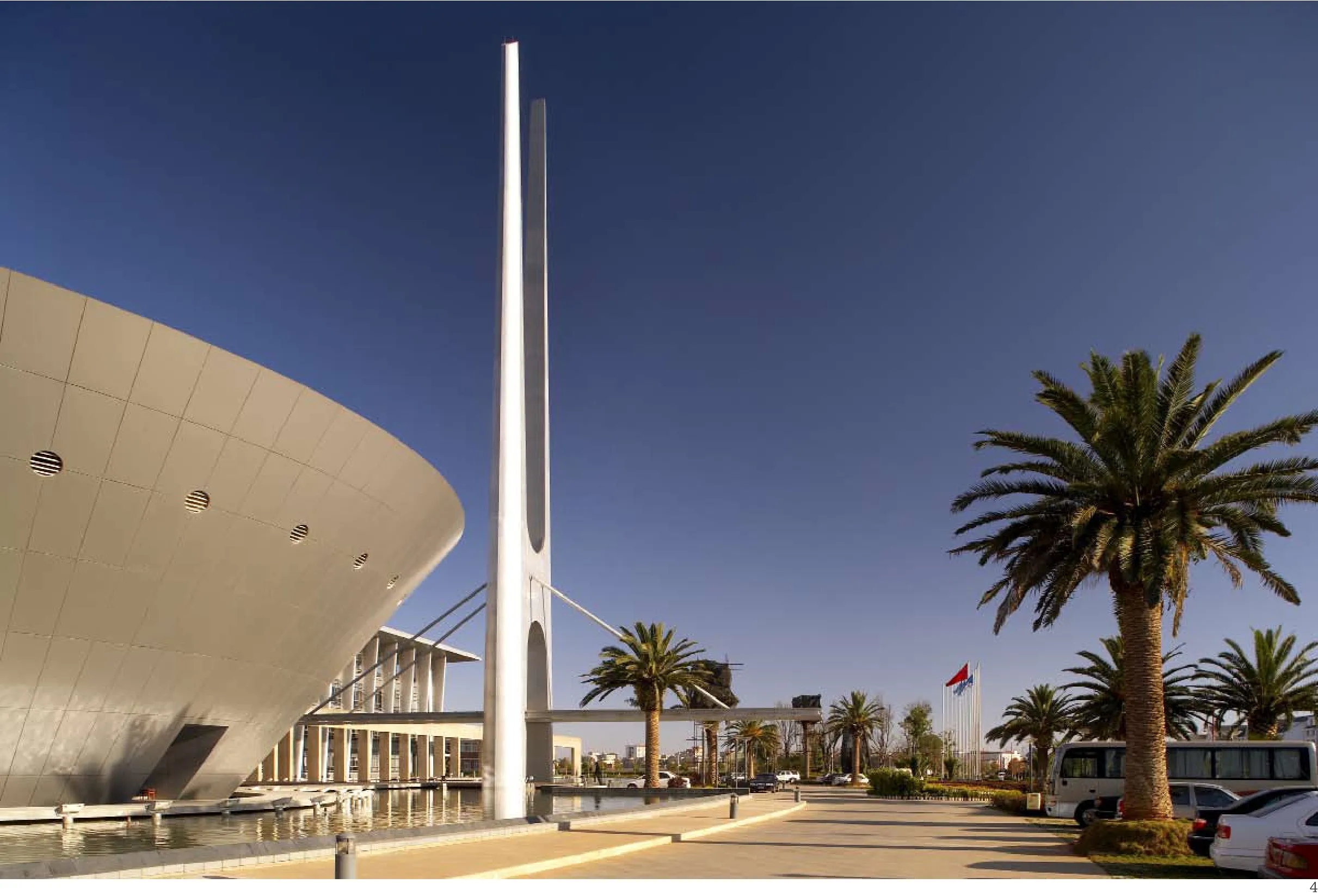
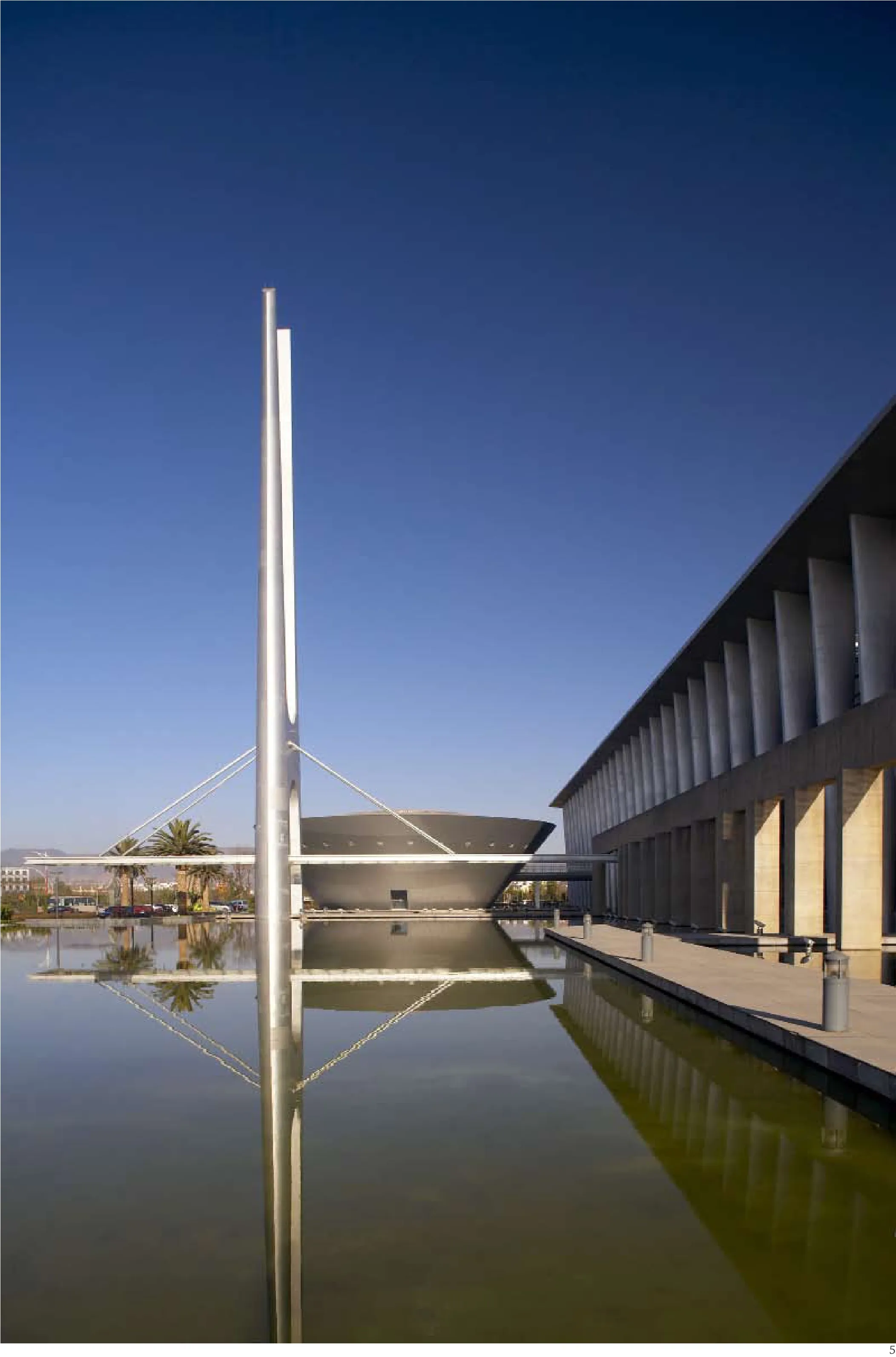
4.5 外景/Exterior views
项目信息/Credits and Data
设计团队/Design Team: 孟建民,陈晖,石磊,黄厚伯等/ MENG Jianmin, CHEN Hui, SHI Lei, HUANG Houbo, et al.用地面积/Site Area: 125,998m2
建筑面积/Floor Area: 54,889m2
设计时间/Design Time: 2001
摄影/Photos: 傅兴/FU Xing
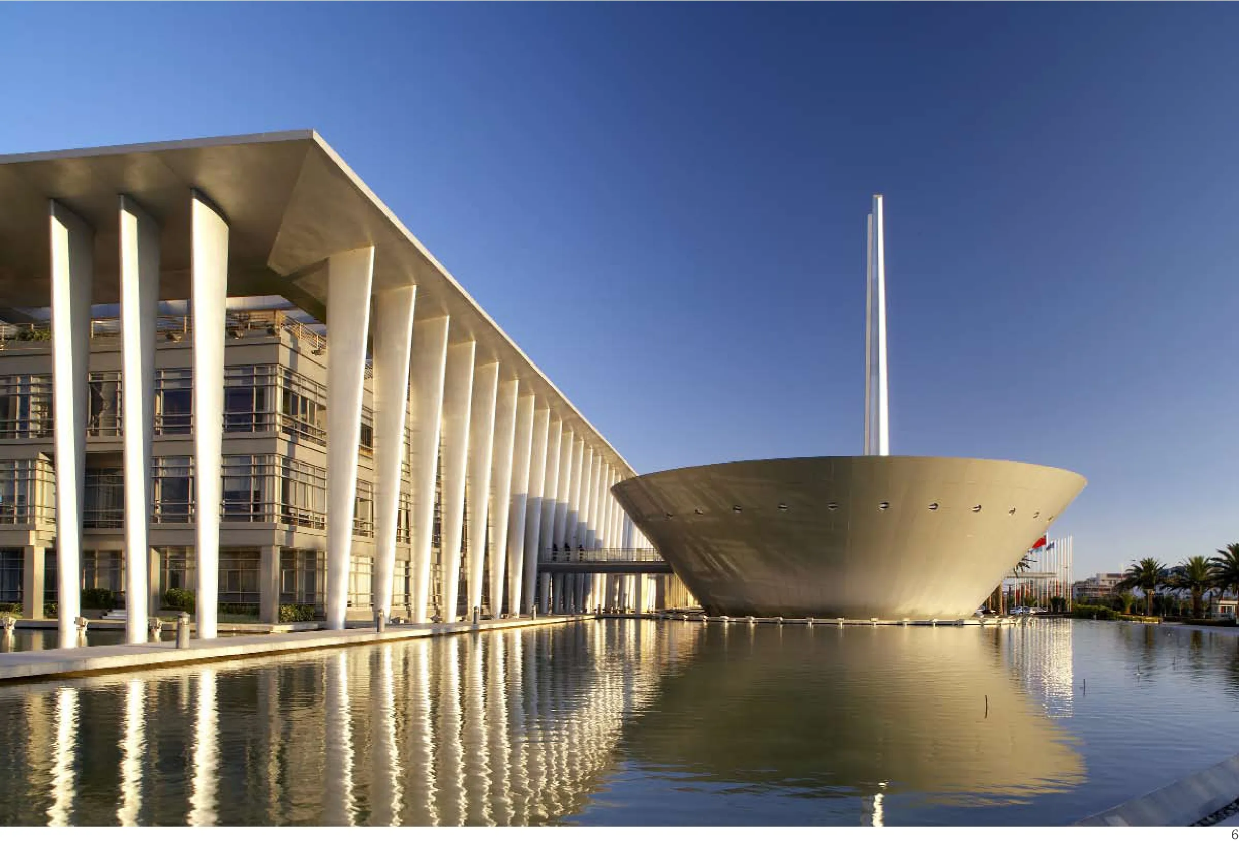
6 外景/Exterior view
7 剖面/Section
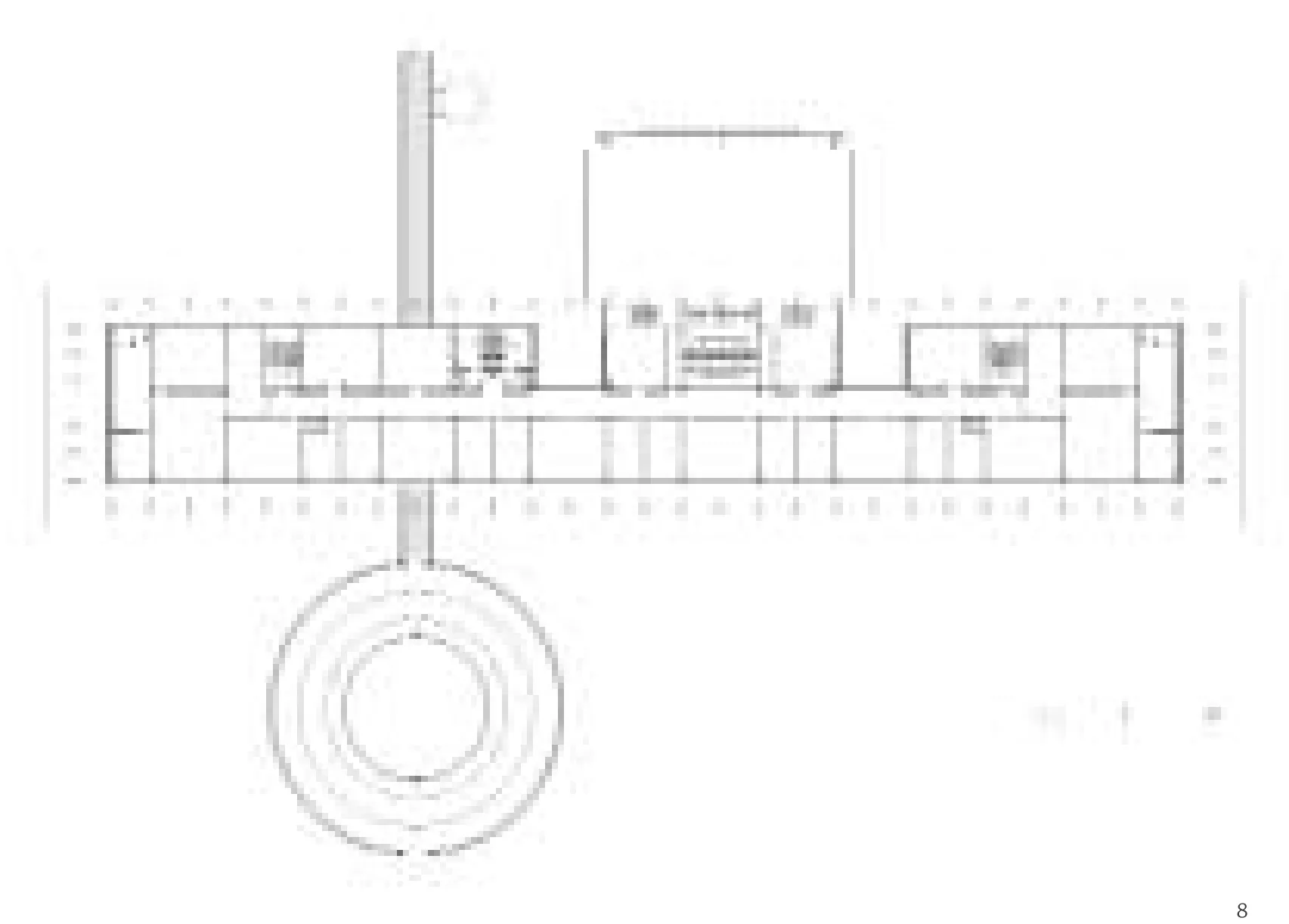

8 三层平面/Floor 3 plan
9 二层平面/Floor 2 plan
评论
章明:椭圆形的水面、长方形延展的办公大楼、圆形的会议厅组合而成的平面布局高效且几何感强烈。在勒·柯布西耶看来,“建筑,是汇聚在阳光下的形体间精巧正确而卓越的游戏”。与勒·柯布西耶设计的昌迪加尔法院异曲同工,云天化办公大楼巨构感的体量、深远的出挑、序列感和韵律感十足的柱廊以及门前竖向标志性的构筑物借由昆明强烈的阳光产生了肯定而丰富的形体和光影的变化,塑造了建筑的形式美。办公楼的外廊增加空间层次的同时兼具良好的遮阳效果。
康德把审美区分为美和崇高两个范畴。云天化集团项目在注重形式美的同时,似乎更强调崇高的场所感的营造。环绕建筑的水面不仅能适当降低风温从而改善建筑的微气候,同时它还扩展了人们的场所感知。水面的镜像作用放大了建筑各部分的尺度张力,而不时受外界扰动泛起的涟漪又戏剧化地模糊了建筑固有的形象,场所得到了一种天地间无限延展的状态,“崇高感”进一步获得加强。昌迪加尔法院本质上体现的是现代主义的理想,它因理性而崇高,云天化集团项目则试图借助崇高性彰显企业精神。云天化集团项目光滑的外立面材料与粗野主义粗糙的混凝土表面相比突显了建筑的时代性。
Comments
ZHANG Ming: Te oval-shaped water surface, rectangular-shaped ofce building and round-shaped conference hall constitute an efficient layout with a strong emphasis on geometry. In the view of Le Corbusier, "Architecture is the learned game, correct and magnifcent, of forms assembled in the light." Similar to the Chandigarh Capitol Complex designed by Le Corbusier, the office building of Yuntianhua Group creates the beauty in form, with its gigantic volume, large eaves, well-ordered and rhythmical colonnades, as well as the vertical iconic structure in front of the gate that works its magic with shapes and shadows under the bright sunshine of Kunming. Te verandah of the ofce building increases the sense of spatial layering while also creating a shading efect.
Kant categorized aesthetics into the beauty and the sublime. The project of Yuntianhua Group focuses on formal beauty, yet pays more attention to generate a sublime sense of place. Te water surface that surrounds the building not only lowers the wind temperature and improves the microclimate, but also raises the profile of the place. Its mirroring-effect magnifies each part of the building, and the ripple of the water dramatically blurs the image of the structure. It helps the place to create a sense of the infinite extension between heaven and earth, which also enhances "the sense of sublimity". Te Chandigarh Capitol Complex essentially presents the ideal of Modernism. Its sublimity comes from its rationality. Te project of Yuntianhua Group intends to illustrate the spirit of enterprise through its sense of sublimity. Te contrast between the smooth exterior walls and rough concrete showcases the contemporaneity of the building. (Translated by Dandan Wang)
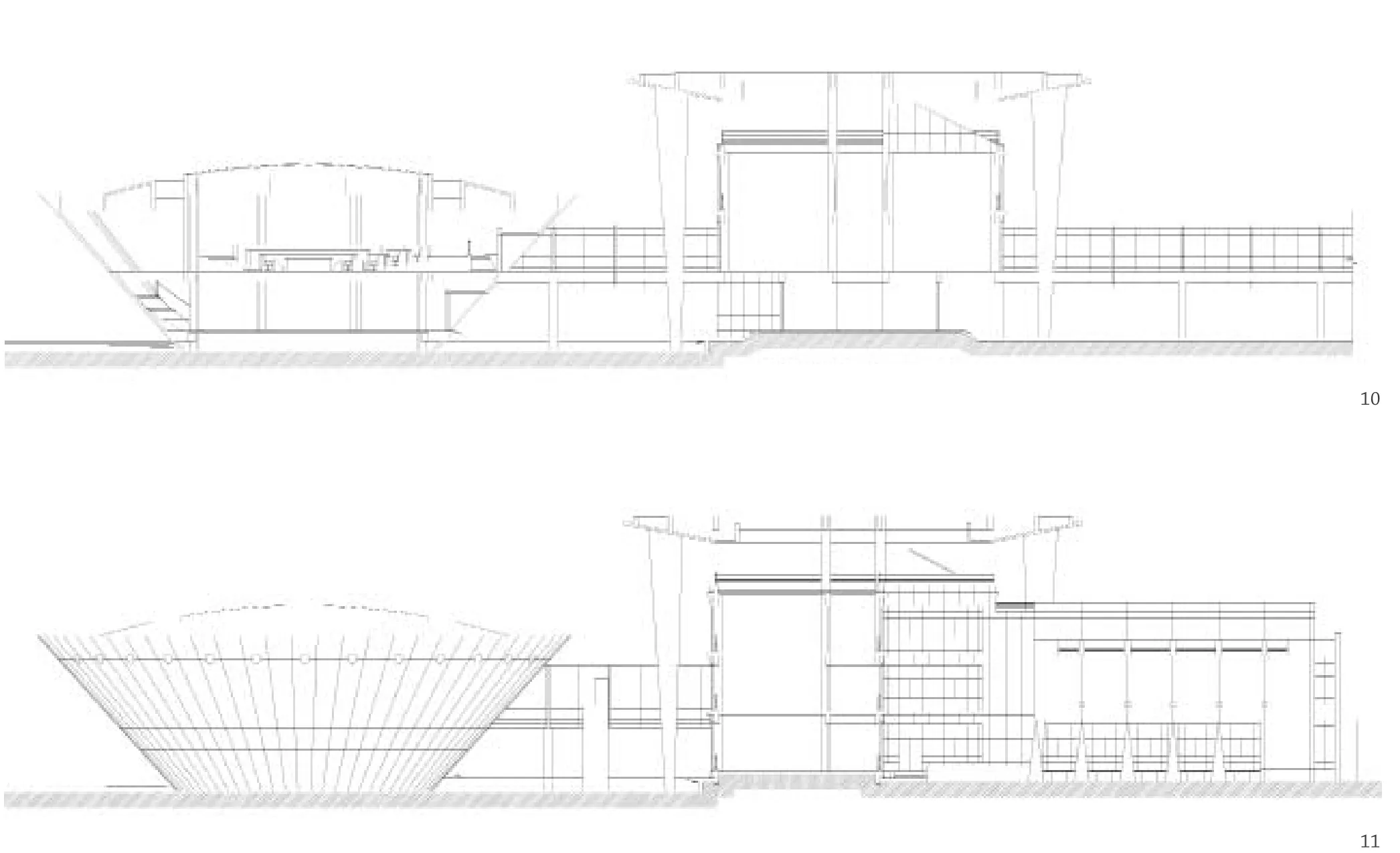
10.11 剖面/Sections
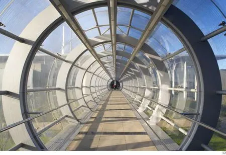
12 内景/Interior view
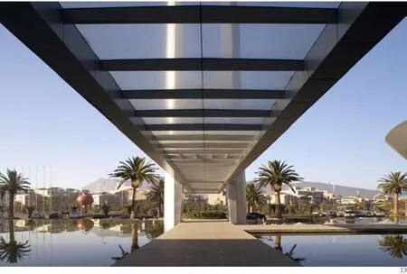
13 外景/Exterior view
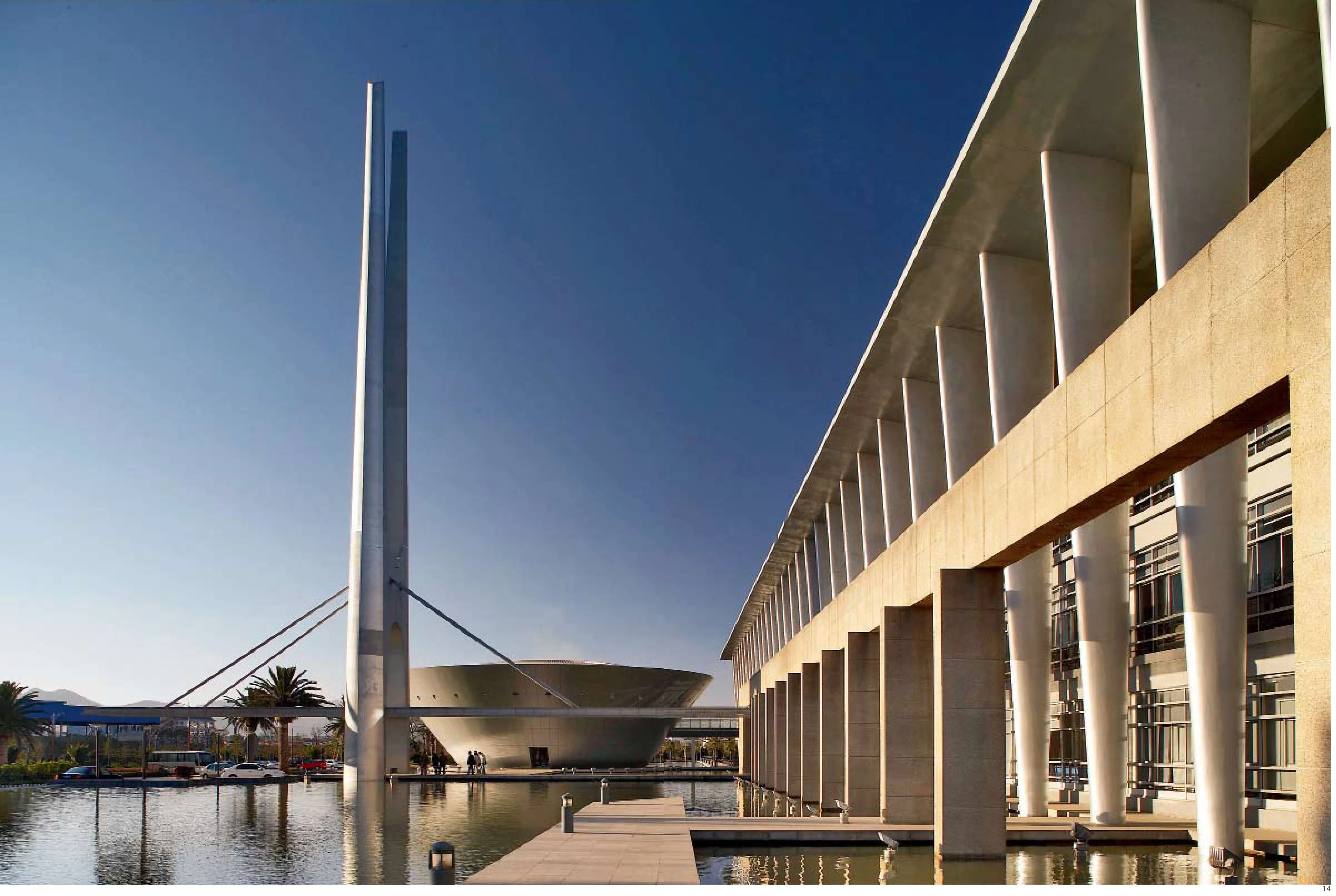
14 外景/Exterior view
Headquarters of the Yuntianhua Group, Yunnan, China, 2003
