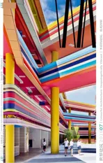
南洋小学扩建项目,新加坡
2016-08-06建筑设计studio505LTArchitects
建筑设计:studio505,LT&T Architects
南洋小学扩建项目,新加坡
建筑设计:studio505,LT&T Architects

1 外景/Exterior views
新加坡南洋小学与幼儿园的最新扩建项目在设计上围绕着一个大型“内向性”的公共中庭。该中庭向着天空和内部元素开敞,但背对着学校周边的住宅街区。如何安排布置学校里的公共空间是studio505和LT&T 团队的设计核心。
南洋小学校区曾经的一部分位于山顶和皇冠路入口处的建筑均在被拆除对象之列,因为它们已无法提供满足当代教学标准的环境设施。先前的建筑,尤其是那庞大的幼儿园,在布置和设计上并没有考虑到与带有自然坡度的地势(从街道至山顶)相匹配。相反,那栋建筑与街道平行并且垂直于山坡,从入口看如同一堵墙,形成了一道拒绝屏障。在建筑背后,那些陡坡或被暴露在外或被架桥连接,但从使用者角度来看,那些带状空间不仅难以利用且不美观,也无法与其他设计元素相结合。
这些先前大尺度建筑物之间难以利用的空间,不仅比例失调而且不符合儿童世界的心理,因而成为了我们新设计的出发点。很快地我们就明确了一点,新概念必须充分利用地段所隐含的地形特点,以宽敞、开放和方便使用的公共空间为中心组织设计。
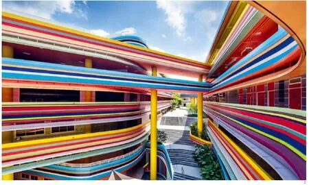
studio505提出将新建筑的体量顺着山坡的方向,垂直于皇冠路,这样就形成了一个具有欢迎姿态的大型中央山谷庭院。此山谷庭院是整个扩建的核心概念,既作为场地的入口,也是主要的导向系统。来访者沿着山谷庭院缓慢爬坡,穿过处在山顶的学校中心地带,最后到达国王路校区的大型露天广场区域。
形态上,在山谷庭院的地理中心处策略性地布置了一处拐弯,在那里安置有一部大型景观楼梯。因此,当来访者从皇冠路上进入山谷庭院时并不能一览庭院的全貌。景观楼梯为到达顶楼和教室区域提供了便捷通道,并结合该楼梯设计了一个小型露天集体活动广场。
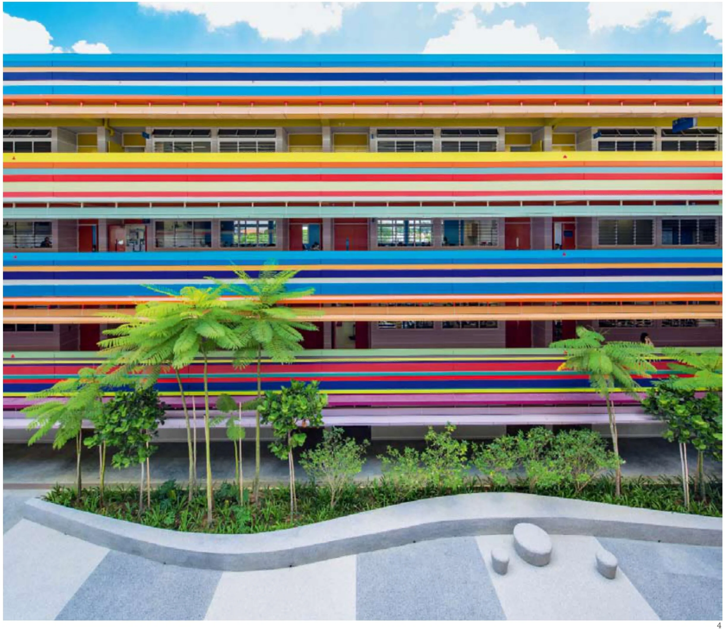
整个山谷庭院的景观形态暗含了地段上的等高线特征。植被顺着山谷庭院的长向排列,但又不会过量种植以保证室外主要空间的公共性。
山谷的水平感被纵向的楼梯和大胆使用黄色的柱子所中和。那些黄色支柱支撑着上方的连接廊桥,为两翼平行的教室区域提供了方便的交通。
所有的交通走廊都向着室外开放,并将人流导向“内向性”的公共山谷中庭。带有顶棚的外廊充满大量悬挑结构,走廊边沿上方的双层棚架提供了额外的遮阳,同时也可有效应对斜风细雨的天气。
所有的教室都背向中央山谷庭院而面向更安静的住宅区。教室里通过白色墙壁和屋顶打造了一种平静的氛围,目的是为了让个体思维可以在课堂中获得专注。教室内部的门是室内唯一的彩色元素。通过这扇门,孩子们可以进入到丰富且充满幻想的外部世界。在那个世界里,有看似无穷无尽的水平彩色飘带和生命在律动。
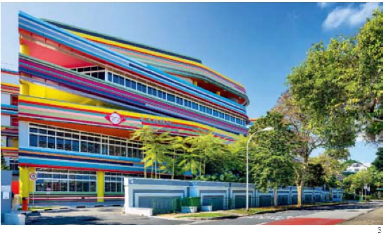
在技术上,通过将低成本乳胶漆涂在预制混凝土拱上,加上上文提到的彩色铝制遮阳架,实现了色彩上的梦幻效果。
南洋小学校长李惠枫(音译)表示:“但对于这里的学生来讲,在全球化浪潮里,他们未来的人生就像是充满变幻的万花筒——会有高潮低谷、迂回曲折。”
我们的目标是创造一个充满启发性的公共活动空间,通过设计展现积极、无拘无束的自由思想,把欢乐与喜悦平等地传达给这里的每一个孩子和老师。
这样的空间为他们将来走向世界各个角落提供了充分的可能性。□(齐轶昳 译)
2-3 外景/Exterior views
4 外景/Exterior view
项目信息/Credits and Data
客户/Client: 新加坡教育部,南洋小学/Ministry of Education Singapore & Nanyang Primary School
项目建筑师/Project Credit: studio505 Pty Ltd. LT&T Architects
建筑设计/Design Architect: studio505 Pty Ltd (Australia)
当地执行建筑师/Local Executive Architect: LT&T Architects (Singapore)
结构工程师/Structural Engineer: ECAS EJ Consultants Pte Ltd
机电工程师/Mechanical & Electrical Engineer: William Ng Consultants Pte Ltd
景观顾问/Landscape Consultant: CICADA Pte Ltd.
项目管理/Project Manager: PM Link Pte Ltd
工料测算/Quantity Surveyor: OTN Building Cost Consultants Pte Ltd
承建商/Builder: Guan Ho Construction Co. Pte Ltd.
建设造价/Construction Costs: S$36,999,000 (Awarded construction cost)
建筑规模/Building Size: 17,785.36m2(山顶校区及2号校区的新建部分/New GFA for Nanyang Extension at hilltop campus and campus 2)
基地面积/Site Area: 9487.4m2(仅限于山顶校区及2号校区/For hilltop Campus and campus 2 only)
容积率/Plot/Utilisation Ratio: 1.87 (仅限于山顶校区及2号校区/For hilltop Campus and campus 2 only)
教室数量/Number of Classrooms: 小学部30间教室+幼儿园9间教室/30 classroom for primary + 9 classroom for kindergarten
健身场馆及其他特殊用房/Number of Gyms and Other Specialist Rooms: 20间特殊用房,1间健身房,1个室内体育馆,1个带篮球场的活动场,一个有顶停车场/20 special rooms, 1 gym, 1 indoor sports hall, 1 activity deck with basketball court, 1 covered car park
竣工时间/Completion Time: 2015.03
摄影/Photos: John Gollings(fg.1-3, 6, 8), Rory Daniel(fg.4), studio505(fg.7, 10-13)
The new extension to the existing Nanyang Primary School and Kindergarten in Singapore is designed around a large "internalised"public Valley, open to the sky and the elements, but facing away from the residential streets surrounding the school. Te design objective was to place the school's communal space at the heart of studio505's and LT&T's design.
Part of the previously existing Nanyang Primary School's campus,namely the hilltop buildings and the Coronation Road entrance buildings had been chosen for demolition under the brief as they can no longer provide an environment up to modern teaching standards. Tose previous buildings,particularly the large kindergarten building had not been positioned and designed in sync with the natural sloping topography of the site from street level up to the hilltop. Instead it was located parallel to the street and perpendicular to the direction of the slope, thus creating a "wall-like",uninviting barrier when seen from the entrance. Behind this building, the steep slopes were exposed or bridged over, creating unusable and unsightly space pockets which were difcult to integrate from a user's perspective.
These unusable spaces between the former large scale buildings, out of proportion and character in a child's world, created the starting point of our thinking for the new design. Very quickly it became clear that the new concept will have to be centered on a generous, open and usable communal space that draws advantages from the site's inherent topography.
Studio505 proposed aligning the new building volumes parallel to the direction of the hilltop slope and perpendicular to Coronation Road, creating a large inviting central valley. Tis Valley is the key space in the extension, and serves as both the entry to the site and the main orientation device. Te Valley draws the visitors gently up the slope, through the heart of the school at the top of the hill and into the large open courtyard of King's Road campus.
When entering the Valley at Coronation Street level the visitors cannot see the Valley's entire extent as it curves around a strategically placed bend at its geographic centre where a large landscaped staircase is located. The staircase provides easy access to the "hilltop" and the classrooms whilst integrating a small amphitheatre space for outdoor group activities.
Te Valley's landscape gesture is modelled on the underlying contours of the site. Vegetation in the valley is planted in the direction of its length,but in its overall extent trying not to overwhelm the intended civic character of the main outdoor space.
Te horizontal extent of the valley is countered by the verticality of the stair and bold yellow columns supporting the link bridges that fy overhead and facilitate easy connection between the two parallelled wings of classrooms.
Close to the Coronation St entrance the design team located the new kindergarten and indoor sports facilities. Teir volumes are fully integrated into the overall composition of the open central valley with interior facilities flanking it either side. A covered outdoor play area for the kindergarten is created via a large, 2 storey high "indent" into the valleys side wall. Studio505 felt it was important that children of all age groups, from prenursery to the end of primary school, should be empowered to claim the Valley as their own. As these children progress through the diferent stages of their school life, they will become active participants and custodians of the school's and their own public space.
All circulation is open to the air and orientated towards the "internal",communal valley. The walkways are covered and large suspended, doublelayered shelves provide additional shading as well as protection against winddriven rain.
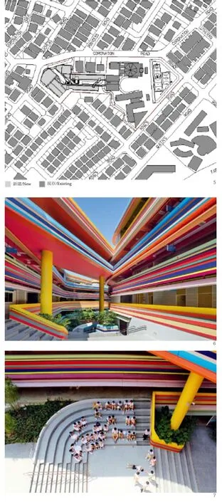
5 总平面/Site plan6.7 外景/Exterior views
All classrooms face away from the central Valley to the quieter residential areas. The inside of the classrooms are typically calm inappearance with white walls and ceilings letting the individual minds focus during class time. The classroom door is the only internal coloured element, leading children out into the rich and dream-like external world of seemingly endless coloured horizontal stripes and pathways of life.
Technically this is achieved through the low-cost budget application of emulsion paint on profiled precast concrete spandrels, together with the abovementioned coloured aluminium shading shelves.
But for the students, according to Nanyang Primary School's principal Lee Hui Feng "the future is an ever-changing kaleidoscope of lives amidst globalisation - full of ups and downs, twists and turns".
Our aim was to create a highly inspirational communal space, designed to showcase active, uninhibited free thinking and bring joy and excitement equally to children and to the child within the teacher.
A space from which everywhere is possible…
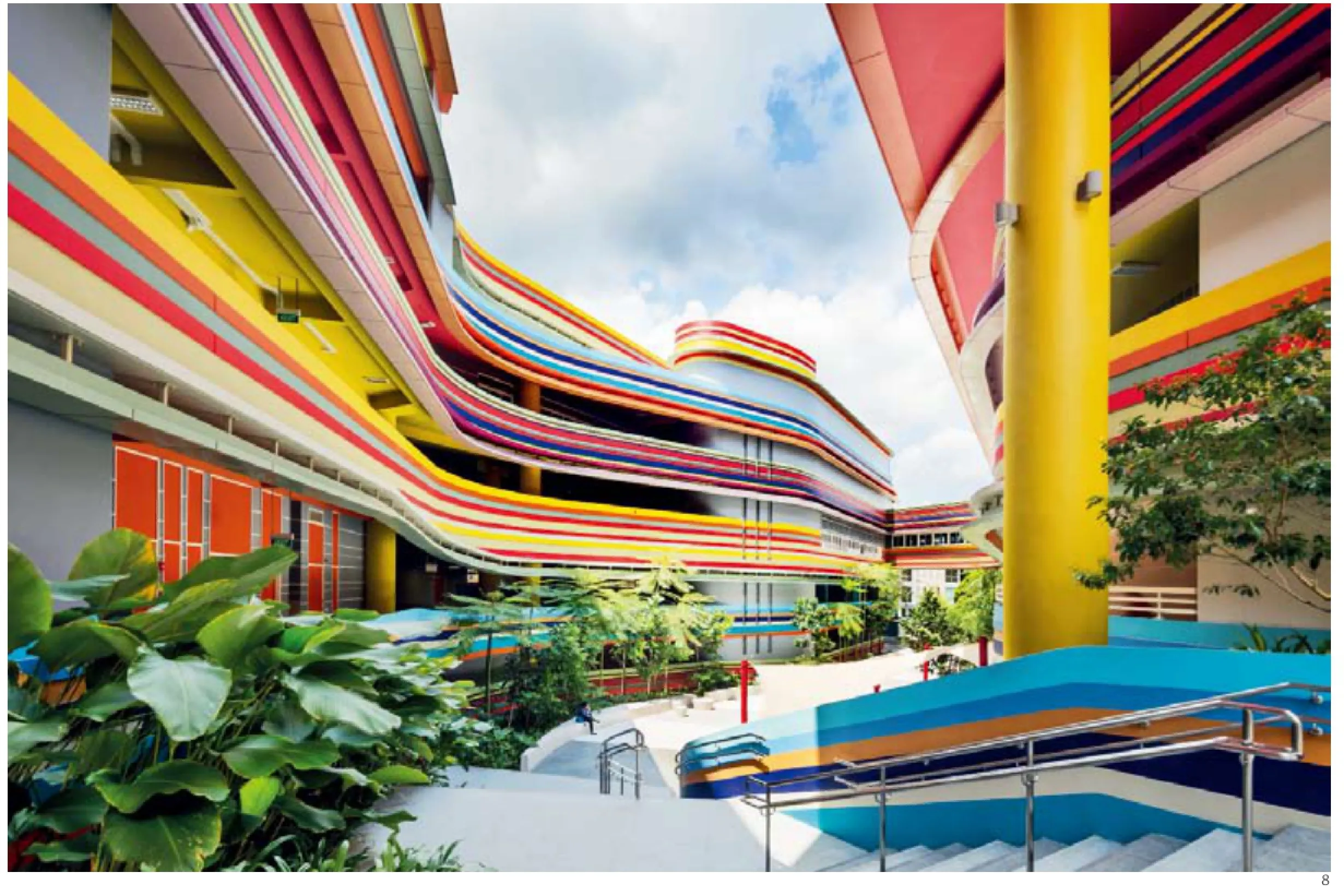
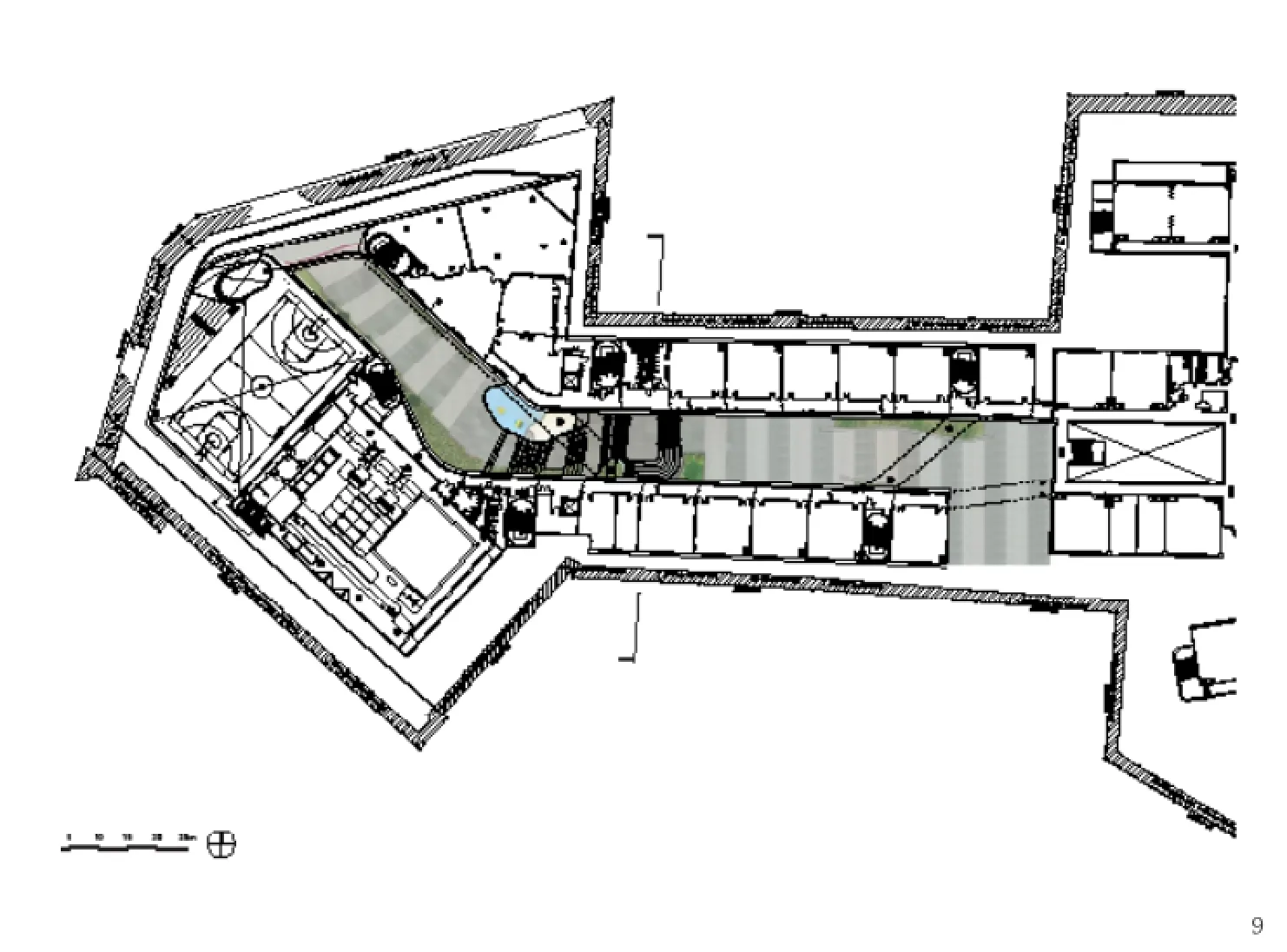
8 外景/Exterior view9 标准层平面/Typical foor plan
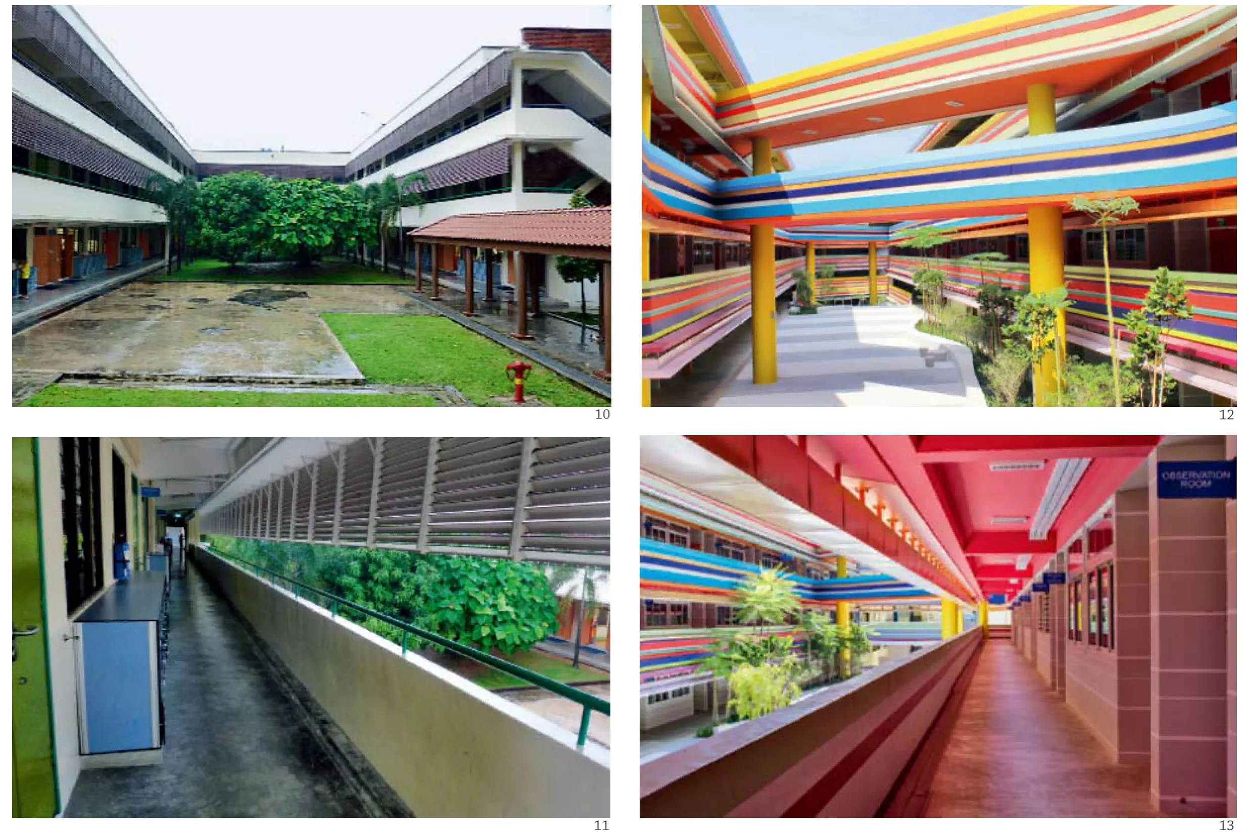
10.11 改造前外景/Exterior views (before)12.13 改造后外景/Exterior views (after)
评论
王晖:南洋小学的色彩设计是最让人不懂的,时尚感强,是少见的把如此多的颜色用于教育建筑的极端例子之一。从地域文化的角度来看,这样的设计能够充分地表达热带的气氛,同时也和热带学生旺盛的精力和较多的室外活动相结合。商业感强,辨识度极高。
张利:看来建筑师在此是准备一不做二不休了。如果没有这些密集的平行彩色线条,建筑的水平性与动感都会趋于平庸。然而这种炫彩棒糖式的喜感对观者来说能够支撑多久实在是个令人感兴趣的问题,特别是当看到天空、地面与植物在夺目的建筑实体面前显得如此次要时。如果把它与彼得·库克在维也纳商学院的宿舍相比照也不难发现,它是建筑实体炫目、景观平淡,而后者是建筑比较炫目、景观更炫目。
Comment
WANG Hui: Te colourful design of Nanyang Primary School is the most elusive one. It is a fashionable yet extreme example since so many colours are used in an education building. Judging from the view of local culture, this kind of design could fully refect the tropical atmosphere. At the same time, the design is in line with the energetic nature of children in tropical areas and their relatively more frequent outdoor activities. In general, it is full of commercial sense and highly recognizable. (Translated by QI Yiyi)
ZHANG Li: Te architect is getting radical and relentless here. Without the rainbow lines, the horizontality and dynamics of the building wouldn't have been so exciting. Yet it is hard for anyone not to wonder how long the building will keep on exciting you once you have get used to its vibrancy. Particularly when you consider the fact that the sky, the ground and the plants all appear to be dull while these rainbow lines are popping up to your eyes. Compare this building with Peter Cook's dormitory in WU,the diference is interesting. Both are vibrant buildings, but while in this project the landscape is simply plain, in Peter Cook's case the landscape is actually more vibrant than the building.
Nanyang Primary School Extension, Singapore, 2015
Architects: studio505, LT&T Architects
