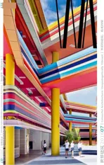
惠山榭丽花园幼儿园,无锡,中国
2016-08-06建筑设计钱强UDGSEU
建筑设计:钱强/UDG+SEU
惠山榭丽花园幼儿园,无锡,中国
建筑设计:钱强/UDG+SEU
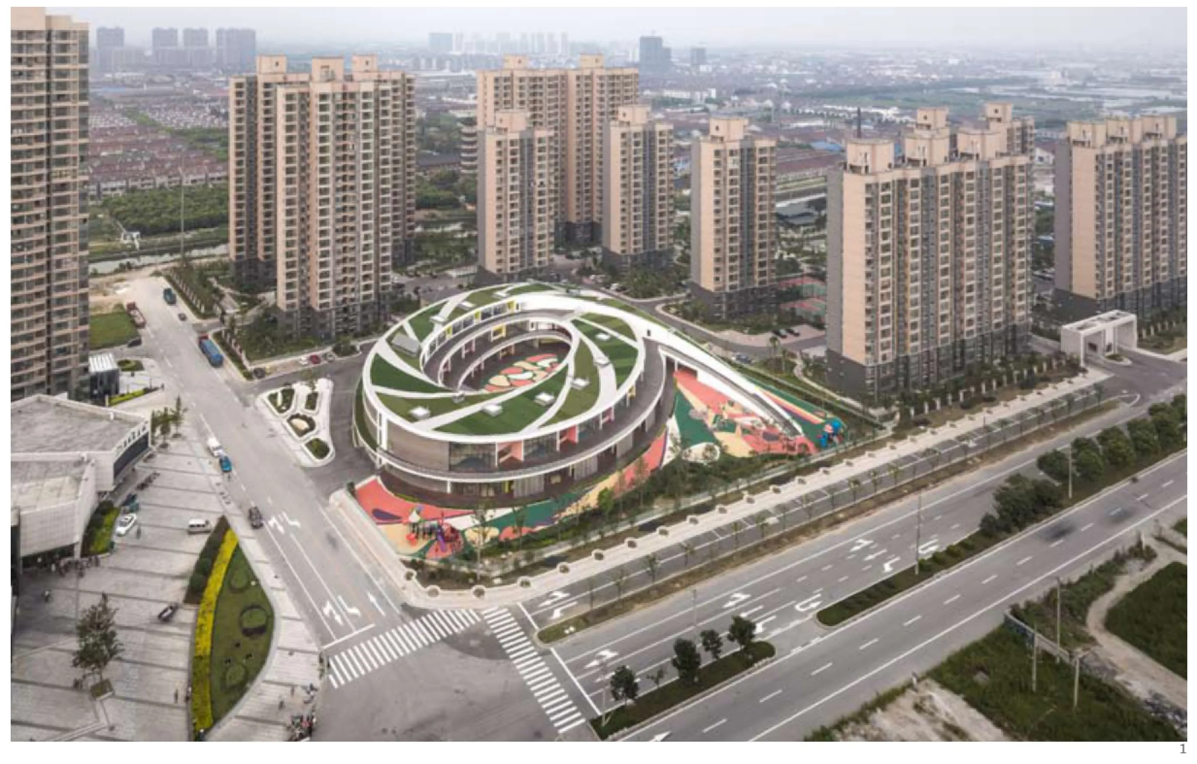
1 鸟瞰/Aerial view
榭丽花园幼儿园位于无锡惠山,基地临近惠山城际车站及站前服务区,是站前区域城市形象展示的重要组成部分之一,是榭丽花园居住区的配套18班幼儿园。
设计试图解决如何在城市高密度和场地限制的条件下,创造出满足最基本的功能性和安全性、同时也能富有趣味性和独创性的幼儿教育建筑。
基于基地条件的建筑空间形态生成
幼儿园是儿童跟家庭成员以外的人最先接触和交往的场所。幼儿园的空间设计中既要营造源于家庭的熟悉的空间尺度和氛围;更要营造不同于家庭的、陌生的、同时能够让孩子们惊喜的空间和生活乐园的氛围。
考虑到基地紧邻城市干道,为了隔离来自道路的各种噪音以及尽可能地减少灰尘和尾气对孩子们的影响,我们希望建筑空间能够围合成跟城市空间隔离的室外空间(内庭院)和跟城市空间邻接的室外空间(外庭院),以这两种不同类型的室外空间来满足孩子们的室外活动的需求。
环形建筑空间自然形成了对内和对外两种不同的空间。椭圆形的长边有利于班级单元的一直展开形成节奏并减小日照的影响;而椭圆形和基地近45°的夹角关系则可以加大椭圆形的长边距离,同时在椭圆形的西北侧和东南侧形成了两个扩大的空间场地。建筑的流线形造型与直线形的道路系统形成了动态的关系。
幼儿园是孩子学习和玩耍的地方,我们希望提供给孩子们最充足的阳光和最安全的庭院,让孩子们跟室外自然之间能够形成良好的互动关系,在这样一个自然舒适的空间里安全而自由地去探索世界。
建筑最高为3层,整体造型为螺旋上升的椭圆环形,建筑通过不同层次的退台、出挑和环形坡道,打造了立体的回游式室外活动空间,激发了孩子们探索的天性,让孩子们拥有探索的乐趣。这种独特新颖的教学组织方式及室内外活动空间,创造了一个既有安全性又充满趣味性的幼儿教育空间。
以儿童的身体和心理为出发点的材料和色彩设计
色彩所产生的不同的视觉效果,会给人不同的视觉体验,从而直接影响着人的美感认知、情绪波动乃至行为状态。幼儿园的环境色彩能够直接影响到儿童的身心发育和健康,因此,幼儿园建筑的色彩设计可以定位为对儿童的色彩认知的培养、情操教育的重要环节。
色彩设计是从无锡当地的自然植物中提取基本的色彩元素,将建筑色彩与地域产生内在的联系。色彩的分布与班级单元进行规律的组合,并进行由暖色到冷色的渐变和楼层间的错动,形成既有规律又绚丽多变的具有童心童趣的空间环境。
幼儿园应以怎样的空间形态来回应基地?呈现怎样的形象来提升区域的整体品质?榭丽花园幼儿园在十字路口的独特位置和形态为这个均质单一的街区提供了一个标志性的坐标点。□(钱强 文)
The Xieli Garden kindergarten is an 18-class community kindergarten of the Xieli Garden residential quarter in the Huishan District of Wuxi. Te building site lies adjacent to the Huishan Intercity Train Station and the station plaza and the structure of the kindergarten is an important landmark representing the city's image in the area.
The design of the kindergarten tackled the challenges of building an early childhood education facility that not only satisfies basic functional and safety requirements but also projects fun and creativity in an urban area with high building density and spatial restrictions.
Shaping the Architectural Space to Correspond with the Project Site Conditions
Kindergartens are the frst place where children come into close contact and interact with people other than their family members. Therefore, the spatial design of kindergartens should create a cozy, family atmosphere that children are familiar with as well as an environment that is full of new discoveries, pleasant surprises, and fun experiences.
Given that this kindergarten is built at the corner of a busy traffic intersection, to shield the children from the trafc and city noise and minimize the impact of dust and exhaust fumes, we designed the building space in an elliptical enclosure with one outdoor space surrounded by a main structure and isolated from the urban area (the inner courtyard)and a second outdoor space that is located at the south of the main structure, adjacent to the urban area (the outer courtyard) to satisfy the need for children's outdoor activities.
The oval-shaped spiral building structure naturally forms two different spatial areas (internal and external); its long, sloping edge forms the foor areas for the class units and it extends upwards from the ground to the third story in rhythmic spirals,reducing the impact of direct sunshine. Te elliptical structure is placed at a 45-degree angle within the square project site, which gives sufcient room for the building to extend its curved ramp as well as create two large open spaces in the northwest and southeast corner of the main structure. Te streamlined shape of the building generates a dynamic contrast to the surrounding straight road system.
A kindergarten is a space for children to learn and play; therefore, we wanted to offer children a safe courtyard with abundant sunshine so that they can interact with the outside environment and explore the world in a natural and comfortable way.
Te three-storied building takes the shape of a spiraling elliptical ring. With setbacks, overhangs,and circular ramps at various levels, the structure creates a multi-layered, strolling space for outdoor activities, which can stimulate children's curiosity and enhance their enjoyment in exploring. This particularly innovative structure has brought about a new approach in schools to utilize both indoor and outdoor spaces to create an educational environment that is both safe and interesting.
Selecting the Materials and Colour from the Perspective of Children's Physical and Mental Development
Diferent coloured visual efects can give people different visual experiences and thereby directly afect their sense of aesthetic cognition, mood, and even behavioral state. Te background colours in a kindergarten can have a direct impact on children's physical and mental development and health. Hence, the selection of colours for kindergarten buildings is a key factor in the development of children's colour perception and cultivation of aesthetic sensibility.
The colours applied in the project were colours chosen from the local flora in Wuxi with the purpose of building an intrinsic link between the architecture and the region. The colours are distributed in a pattern that refects the class units,with a gradient from warm to cold colours, as well as a differentiation of positions among the floors,creating a recognizable but varied, childlike, and playful spatial environment.
Te project is a perfect example of how spatial forms of kindergartens should be designed to refect the characteristics of the building site as well as how kindergartens should be presented to improve the overall quality of the region. Located at a city cross-section, with its extraordinary appearance,the Xieli Garden kindergarten provides a symbolic reference point in this simple and homogeneous neighborhood. □ (Text by QIAN Qiang)
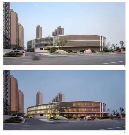
2 日景/Day view3 夜景/Night view

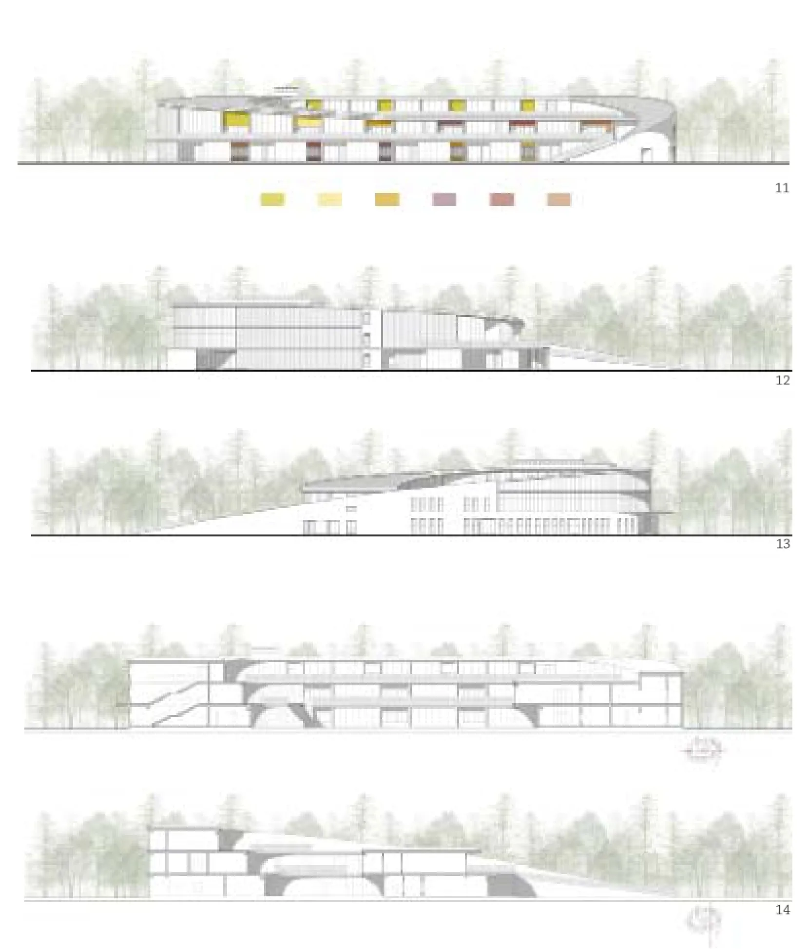
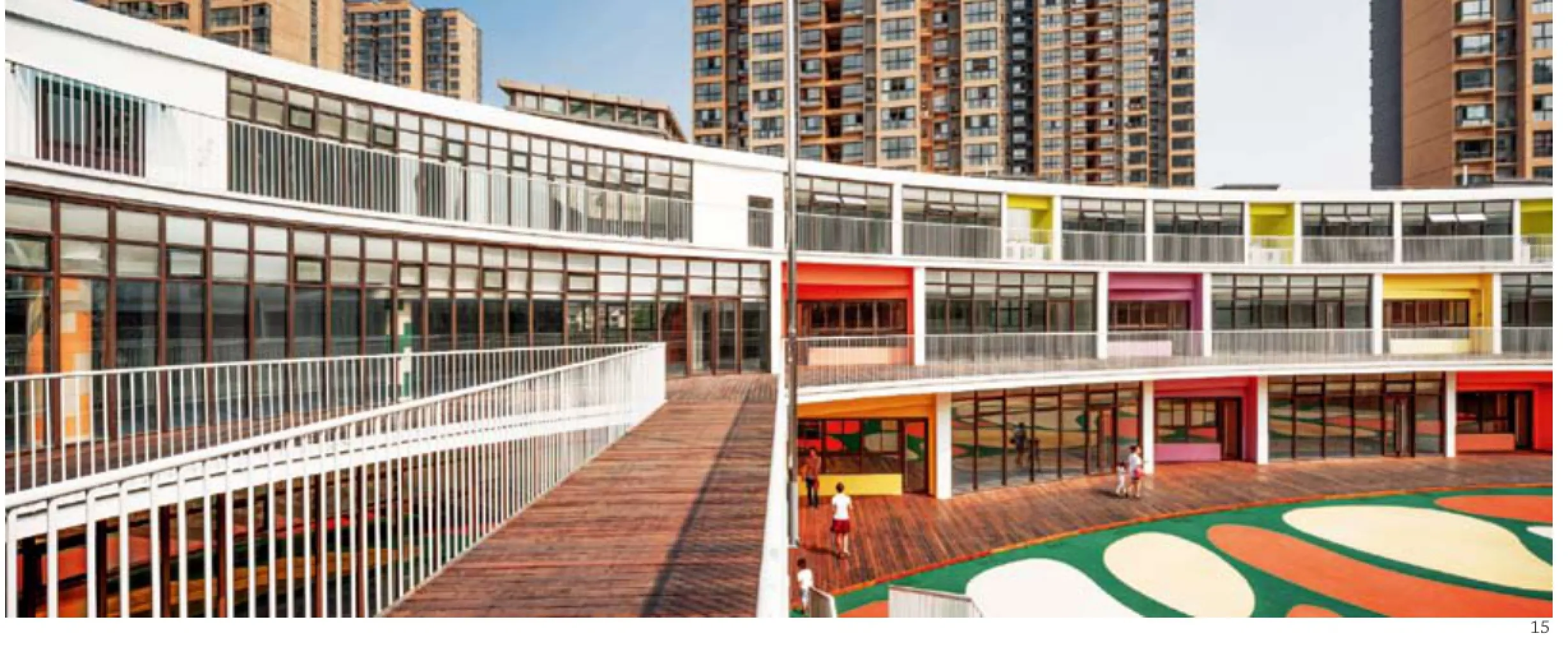
4 取色与配色分析/Colour analysis5 总平面/Site plan6 首层平面/Floor 0 plan7 二层平面/Floor 1 plan8 三层平面/Floor 2 plan9 功能分析/Program analysis10 流线分析/Flow analysis11 南立面/South elevation12 西立面/West elevation13 东立面/East elevation14 剖面/Sections15 外景/Exterior view
项目信息/Credits and Data
项目负责人/Principal Architect: 钱强/QIAN Qiang
设计团队/Design Team:
建筑/Architecture: 钱强,迟晓昱,冯海花,胡琪琪/ QIAN Qiang, CHI Xiaoyu, FENG Haihua, HU Qiqi
景观/Landscape: 陆哥,吴亚伟,马奇达,沈博/LU Ge,WU Yawei, MA Qida, SHEN Bo
功能/Program: 幼儿园(18班)/18-class kindergarten
材料/Materials: 高透中空玻璃、彩色涂料、半透明亚克力板、穿孔铝板等/High transmittance insulated glass,colour paint, semi-transparent acrylic board, perforated aluminium panel, etc.
基地面积/Site Area: 11,002.87m2
建筑面积/Floor Area: 7891.1m2
容积率/Plot Ratio: 0.72
建筑密度/Building Density: 34%
绿地率/Green Area Ratio: 21%
设计周期/Design Period: 2010.10-2013.10
竣工日期/Completion: 2015.09
摄影/Photos: 姚力/YAO Li
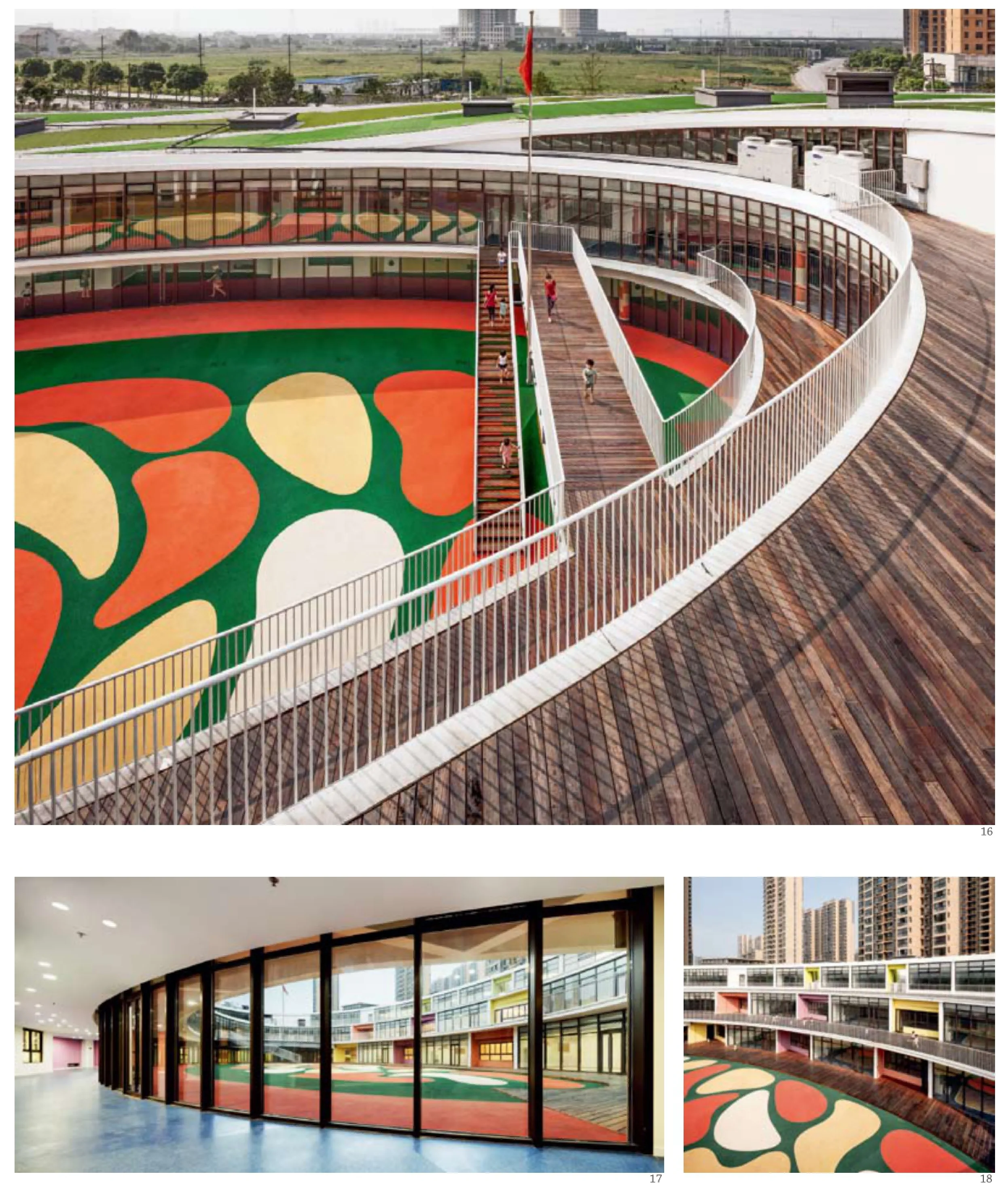
16 外景/Exterior view17 内景/Interior view18.19 外景/Exterior views
评论
维雷娜·M·申德勒:要想单从图片来判断颜色几乎是不可能的事,因为随着光线条件发生改变,颜色也会出现很大差异。建材的颜色在这座椭圆形的螺旋状建筑的北面发挥了作用,使其与周围环境紧密地融合。这个项目的颜色是被隐藏起来的,似乎建筑的生命根本在于其室内空间。中庭的地面由不规则形状的图案装饰,而南面的室外空间在一片绿色背景中泛着白、黄、红色,仿佛草地上开出巨大的花朵。那种鲜亮的绿色也出现在了室内,和金黄一起,但同时也运用了非彩色色调,使空间在视觉上具有舒适感、韵律和景深效果。(辛梦瑶 译)
王晖:幼儿园这一类项目的颜色使用,可以为各个功能空间提供更为直接的识别性,这也是颜色在建筑设计使用中比较常用的一种方法,本案中的色彩和空间本身的关系较弱,颜色使用随意、过于暧昧和难以描述,色彩及装饰图案如果能够和室内外空间产生更为有效/直接的结合,就可能对建筑的使用者—儿童的色彩—空间感受带来更为积极的影响。
Comment
Verena M. Schindler: Judging colours only from pictures is an almost impossible mission, because colours can strongly change depending on the varying light conditions. Te north side of the spiraling elliptical building exterior fully adapts to its surroundings where the material colours dominate. In this project, the applied colour palette is hidden as if the life of the building is essentially in the interior. Te amorphous shapes decorating the ground of the inner courtyard and the southern outdoor space are whitish, yellowish and reddish on a green background-like a meadow with large flowers. The intense green also appears in the interior together with, for example, golden yellows and fashy greens, combined with achromatic shades that give the space a visual comfort, rhythm and depth.
WANG Hui: For the type of kindergarten buildings, the identification of different functional spaces could be benefited from the distinctive uses of different colours. Tis is the way that colours are commonly adopted in architectural design. In this case,however, the relationship between the colours and the spaces are relatively weak. It seems that the colours are randomly used, ambiguous, and indescribable. If the colours and decorations could be bounded more efectively/directly with exterior and interior spaces, it might afect user's experience, i.e. children's colour and spatial experience,more positively. (Translated by QI Yiyi)
Xieli Garden Kindergarten in Huishan, Wuxi, China, 2015
Architects: QIAN Qiang/UDG+SEU
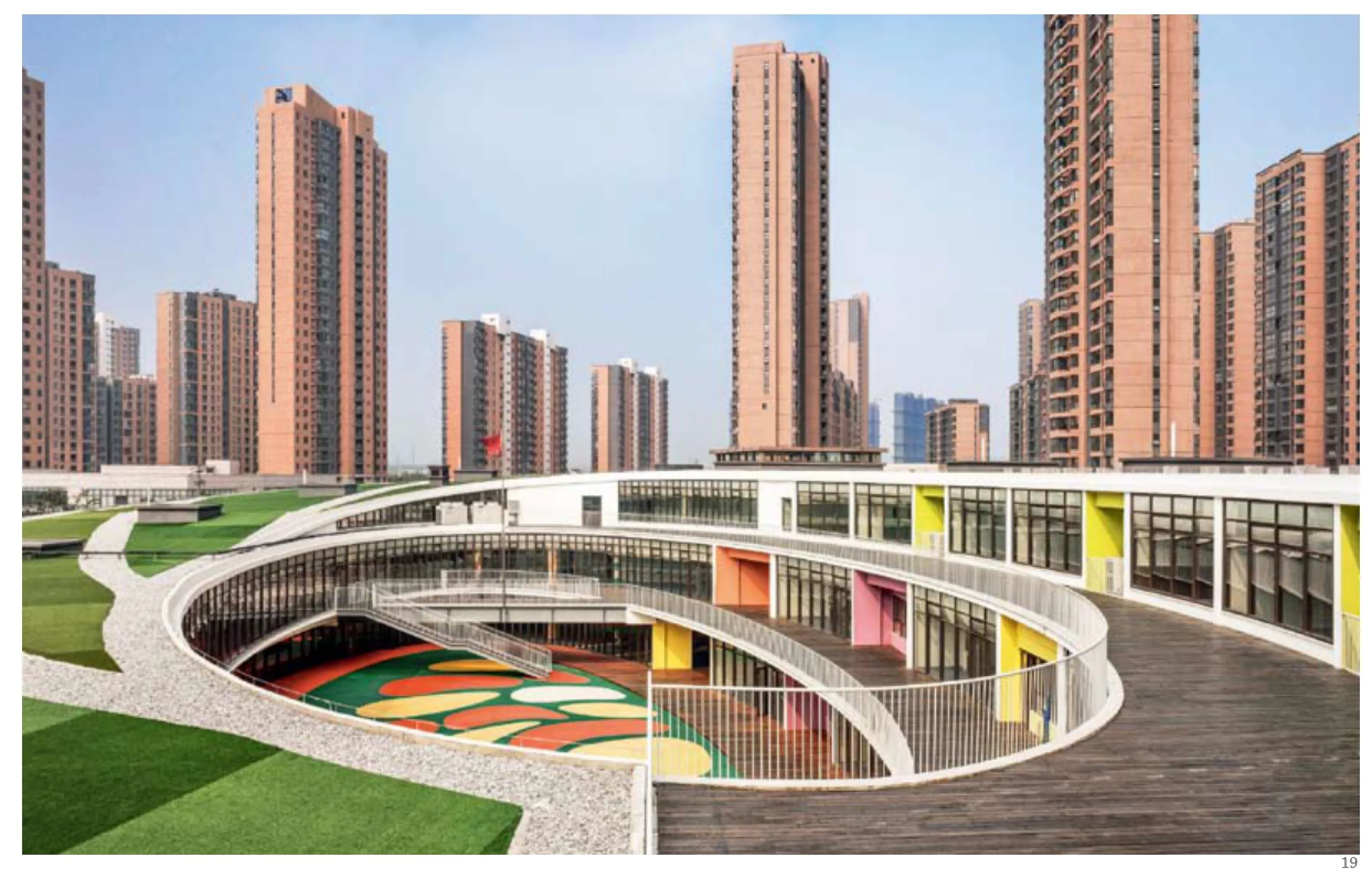
19 外景/Exterior views
