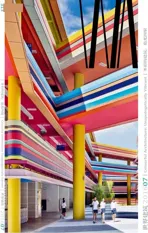
索易儿童快乐成长中心,郑州,中国
2016-08-06建筑设计蓝冰可董灏北京Crossboundaries建筑事务所
建筑设计:蓝冰可,董灏/北京Crossboundaries建筑事务所
索易儿童快乐成长中心,郑州,中国
建筑设计:蓝冰可,董灏/北京Crossboundaries建筑事务所
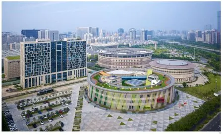
1 鸟瞰/Aerial view
索易快乐成长中心(以下简称“索易”)作为一个大型改造项目,不仅是原有建筑量身定做的新形象,更反映出设计师从空间上挑战了现有中国儿童设施的教育理念。
由于建筑外墙和结构不容大肆改动,Crossboundaries使用不同颜色的绳索连接屋檐及地面。绳索的间隙既保证了室内匮乏的自然光不被遮挡,其随风抖动的特质更为原本笨重的建筑带来生气与活力。原本为商业活动设计的庞大、单调的建筑顺利地从“面子”上吸引了来往人群的注意。
建筑内部,为引导孩童在建筑内找到自己的方向,Crossboundaries为索易设计的室内空间和外立面遵循相同的色彩逻辑。根据七色盘衍生出来的逻辑对应着本身不容改动的圆形建筑,每个方位都对应一个颜色,使孩童通过颜色的渐变寻找不同的空间。这些音乐、艺术、阅读等兴趣空间在布局上不像其他教育建筑一样将学科归类或划分层级,而是通过开阔没有边界的空间表达这样的理念——各个学科并不是独立存在的,不同领域的知识都是息息相关、且相互启发的。
除了一般建筑内的竖向电梯,Crossboundaries为儿童提供了非传统的斜向交通渠道——5条彩色管道以不同角度贯穿着建筑的不同楼层及方位。儿童们能通过各自兴趣和注意力的不同自主选择路径,或通过一条管道通往天台,或从一条管道切换至另一条绕行。无限的通行可能打破孩童对传统建筑的既定认识,并使他们认识不同的路径和目的地都有各自的价值。
大型的公共入口面对主道路开放,场地附近各个方向均可轻松到达索易。同时,建筑也提供长凳和绿植,更带来了超过建筑本身的愉悦氛围。这个广场不仅仅开放给儿童游乐,更面向整座城市的居住者。
索易给无数周围已完工数年的住宅带来外部活力。在施工开始不久,索易独具魅力的教育项目和公共空间,便吸引了大量的人群和商业,周边零售店的陆续开业。这座建筑,创造了社区内的和谐与紧密联系,也给原有联系松散的住宅注入新活力。
肯·罗宾逊爵士曾写道:“教育不需要改革——而是需要改变。这个改变的最主要的部分就是不要将教育标准化,而是要个性化。就是教育的成果应该取决于我们是否能够发觉每个孩子的天赋。就是要让学生们在一个允许他们发现自身的激情的环境中学习。”
As a large renovation project, the program of Soyoo Joyful Growth Center (abbreviated as Soyoo in the essay) not only endows the original building with a new image, but also indicates the designer's intention of challenging the present pedagogic concept in terms of spatial design applied on facilities for Chinese children.
Since drastic change is allowed on neither the façade nor the structure of the building,Crossboundaries uses ropes in different colours connecting the roof and the ground. The intervals between the ropes guarantee sufficient daylight in the indoor space, and the vibration of the ropes with wind brings life and vitality to the originally heavy appearance of the building. As a result, the bulky and dull building originally designed for commercial activities starts attracting people's attention to its appearance.
In the interior space, in order to guide children to find their own directions, Crossboundaries follows the same logic of colour in both exterior and interior designs. Growing from the colour palette,the colour logic of the design corresponds with the unchangeable round shape of the building, with one colour for each direction so that children can follow the change of colours to a different space. Unlike other buildings for education that classify or discipline the users, the open and borderless layout of the spaces for music, arts, and reading in Soyoo is trying to reflect the idea that instead of being independent from each other, knowledge in different fields in fact are connected and mutually inspired.
Besides traditional vertical lifts inside a building, Crossboundaries also provides untraditional diagonal traffic channels - five tubes of diferent colours cutting through the building at different angles on different floors and directions. Children can choose their routes based on their own interests and attentions, either going to the roof via one tube or going detour from one tube to another. The unlimited passage in the space may break children's recognitionsin traditional buildings and enable them to understand that diferent routes and destinations may have their own values.
A large public space opens up to the road intersection, easily accessed from all corners of the site. Benches and planting are offered to provide a pleasant environment beyond the building. This plaza isn't just given to children as playground but also to the city dwellers, as a place to relax and gather.
Soyoo invigorates numerous peripheral residential compounds built over the years. Its intriguing educational program and public space attracts a fow of people and businesses, neighboring retail spaces opening soon after the construction began. Te building as a whole creates coherence and connections within the community, adding vitality to a long disengaged residential neighborhood.
Sir Ken Robinson wrote, "Education does not need reform - it needs a change. Te primary part of this change is not to standardize education, but to personalize it. It means that the result of education should depend on whether we are able to discover the talent of each child. And we should let students to study in an environment allowing them discover their own passions."
项目信息/Credits and Data
客户/Client: 河南索易文化发展有限公司/Soyoo Culture Development Co., Ltd.
地点/Location: 中国河南省郑州市/Zhengzhou, Henan,China
负责合伙人/Partners in Charge: 蓝冰可,董灏/Binke Lenhardt, DONG Hao
团队/Design Team: Tracey Loontjens, 李振宇/LI Zhenyu,Cristina Portoles , Brecht Van Acker, Filip Galuszka, Diego Caro委任时间/Commission Time: 2013.01
建成时间/Completion Time: 2015.09
建筑面积/Floor Area: 28,200m2
摄影/Photos: 杨超英/YANG Chaoying
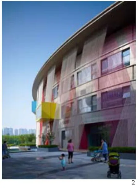
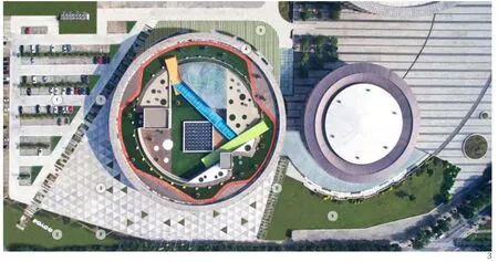
2 外景/Exterior view3 俯瞰/Top view
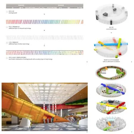
4 外立面生成图/Facade diagram5 概念图/Concept diagram6 内景/Interior view7 轴测/Axonometrics
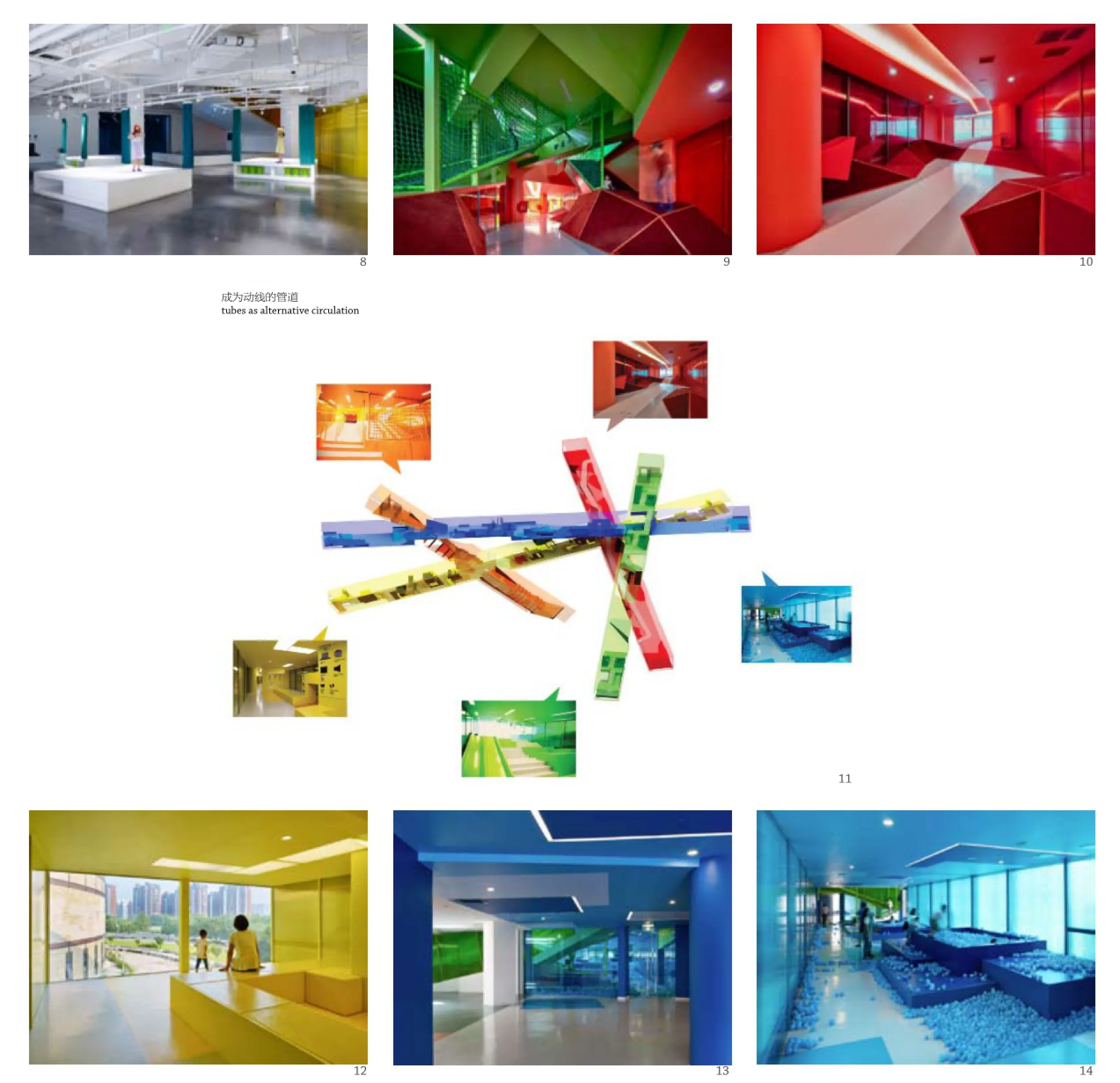
8-10 内景/Interior views11 概念图/Concept diagram12-14 内景/Interior views
WA:色彩在这个项目中的作用是什么?
露淳熙+蓝冰可:在索易,颜色的使用超越了美学本身:它成为儿童辨识空间和识别路径的方式。除了功能性,颜色也为建筑立面增添了一抹童趣的色彩,暗示了其儿童设施的新身份。
建筑的圆形外形为颜色的应用提供了灵感: 颜色排列成一个圆环渐变围绕着建筑。其排列基于感官:冷色布置在北面,暖色在南面。外立面上的每种色彩对应着建筑内部的一个功能区。
建筑的外观和内部都贯彻着同一个色彩逻辑,并且在内外建立了视觉联系。孩子们的方位识别能力尚在发展中,这个系统为他们提供了清晰、便捷、全面的视觉引导,使他们能够独立的体验建筑空间及周边环境。
WA:本项目中最具创造性和吸引力的设计是什么?
露淳熙+蓝冰可:索易项目开展之初的设计理念是“创造不同的中国教育”。我们希望引入一种以孩子为中心的教育哲学,以角色扮演为主要教学方法,提供多元化的教学课程。有别于重复、片面的模仿现实角色,索易的角色扮演强调以想象力为驱动以及丰富的变化,允许孩子自由探索,发掘自我,并寻找实现自我的途径。
这种理念需要一种新的建筑类型,来提供一个可供孩子探索学习并发现自身兴趣和热情的环境。为了改变建筑现有的单调空间,我们大胆地加入5根穿过建筑的彩色管道。这个举措弱化了建筑的原有布局,不仅为建筑提供了一个显著的视觉转变,同时提供了一个独具特色的流线设计,体现了建筑在创新式教育中的新角色。
尽管开放平面不算是创新,但在教育设施中利用开放空间连接学习区域是不常见的,小孩通常会被限制在一个界限分明的空间里来控制和管理。索易的排布方式体现了在知识的领域里学科间是不存在界限的。
在立面设计上, 白色和彩色的双层绳索由现有屋面到地面斜向延伸-为外立面提供了一个具有创造性又有效的解决方法。
WA:在设计过程中最困难的部分是什么?
露淳熙+蓝冰可:索易的原始建筑,作为3个圆形建筑中的一个,10年前规划为商业中心,建成后却从未被使用过。我们遇到了现有建筑再利用类型的项目中常见的限制和挑战,而它的庞大体量也是很大的挑战。
在我们努力创新的过程中,由于缺少行业内的成功案例,项目不仅要求大量的前期调研和发散性思考,并且督促我们与项目的其他参与方保持密切的交流。项目的甲方希望在教育方式和教育空间上尝试创新,与我们的设计理念达成一致。这并不意味着实现设计的过程中毫无挑战。施工方为了在现有建筑中植入5条交错的管道,在建造方面挑战着极限。未来将会在此授课的教师们,带着保守的教育观念与方式,在接触到索易的教育理念后受到了不小的冲击。
WA:使用者和社群的反馈如何?
露淳熙+蓝冰可:考虑到索易自开放到现在只有一年,它无疑需要更多时间成熟,将自身潜能发挥尽致。但从目前设施内及周边环境的热闹程度来看,它已经成为社区和城市中一个受欢迎的新场所。
同时索易通过自身的介入激活了城市空间,这个项目对于当地社区,特别是年轻家庭的需求给出了回应。索易的成功在于它不仅局限于使用者,并同时服务于周边群众。居民们能够自由享受室外广场空间,以及入口门厅设置的一些免费游乐设施。
索易提供的多样性儿童服务、课程、娱乐及活动,吸引了越来越多的人群,促进他们之间的互动。寓教于乐的观念日趋主流。在儿童教育游乐市场蓬勃发展的今天,索易的多元化功能将其置于新兴引领者的位置,成为郑州及更广阔区域的焦点。
WA:本项目是如何提升公共空间品质的呢?
露淳熙+蓝冰可:建筑周边的室外空间同样经过了长时间的休眠、废弃和停用。作为与建筑本体不可分割的一部分,它同样被转化成了一个高质量且有意义的公共空间。曾经了无生机的区域如今成为一个开放、吸引人的公共空间,与建筑周边区域产生密切联系。景观空间内设有座椅和绿化区域,为来访者和周边居民及市民提供了一个充满活力的休闲和聚集场所。
翻新后的建筑、周边的景观空间以及索易有趣的教育活动,吸引了大批来访者。同时,自索易开业后在其周边涌现出的新商铺,可看出索易的诞生为这片区域带来大量商机。
整体项目为社区提供了凝聚力,为一个长期沉闷的居住区带来了活力,并为城市周边的升级进化提供了契机。

15 剖面/Sections1.2-接待处及信息台/Info & reception desks1.3-零售店/Retail area1.5-室内游乐区/Indoor playground1.6-咖啡厅/Cafe1.7-泳池区和更衣区/Swimming pool & changing room area2.3-厨艺及餐饮区/Cooking & drinking area2.8-戏剧区/Drama area2.9-电影院/Cinema2.10-剧场/Teatre3.1-幼儿园教室/Kindergarten classrooms3.4-温室/Greenhouse3.5-办公室/Ofce area4.1-室外游乐区/Outdoor playground

16 剖面/Sections1.2-接待处及信息台/Info & reception desks1.3-零售店/Retail area1.4-衣帽间/Shoe & cloak storage1.5-室内游乐区/Indoor playground2.1-艺术区/Art area2.4-地球村/Global village2.5-阅读区/Reading area3.1-幼儿园教室/Kindergarten classrooms3.5-办公室/Ofce area3.6-室外游乐区/Outdoor playground4.1-室外游乐区/Outdoor playground
WA: What is the role of colour in this project?
Tracey Loontjens & Binke Lenhardt (TL&BL): In Soyoo, the use of colour is more than a mere aesthetic need: it offers means for child-friendly spatial recognition and wayfinding. Besides its functional purpose, the colour palette also provides the building with a more playful and child-friendly appearance,refecting on its new function as a children facility.
Te building's circular shape lent itself to apply the colours as in a colour wheel: arranged in a circle,and gradually shifting from one colour into another. Positioning the colours was based on intuitive association: colder colour tones in the north, warmer ones in the south. Leading to each colour being identifed with a specifc zone and/or program.
Tis logic was applied consistently for both the exterior (on the façade) and interior, ofering visual connections between one another. Considering children's developing way finding abilities. This offers them clear and easy comprehensible visual clues, and allows them to explore the building and its immediate environment independently.
WA: What is the most creative and attractive solution?
TL&BL: At the beginning of Soyoo's commission,a vision was put forward to "make a difference in Chinese education". With children as the starting point, we embraced the idea of implementing a pedagogic philosophy that offers a holistic approach to education, embodied in a role-play based program. Rather than focusing on mimicking realistic roles in a repetitive routine, Soyoo's roleplay is imagination-driven and ever-changing,allowing children to explore freely what they should learn in order to become whoever they want.
Tis required a new spatial typology, providing an environment where children explore the process of learning and discover their passions and interests. To counter the dull and repetitive nature of the building's pre-existing spatial arrangement, five coloured tubes were inserted boldly, to cut through the building. This is a direct gesture to uplift the building's previous function and design, offering both a conspicuous visual transformation and an out-of-ordinary way of circulation to present the building's new role in creative education.
Although an open plan layout is not an invention, the use of it in an educational facility to connect learning areas is uncommon, simply because children are usually kept within a bounded space for easier control. Tis arrangement is a direct refection of the idea that learning or knowledge is not limited to isolated subjects.
Also the façade - a double-layered tensed white and coloured ropes, spanning diagonally from the existing roof to the ground - provided an inventive,yet efective solution for the initial requirements.
WA: What was the most difcult part in the process of design?
TL&BL: One of three round buildings, it had never been occupied since it was built as business center 10 years ago. In repurposing an existing building came with it all the usual constraints and challenges,of note its vast size.
Our endeavor for innovation and the absence of precedents required not only considerable research and inventiveness, but also continuous consultation with each of the key parties involved in the project. An aspirational client seeking to make a difference in education and its supporting architecture, ultimately found alignment with our design, but this isn't to say the process came without a challenge. The contractor was stretched by the limits of the tubes when ftting them into the existing structure. Te staf that would facilitate the learning experienced the greatest deviation because Soyoo's vision misaligned with their current practice and preconceived image of innovation.
WA: What is the feedback from the users and the community?
TL&BL: Considering the facility opened only a year ago, it undoubtedly still needs some time to mature until it will reach its full potential. However, from the buzz of activity we have seen in, around and about Soyoo, one could conclude it is a welcomed addition to the community and city.
Whilst Soyoo invigorates the urban environment through its architectural intervention,its programmatic offer responds to the needs of the local community, which is mainly composed of young families. Te success is that it is not limited to this user group, but also to the surrounding community who has expressed a high positive response. Residents can enjoy the plaza, extending inside the spacious entrance hall filled with free accesses to playing all day long.
Te facility ofers a wide range of child-specifc services, programs, activities and events, that attract, engage and connect a growing number of people. Amidst the rising trend of learning through play, this holistic program positions Soyoo as a promising newcomer in the booming market for children's recreational facilities, attracting attention of Zhengzhou and beyond.
WA: How did this project improve the quality of the public space?
TL&BL: Just as the buildings were left dormant,so was the surrounding outdoor space, neglected and in disrepair. Though, by considering it as an integral part of the project, it became a qualitative and meaningful public space. The inactive area was transformed into an overt, accessible and inviting urban area that not only connects with,but also opens up towards the building's immediate surroundings. Provided with seating elements and greenery, it ofers a revitalizing environment for the building's visitors, as well as local residents or city dwellers, to gather and relax.
The renewed building, its adjacent outdoor space, and Soyoo's intriguing educational program,attracts a flow of people. In turn working as a catalyst for other businesses, notably seen in neighboring retail spaces opening soon after the construction began.
Te project as a whole creates coherence within the community, adding vitality to a long disengaged residential neighborhood, and setting the incentive for its urban surroundings to take action and strive towards a positive change.
评论
维雷娜·M·申德勒:在这个项目中,颜色的运用是功能性的。5种鲜艳的颜色——红、橙、黄、蓝、绿——被运用到附加的廊道上。那些管状的廊道无规则地纵横交错于这座圆形建筑中,相互连接,各自内外颜色一致的同时彼此采用不同的鲜亮颜色。每种颜色都被用于不同的方位,室内空间因此变得生动而跳跃。这些四通八达的管道的末端穿过建筑立面,在不同的层上形成了凸窗。那些明亮的颜色闪着光亮,改变了建筑严肃的外观。(辛梦瑶 译)
庄子玉:“在废弃的残桓上创建新的乐园”这一传统的乌托邦式命题在索易快乐成长中心斑斓的色彩中无疑有了全新的诠释。原有建筑的厚重与封闭,恰好成为新的色彩穿插与渗透的绝佳底衬。不同色彩和体块的植入带来功能层面的新组织及叙事层面的新线索;内与外,上与下,动与静,曲与直等一系列的二元关系也因此消解;从而空间亦回归于一个弱对立关系的童真世界。
Comment
Verena M. Schindler: In this project, the use of colour is functional. Five vivid colours-red, orange, yellow, green and blue-are applied to additional pathways that crisscross the circular building in an irregular way. Te exterior and interior of these tube-like interconnections form fully monochrome corridors with their respective intense expressions. Each colour is used for a diferent orientation thereby providing the interior with a vivid and dynamic appearance. Te ends of these circulation tubes cut through the building's façade creating protruding windows at different levels. The bright colours flash, breaking up the building's severe exterior.
ZHUANG Ziyu: The strive for Utopia is something deeply rooted in the way architects operate. It sometimes seems that it is an even greater appeal to turn something derelict into the new Garden Eden, to reinvigorate an unused ruin and prove the powers of architecture. Not quite a ruin yet, but nonetheless an abandoned building was the Soyoo Joy Growth Center in Zhengzhou. An introverted structure, expressing its disconnectedness from its surrounding through both its façade-heavy stone with sparse openings-and form-a self-centered circle-alike. Crossboundaries was charged with reinvigorating the building, and decided to do so from the inside out: a variety of shapes are inserted into the building, forming paths, nodes and leaving few open voids, breaking the formerly monumental shape up into a playful picture. Each different element is treated with a distinct, strong colour, what we are more willing to accept in a building repurposed as a children's playground, than we would be in other architecture. However, the function of those colours goes far beyond making it "childlike": each of them serves as an accent to explain the building to us, and avoid a feeling of not seeing the forest for all the trees. Te outside appearance of the building also reflects the inside-out thinking: the circular shape is not altered, but like colourful dots, the inside additions are poking through the façade.
Soyoo Joyful Growth Center, Zhengzhou, China, 2015
Architects: Binke Lenhardt, DONG Hao/Crossboundaries, Beijing
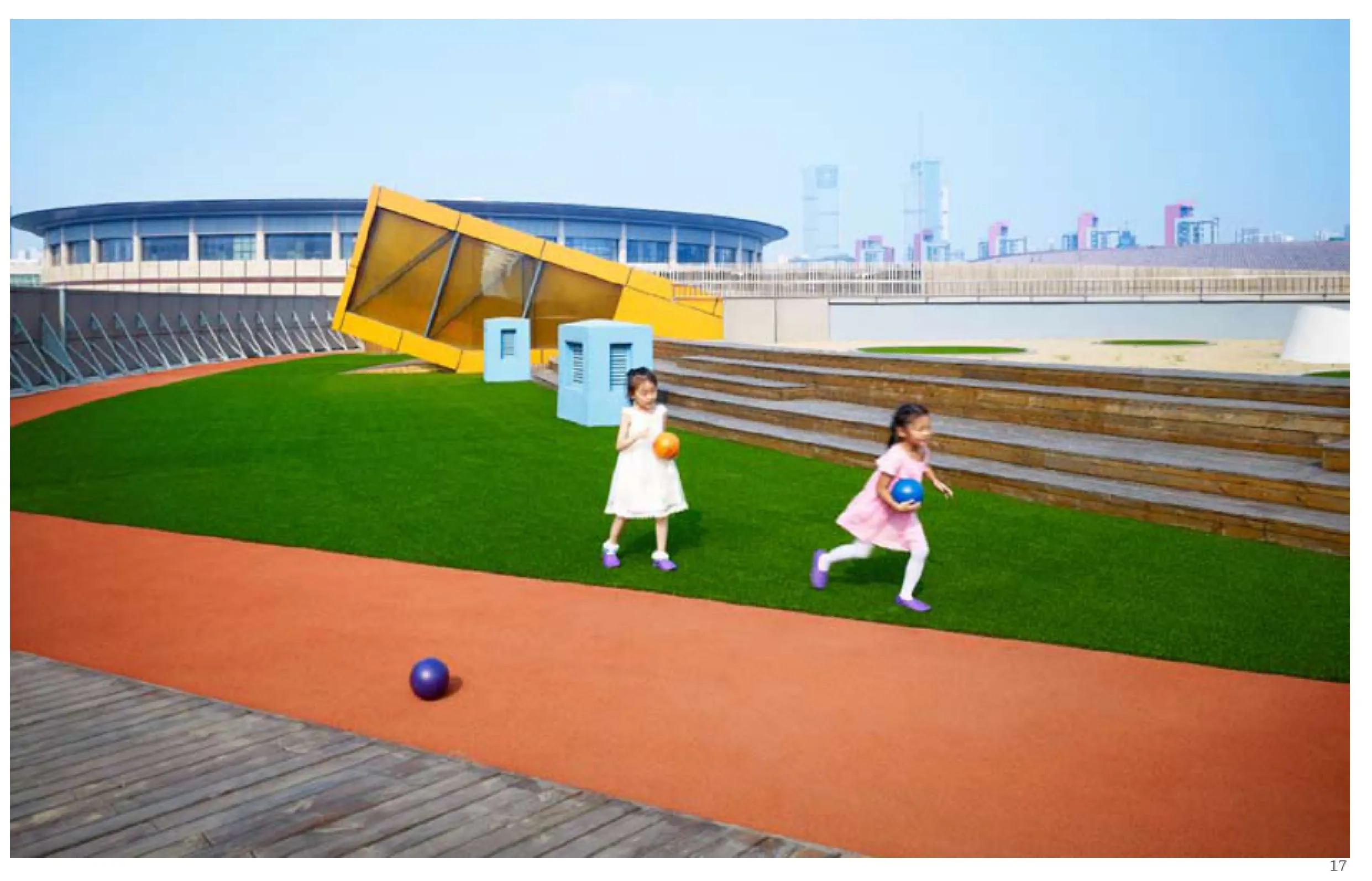
17 外景/Exterior view
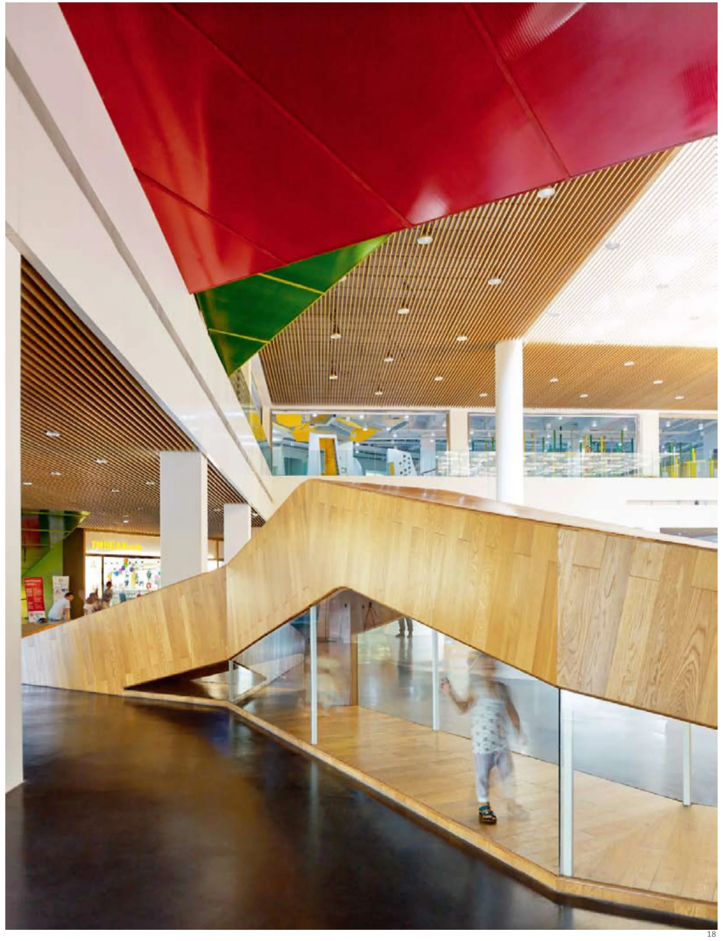
18 内景/Interior view
