公寓·屋,千叶,日本
2016-08-06建筑设计河内一泰河内建筑设计事务所
建筑设计:河内一泰/河内建筑设计事务所
公寓·屋,千叶,日本
建筑设计:河内一泰/河内建筑设计事务所
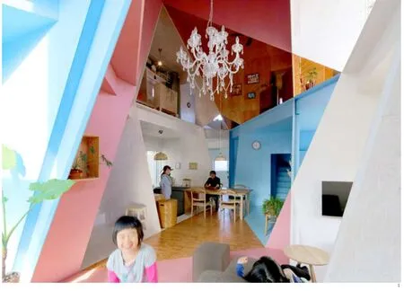
1 内景/Interior view
这是对一座独栋别墅的改造工程。别墅位于东京的郊区,原来是一个典型的二层公寓,内部有8个用来出租的小房间。因为超过一半的公寓只能空置,所以业主最初决定要拆除它,然后新建一座独栋别墅(供父母及两个女儿居住)。不过,我的建议是对独栋别墅进行改造而不是拆除它。因为业主的预算有限,如果推倒重建的话建筑面积只能达到原来的一半,这对业主来说是非常不利的。
日本人口从10年前开始呈下降趋势,家庭的数量也随之减少。所以,我认为,理论上来说人们应该可以拥有更多的居住空间。时代已经发生了变化,日本人不再需要生活在狭小的房子中。之前由于人口众多而空间有限,人们需要把有限的空间划分成更多房间。而如今人口下降,人们对房间数量的需求减少,所以需要合并原来已经划分好的一些空间。不过一般来说,客户还是倾向于把一个房子变成更多的房间。在设计这座房子时,我自己的愿景是在划分空间和合并空间两者之间寻求一种平衡,最终可以形成一个充满活力而又丰富多彩的室内空间,这样可以为使用者提供多种空间感受而不至于单调乏味。这个项目被称为“公寓楼”,而我则希望这个小建筑能够带来利用率更高的居住空间和多姿多彩的视觉效果。
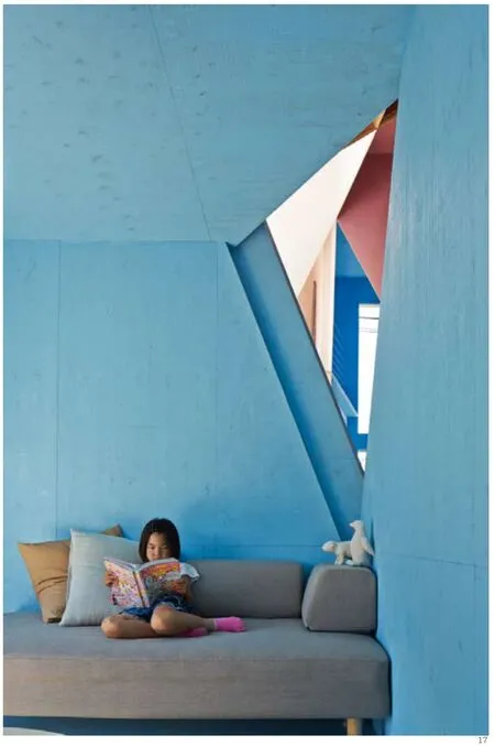
首先,我在公寓内切出一个洞来连接8个房间。在现有建筑中,墙壁和地板组成了严格的三维网格系统,这个系统将室内空间分成了8个部分。我在这个三维网格系统之外加入了一些二维图形(三角形或四边形,没有五边形)。同时,我认为这些二维的形状不应该遵循已有的三维网格。比方说,其中一个三角形就跨越了首层和第二层之间的网格,这样也就超出了X轴和Y轴组成的平面。8个房间都处在三维网格而非二维的平面形状之中。根据四色原理,我将二维形状用不同的鲜艳色彩标示出来,从而凸显这些形状的存在。当人们置身于房间里,就能在同一个空间中感受到两种不同类型的深度。
设计成果能够展示很多不同深度的空间,这也让我想起了立体主义在二维和三维之间采取的这种交错的视角。我们可以看到三角形和四边形聚集的视觉效果。这些形状相互重叠并交叉,从而创造出形态各异的空间。
建筑不能摆脱三维系统的束缚,而另一方面绘画也无法离开二维的约束。艺术史上,立体派从二维绘画中发掘了一个新兴的深度。那么同理来说,建筑是否也能从三维空间中找到自己的另一种深度呢?□(河内一泰 文,张弦 译)
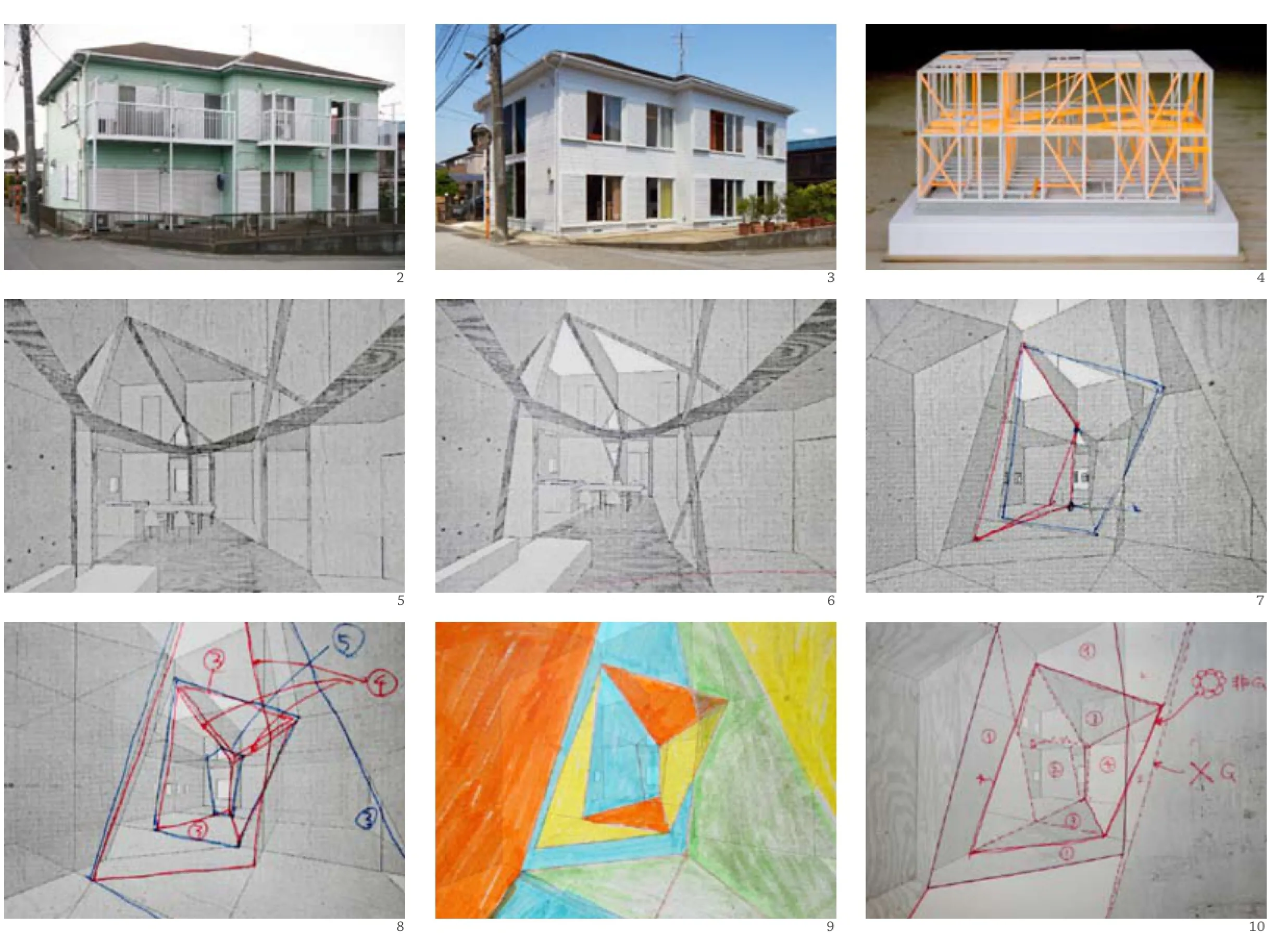
2 外景(改造前)/Exterior view (before)3 外景(改造后)/Exterior view (after)4 建造模型/Construction model 5-10 草图/Process drawings
This is a renovation project of a single-family house, originally used as a typical two-story apartment-house with eight small rental units in the suburban area of Tokyo, Japan. More than half of the units of this old wooden apartment were empty,therefore the owner wanted to demolish it and then build a new single-family house (parents and two girls) at the beginning. However, I proposed to renovate this existing building into a single-family house instead of demolishing it, because with their budget I thought the clients could only gain half of the existing foor area if they built a new one, which does not beneft them.
Depopulation in Japan started 10 years ago. The number of households decreased, too. I would say theoretically people can have more space in their residences. Te time of Japanese people living in tiny houses has changed. There is a shift from dividing limited space for many people into uniting existing divided space for fewer people, I think. However, clients generally still tend to divide a house into many rooms. I picture the image of a new house, which is well-balanced between dividing and uniting space inside. The act of dividing coexists with the act of uniting here. The result will be dynamic and complex internal space, which provides the experience of being all the spaces without losing the sense of retreating into the one. In this project called "Apartment-House", my ambition is to create high density and richness of diverse sceneries in this small architecture.
I started with cutting a hole inside the apartment to connect eight rooms. The existing building has a rigid 3D grid, consisting of the walls and foors, which systematically divide the internal space into eight rooms. I cut 2D shapes (triangle or quadrangle, not pentagon) out from this grid system. As a rule, I decided these 2D shapes should not follow the 3D grid. For example, one triangle shape was cut out crossing the grid between the frst foor and the second, and placed beyond the X and Y coordinate plane. Each of the eight rooms is on the 3D grid, but 2D shapes are not. I used diferent vivid colours as "Four colour theorem" for each 2D shape, which is not following the grid, to emphasizethe presence. As we stand inside, we can find two different types of depth (=perspective view) in the same space.
Te result of this process showed some diferent depth of space. This reminded me of a picture of Cubism, which has distortion of perspective between 2D and 3D. We can see scenery, in which triangles and quadrangles gathered, overlapped and intersecting each other, creating diversity of spaces into one place.
Architecture cannot escape from 3D grid system, and paintings also cannot escape from 2D on the other hand. In the history of art, cubist found an emerging depth of space in their 2D paintings. Similarly, may architecture discover its emerging depth in the 3D space? □ (Text: Kazuyasu Kochi)
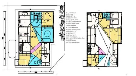
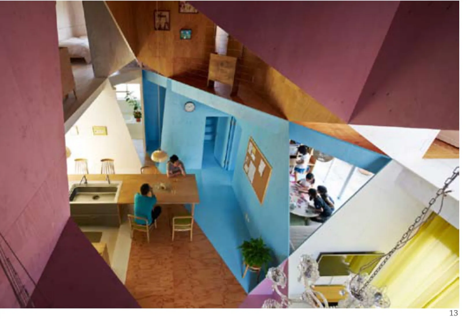
11 首层平面/Floor 0 plan12 二层平面/Floor 1 plan13 内景/Interior view
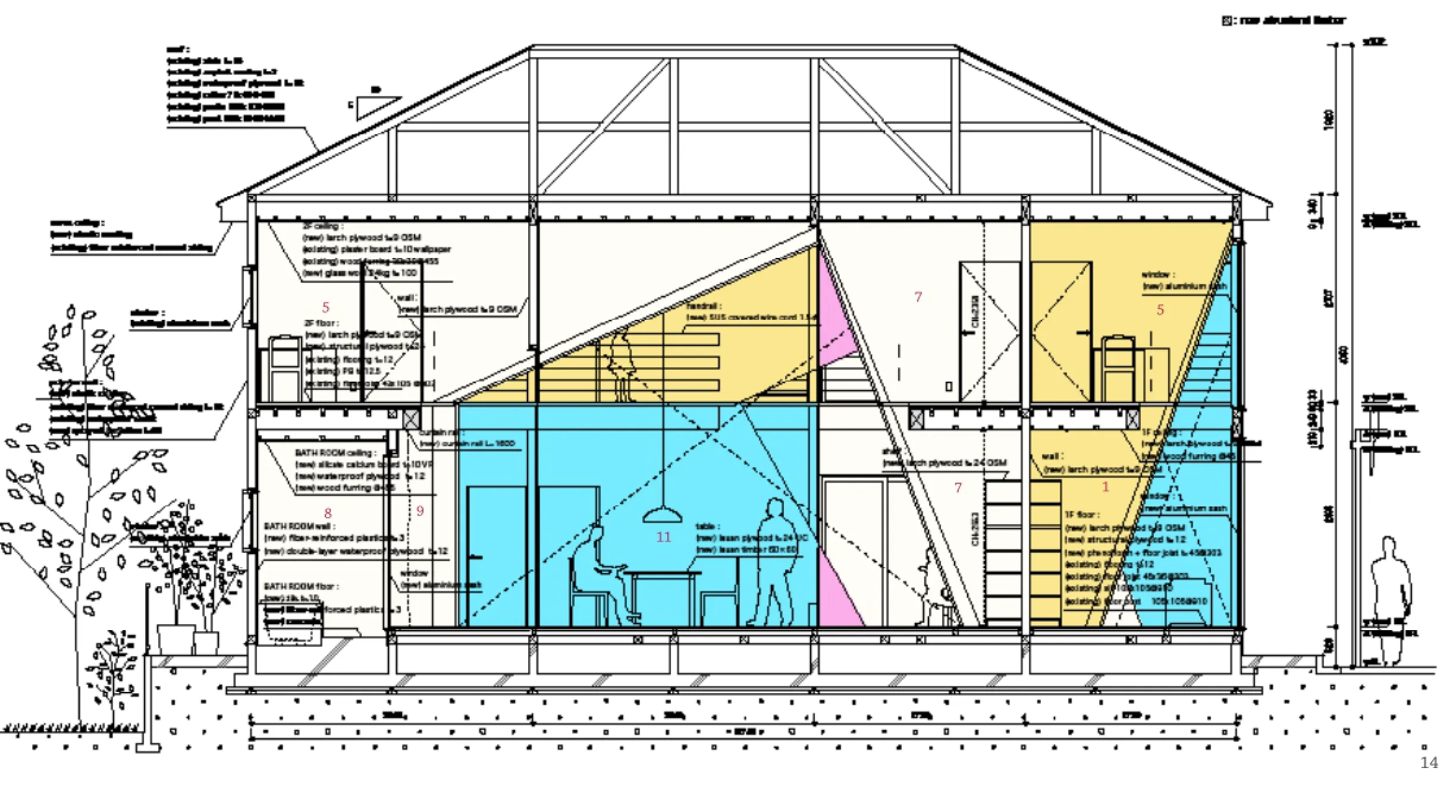
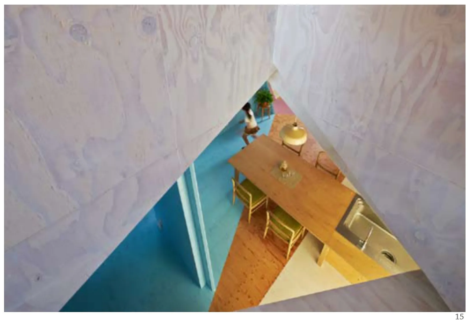
14 剖面/Section15 内景/Interior view
项目信息/Credits and Data
结构工程设计/Structural Engineering: Yukihiro Kato/ MI+D architectural laboratory
施工单位/Construction: Sugimoto Group
规模/Scale: 二层木结构房屋/Wooden house 2F
基地面积/Site Area: 198.35m2
基底面积/Building Area: 99.37m2
建筑面积/Floor Area: 177.31m2
竣工时间/Completion: 2014.03
造价/Cost: $190,000
摄影/Photos: Daichi Ano (fig.3,13,15-17), 河内一泰/ Kazuyasu Kochi (fg.1,2,4)
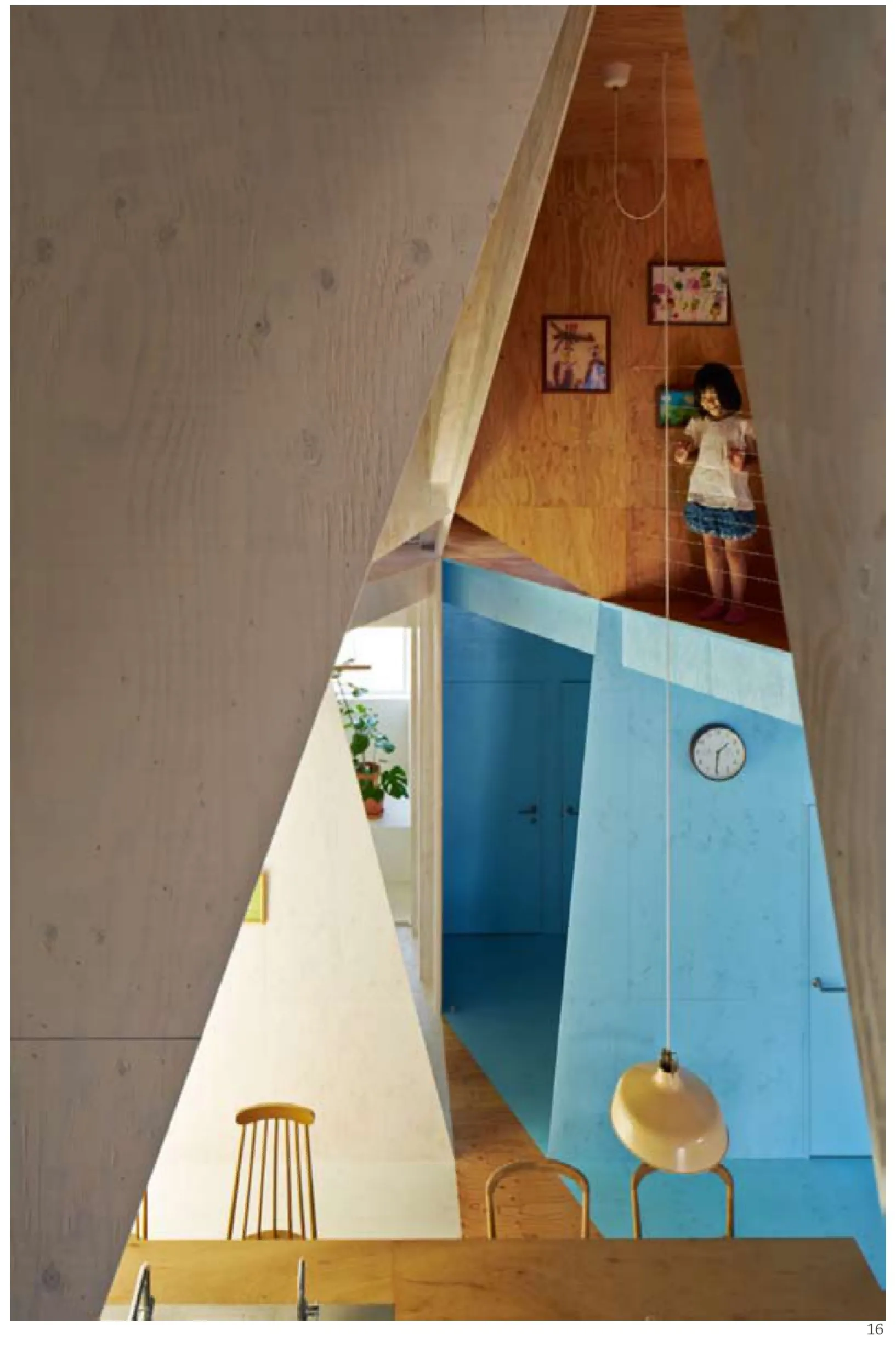
16-17 内景/Interior views
WA:色彩在这个项目中的作用是什么?
河内一泰:我希望在室内形成一种拼凑的视觉效果,所以采用了4种颜色去强化设计中的几何元素。
WA:本项目中最具创造性和吸引力的设计是什么?
河内一泰:原有建筑中有许多房间,所以我用一个洞来连接所有的房间。本项目中最大的亮点就是在分割的同时也进行了连接。
WA:在设计过程中最困难的部分是什么?
河内一泰:最难的部分就是洞的形状。现在建筑采用的是木结构的网格。而我所做的则是在这个现有的三维网格系统之外切出各种二维的三角形和四边形。我的基本原则就是二维形状不应遵循三维的网格系统。比方说,其中一个三角形就跨越了首层和第二层之间的网格,这样也就超出了X轴和Y轴组成的平面。通过这种手法,一种超越了三维网格系统的新颖视觉效果也就应运而生。
WA:使用者和社群的反馈如何?
河内一泰:洞口的尺寸都是根据房间的私密程度来进行调整的。使用者可以根据活动类型来选择所需要的空间。业主反映他们都很高兴能够感受彼此在居所内的存在。
WA:本项目是如何提升公共空间品质的呢?
河内一泰:原有建筑位于丁字路口的尽端,因此设计时我特意增加了一个面向街道的大窗。□(张弦 译)
WA: What is the role of the colour in this project?
Kazuyasu Kochi (KK): I wanted to see a kind of patchwork scenery inside the house. So I used 4 colours to emphasize the geometrical elements.
WA: What is the most creative and attractive solution?
KK: Existing building has many rooms, so I put a hole to connect each room.
The most attractive solution is "dividing and connecting at the same time".
WA: What was the most difcult part in the process of design?
KK: The most difficult part was the shape of the hole. The existing building already had the grid of the wooden structure. What I did was cutting out diferent two-dimensional fgures from this grid in the shape of triangles and quadrangles. My rule was that the 2D figure should not follow the 3D grid. For example, I cut a triangle across the first and second floor, in other words, between the X and Y coordinate plane. Te efect is a new kind of scenery,one that goes beyond the original 3D grid.
WA: What is the feedback from the users and the community?
KK: The size of holes is adjusted by privacy for rooms. Users can choose their place depending on activity. Client said that they are happy to feel each other's existence in the house.
WA: How did this project improve the quality of the public space?
KK: Existing building located at the end of a T-intersection. So, I put a new large window facing to street.
评论
方晓风:这个改造项目内外反差很大,建筑师的平面造型能力与空间塑造能力都是一流的,最终效果可以称为反立体主义——奇特的立体感来自平面的色块而非体积塑造。尽管内部切割空间的手法显然是受立体派的影响,这仍然是个富有东方味道的设计,整体观感是轻快的,空间效果也十分丰富。评论这个项目的困难之处在于,照片可能来自特定的视角,更随意、平常的室内观感如何呢?局部是否有点凌乱呢?视觉穿透带来的拼贴感经得起时间的考验吗?无论如何,从这个项目可以感受到来自视觉艺术其他门类的影响,建筑的可能性在大大拓展。
庄子玉:设计师在整体平面格局和结构体系框架依然基于传统的正交体系的基础上,巧妙地通过三角形开洞的介入方式改变了原有的正交体系格局,并通过洞口的错位将新的视线与领域感的交叠关系代入到每一个细分空间之中。色彩在其中将这种新的介入所带来的边界属性及视线层次进一步明确。结果一方面带来了室内视觉空间的丰富度和层次感,另一方面也带来了大量的不确定性和不稳定感。建筑外表皮的平实和内里激进状态形成了鲜明对比,加之窗口所透出的些许跳色亦暗示了其内部的巨大“能量”。
Comments
FANG Xiaofeng: The renovation project brings contrast from inside and outside of the apartment. Te graphic modeling and space creating abilities of the architect are the best of its type. And the fnal efect can be regarded as anti-cubism: the unique 3D sense comes from graphic coloured grids instead of volume. Tough the method of internal spatial segmentation is obviously infuenced by cubism, it is still full of unique eastern characters, with brisk overall impressions and spatial effect. One thing is that, the pictures might be taken through specific angles of view, how about the more casually and ordinarily indoor impressions?Will any part be in a mess? Can the sense of splice brought by visual penetration stand the test of time?Anyway, we can feel the influence of visual arts and other categories, which provide more possibilities for architecture.
ZHUANG Ziyu: Tis Japanese refurbishment project seemingly aims to break the perception of orthogonal system. In an effort to achieve that, the architect cuts diagonal openings into the walls of the rooms,opening corners and visual connections, where none existed before. At the same time the actual layout of the floors remains unchanged, in an effort to marry the advantages of the 90°angle with the freedom of a loose shape. The function of the colour is here clearly to strengthen this effect: the lines between diferent coloured patches follow more the visual axes,which are newly created, and counterpoint the rooms. This tendency is sometimes leading to the point of the eclectic. The façade is purposefully reduced in its appearance, the light green colour from before is replaced with a clean white, and balconies and other façade elements are reduced to a minimum. Tis leads to an emphasis in the multicoloured rooms that show themselves through the large windows, like paint blots on a white canvas. Te question remains that if this highly interesting approach creates a long-term suitable place for living, or if the residents will later start missing the calmness of conventional layouts.
Apartment - House, Chiba, Japan, 2014
Architects: Kazuyasu Kochi/Kochi Architect's Studio
