MK-CK5生产办公楼,北揽府,泰国
2016-08-06建筑设计agaligo工作室
建筑设计:agaligo工作室
MK-CK5生产办公楼,北揽府,泰国
建筑设计:agaligo工作室
为了庆祝MK餐饮集团从私人机构成功转型为一个崭新的公司,集团决定建造一个全新的中央厨房,也就是CK5。MK餐饮集团在泰国已有27年的历史,以其物美价廉的火锅餐饮以及敢于开拓的企业文化而闻名。MK餐饮集团是泰国连锁餐厅里第一家使用电火锅、便携点餐设备、感应炉、自助点餐平板、机器人服务员等新颖设施的。集团的一大创举是设计了一种被称作“Condo”的红色餐饮托盘。这种“Condo”托盘不仅可以垂直叠放,从而给储存和服务带来方便,同时也为餐桌节省出了更多的空间。“Condo”也最终成为了MK集团的品牌标志。事实证明,由业主在开店早期自行设计的这种红色托盘最后也成功地替代了那些不实用的圆形托盘。如今这种红色的“Condo”已经被同行们竞相模仿,从而广泛流行于泰国的各家火锅店中。
CK5项目就坐落在Bangna-Trad高速公路旁。设计者意图通过建筑来体现MK集团的品牌特征。整个项目是由中央厨房和主办公楼两部分建筑组成。业主希望该项目不仅仅是一个生产性的厨房和办公室,同时也能够成为游客们了解MK餐饮制作、食物分发的博物馆。除此之外,业主还要求办公室大楼在整个项目中处于“主角”的地位。
为了达成这种效果,从建筑的角度来说这个项目需要采用一种清晰的形式表达来吸引大众的关注。设计方案必须能展示公司的事业蒸蒸日上,而且还随时准备开拓更大的领域。所以这座建筑应该是新颖的、有趣的、富有意义的,最重要的是易于解读的。因此在第一次会议上,设计者向业主提出了“动感的红色盒子”这一概念。这个构思一经提出就得到了业主的充分认可,后来再也没有改变过。
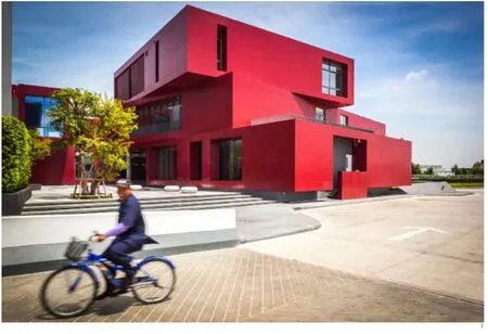
这座大楼由6个功能各异的红色盒子组成,分别用于展览、办公、聚会、会议、实验和空间转换。大楼外墙表皮采用了暗红色的铝复合板。选择这种特定的暗红色是为了能与MK集团标志性的“Condo”的红色相协调。建筑主要朝向避免了阳光直射,将大面积的窗户都面向北方,这样可以更好地采纳自然光从而减少人工照明。在建筑流线设计上,设计方案使得参观者不仅可以在不造成干扰的前提下近距离地观察餐饮生产系统,甚至还能够在参观途中亲身体验部分特定食物制作站的工作。此外,项目采用的变频多联空调系统也使得整个建筑更为节能。建筑内部则一直保持着空气正压,这样能确保在任何时候潮气、杂质和病菌等都无法进入建筑物。


1.2 外景/Exterior views
景观设计也对强化设计理念起到了至关重要的作用。办公大楼周边的区域就宛如一张摆着火锅的桌子。椭圆形状的浅池象征着一个寿喜火锅,而地面的拼装图案则是仿照了盛满食材的沸腾火锅。设计师首先通过计算机编程将像素化的图像转化为一系列的平铺矩阵,然后根据这个矩阵在池内铺装彩色的六边形瓷砖来掌控整体的图案效果。
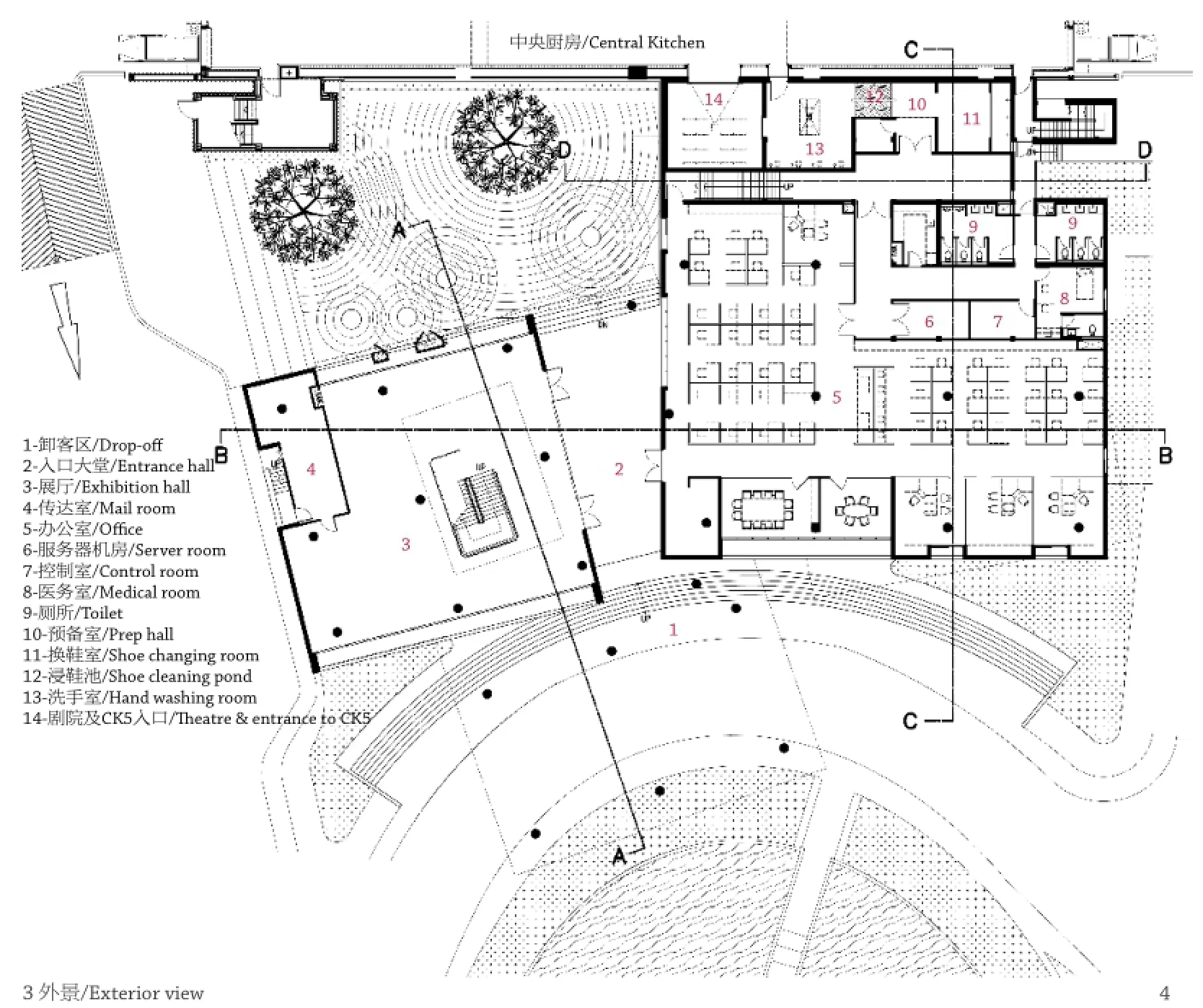
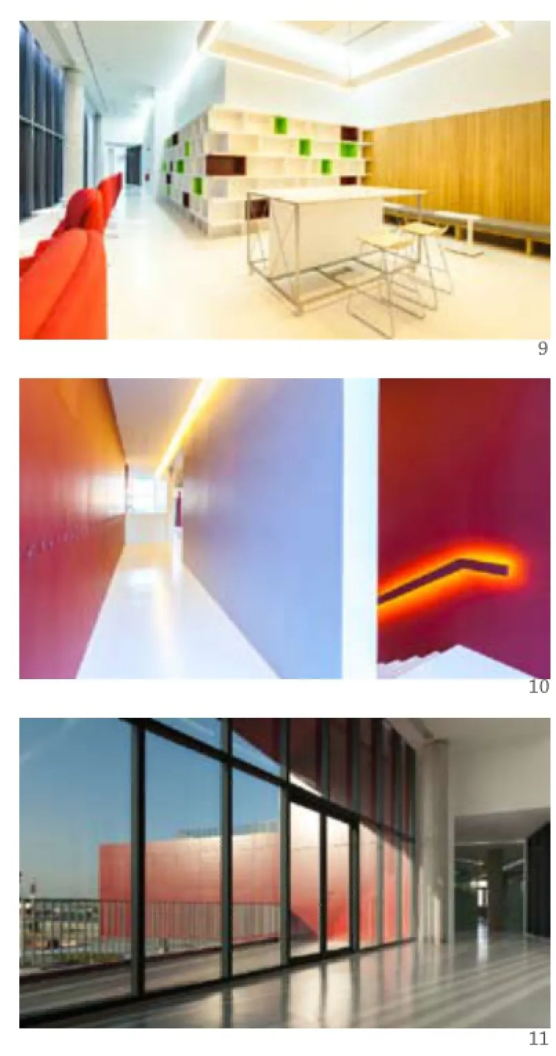
室内设计则主要采用了开放的规划理念。主楼梯间从首层直通到顶层,楼梯间的外壳则是用2000多个回收的旧罐子盖组成的半透明屏幕。会议室采用了与“Condo”托盘相同的形状,都围绕着主楼梯间布置。会议室的玻璃墙印有渐变白色图案,由下部的白色渐变至顶部的透明玻璃。这种设计不仅为会议室提供了半私密的空间,同时还营造出一种吃火锅时蒸汽腾腾的气氛。此外,地面上还都设置有图案指示来引导游客,将他们从过渡性的卫生室和迷你剧场引领至中央厨房。
由于这座大楼本身是用来制作食物的,因此在夜间也能够全方位地运营。通常从凌晨4点开始就陆续有客人造访,这对办公建筑来说是一个相当特殊的运营时间。这也就要求设计者在外部空间和内部空间都要进行密集的照明设计。外部照明设计主要与建筑形式相协调,因此在建筑外部并没有非常明显的光源体,只是对平面、体块和空间进行了照明。与此同时,室内照明设计则起到了另一个作用,那就是给整座建筑带来了一种从内部发光的感觉。内部光源的图形排列方式主要是根据室内功能和家具布局来设计,这样可以给室内活动添光加彩。□(张弦 译)
项目信息/Credits and Data
主持建筑师/Principal Architects: Sitt Therakomen,Preechaya Terakomen
景观设计/Landscape Design: OpenBox
室内设计/Interior Design: Storage Studio
灯光设计/Lighting Design: Studio Accent
平面设计/Graphic Design: Work In Bangkok
工程设计/Engineering: EEC-IE, A+ Consultants
面积/Area: 3023m2
竣工时间/Completion Time: 2013
摄影/Photos: Spaceshift Studio

3 外景/Exterior view4 首层平面/Floor 0 plan
To celebrate the transformation of a private organization to a brand new public company,MK Restaurants Group PCL decided to establish a new Central Kitchen, CK5. MK Restaurants is widely known in Thailand for 27 years for serving affordable hot pot meals of high quality as well as pioneering many innovative movements. It was the first chain restaurant to implement the use of electric pots, handheld ordering devices, induction stoves, self-ordering table tablet technology, robot service staf, and etc. One of MK's earliest creations that eventually become its brand signature is the red trays, also called the "condo," that are able to stack up vertically, allowing easier storage, convenience in serving, and extra space on the dining table. Designed by the owner himself since the early days of the business, it proves an inventive substitute for impractical round plates. The use of the red condos is now common in every hot pot restaurants throughout Thailand, and is often imitated by the competitors.
CK5 project is located on Bangna-Trad highway. Te infrastructure is designed to embrace the brand signatures of MK and is composed of two buildings attached together-the Central Kitchen and the main office building. The client made a requirement that this project not only be just another industrial kitchen with an ofce, but also a live museum to welcome visitors who are interested in MK Restaurant's efficient food production and distribution system. On top of that, the client requested that the ofce building play the role of a "leading actor" the project.
To fulfill this exciting reuqirement, from the architectural point of view, MK needed a new building with a lucid formal expression in order to capture public attention. The design should demonstrate that the company has achieved another level of success and that it is ever ready to progress to the grander realm. Fresh, interesting, meaningful,and above all, easy to read should be the keywords of this building. The concept of "Red Boxes on the Move" was therefore proposed to the client in the first meeting. It was so well received that it has never changed ever since.
Te building consists of six red functional boxes: exhibition, ofce, meeting, conference, experiment,and transition. Dark red aluminum composite panels were used for external wall cladding. Certaincoded dark red colour was purposely selected to reconcile with the colour of MK's signature condo. The building is oriented to avoid direct sunlight while the large windows are positioned to face thenorth in order to admit natural light, reducing the use of artificial bulbs. The circulation of the building was designed to allow visitors to be able to closely observe the food production system without interference and also to participate in certain stations during the facility tour. VRF (Variable Refrigerant Flow) air conditioning system was installed throughout the building for better energy saving. Positive air pressure is maintained at all times to ensure moisture and unwanted matters and germs do not enter the building.
Landscaping also plays a significant role to enhance the core concept. The area around the main ofce building represented a hot pot table. A large, shallow pool in an oval shape was laid out to symbolize a suki pot. Te tiling pattern was derived from a boiling pot full of food ingredients. Trough computer programming, a pixelated image was generated to produce a series of tiling matrices,and using this series to govern the overall pattern,colourful hexagonal tiles were then meticulously arrayed on the inner side of the pool.
The interior of the building mainly adopted an open planning concept. The main staircase is wrapped from the ground level to the top floor with a translucent screen made of more than 2,000 reclaimed old-unused pot lids. Te meeting rooms of the same shape of the condo were discreetly exhibited around the main stairs. Built with glass walls printed with a gradient white pattern, the setup provides semi-privacy and suggests an ambience of boiling steam, having its white gradient covering the lower part of the glass. Additionally, in guiding the guests around the ofce space, directions are advised via the graphics on the foor, leading visitors to the Central Kitchen through a transitional hygiene room and an introductory mini theater.
Since the whole infrastructure supports a full work operation at night due to its food production nature, guests usually start their visit around 4am, a rather unusual operating time for an office building. This requirement calls for an intensive lighting design for both exterior and interior spaces. The lighting design for the exterior supported the architectural forms, and therefore, there is no visibility of light sources, and only planes, masses,objects, and spaces are lit. Meanwhile, the interior lighting design plays another role. The interior lighting gives a sense of glow from the inside out. Interior light sources are graphically arranged to conform to the room functions and furniture layouts in order to celebrate the activities inside the building.

5 立面/Elevation6.7 剖面/Sections8 外景/Exterior view

9-11 内景/Interior views
评论
张利:这是一个通过水平体量的叠合来降解办公建筑尺度的实例。体量的错动一方面形成活跃的阴影,与实体感很强的红色相得益彰;另一方面则自然地在各层形成空中的露台空间。美中不足的是金属板的分缝,它与红色的实体感并不兼容,在转角处尤显局促。
庄子玉:转折的体块与厚度的叠加和巧妙的搭接及细部处理使此项目在体块策略上显得非常成功,然而与之相应的色彩策略则略显单调。固然作为业主形象的代表的“Condo”红色餐饮托盘是其再现的主要意向,但项目也为此失去了通过更多的色彩选择配合处理功能分区关系或重塑空间线索的可能,比如西萨·佩里的太平洋设计中心或伯纳德·屈米的拉维莱特公园。景观设计和室内设计亦有其独立的特点和表达,然而与建筑的关系特别在形式和色彩的关联性和交叠处理上略显不足,使人始终无法把握到一个项目完整的意向。
Comments
ZHANG Li: This is a good example of creating better scale in an ofce building by stacking horizontal volumes. The rotating of the volumes produces sharp shadows that speak well with the solid red wrapping the whole building. Various balconies are also achieved through this treatment. Te Achilles heel of the building is the joints in the metal cladding. They are the antitheses of the monolithic red, particularly in the corners.
ZHUANG Ziyu: This building houses a variety of diferent functions: laboratory areas, ofce space and exhibition rooms. Tese diferent requirements arrive at a direct expression in the shape of the building: each of them is housed in a rectangular box, which are stacked on top of each other. With a strong attention to details, the foors are executed in double thickness,as to avoid an intersection of the boxes. While colour is often used to accentuate diferent aspects of a building,or make monotonous spaces more differentiated, in this case the opposite is the case: Te entire building is seemingly dipped in a paint bucket and left in a strong crimson red in an attempt to have the diferent boxes strongly resemble each other. Colour also plays an important role in the projects exterior: a mosaic like painting, reminding of a hot pot defines the arrival plaza. In a very direct citation of the classic modernist theme of art as part of the building, strong colours form a direct counterpoint to the harsh edges of the main building. Unfortunately this concept is not truly connecting the two plazas in front and behind the diferent boxes, but instead they remain isolated, what seems like a missed opportunity to have building and surrounding come together, and leaves it a little bit detached. The curved shapes that are used for both sides landscape design is not continued through the gap between exhibition space and building, and instead where you should feel as if you would be standing between boxes, you fnd yourself inside one.
WA:色彩在这个项目中的作用是什么?
希特·希拉科曼:色彩在这个项目中起了重要的作用。暗红色的建筑色彩来自于MK集团标志性的红色托盘。红色托盘最初是由MK集团的创始人设计,现在已被广泛地应用于泰国所有的火锅餐厅,这其中甚至包括了MK集团的竞争对手。这个特定的色码也是精心挑选的,它能够精确匹配MK的红色托盘。因此,色彩不仅展示了企业的个性,同时也代表着企业的起源。
WA:该项目中最具创造性和吸引力的设计是什么?
希拉科曼:本次设计中最具创造性和吸引力的亮点是在建筑的形式和功能之间找到一种平衡,从而能够精准地表达企业的理念,也就是在保持食品质量和服务质量的同时还能寻求乐趣、幸福、新鲜和创新。此外,企业还希望方案能展示他们对更大挑战的渴望。由于MK集团刚刚转型成为一个公共公司,集团同时还将这个项目视为一次盛大的庆典,为了实现这些诉求,设计师将5个办公室部门分别设置在5个盒子里面,并用“动感的红色盒子”这个理念来串联他们(请参照设计理念图示)。将5个部门分开布置在5个独立的盒子中,对于日常管理和机电系统配置来说也是非常合理和实用的。整个设计的成果是让人兴奋同时又充满内涵的。当看到第一版设计草图的时候,所有人都非常激动。
WA:在设计过程中最困难的部分是什么?
希拉科曼:在设计过程中最困难的部分是将信息转化为易于解读的建筑语言。我们把所有的信息都集合在一起,包括对企业历史的一些思考、建筑结构以及工程方面等等,并试图从这些信息当中创建一个形式上的表达。
WA:使用者和社群的反馈如何?
希拉科曼:此项目投入全面运营以后不仅迎来了泰国本土和世界上其他国家的各种访客,同时也引起了许多来自食物和设计相关领域的学生们的关注。通过这次建筑和室内的设计,MK集团内部的员工和社会上的普通大众都开始对集团的设计理念给予了更多的关注,这在MK集团后续的产品和服务方面体现得尤为明显。许多MK其他办公点的员工甚至都想搬到这座大楼里来工作。这座大楼不仅干净整洁,同时也舒适而有趣。此外,集团董事更是经常引用这座建筑来描绘企业的发展愿景。项目同时也被视为集团大获成功的“时光印记”。
WA:此项目是如何提升公共空间品质的呢?
希拉科曼:该项目位于班皮工业区。整个地区遍布着工厂、办公室和仓库。大多数建筑都平淡无奇、毫无个性,同时尺度也不宜人。唯一的公共空间就是混凝土马路。因此,这座个性鲜明的红色CK5大楼很快就成为了该地区的标志性建筑。由于大楼极强的辨识性,出租摩托车开始在大楼前聚集。随后,街头小贩也多了起来,使得这个片区成为附近工厂工人和雇员们主要的集聚场所。可以说,在给死板的工业道路吸引人气、增强活力这方面,这座大楼至少让我们看到了希望。
由于安全等级的原因,CK5大楼设置了围栏,但是项目的景观设计却采用了大量的大型树木。这种做法对混凝土路面遮荫和冷却周边空气温度起到了很大的作用。
WA: What is the role of the colour in this project?
Sitt Therakomen (ST): The colour plays an important role in this project. Te colour of dark red was derived from MK's signature red tray used for serving food on the table. Te red tray was originally designed by the founder of MK and it is now widely used in all hot pot restaurants in Tailand (even the competitors use it). The colour code was carefully selected to precisely match that of the red tray. Therefore, it represents the corporate identity as well its origin.
WA: What is the most creative and attractive solution?
ST: The most creative and attractive solution is to find a right balance between form and functions of the building that expresses the corporate philosophy: fun, happiness, fresh and new, while maintaining quality of the food and service. The corporate also shows its eagerness to meet new challenges and it has just moved to another level to be a public company, of which they wanted to give it a grand celebration. In order to achieve this,we (the designers) formalized 5 ofce departments into 5 boxes and tied them with the story of "red boxes on the move" (please find the attached conceptual diagram). Te 5 departments separated in 5 distinctive boxes are very practical in terms of management and M&E systems. The result was a provocative architecture that embraces profound meanings. Everybody was so excited when they saw the frst schematic design.
WA: What was the most difcult part in the process of design?
ST: Te most difcult part in the design process was to interpret the information into the understandable architectural language. We put on the table all the information ranging from the corporate history including insightful thoughts to building structure and all engineering aspects, and tried to create a formal expression from it.
WA: What is the feedback from the users and the community?
ST: After the building was fully operated, it has been welcoming many visitors from both in Tailand and from many countries as well as groups of students mostly from food and design related felds. According to the new architectural design and interior design, employees (also the public) are getting more design awareness of the corporate which later became noticeable in all MK's products and services. Many employees from some other facilities even want to move to work in this building. It is clean, wellorganized, comfortable, and fun. Moreover, the board usually mentions this building as a metaphor to realize the corporate vision. It is also referred to as a "time stamp" of corporate success.
WA: How did this project improve the quality of the public space?
ST: Te project is situated in the industrial district of Bangphi. There are factories, offices, and warehouses throughout the area. Most buildings are bland, faceless, and absence of human scale. Te only public space is the concrete road. Te distinctive red CK5 building quickly became a landmark in the area. The motorbike taxis start to accumulate in front of the property because it is easy to reference,followed by street vendors around the site making it a gathering place for workers and employees from the nearby factories. It at least has given some hope to add more activities to the lifeless industrial road. Although it is a fenced facility of high security,its landscape with a large number of big trees contributes greatly to shading the concrete road and cooling air temperature.
MK-CK5 Production Ofce, Samutprakarn, Tailand, 2013
Architects: agaligo studio
