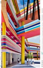
鲜艳色彩的平民主义与精英主义
2016-04-06张利
张利
鲜艳色彩的平民主义与精英主义
张利
什么是好的色彩?在人类的文明史上,我们明显地看到两种截然相反的取向:更多的色彩是更好的色彩,更少的色彩是更好的色彩。当然,这里的多或少不仅指色相的多少,也同样指色彩饱和度的高低。一般情况下,我们会把前一种取向与人类初始时期的朴素冲动联系在一起,因而为了强调教育与文化所带来的启蒙,我们会用后一种取向代表一种更为“文明”、更经“教化”的色彩价值观:西方基督教文化中的“色彩恐惧症”,中国传统宋明建筑装饰相对于清朝彩画的气定神闲,直至20世纪后期至今无处不在的“博物馆白”与“建筑师黑”,对色彩的谨慎已经深深地融入了中产阶级自我怀疑的焦虑之中。
有趣的是,在全球化的今天,当“无色彩是最好的色彩”随世界各地城市的中产阶级化而无处不在时,我们又不得不借助另一种色彩价值观来再次实现与公众共识划清界限。因而鲜艳的色彩被再次重视,原始的冲动再次成为 “返璞归真”、教化之再教化的升华途径。这一实际上是源于知识性的文化批判的动向,带有一种故意混淆阶层的企图:表面上它以“返璞归真”提示其“平民主义”的社会关怀,深层中它则很可能是对不再具备识别性的过去的精英主义标识的更新,是事实上的升级版本的“精英主义”。正是“平民主义”与“精英主义”的彼此纠缠,造就了当代建筑中鲜艳色彩空间的复杂图景。
当代建筑对鲜艳色彩的最常见使用是用强烈色彩的二维化对三维空间进行某种程度的消解,从而实现一种源于平民传统,却带有不确定性与抽象性的建筑方法。视觉上,它会让人想起文丘里在后现代主义建筑时期所提出的“向拉斯韦加斯学习”的广告化,但在实质上根本不同。墨西哥帕丘卡斯的拉斯帕尔米塔斯社区能够在当代成为与希腊的圣托里尼风格对立的旅游目的地,完全因为其由所有邻里墙面连成的巨幅彩绘,有趣的是这一彩绘并不关注传达具体的意义,而是仅仅关注对社区房屋聚落体量感的消除。类似的,在当代城市中大量使用的涂鸦墙面,比如在奥斯陆,也是对相对混乱的城市界面进行抽象简化的非常有效的手段。
鲜艳的色彩在当代建筑中有时被直接当作建筑材料来使用,醒目色彩的交替被用来解决以前需要依靠材料的交替来解决的问题,这也是一种源于平民化传统的抽象。这种鲜艳色彩的“材料性”最集中体现在对尺度的表达。当建筑项目本身的预算并不充裕,而建筑师又不想放弃在城市中建立明确的尺度立场的机会时,这种色彩“材料”的使用就显得尤为有效了。如果没有作为材料的色彩,本期所收录的阿姆斯特丹-赞丹酒店不可能达到其现在与周边街区诙谐的尺度对话。类似的情况也出现在维也纳布琛大街的社会住宅中。不过色彩“材料”并不局限于低造价项目之中,事实上,本期所收录的阿姆斯特丹香奈尔水晶屋从任何角度讲都是高造价的项目,也正是充裕的投资使作为实际材料的玻璃砖营造了作为虚拟材料的整个墙面的渐变色彩,而且建筑对色彩的表达也不再限于反射色彩,而是有了折射、透射等多种方式。
鲜艳的色彩当然可以在当代建筑中直接被用来表达价值观,而且往往因其引人注目的配色方案而戏剧性地加大表达的强度。它不再拘于平民传统,而是带有明白无误的社会评论属性。这其中,以鲜艳色彩所表达的最“安全”的价值观是关于社会的未来——儿童或少年的——人们一般不会对彩虹配色空间与儿童生活的联系产生太多的怀疑,无论这种表达是相对克制的,比如本期收录的索易儿童成长中心;还是声嘶力竭的,比如本期收录的南洋小学扩建项目。如果说少儿空间的彩虹母题已是司空见惯了的话,那么依赖单一鲜艳色彩所形成的巨石式的超现实空间则无疑先天拥有了尖锐的社会批判性格。纯度极高的萤光色彩出现在某一建成空间的所有大小界面,这本身就是与人们的空间经验极度相悖的,也恰恰是促使人们在空间中思考的动力:从思考企业的行为模式,如本期收录的北揽府MK-CK5生产办公楼,到思考公共空间与私有空间、自然与人工之间的定义与联系,如鹿特丹的黄色步行桥和本期收录的林茨黄屋等。
Te Populism and Elitism of Vibrant Colours
ZHANG Li
清华大学建筑学院 /《世界建筑》 收稿日期:2016-07-10
What is good colour? In the story of human civilisation we see two opposing trends: more is better; less is better. Of course the "more or less" here refers not only to the number of colours, but also the level of saturation. Usually, we would tend to associate the "more" camp with the basic impulses of primitive societies while regarding the "less" camp as the product of education and enlightenment. Evidence of this attitude can be found throughout the last millennium, from the "chromaphobia" of Christianity, to the serenity of the Song-Ming Chinese Art when compared to the vulgarity of Qing Art, to the ubiquitous "Museum White" and "Architect Black" in recent decades. It is fair to say that the caution towards the use of vibrant colours has already been deeply embedded in the self-doubting anxiety of the new middle class.
Ironically, in the globalised world of the 21st century, after "zero colour is the best colour" has become the new middle class norm, something new about colour has to be set up again to distinguish the views of the elites from those of the average public. Tis something new once again is the re-valuing of vibrant colours, in which primitive impulses have become a means of returning to the origin, a re-education of the educated. Being an intellectual move in cultural criticism, this re-valuing of vibrancy is determined to blend class implications. On the surface it is apparently populism, deep inside it is an upgraded elitism. And it is the blend of populism and elitism that has made the complex panorama of vibrant colours in architecture today.
Te 2D-ness of vibrant colour compositions can be used to dissolve the 3D-ness of architecture spaces, ending up with an approach that combines both popular tradition and contemporary ambiguity and abstraction. Visually it may look like Venturi's "learning from Las Vegas" type of consumerism; philosophically it is a totally diferent beast than Venturi's. Te giant mural in Las Palmitas in Mexico shows a convincing example. It is rightly the ultra-vibrant meaning-free mural that overrides the clustered volumes of the neighbourhood houses, making the whole area a worthy tourist destination that is the antithesis of Santorini. Similarly, the use of giant grafti in urban interfaces, such as the generic street walls in Oslo, is a widely adopted approach in the making of some 2D order out the 3D mess.
Very often, we see vibrant colours in architecture taking the role of materials. The joint of colours are used to provide solutions that are usually done through the joint of materials. There is an intention to achieve popular abstraction here. It is best when used to present a statement in building scale. In projects of modest budgets where architects insist on providing gestures about scale, vibrant colours can be efficient assets. Without them, Hotel Amsterdam-Zaandam wouldn't have spoken so well and so humorously to its context. Similar things can be said on the apartment buildings in Buchengasse Vienna. But the use of vibrant colours as materials doesn't only apply to low-budget projects. The Chanel Crystal Houses are by no means a low-budget project, yet its use of glass bricks and the capitalisation on their colourful optical distortions are the key to the success of the whole facade as one gradient-colour-fll.
Vibrant colours can be used in direct presentation of ideology. More vibrant the colours are, the stronger the voice will be. Being a means of delivering straight-forward social criticism,there is no more need of limiting to popular tradition. Te safest ideological use of vibrant colours is the connection to the very youthful. Very few people would question the association of rainbow colours and the spaces in kindergartens and primary schools, no matter this association is expressed with constraint,like in Soyoo Joyful Growth Center, or by exhausting the highest pitch possible, like in Nanyang Primary School Extension. If rainbow colours and youthful spaces is a common motif, the monolithic use of single ultra-vibrant primary colour throughout a building, and the surreal contrast between the building and its context, is anything but common. It bears unmistakable critical identity. Te counter-intuitive existence of a single bright colour creeping over all surfaces of a building is itself a drive to refection. It can be a refection on patterns of economic production, like the MK-CK5 Ofce Building; it can also be a refection about publicprivate, inside-outside and natural-artifcial, like the Footbridge in Rotterdam, or the Yellow House in Linz.
