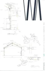
蓬皮杜梅斯中心,梅斯,法国
2014-02-20建筑设计坂茂建筑事务所加斯蒂讷建筑事务所
建筑设计:坂茂建筑事务所,让·德·加斯蒂讷建筑事务所
蓬皮杜梅斯中心,梅斯,法国
建筑设计:坂茂建筑事务所,让·德·加斯蒂讷建筑事务所
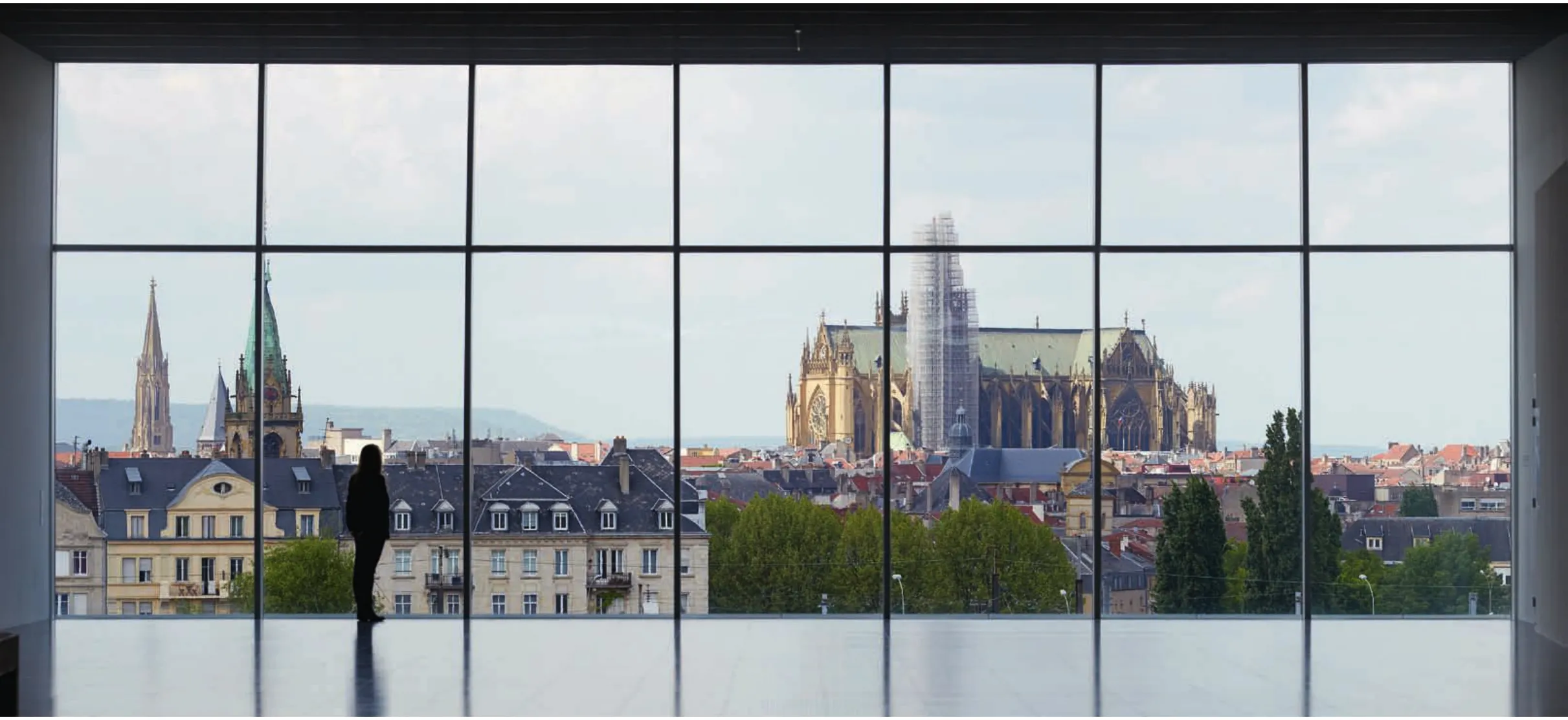
1 内景/Interior view
开始着手设计的时候,我首先想到的是与当今全球艺术博物馆有关的两种现象。第一种趋势即早已广为人知的“毕尔巴鄂效应”,始源于弗兰克·盖里在西班牙毕尔巴鄂设计、1998年建成的古根海姆博物馆。当时的设计策略是要以雕塑般的建筑形态为这个在国际上默默无闻的城市吸引大量游客,最终取得了成功。但有人认为,这样的建筑其实视艺术家与博物馆员工的需求于不顾,对建筑功能造成破坏,虽由此形成了建筑师个人的纪念碑,却也使博物馆的艺术作品展示和欣赏条件惨不忍睹。
而另一个极端的例子则是对工业建筑的改造更新,无论其建筑物本身如何中立而平淡,都要为艺术作品的展示提供最佳的空间条件。伦敦的泰特当代美术馆,2003年建成的位于纽约北部、为迪亚艺术基金会设计的迪亚贝康美术馆等,都是此类较为成功的案例。相比起这两种极端的选择,我更想创造出一种能在为艺术品的展示与欣赏提供方便的同时、也让建筑物本身在参观者脑海中留下深刻印象的设计理念。
为了提供功能空间,我将功能布局分散为一列简单的体块,以明晰的流线穿插其间。这些空间以三维的方式组织在一起,以简化其功能上的内在关系。
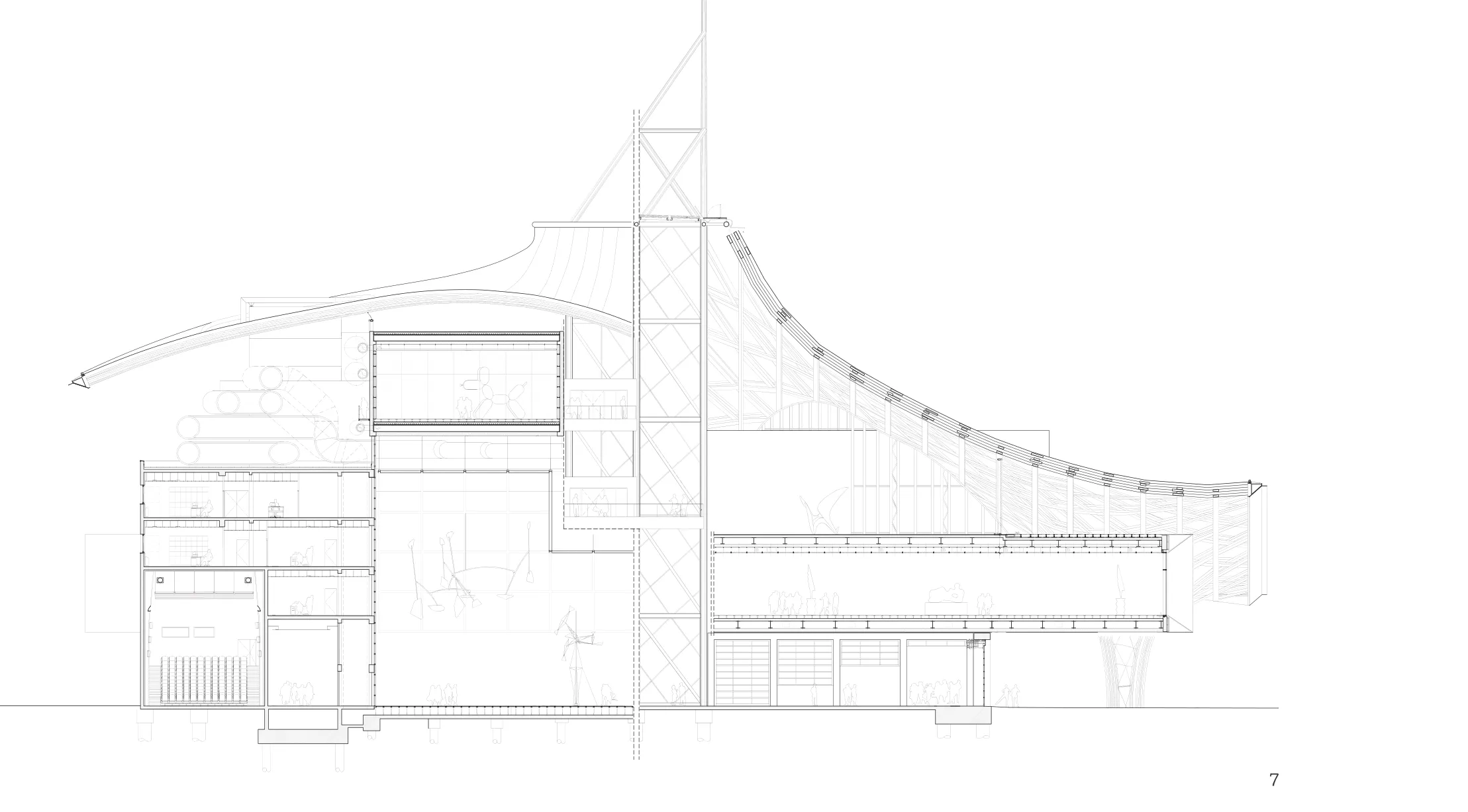
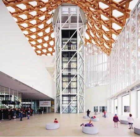
根据画廊对距离的不同要求,我以15m跨度为模数,设计了3个纵深长达90m的长方体。这3个管状的长方体彼此垂直叠加,略有错动,并在附近布置了一个六边形的钢框架核心筒,核心筒内部是楼梯与电梯。在这3个叠错的展厅方管形成的层叠天花之下,正是大中庭展廊。
这座蓬皮杜中心附属建筑物的主要功能是为公众展示更多的艺术作品(在巴黎仅仅展出了其所有藏品的20%),并为在净高仅5.5m的巴黎博物馆无法展出的超大件作品提供展览空间。为了满足这些要求,大中庭展廊的最大净空高度保持为18m。
建筑物的地段位于目前火车站的南侧,这里原先用作调车场,在市中心北侧。为了保持建筑与城市空间肌理的延续性,在3座展厅方管的尽端分别设计了朝向各个城市纪念性建筑方向的大面积观景窗。通过这一策略,建筑物与城市融为一体。从最顶部的3层展厅方管观景窗能欣赏到作为梅斯市象征的大教堂,站在2层的展厅方管观景窗前则可将中央车站的景象尽收眼底。由于梅斯的位置非常靠近德国边境,加之历史上曾发生多次战争,这座城市的权属在法国与德国之间几易其手。因此,这座建于德占期间的新罗曼风格车站便成为了城市历史的重要组成部分。
My first thoughts when beginning the design were two recent phenomena concerning art museums throughout the world today. The first trend, which has become widely known as the "Bilbao Effect", was born from the Guggenheim Museum in Bilbao, Spain, designed by Frank O. Gehry and completed in 1998. The strategy was to create sculptural architecture in an internationally unknown city to draw tourism, and it was ultimately a success. But there is an opinion that this kind of architecture spoils its functionality by disregarding the concerns of artists and staff, to produce a personal monument resulting in poor conditions for displaying and viewing art.
As an example at the other extreme, there is a method of renovating old industrial architecture to produce an optimal space for the exhibition of works, however neutral the architecture may be. The Tate Modern in London, and the Dia:Beacon completed in 2003 in upstate New York for the Dia Art Foundation are such successful examples. Rather than choosing either extreme, I thought to create a design concept which considered the ease of displaying and viewing art, while architecturally leaving a deep impression with visitors.
In order to create functional spaces, I articulated the program into simple volumes with a clear circulation amongst them. They were arranged three-dimensionally, in order to simplify their functional interrelationship.
The general galleries with varying requirements for lengths were based on a 15m wide module to create three simple square tubes with long, 90m deep rectangular volumes inside. The three tubes are stacked vertically and arranged around a hexagonal steel frame tower which contains the stairs and elevators. The space created beneath the tiered ceilings of the three shifted Gallery Tubes make up the Grand Nef Gallery.
The main purpose for this annex to the Centre Pompidou was to be able to show more works to the public (only about 20% of the entire collection is exhibited in Paris), and to be able to display the very large works that cannot be shown in the Paris museum due to the 5.5m ceiling height under the beams. To accommodate this requirement, 18m was maintained as the highest ceiling height under the Grand Nef Gallery.
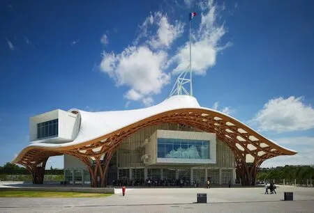
2 外景/Exterior view
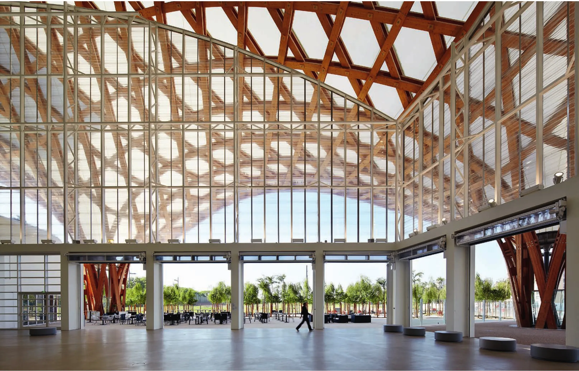
3 内景/Interior view
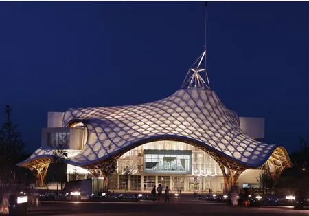
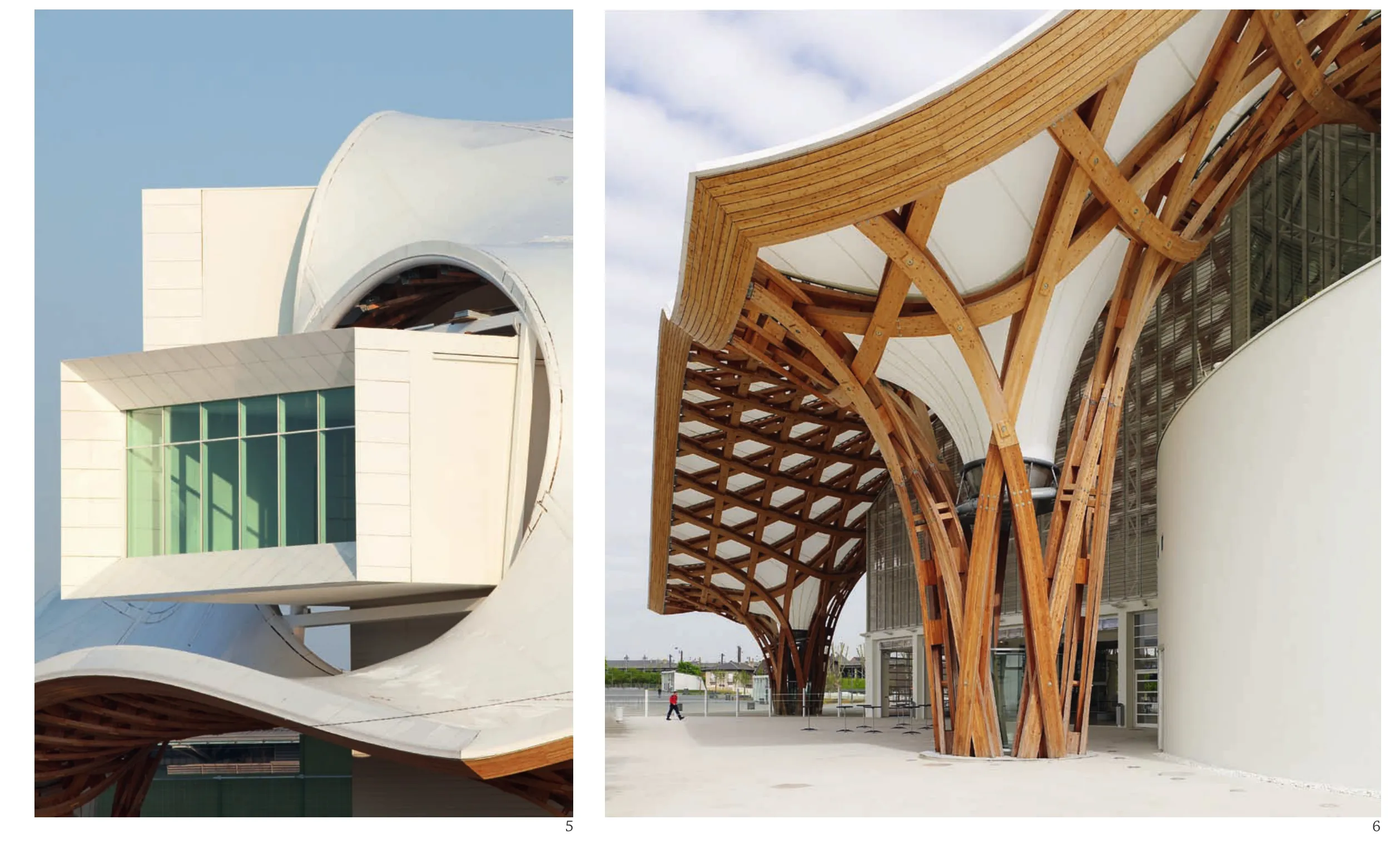
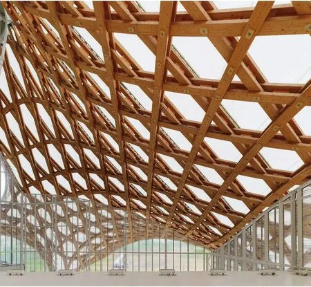
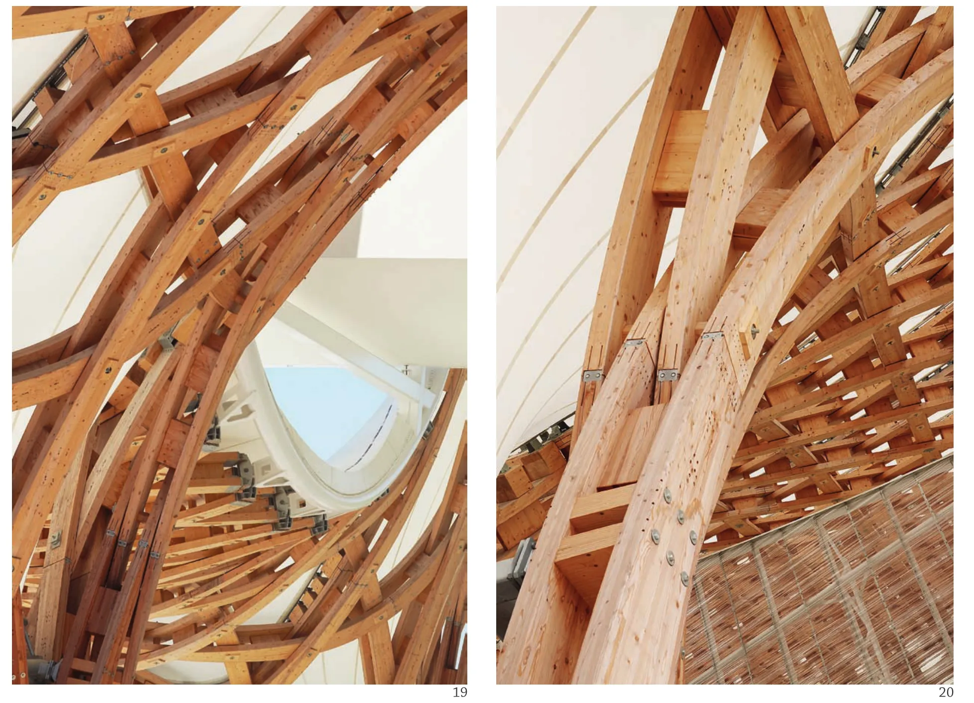
除这3个展厅方管之外,建筑内部还包含一个布置了创新实验室和顶层餐厅的圆柱体,与一个容纳了演讲厅、办公室和其他辅助空间的正立方体。在这些独立的体块上方,覆盖着一个六边形的木结构屋顶,将它们统一为整体。对法国人而言,六边形是他们国家的象征,法国的疆域平面就像是一个六边形。此外,这个大六边形又由一系列六边形和等边三角形的图案构成,其构思来源于亚洲地区的传统竹编草帽与竹篮的造型。尽管将整个屋顶表面分形为三角形会更有利于加强屋顶结构的内部稳定性,然而,6块木构件共同相交于一点也将产生极为复杂的链接构造。而通过形成六边形与三角形组合的分形图案,每个交接处便只需同时出现4块木构件。这些节点并未采用机械的金属构件衔接,因为那样将使屋顶表面变得体量庞大,构件的尺寸也将各不相同,且将因此增加建造的复杂程度和节点的构造成本。相反,我们采用了与竹编工艺相仿的方式,让木构件彼此穿插叠加在一起。这个概念受到我于1999年在巴黎一个古董店里找到的一顶中国传统编织草帽的启发,我当时正在为汉诺威的世博会设计日本馆。那时,我正与弗雷·奥托合作,将这座日本馆设计为一个纸管拉索结构;自从第一次见到他为斯图加特大学设计的轻质结构与概念设计学院,我就为这种张拉索结构的设计所着迷,同时也遗存了一些疑惑。当我见到那顶中国帽子的时候,这些疑惑顿时烟消云散。弗雷·奥托的拉索结构以最少的材料形成了非常有趣的三维室内空间,然而拉索结构毕竟只是线性的元素,为形成正常的屋顶,还必须在其外部覆盖木结构的壳体。当我见到这一切的时候,不禁想到是否有可能利用木材(压型木板)建造一个网壳结构,它不仅能很容易地在二维方向产生弯曲,也可直接在其上方覆盖材料。既然木结构能同时作为承受拉力和压力的结构构件,我当时就认定,除了作为张拉网结构之外,它也是一种理想的壳体荷载结构。自此之后,我不断地探索这种木结构,如宇野千代ⅰ纪念博物馆设计方案(日本岩国市,2000年)、今井病院附属托儿所(日本秋田,2001年)、今井敦纪念体育馆(日本秋田,2002年)、竹屋顶(美国德克萨斯州休斯顿市,2002年)、弗雷·奥托实验室设计方案(德国科隆,2004年)等,以及这座已经建成的蓬皮杜梅斯中心中达到顶峰的屋顶结构设计。在竞赛阶段,通过“竹屋顶”的关系,由奥雅纳工程顾问公司的塞西尔·巴尔蒙德负责屋顶结构的工程设计,并设计了一个木材与钢混合的结构;但在赢得竞赛之后,正如上面提到的,最终仍采用了全部木结构的屋顶设计。
这一设计概念的另一个重要方面,是其室内外空间的延续性以及从这些关系中衍生出来的诸多不同空间。建筑在设计之初只是一些由墙体分隔出室内外空间的盒子。然而,在只有屋顶存在的条件下,却能形成一种新的空间。近年来,艺术变得日益抽象、也日益远离普罗大众。有越来越多的人不愿花钱走进一个方盒子,去欣赏他们甚至未必能理解的作品。然而,这座博物馆与其说是一个盒子,不如说是一个巨型屋顶下的聚会场所,也是周围公园的延伸。由于不存在墙体的遮挡,人们更容易走进这一空间,其建筑立面由轻易即可移除的玻璃百叶组成。密斯·凡·德·罗的柏林新国家美术馆就全部以玻璃作为围合材料,却只是在视觉上形成了通透的效果,在空间上并不能称作是完全透明。这处广场的巨大空间让人们能够随便进入,他们可以在这里品茶,欣赏布置其间的雕塑和装置艺术,当不经意间瞥见展厅中的艺术作品时,又可在进一步接近艺术作品的过程中,逐步体验建筑的空间序列。大屋顶与每个独立体块之间的间隙空间都具有不同的功能。首先,这是一处用于聚会的广场。其次,在一层和二层的展厅方管顶上,还有一处利用经屋顶过滤的自然光线展示雕塑品的空间。这两处展厅面积共计840m2,是最初的任务书上未作要求的额外面积。不幸的是,最初在竞赛方案中提出的位于三层展厅方管顶部的餐厅由于预算原因不得不被取消(根据法国的建筑规范,高于地面28m处的楼层属于高层建筑,因此将使其疏散和安防预案变得极为复杂)。这座建筑的设计理念大致就是这些。(徐知兰 译)
译注:
ⅰ宇野千代,1897-1996,日本女作家、和服设计师。
The site is the location of the original switchyard south of the current station, and is isolated from the urban center of the city to the north. To establish contextual continuation with the city, the large picture windows at the ends of the three gallery tubes frame views to the city's monuments. Through this design, the building and the city become one.The picture window of the uppermost Gallery Tube 3 frames the view to the cathedral, the symbol of Metz, and Gallery Tube 2 frames the central station. Owing to Metz's proximity to the German border and the many wars of the past, the city has changed hands between France and Germany on several occasions. This station is thus an important part of the city's history, a monument in the neo-Romanesque style during a period when Metz was under German occupation.
Aside from the three Gallery Tubes, there is a round volume containing the Creation Studio with a restaurant on top, and a square-shaped volume containing an auditorium, offices, and other back of house program spaces. A timber roof structure in the form of a hexagon hovers over all of the separate volumes in order to unify them into a cohesive whole. To the French, the hexagon is a symbol of their country, as it is similar to the geographical shape of France. Furthermore, the hexagonal is composed of a pattern of hexagons and equilateral triangles inspired by traditional woven bamboo hats and baskets of Asia. Although it is preferred to form triangles to create in-plane stiffness, by dividing up the whole surface into triangles, six wood elements would converge at each intersection producing extremely complex joints. By creating a pattern of hexagons and triangles only four wood elements ever intersect. The intersections do not use mechanical metal joints, because if they were used, the surface would become voluminous and the lengths of the elements would all become unique, increasing the complexity and also the cost of the joints. Instead, each member overlaps one another similar to bamboo wickerwork. This idea came from a traditional woven Chinese hat I found in an antiques shop in Paris in 1999 while designing the Japan Pavilion for the Hanover Expo. I was collaborating with Frei Otto to design the pavilion as a paper tube grid-shell structure, and since first seeing his design of the Institute for Lightweight Structures and Conceptual Design at the University of Stuttgart, I was fascinated with the tensile wiremesh structure while also being left with some doubts. When I saw the Chinese hat, these doubts were cleared. Frei Otto's wire-mesh allowed the formation of an interesting three-dimensional interior space using the minimum amount of materials, but in the end the wire was only a linear member, and in order to build a normal roof, a timber shell had to be formed over the wire-mesh. When I saw this, I wondered about the possibility of making a grid structure using wood (laminated timber) that can be easily bent two-dimensionally, where the roof can be placed directly on top. Since timber can be used as both a tensile member and compressive member, I thought it could be realized as a compressive shell structure, in addition to being a tensile mesh structure. Since then, I have continued to develop timber structures, such as Uno Chiyo Memorial Museum Proposal (Iwakuni City, 2000), Imai Hospital Daycare Center (Akita, 2001), Atsushi Imai Memorial Gymnasium (Akita, 2002), Bamboo Roof (Houston, Texas, 2002), Frei Otto Laboratory Proposal (Cologne, Germany, 2004), and this work has culminated in the now completed roof of the Centre Pompidou Metz. During the competition phase, through ties from Bamboo Roof, Cecil Balmond of Arup was in-charge of the structure for the roof, and a timber and steel hybrid structure was proposed, but after winning the competition, as stated above, a completely timber roof structure was developed.
Another important aspect of the concept is the continuation of interior to exterior spaces, and the sequence of spaces borne from these relationships. Buildings are generally boxes that only begin when the interior and exterior are separated by walls. However, a space can be created with the presence of just a roof. In recent years art has become more and more conceptual that it is distancing the general public. There is an increasing number of people not willing to pay money to enter a box to view works that they may not even comprehend. Instead of a box, the museum is a gathering place under a large roof that is an extension of the surrounding park. As it is easier to enter without the presence of walls, the facade was composed of glass shutters that can be easily removed. Mies van der Rohe's New National Gallery in Berlin has walls that are all in glass, but is only visually transparent, and cannot be called physically transparent. The large volume of the forum can be accessed free of charge, where people can have tea and freely enjoy the sculptures and installations there while they are drawn by glimpses of the artwork in the galleries, and gradually experience the sequences of spaces as they proceed further. The interstitial areas between the large roof and each volume have various functions. First, it is a forum space for gathering. Secondly, on top of Gallery Tubes 1 and 2, it is an exhibition space for displaying sculptures, taking advantage of the natural light filtering in through the roof. The 840 square meters of these two exhibition spaces were extra spaces not originally requested in the program. Unfortunately, the restaurant atop Gallery Tube 3 which was originally proposed during the competition had to be cancelled due to budgetary reasons (according to French building code general purpose floor use higher than 28m above ground are considered a high rise building, which makes emergency evacuation and safety precautions very complex). These are the concepts of this architecture. (Text by Shigeru Ban)
项目信息/Credits and Data
项目团队(竞赛)/Project Team (Competition): Shigeru Ban Architects - Shigeru Ban, Nobutaka Hiraga, Keina Ishioka, Anne Scheou, Mamiko Ishida, Masahito Kinjo, Asako Kimura; Jean de Gastines Architecte DPLG; Philip Gumuchdjian Architect
项目团队/Project Team: Shigeru Ban Architects Europe, Jean de Gastines Architecte DPLG
结构设计/Structural Engineers: Ove Arup, Terrell, Hermann Blumer (木屋顶结构/Structure for the timber roof)
总承建方/General Contractor: Demathieu & Bard, Metz
场地面积/Site Area: 12000 m2
基底面积/Building Area: 8118 m2
总建筑面积/Total Floor Area: 11330 m2
最大高度/Maximum Height: 77m (至六边形塔顶/At the top of the hexagonal tower)
层数/Number of Floor: 3 (展览/Exhibition galleries); 6 (管理/Administration)
建成时间/Construction Period: 2010.05
摄影/Photos: Didier Boy de la Tour
4 夜景/Night view
评论
郝琳:承上启下的梅斯蓬皮杜
坦白地讲,我更期待看到的是坂茂竞标方案的执行——动感的屋顶表现出极其轻盈和类似日本和纸般柔美的姿态和光感。实际的状况是,因为采用了体育场馆常用的PTFE膜材料,灵感来自于草帽的舞动屋顶编织结构,反而更像厚实的帐篷。也因此,建筑内部的光影,比之于方案,趋于平淡。不过,个中考量之一,大概是要满足临时展区和公共区域的环境控制和节能要素。坂茂说,这栋建筑是希望提供更好的展示和欣赏艺术的场所,而非丰碑。无论如何,这栋建筑聚拢大众的姿态、开放营建的思路和木结构的创新,确实是沿着罗杰斯和皮亚诺的第一版蓬皮杜中心,迈出了承上启下的坚实一步。
庄慎:反常
为一个展览空间覆以一个大跨度的屋顶,并且还希望有所起伏,最直接有效的方式显然是钢结构,但是坂茂却使用了性能并非最优的木材,为此还绞尽脑汁地设计了六边形和三角形穿插的编织方式,还有层压板材的单元构件,其意义究竟何在?也许,挑战工业化体系材料和工艺极限的反常规的设计所形成的震撼,就是目的吧!
Comments
HAO Lin: Nexus of Pompidou
Frankly speaking, I was expecting to see Ban's original competition scheme fully executed -a dynamic roof expressing an extreme lightness and softness of something like the Japanese shoji paper. However in the real situation, the architecture looks more like a thick canvas tent, due to the adoption of PTFE, a membrane material typically used in stadium construction, as inspired by the knitting structure of straw hats. Hence, the interior light and shadow effect is less richer compared to its original design. However, this compromise was probably made to meet the requirements of environmental control and energy conservation in public areas and temporary exhibition zones. Shigeru Ban said that the purpose of this building was to provide a better venue for displaying arts, not to set up an architectural monument. In any case, the public inclusiveness of the building, the open design concept and the innovation of wood structure, are all solid steps taken as a nexus following the first version of Pompidou by Rodgers and Piano.
ZHUANG Shen: Unusual
To cover a huge exhibition space with large span roof, and hopefully with a fluctuating surface, a steel structure is obviously the most direct and effective solution. Unusually, Shigeru Ban adopted timber, which seems inferior in performance, and accordingly racked his minds to design a knitting method of hexagonal and triangle patterns. What is the significance of this strategy? Maybe it aims at the shock evoked by an unusual way of design that challenges the limits of materials and techniques in industrialization.
Centre Pompidou-Metz, Metz, France, 2010
Architects: Shigeru Ban Architects, Jean de Gastines Architecte DPLG
5.6 细部/Detail
7 剖面/Section
8 内景/Interior view

9 轴测示意/Axonometric diagram
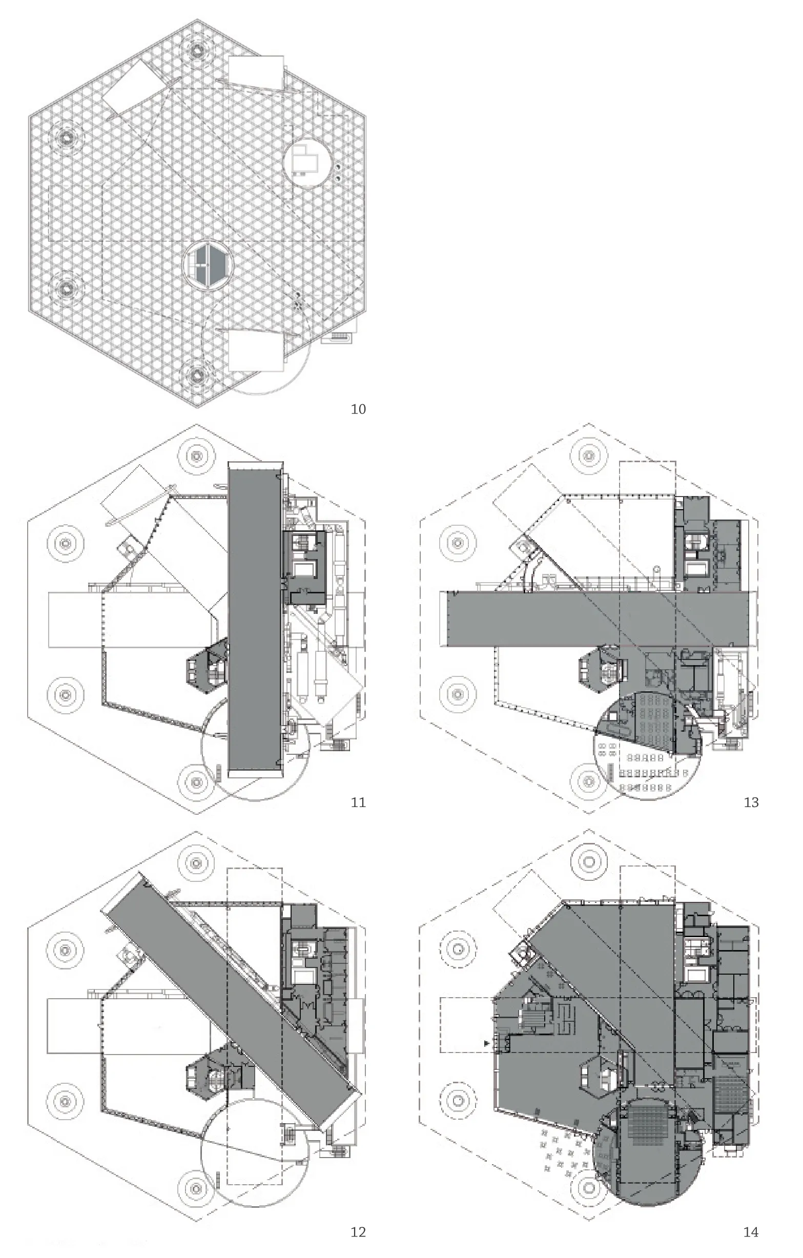
10-14 平面/Floor plan
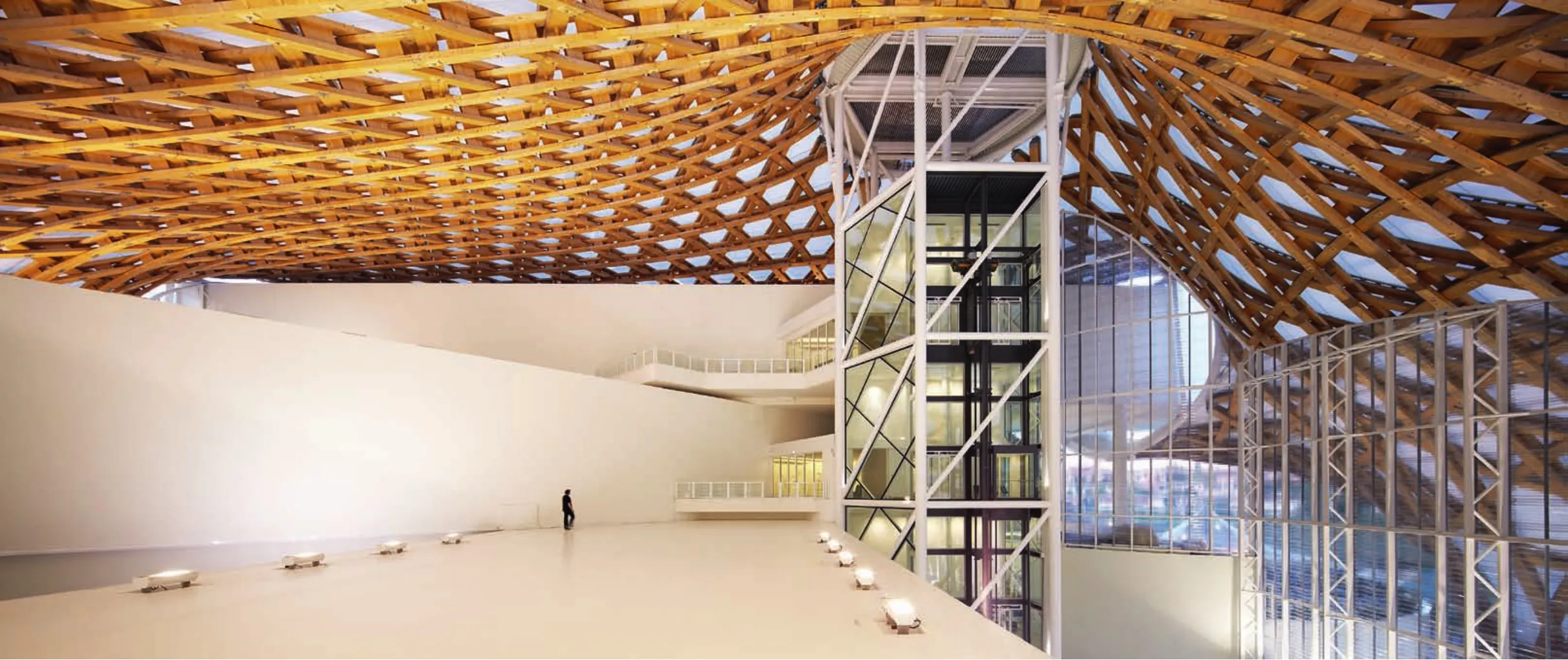
15 内景/Interior view
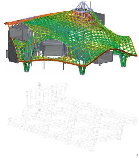
17 细部模型/Detail model
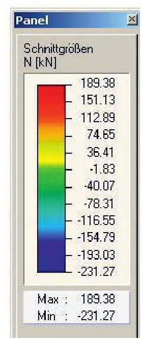
16 结构模型/Structure model
18 内景/Interior view
19.20 细部/Detail
